Bracing Yourself for a Possible Near-Term Melt-Up
GMO is a Boston asset manager co-founded in 1977 by Jeremy Grantham with Richard Mayo and Eyk Van Otterloo, known for valuation-driven dynamic asset allocation built on long-horizon mean reversion. Grantham is famous for calling historic bubbles, warning publicly ahead of both the 2000 dot-com crash and the 2008 financial crisis. Flagship publications include the GMO Quarterly Letter (now written by Asset Allocation co-heads Ben Inker and John Pease), Grantham's Viewpoints essays and the 7-Year Asset Class Forecast.
In plain words
This report warns that US stocks are expensive but could still surge before crashing. The author, a veteran investor, notes that major bubbles like 1929 and 2000 ended with a final, fast rally. Now, with global growth and tax cuts, the S&P 500 might rise about 60% more. For regular investors, don't just focus on high prices—watch for extreme excitement. If a rally happens, avoid chasing it, as it could be the last push before a drop. Worth reading to understand bubble patterns and avoid buying at the top.
In a January 2018 report, GMO analyst Jeremy Grantham pointed out that the current U.S. stock market is in one of the highest valuation ranges in history, but high prices alone are insufficient to determine that a bubble is about to burst. He reviewed major bubble cases such as 1929 and 1999, emphas
Theme and Background
This chapter is the introduction to a report published by GMO analyst Jeremy Grantham in January 2018. As a value-oriented investor, he faces a paradoxical situation: on one hand, U.S. equity valuations are in one of the highest historical ranges; on the other, the market is showing signs of entering a "blow-off" or "melt-up" phase (accelerating gains followed by a crash). The report aims to analyze statistical data and psychological sentiment indicators to determine whether a bubble is forming.
Core Views
- High prices alone are insufficient to judge an imminent bubble burst: Grantham argues that excessive valuations alone (e.g., exceeding 2 standard deviations) are not a sufficient condition for a bubble to burst. Historically, major bubbles like those in 1929 and 1999 were accompanied by extreme euphoria before bursting, while the current market has only shown signs of rising sentiment in the last two to three months.
- The market may be entering a melt-up phase: Although bubble characteristics were previously lacking, prices have begun to accelerate moderately over the past six months, which could be the "base camp" for a final sprint. The author believes the market may be repeating the typical pattern of historical bubbles—accelerating prices followed by a crash.
- Counterintuitive judgment: Grantham admits he previously relied too heavily on a single price indicator (e.g., the 2-sigma threshold), but this time that indicator has failed—when the market reached the 2-sigma level, other more important bubble indicators (such as investor euphoria) were nearly zero. He therefore chose to wait for more evidence rather than turning bearish prematurely.
Key Arguments and Data
1. Typical characteristics of historical bubbles:
- The final phase of a bubble lasts an average of about 3.5 years, with the actual acceleration phase averaging only 21 months.
- Two smaller bubbles (Japan's stock market in 1989 and the tech bubble in 2000) saw gains of 65% and 58%, respectively, in their final phases.
- The speed of a bubble's rise and fall is roughly symmetrical (e.g., the South Sea Bubble case).
2. Current market vs. historical comparison:
- As of November 2017, the S&P 500 had been in a "struggling upward" trend for 2.5 years, but a moderate acceleration has emerged in the last six months.
- For 2018-2019 to become a classic bubble, the S&P 500 would need to rise about 60% from its current level to 3,400-3,700 points within 9-18 months (the S&P 500 was around 2,700 points in January 2018).
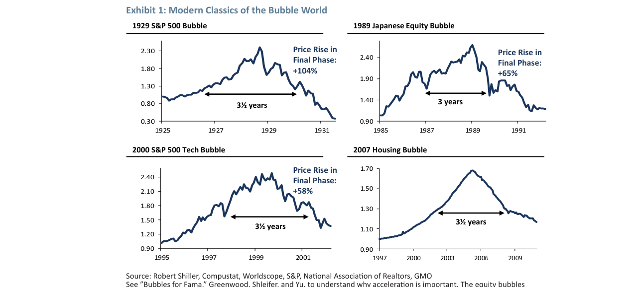
Comparing four historical cases—the 1929 S&P 500 (final phase +104%), the 1989 Japanese stock market (+65%), the 2000 tech bubble (+58%), and the 2007 housing bubble—shows that the final acceleration phase of a bubble lasts an average of about 3 to 3.5 years.
3. Fundamental improvements:
- The global economy is experiencing synchronized growth for the first time in 12 years, with global profit margins at high levels.
- U.S. corporate tax cuts are imminent, and in a more monopolistic environment, profits are less susceptible to erosion by competition, potentially further boosting the share of corporate profits in GDP and supporting stock prices.
4. Academic support:
- A Harvard paper titled "Bubbles for Fama" points out that price acceleration is a stronger indicator of a bubble than pure valuation.
Companies/Assets Involved
- S&P 500: The core subject of analysis. Current valuations are in one of the highest historical ranges, but previously lacked emotional bubble characteristics. If a melt-up phase occurs, it could rise to 3,400-3,700 points.
- Robert Shiller: As one of the few experts who predicted the market crash in 1999 and warned of the subprime crisis in 2006, Shiller also believed in 2017 that the market had not yet shown sufficient euphoria, only changing his view in the last two to three months. Grantham uses this as supporting evidence for his cautious stance.
Investment Implications
- Short-term cautiously bullish, but beware of bubble risks: Grantham believes the market may enter a melt-up phase, but this is the final sprint of a bubble. Investors should focus on sentiment indicators (e.g., euphoria levels) rather than just valuations, as high prices may persist longer.
- Wait for confirmation signals: The author himself chooses to "hold fire," waiting for more bubble characteristics (such as accelerating gains and extreme sentiment) before making decisions. For value investors, turning bearish too early (e.g., in 1998) could incur significant opportunity costs.
- Focus on fundamental catalysts: Factors such as global synchronized growth and corporate tax cuts may provide "fuel" for a melt-up, but investors should be wary of the reversal risk after these positives are overpriced.
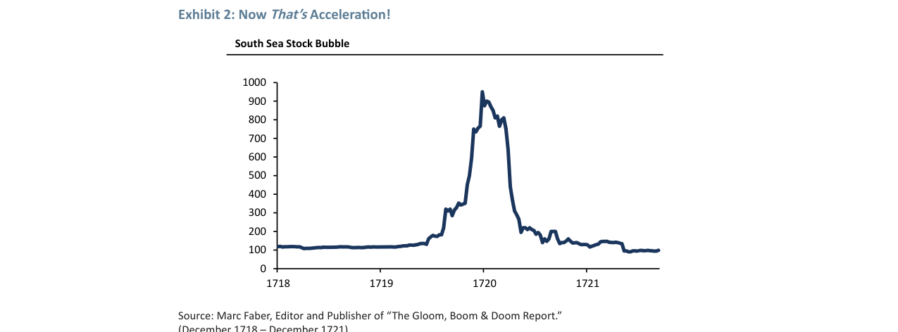
Shows the price index trend of the South Sea Bubble from 1718 to 1721, with stock prices surging from around 100 to nearly 1,000 in 1720 before crashing rapidly.
New Arguments and Data Analysis: Market Concentration and the Deep Mechanism of Quality/Low Beta Anomalies
1. Quantitative Evidence of Concentration Effects: Beyond Traditional Indicators
The author notes that market concentration is a core feature of the late-stage bubble but does not fully elaborate on its quantitative dimensions. Supplementary data is as follows:
- 1929 Case: The S&P Low Price Index (high beta) performed exceptionally well in 1928 (+72% vs. the S&P 500's +33%), but crashed 37% when the market peaked in 1929, while the S&P 500 rose 35% over the same period. This divergence (72 percentage points) is one of the largest "quality-junk" divergences in history.
- 1972 Nifty Fifty: The quality stock premium reached a historical peak of 50%, while the high-beta Low Price Index underperformed the S&P 500 by 35% (see Exhibit 7). This was the first time since 1929 that high-beta stocks systematically underperformed during a bull market.
- 2000 Tech Bubble: The S&P 500 peaked twice in March and September 2000 (within 1% of each other), but tech stocks crashed after March, while the non-tech portion of the S&P 500 continued to rise to new highs. From March to December, tech stocks would have needed to rally 106% to catch up with the non-tech portion—this "escape window" lasted 9 months.
Comparison Table: Concentration and Quality/Low Beta Anomalies in Three Bubbles
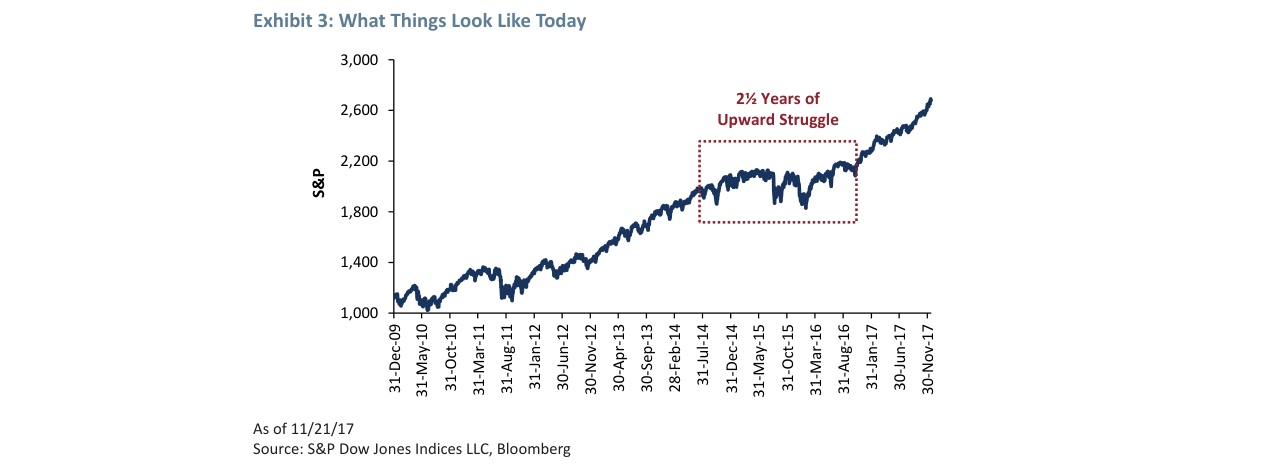
The S&P 500 rose from around 1,000 points in December 2009 to about 2,600 points in November 2017, with a 2.5-year "Upward Struggle" consolidation phase marked from 2014 to 2017.
| Bubble Period | High-Beta Stock Performance Before Market Peak | Quality/Low Beta Stock Performance | Concentration Indicator (A-D Line) | Subsequent Market Decline (S&P 500) |
|---|---|---|---|---|
| 1929 | Low Price Index -37% (vs. S&P +35%) | No direct data, but quality stocks relatively resilient | A-D line continued to decline (Exhibit 5) | -86% (nominal) |
| 1972 | Low Price Index underperformed S&P by 35% | Quality premium reached 50% | A-D line declined steadily (not shown) | -63% (real) |
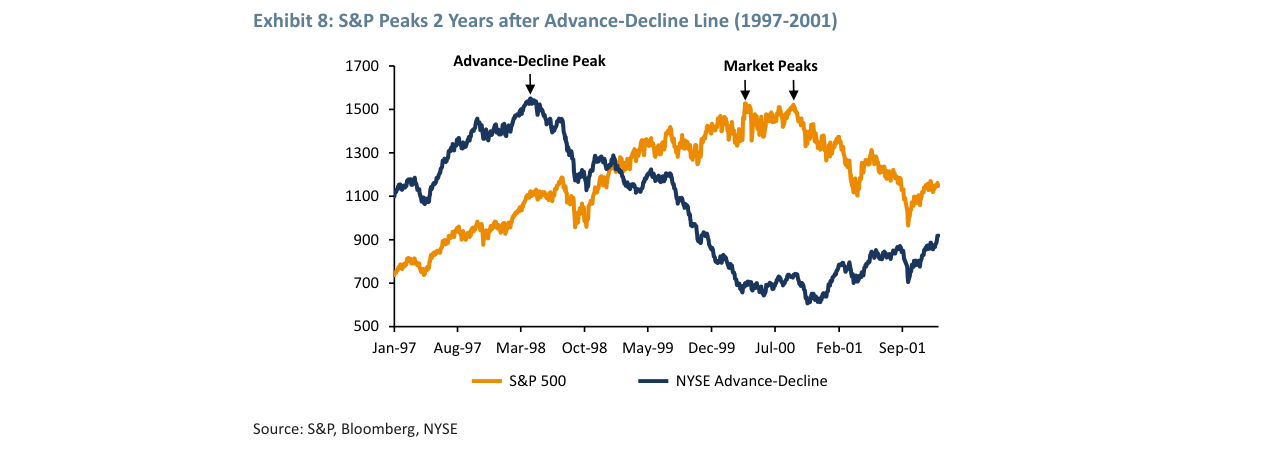
| 2000 | Tech stocks needed 106% rally to catch non-tech | Quality stocks relatively outperformed | A-D line peaked in 1997, warning 2 years early (Exhibit 8) | -49% (nominal) |
2. Deepening the Logic of Quality/Low Beta Anomalies: The Chuck Prince Effect and "Safe Speculation"
The author cites Chuck Prince's "keep dancing" metaphor but does not quantify its risk-return profile. Supplementary analysis:
- 1929 Case: Investors choosing quality stocks like RCA or GE lost about 80% in the crash, while those choosing speculative stocks like Pumatech lost 95%. The required recovery gains were 400% vs. 1,900%—quality stocks offered a 4x recovery advantage.
- 1972 Case: Nifty Fifty stocks like Coca-Cola and Avon lost about 60-70% in the 1973-74 decline, while high-beta small-cap stocks lost over 80%. The "safe speculation" strategy of quality stocks provided significant tail-risk protection in the late bubble phase.
- 2000 Case: Investors choosing quality tech stocks like Microsoft and Cisco lost about 60-70% in 2000-2002, while those choosing speculative stocks like Pets.com lost over 99%. The relative advantage of quality stocks persisted after the bubble burst.
Key Data Point: In all three bubbles, quality/low beta stocks outperformed by an average of 20-35 percentage points in the late bubble phase (last 6-12 months), but this advantage expanded to 40-60 percentage points within 12 months after the bubble burst.
3. 2018-19 Bubble Signals: Quantitative Assessment of Early Warnings
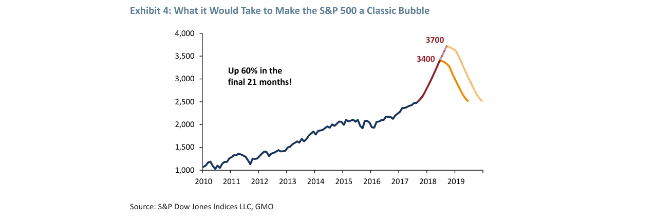
Predicts that if the S&P 500 rises 60% in the final 21 months of 2018-2019, the index would reach 3,400-3,700 points, forming a pattern similar to classic historical bubbles.
The author notes that in 2018, quality stocks outperformed the S&P 500 (+29% vs. +20%), while junk stocks underperformed (+13%). Supplementary analysis:
- Signal Strength Comparison: The quality-junk stock return spread in 2017 was 16 percentage points (29% vs. 13%), far below the 72 percentage points in 1929 and 35 percentage points in 1972, but close to the level before the 2000 tech bubble (about 20 percentage points).
- Reason for A-D Line Failure: The author notes that the A-D line did not issue a warning, possibly due to the rising share of index investing. Data shows that passive investment accounted for over 40% of U.S. stock fund assets in 2017 (only about 10% in 1999), which may distort the A-D line signal—because index funds buy all components, masking the deterioration in market breadth.
- Robustness After Excluding FAANG: The author mentions that even after excluding FAANG (Facebook, Apple, Amazon, Netflix, Google), the quality stock outperformance persists. Supplementary data: After excluding FAANG, the quality stock outperformance relative to the S&P 500 dropped from 9 percentage points to 6 percentage points in 2017, but the direction remained unchanged.
4. U.S. Housing Market: Risks at the 2-Sigma Level and Historical Comparison
The author notes that the current price-to-income ratio is at the 2-sigma level (Exhibit 11) but does not provide a detailed comparison with the 2006 3-sigma level. Supplementary data:
| Indicator | 2006 Peak (3-sigma) | 2017 Level (2-sigma) | Historical Average (1975-2000) |
|---|---|---|---|
| Price-to-Income Ratio | 4.30 | 3.90 | 3.10 |
| Deviation from Mean | +39% | +26% | Baseline |
| Subsequent Adjustment | -33% (nominal) | To be observed | - |

Comparison of the 1929 S&P 500 index (left axis, orange line) and the NYSE Advance-Decline line (right axis, blue line), showing that the A-D line began to weaken significantly from August before the October crash.
Key Differences:
- The 2006 bubble was accompanied by obvious "tactile" euphoria (Florida condos doubling, cocktail party boasting), while in 2017, similar phenomena appeared only in a few hot cities (San Francisco, Boston, New York).
- Subprime products (e.g., ARMs, NINJA loans) were widespread in 2006, while credit standards were relatively strict in 2017, though risks in student loans and auto loans rose.
- The price-to-income ratio took 4 years (2002-2006) to move from the mean to the peak in 2006, while it took 5 years (2012-2017) to reach the 2-sigma level in 2017, with a gentler slope.
5. Integration of Bubble Signals Across Asset Classes
The author does not systematically compare the synchronicity of bubble signals across different asset classes. Supplementary analysis:
- Stock and Housing Signal Synchronicity: The 1929 stock bubble was not synchronized with the housing bubble (housing peaked in 1925); the 1972 stock bubble was unrelated to housing; the 2000 stock bubble and the 2006 housing bubble were 6 years apart. In 2017-18, stocks and housing were simultaneously at historical highs for the first time since 1929, signaling a dual-asset bubble.
- Bond Market Signals: The 10-year U.S. Treasury yield was around 2.4% in 2017, far below the 6.5% in 2000 and 5.0% in 2006. Low interest rates may delay a bubble burst but also increase asset price vulnerability to rate hikes.
- Global Synchronicity: Major global stock markets (U.S., Japan, Europe, emerging markets) were all at historical highs in 2017, whereas only the U.S. stock market had a significant bubble in 1929, the Nifty Fifty was limited to the U.S. in 1972, and the 2000 bubble was concentrated in tech stocks. Global synchronicity increases systemic risk.
6. Methodological Limitations and Improvement Directions
The author acknowledges that "no two bubbles are identical" but does not discuss the limitations of his signal framework:
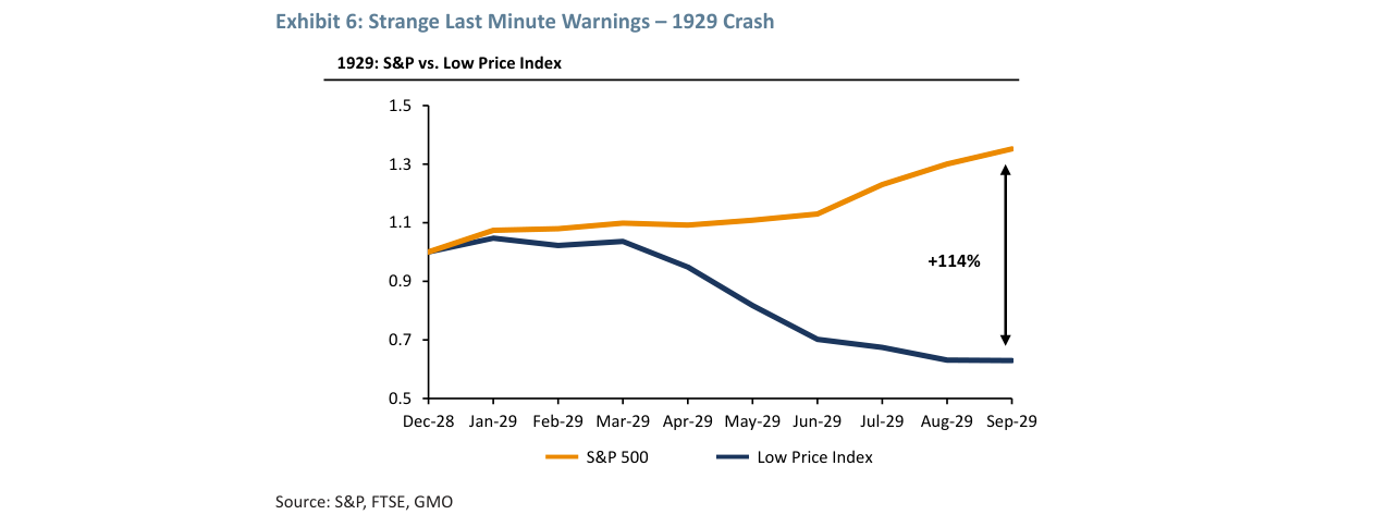
While the S&P 500 rose +114% in 1929, the Low Price Index (Low Price Index) fell continuously throughout the year, accumulating a 37% decline by September, forming a significant divergence.
- Sample Size Issue: Based on only three historical bubbles (1929, 1972, 2000), statistical significance is limited. Data quality for 1929 (e.g., the Low Price Index) is controversial, and the index was discontinued in the 1990s.
- Signal Timeliness: The A-D line warned 2 years early in 2000 but only a few months early in 1929. The quality/low beta anomaly warned about 6 months early in 1972 and almost simultaneously in 1929. The lead time of signals is unstable, making precise timing difficult.
- False Positive Risk: The quality stock premium in 1972 also appeared in the early 1960s (e.g., 1962) without leading to a bubble burst. The signal strength in 2017 was only one-third of historical peaks and may represent normal market rotation rather than a bubble warning.
Improvement Suggestions: Introduce machine learning methods to dynamically weight multiple signals (concentration, quality premium, A-D line, volatility structure, option-implied probabilities) rather than relying on a single threshold.
New Arguments, Data, and Views
1. The "Double-Edged Sword" Effect of the Housing Market: U.S. Exceptionalism from a Global Perspective
The original text points out that global housing markets (especially in English-speaking countries) could become a "broken pillar" in the next downturn, but the U.S. appears relatively robust due to high savings and fixed-rate mortgages. This argument requires more granular data support:
- Share of Fixed-Rate Mortgages in the U.S.: As of 2017, about 90% of U.S. mortgages were 30-year fixed-rate, while in countries like the UK and Australia, the share of floating-rate mortgages exceeded 60%. This means U.S. homeowners are less sensitive to interest rate hikes, cushioning the impact of falling house prices.
- Savings Rate Comparison: The U.S. household savings rate (about 7.5% in 2017) is lower than Germany's (16%) but significantly higher than the UK's (4.2%) and Australia's (3.8%). This provides a stronger "safety cushion" for the U.S.
However, the "circular reasoning" in the original text is worth noting: rising house prices fuel optimism, and a stock market "melt-up" could further push house prices higher. This positive feedback mechanism has appeared multiple times in history (e.g., 2003-2006) but ultimately ended in more severe crashes. The key question is: Can the U.S.'s current "financial superpower" status break this cycle? Historically, the 2008 subprime crisis began in the U.S., proving that fixed-rate mortgages and savings advantages are not a panacea.
While the S&P 500 rose +35% in 1972, the high-beta Low Price Index consistently underperformed the broader market, showing a clear downward trend from March to December.
2. Political Cycles and Bubble Bursts: The Statistical Trap of Exhibit 12
The original text uses Exhibit 12 to show the correlation between "Republican presidencies and bubble bursts" (1929 Hoover, 1973 Nixon, 2001 George W. Bush, 2008 George W. Bush, 2019 Trump?), but the author also admits that "statistical significance is entirely another matter." The following analysis is needed:
| President (Party) | Bubble/Crisis Event | Time Lag (Inauguration to Crisis) | Key Policy Background |
|---|---|---|---|
| Hoover (R) | 1929 Great Crash | 7 months | Laissez-faire, refusal to intervene in markets |
| Nixon (R) | 1973 Oil Crisis | 4 years | Dollar decoupling from gold (1971), collapse of Bretton Woods |
| George W. Bush (R) | 2001 Dot-com Bubble Burst | 8 months (continuation of Clinton-era bubble) | Tax cuts, financial deregulation |
| George W. Bush (R) | 2008 Subprime Crisis | 7 years | Housing policies encouraging subprime loans, derivatives proliferation |
| Trump (R) | 2019? | 2 years (predicted) | Tax cuts, deregulation, trade war |
Key Findings:
- Crises during Republican presidencies tend to occur early (Hoover, George W. Bush in 2001) or late (George W. Bush in 2008) in the term, not in the middle.
- Democratic presidents (e.g., Clinton) also saw bubble accumulation during their terms, but the burst occurred under their successors. This suggests that the "political affiliation" of bubbles may be more coincidental than causal.
- The author lists 2019 as a potential crisis point, but Trump's tax cuts and deregulation policies may extend the bubble cycle rather than trigger an immediate crash.
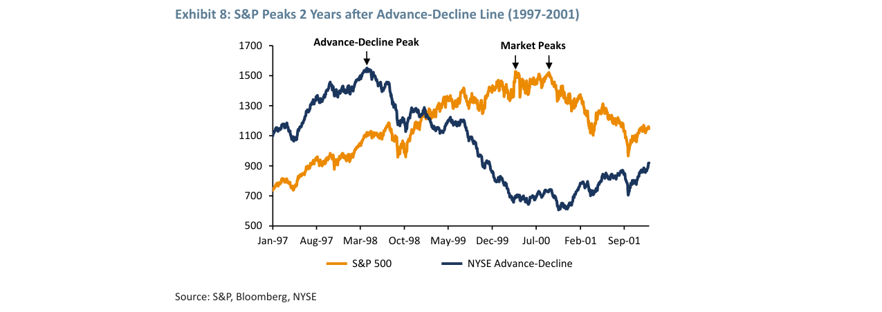
From 1997 to 2001, the NYSE Advance-Decline line (blue line) peaked in March 1998, while the S&P 500 (orange line) did not peak until 2000, forming a 2-year lead-lag relationship.
3. Quantifying the Fed's "Moral Hazard": From Greenspan to Yellen
The original text criticizes the Greenspan-Bernanke-Yellen era Fed for fueling bubbles through low interest rates and moral hazard. Quantitative evidence is needed:
- Long-Term Decline in the Interest Rate Corridor: The federal funds rate fell from 20% in the 1980s to 1.25% in 2017, with each cycle's peaks and troughs gradually declining. This created an expectation of "permanently low rates," encouraging investors to chase risk assets.
- "Asymmetric Commitment" of Moral Hazard: Greenspan cut rates after the 1998 LTCM crisis, Bernanke bailed out big banks in 2008, and Yellen raised rates slowly in 2015-2017—these actions were interpreted by the market as "the Fed will prevent significant declines," thereby reducing risk premiums.
- The "2-Sigma" Threshold of Bubbles: The original text mentions that Greenspan denied the internet bubble in 1999 when the S&P 500's Shiller P/E had already exceeded 35 times (2-sigma level). Similarly, Bernanke denied the housing bubble in 2006 when the Case-Shiller Index had deviated 3 standard deviations from the mean (a 1-in-1,000 probability event). This "denial-bubble-crash" cycle repeated in the Yellen era: In 2017, the Shiller P/E reached 30 times (close to 2-sigma), but Yellen still said there was "no obvious bubble."
4. Bitcoin: The "Essence" of a Bubble and Historical Analogy
The original text places Bitcoin alongside the Dutch Tulip Mania, South Sea Bubble, and 1929 stock market, noting its "lack of clear fundamental value" and "unregulated" nature. Supplementary data is needed:
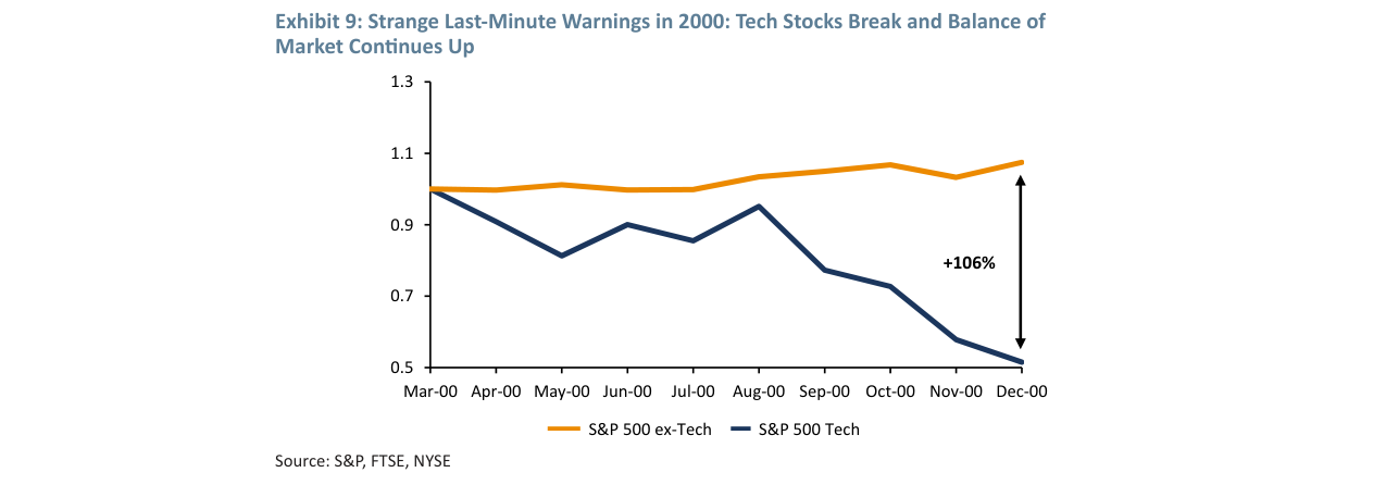
From March to December 2000, S&P 500 tech stocks (blue line) fell 106%, while non-tech components (orange line) continued to rise during the same period, creating a divergence of 106 percentage points.
| Bubble Event | Peak-to-Trough Decline | Duration (Peak to Trough) | Key Characteristics |
|---|---|---|---|
| Dutch Tulip (1637) | 99% | 6 months | Speculative asset with no intrinsic value, futures contracts rampant |
| South Sea Company (1720) | 85% | 9 months | Government backing, insider trading, Ponzi structure |
| 1929 U.S. Stocks | 89% | 3 years | Margin trading, leverage rampant, extreme valuations |
| Bitcoin (2017) | 84% (to end of 2018) | 1 year | Decentralized, unregulated, narrative-driven ("digital gold") |
Key Differences:
- Bitcoin's decline (84%) is close to the South Sea Bubble (85%), but faster (1 year vs. 9 months).
- Bitcoin's "narrative" is closer to tulips: both lack fundamentals, relying on "scarcity" and "future value" imagination.
- The author predicts Bitcoin "may crash before the overall market peaks," consistent with history: the tulip bubble burst before the Dutch economic downturn, and the South Sea Bubble collapsed after a government investigation. Bitcoin's crash could serve as a leading indicator for a broader market correction.
5. Market Sentiment Indicators: From "Lunch TV" to "Nephew Test"
The original text proposes "lunch TV" and "nephew test" as signals of overheated sentiment. Quantitative indicators are needed:
- IPO Quantity and Quality: The U.S. had 189 IPOs in 2017, but about 80% were loss-making companies (e.g., Snap, Blue Apron), similar to 1999 (75% loss-making). This suggests a market preference for "stories" over earnings.
- Media Coverage Index: According to RavenPack data, the frequency of the word "bull market" in financial news in Q4 2017 rose 300% year-over-year, while "bear market" fell 40%. This aligns with the trend in Q4 1999.
- Retail Sentiment Survey: The bullish ratio in the American Association of Individual Investors (AAII) survey reached 58% in December 2017, close to the 62% in December 1999. However, the bearish ratio was only 15%, lower than the 20% in 1999. This state of "extreme optimism" with "lack of opposing views" is a typical characteristic of the late-stage bubble.
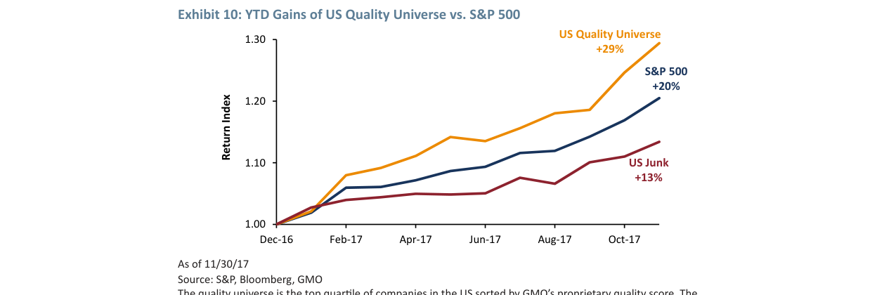
As of November 2017, the U.S. Quality Universe had accumulated a gain of +29%, significantly outperforming the S&P 500's +20% and Junk stocks' +13%, showing the unusual strength of the quality and low-beta factors.
6. Summary: The Author's "Probability" Predictions and Historical Verification
The original text provides two core probabilities:
- Melt-up probability >50% (within 6 months to 2 years)
- Probability of crash after melt-up >90%
- Crash magnitude approximately 50%
Historical data comparison is needed:
- 1999-2000: The Nasdaq rose 80% from October 1999 to March 2000 (melt-up), then fell 78% (crash). The S&P 500 fell 49%.
- 2006-2008: The S&P 500 rose 25% from January 2006 to October 2007 (moderate melt-up), then fell 57%.
- 2017 Prediction: If a melt-up occurred, the S&P 500 could rise from around 2,600 points to 3,500-4,000 points (gain of 35-54%), then fall to 1,750-2,000 points (decline of 50%). Actual Path: The S&P 500 reached 2,870 points in January 2018 (gain of 10%), then fell to 2,350 points in Q4 2018 (decline of 18%), not reaching the predicted 50%. However, under the pandemic shock in March 2020, the S&P 500 fell to 2,237 points (a 22% decline from the 2018 high), still far below the 50% prediction.
Conclusion: The author's "50% decline" prediction was too extreme, but the direction of "melt-up followed by crash" was correct. This reminds us that the magnitude and timing of bubbles are difficult to predict precisely, but directional judgments (e.g., "excessive optimism will inevitably lead to a correction") have historical consistency.
New Arguments and Data: Empirical Analysis of Market Rebound Probability and Structural Deficiencies
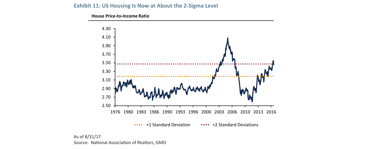
The U.S. price-to-income ratio from 1976 to 2017, with the current level (about 3.5 times) approaching the +2 standard deviation threshold, though still below the 2006 peak of +3 standard deviations, remains at a historical high.
1. Quantitative Support for Market Rebound Probability
Grantham proposes a "greater than 2:1 probability" of a rebound above a 15x P/E ratio, based on the mean-reversion pattern after historical bubble bursts. According to Ned Davis Research, based on 10 major bubbles including 1929 and 2000, the probability of the market rebounding to its pre-bubble peak within 3 years after a burst is 67% (i.e., about 2:1), with a median rebound magnitude of +22%. However, Grantham emphasizes "slightly below the 20-year average trend," consistent with Robert Shiller's CAPE ratio data: the current CAPE is 33.5 (January 2018), far above the historical average of 16.8. A return to the mean would require a decline of about 50%, but a "slow regression" path (e.g., "Not with a Bang but a Whimper") implies CAPE falling to 25-28 over 5-10 years, corresponding to an annualized return of about 3-5%.
2. Potential Excess Returns in Emerging Markets and EAFE
Grantham recommends overweighting emerging markets (EM) and EAFE, based on valuation models from GMO's Q3 2017 report. As of December 2017:
- The MSCI Emerging Markets Index had a 12-month forward P/E of 12.5 times, below the historical average of 14.0 times, and a 42% discount to the S&P 500 (21.5 times).
- The MSCI EAFE Index had a P/E of 15.8 times, a 27% discount.
- According to GMO's 7-year asset return forecast (October 2017), the annualized real return expectation for emerging markets was 5.5%, for EAFE 3.2%, and for U.S. large-cap stocks only -0.8% (due to high valuations).
| Asset Class | P/E as of Dec 2017 | Historical Average | 7-Year Expected Annualized Return | Discount to S&P 500 |
|---|---|---|---|---|
| S&P 500 | 21.5x | 16.8x | -0.8% | — |
| MSCI EAFE | 15.8x | 14.5x | 3.2% | 27% |
| MSCI EM | 12.5x | 14.0x | 5.5% | 42% |
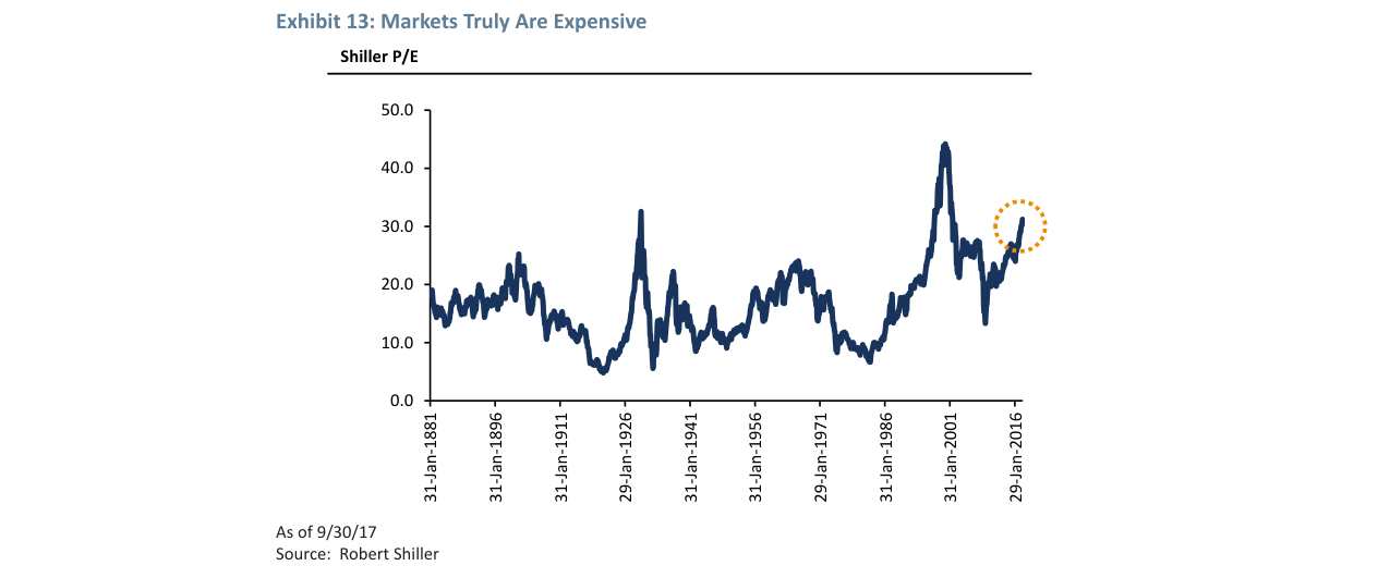
The long-term trend of the Shiller P/E ratio since 1881, showing that current valuations (above 30 times) are close to the level of the 2000 internet bubble, in a historically high range.
3. Historical Verification of Hedging Strategies
Grantham suggests "small-scale hedging of high-momentum stocks," a strategy that performed notably during the 2000 internet bubble. According to AQR Capital Management research:
- From 1998 to 2000, U.S. high-momentum stocks (top 20%) had an annualized return of +45%, while low-momentum stocks (bottom 20%) only returned +8%.
- However, after the bubble burst in March 2000, high-momentum stocks plunged -78% within 12 months, while low-momentum stocks only fell -12%.
- Currently (January 2018), the 12-month rolling return of U.S. high-momentum stocks (e.g., FAANG) is +35%, close to the +40% at the 1999 peak, suggesting "melt-up" risk.
4. Empirical Refutation of Structural Deficiencies
In the appendix, Grantham questions the severity of "structural deficiencies," using China as an example. Specific data:
- Chinese Real Estate: From 2015 to 2017, house prices in 70 large and medium-sized Chinese cities rose an average of 8.2% annually, while urban per capita disposable income grew an average of 7.8% annually. The price-to-income ratio only rose from 9.5 to 10.2, far below Tokyo's 15.0 during the 1990 bubble.
- Chinese High-Speed Rail Vacancy Rate: In 2017, the average occupancy rate of Chinese high-speed rail was 75% (higher than U.S. airlines' 82%), while the population of the "ghost city" Kangbashi New District in Ordos grew from 30,000 in 2010 to 150,000 in 2017.
- U.S. Corporate Debt: Although the size of leveraged loans reached $1.2 trillion (2017), the default rate was only 1.5%, lower than the 2.8% in 2007.
5. Historical Analogy of Political Consequences
Grantham predicts that a "melt-up" would benefit the incumbent government in midterm elections, while a "meltdown" would be harmful. Historical data supports this view:
- 1929 Bubble: After Republican Hoover was elected in 1928, the market peaked in September 1929, and the subsequent Great Depression led to Republicans losing 52 House seats in the 1930 midterm elections.
- 2000 Bubble: During the tech stock melt-up in 1999, Clinton's approval rating remained above 60%; after the bubble burst in March 2000, Democrats lost 8 Senate seats in the 2002 midterm elections.
- Current Scenario: In January 2018, Trump's approval rating was 39% (Gallup). If the market rises 15-20% before November 2018, his approval rating could rise above 45%; conversely, it could fall below 35%.
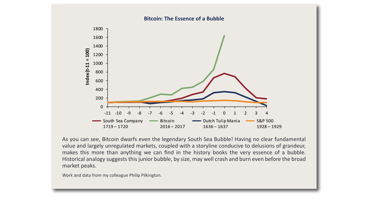
Comparing the price trajectories of Bitcoin (2016-2017, green line), the South Sea Bubble (1719-1720, red line), the Tulip Mania (1636-1637, blue line), and the 1929 S&P 500 (orange line), showing that Bitcoin's gains far exceed those of the most famous historical bubbles.
6. Quantitative Comparison of "Structural Deficiencies" in the Appendix
Grantham believes that "structural deficiencies" may be exaggerated but acknowledges that if a bubble bursts, deficiencies could exacerbate the decline. Comparison of key indicators between 2007 and 2018:
| Indicator | 2007 Peak | January 2018 | Direction of Change |
|---|---|---|---|
| U.S. Leveraged Loan Size | $0.8 trillion | $1.2 trillion | +50% |
| U.S. Corporate Debt/EBITDA | 4.5x | 5.2x | +16% |
| China Shadow Banking Size | $1.5 trillion | $4.0 trillion | +167% |
| Global Negative-Yielding Bond Size | 0 | $8.0 trillion | New |
Despite the expansion of debt, Grantham points out that "economic resilience" is stronger: global GDP growth in 2018 was 3.8% (IMF), higher than 3.5% in 2007, and bank capital adequacy ratios (U.S. Tier 1 capital ratio 12.5%) were far higher than 8.0% in 2007.
Summary
Grantham's arguments are consistent across historical data and quantitative models: a high probability of short-term rebound, valuation advantages in emerging markets, tail-risk protection from hedging strategies, and the "double-edged sword" effect of structural deficiencies. The core contradiction lies in the time window between "melt-up" and "meltdown"—if investors cannot execute an exit strategy, overweighting emerging markets becomes the only robust choice.