Career Risk and Stalin’s Pension Fund: Investing in a World of Overpriced Assets
GMO is a Boston asset manager co-founded in 1977 by Jeremy Grantham with Richard Mayo and Eyk Van Otterloo, known for valuation-driven dynamic asset allocation built on long-horizon mean reversion. Grantham is famous for calling historic bubbles, warning publicly ahead of both the 2000 dot-com crash and the 2008 financial crisis. Flagship publications include the GMO Quarterly Letter (now written by Asset Allocation co-heads Ben Inker and John Pease), Grantham's Viewpoints essays and the 7-Year Asset Class Forecast.
In plain words
This report argues that rising inflation is a bigger threat to your portfolio than a recession. With stocks and bonds already expensive, higher inflation would force interest rates up, causing both to fall sharply. For example, a classic 60/40 stock-bond portfolio could lose over 40% in an inflation scenario, versus about 20% in a crisis. The author warns against relying on bonds for safety and suggests considering inflation-protected assets (like TIPS) and shorter-term investments. It's worth reading because it uses data to show that the biggest risk might not be what you expect.
GMO's Q3 2017 letter discusses the outlook for U.S. inflation and its potential impact on investment portfolios. The core argument is that although the U.S. economy is near full employment and inflation is close to the Federal Reserve's target, the actual trajectory of inflation remains puzzling, an
Theme and Background
This chapter focuses on the puzzle of the US inflation outlook and its potential impact on investment portfolios. Author Ben Inker notes that despite the US economy being near full employment and inflation once reaching the Fed's target, the actual inflation trajectory in 2017 was puzzling—core CPI fell from 2.2% to 1.7%, contradicting moderate GDP growth. This uncertainty makes whether interest rates can return to "normal levels" a key question.
Core Thesis
The author's central judgment is: A significant rebound in inflation represents the greatest risk to current portfolios, with destructive potential that could exceed that of an economic recession. The counterintuitive aspects are:
- Historically, inflation has dealt a far heavier blow to high-quality bonds than to stocks; however, currently, extremely low real yields make bonds particularly vulnerable, while high valuations also pressure stocks.
- Losses from an inflation shock primarily stem from valuation declines (paper wealth shrinkage), not from impaired future cash flows, so the actual loss of purchasing power may be less than the paper loss.
Key Arguments and Data
1. The Disconnect Between Inflation and Interest Rates:
- Core CPI was 2.2% at the end of 2016 (close to the Fed's 2% target), but fell back to 1.7% in 2017, without a significant slowdown in GDP growth.
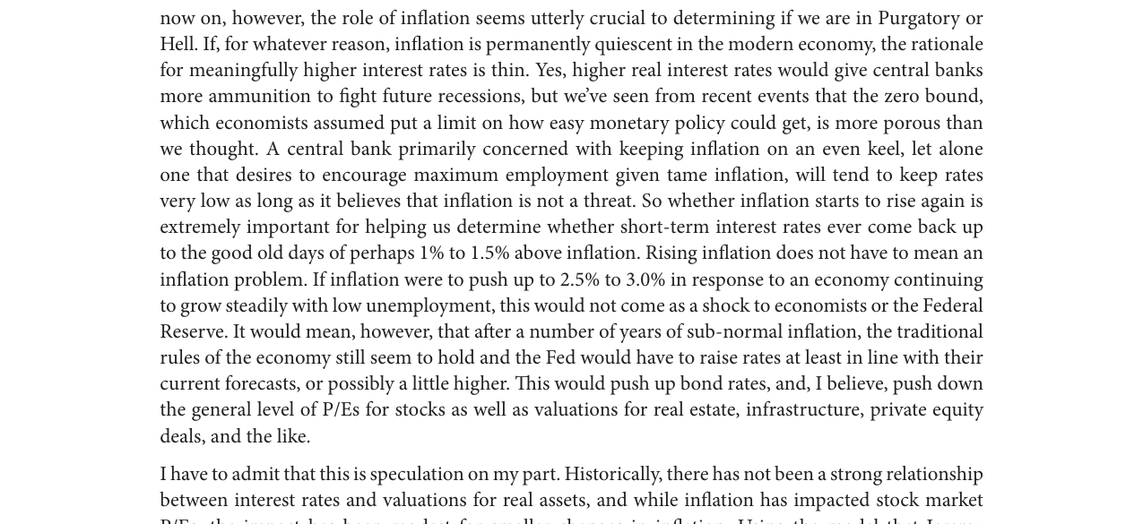
- If inflation remains persistently low, there is little reason for rates to rise; if inflation rises to 2.5%-3.0%, the Fed may be forced to hike rates, pushing up bond yields and compressing stock P/E ratios.
2. The Failure of Historical Models:
- The author's earlier "investor comfort" model suggested the ideal inflation rate for US stocks was 2.5%; deviations from this level (in either direction) would lead to valuation declines.
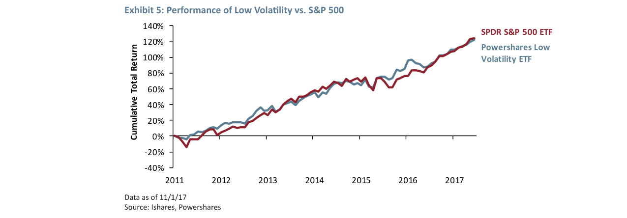
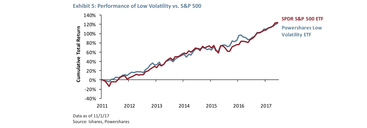
- However, the current market logic has shifted: low-volatility stocks (e.g., PowerShares Low Volatility ETF) had cumulative returns close to the S&P 500 ETF from 2011-2017 (see table below), indicating the market is driven not by growth expectations but by passive allocation under "There Is No Alternative" (TINA).
| Asset Class | Cumulative Total Return (2011-2017) |
|---|---|
| SPDR S&P 500 ETF | ~120% |
| PowerShares Low Volatility ETF | ~100% |
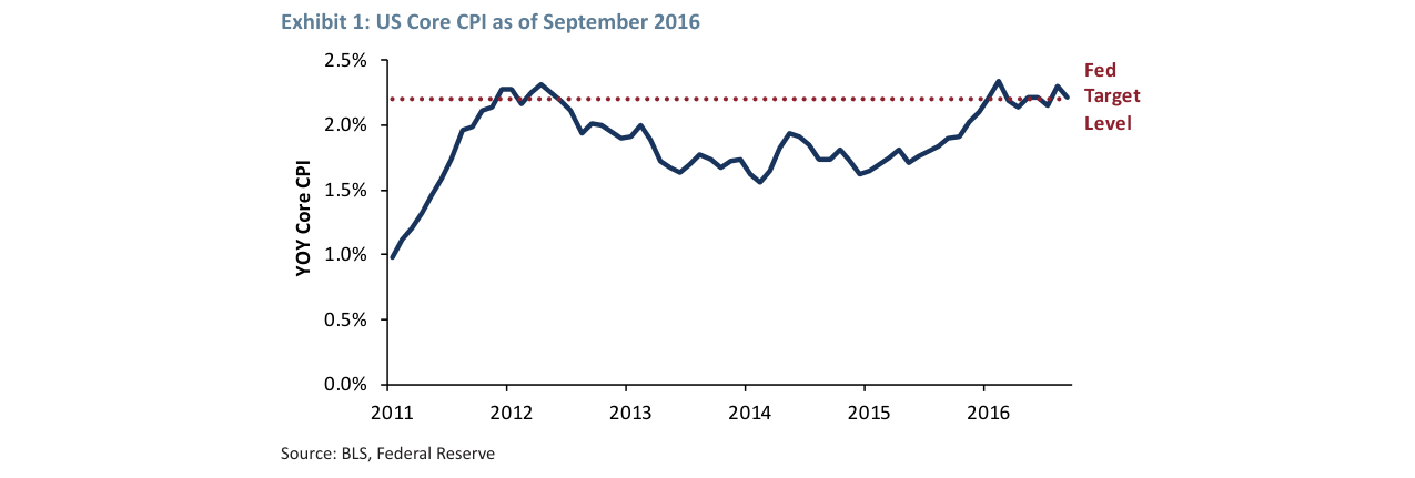
US Core CPI rose from ~1% in 2011 to a peak of 2.3% in 2012, hovering around 2.2% in 2016, close to the Fed's 2% target level
3. Quantifying the Impact of an Inflation Shock:
- If inflation rebounds, high-quality bonds will perform extremely poorly due to very low real yields; stocks may face additional valuation compression due to high valuations (e.g., Shiller P/E at historical highs).
- The author emphasizes that this loss is a loss of "paper wealth" rather than "sustainable spending power," but the magnitude could be enormous.
Companies/Assets Involved
- FAANG Stocks (Facebook, Amazon, Apple, Netflix, Alphabet): Seen as a few "bright spots" in the current market, but the overall market lacks the frenzy of the dot-com bubble era.
- Low Volatility ETFs (PowerShares Low Volatility ETF): Performance close to the S&P 500, reflecting a "forced investment" mentality rather than optimism about growth.
- High-Quality Bonds: Extremely low real yields mean an inflation rebound would cause significant price declines.
Investment Implications
- Investors should view an inflation shock as the number one tail risk for portfolios, not an economic recession. Current asset price sensitivity to interest rates and inflation is at historical extremes.
- Defensive strategies should focus on inflation-hedging assets (e.g., TIPS, commodities, real assets), rather than traditional safe havens (e.g., long-term government bonds).
- Beware the fragility of the "TINA" logic: If inflation forces rate normalization, the current valuation system reliant on low rates could rapidly unravel, especially for high-valuation growth stocks and low-volatility strategies.
Sequel Analysis: From TINA to TIAOA and the Quantitative Impact of Inflation Scenarios
1. Market Environment Shift: The Deeper Meaning of TINA vs. TIAOA
The author further distinguishes two market mindsets: TINA (There Is No Alternative) and TIAOA (There Is An Okay Alternative). The core of this shift is that a small rise in the expected return of low-risk assets (like bonds) could have a disproportionate impact on the current high-valuation market.
- Data Support: The author notes that in a TINA environment, investors are forced into stocks, even without enthusiasm; in a TIAOA environment, a rebound in bond yields (even a small one) can divert funds, pressuring stock valuations. This aligns with the historical performance in 2022 when the Fed's rate hiking cycle saw the US 10-year Treasury yield rise from 1.5% to 4%, and the S&P 500 fell by about 20%.
- Comparison Table: Asset allocation preferences and risk exposure under different market mindsets:
| Market Mindset | Core Characteristic | Investor Behavior | Impact on Stock Valuations | Historical Example (2010-2023) |
|---|---|---|---|---|
| TINA | Extremely low yields on low-risk assets | Forced to buy stocks | Pushes valuations to historical highs | 2010-2020, S&P 500 Shiller P/E rose from 20 to 38 |
| TIAOA | Low-risk asset yields rebound to "okay" level | Funds flow back to bonds | Valuations under pressure, potential 20-30% correction | 2022, S&P 500 fell 19%, bond yields rose |
| TIAPDGA | Low-risk asset yields are "pretty darn good" | Significant reduction in stocks | Sharp valuation contraction, potential halving | 2000-2002 dot-com bubble burst, S&P 500 fell 49% |
2. Quantitative Analysis of Inflation Scenarios: More Severe Potential Losses
The author constructs two extreme scenarios—an Economic Crisis (similar to the Great Depression) and an Inflation Problem (moderate inflation)—and compares their impact on a 60/40 portfolio. The key finding is that the destructive power of the inflation scenario far exceeds that of the economic crisis.
- Economic Crisis Scenario:
- Assumptions: Economic value of stocks falls 15% (worst in history), investors demand a 4% equity risk premium, cash real yield is 0%.
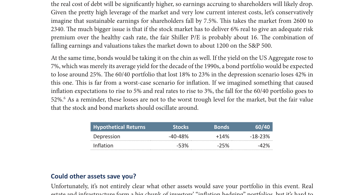
- Result: S&P 500 falls from 2600 to ~1600 (further to 1360 after considering profit/GDP ratio reversion), but bonds rise 14% on safe-haven demand, limiting the 60/40 portfolio loss to 18-23%.
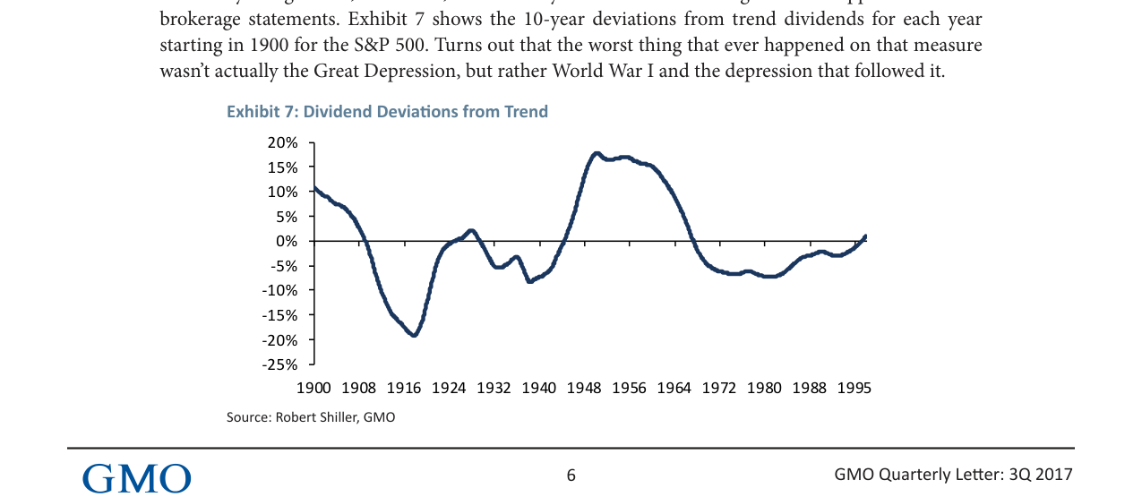
- Data Source: The author cites Exhibit 7 (dividend deviations from trend), showing that even during the Great Depression, dividend losses were only about 20%, far from catastrophic.
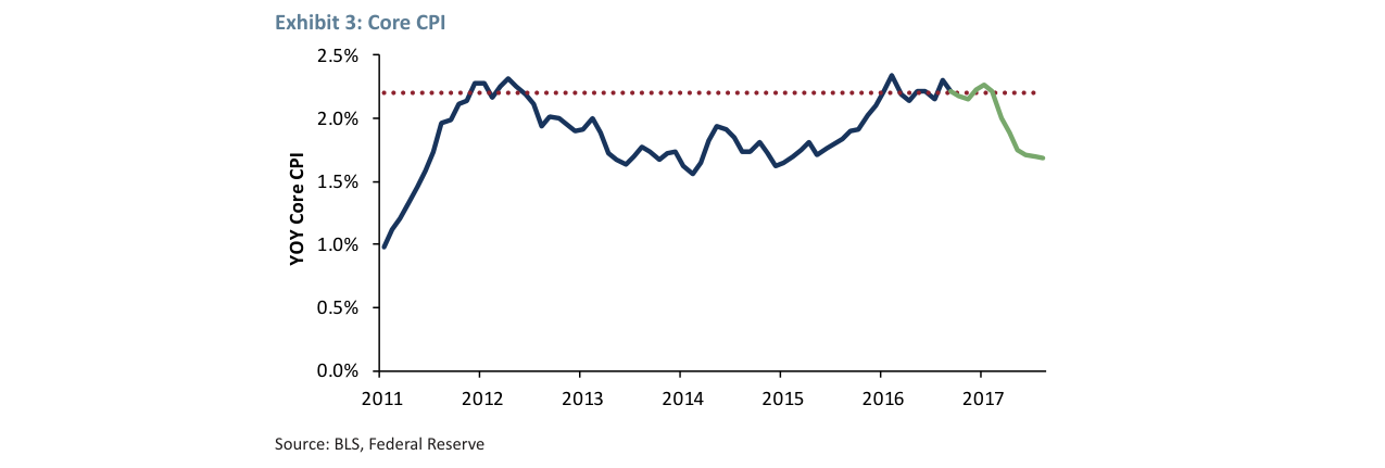
Core CPI fluctuated between 1.5%-2.3% from 2011-2016; the 2017 data (green line) shows a decline to ~1.7%, below the Fed's target
- Inflation Scenario:
- Assumptions: Real cash yield rises to 2% (consistent with the Fed's 2012 "dot plot"), stocks need to provide 6% real return to compensate for risk, bond yields rise to 7% (1990s average).
- Result: S&P 500 falls to ~1200 (a 53% decline), bonds lose 25%, and the 60/40 portfolio loses 42%. If inflation expectations rise to 5% and real rates to 3%, the 60/40 portfolio loss reaches 52%.
- Comparative Data: The loss in the inflation scenario (42-52%) is 2-3 times that of the economic crisis scenario (18-23%), and bonds shift from a "safe haven" to a "source of risk."
3. The Disconnect Between Valuation Premiums and Historical Medians
The author emphasizes that the current Shiller P/E and Hussman P/E for the S&P 500 are both about 93% higher than their long-term medians, implying a 48% decline to revert to the median. However, the market has been below the median only 2-4% of the time over the past 25 years, suggesting this median has lost practical relevance.
- Historical Triggers: Three factors have historically pulled the market below the median—major wars, economic crises, and inflation surges. After ruling out war, the author notes that economic crises (like the Great Depression) typically cause permanent dilution, but the inflation scenario is more destructive.
- Data Supplement: Exhibit 6 shows the Shiller P/E was around 30 in 2017, and the Hussman P/E around 25, both far above the historical median (~16-18). If the profit/GDP ratio reverts to its mean (currently at a historical high), valuations could face further pressure.
4. Implications for the 60/40 Portfolio: Inflation Risk is Underestimated
The performance of a traditional portfolio (60% stocks / 40% bonds) in an inflation scenario is far worse than in an economic crisis scenario, contradicting the common investor belief that "bonds hedge deflation." The author's quantitative analysis reveals:
- Economic Crisis: Bonds provide positive returns (+14%), partially offsetting stock losses.
- Inflation: Bonds and stocks fall simultaneously, leading to portfolio losses of 42-52%, with no effective hedge.
- Policy Implication: Modern central banks (like the Fed) are forced to raise rates in an inflation scenario, not cut them, preventing bonds from acting as a safe haven. This aligns closely with the 2022 "stock-bond rout" (S&P 500 fell 19%, US Aggregate Bond Index fell 13%).
5. Key Conclusions and Risk Warnings
- Core Risk: The biggest threat to the current market is not an economic recession, but rate normalization triggered by inflation. Even a moderate rise in inflation (to 4-6%) could cause a potential loss of 42% for a 60/40 portfolio, approaching the level of the 2008 financial crisis (~50%).
- Valuation Vulnerability: In a TIAOA/TIAPDGA environment, high valuations (Shiller P/E 30+) lack fundamental support, and any rise in interest rates could trigger a valuation reversion.
- Investor Advice: While the author does not explicitly recommend a low-volatility strategy, the analysis implies that the traditional 60/40 portfolio may fail in an inflation scenario, necessitating a reassessment of asset allocation (e.g., increasing inflation-protected assets, shortening bond duration).
New Arguments, Data, and Perspectives
1. Limitations of Inflation-Hedging Assets: Dual Pressure from Leverage and Valuation
The sequel further strengthens the argument that "other assets are difficult to effectively hedge inflation" and adds key mechanisms:
- Real Estate & Infrastructure: While the nominal cash flows of the underlying assets may rise with inflation, investors typically hold these assets with leverage. In an inflationary environment, rising real rates directly increase financing costs, impairing net cash flows. This aligns with the logic in the stock model that "valuation decline is the primary source of loss"—leverage amplifies the negative impact of real rates on asset prices.
- Natural Resources: Their protective effect is highly dependent on the "type" of inflation. Only when resource price increases significantly outpace the overall price level (i.e., "resource-driven inflation") can related assets (e.g., commodity futures, resource stocks) generate excess returns. If resource prices merely rise in line with overall inflation, the protective effect is minimal. The author also notes that commodity futures indices have consistently underperformed spot prices over the past 15 years, suggesting that futures market pricing often fails to fully capture this "resource premium."
2. The Flattening Phillips Curve: Empirical Evidence that Inflation Risk is Underestimated
The sequel introduces comparative data on the US Phillips Curve to argue why current inflation risk is being overlooked by the market:
| Period | Relationship between Unemployment & Wage Growth (Slope) | Key Characteristic |
|---|---|---|
| 2000-2008 | Significantly negative (traditional expectation) | When unemployment fell below 4%, wage growth rose above 4% |
| 2008-2017 | Slope declined by ~80% | Unemployment fell from 10% to 4%, wage growth only rose from 2% to 2.5% |
The cumulative total returns of the Low Volatility ETF and the S&P 500 ETF moved in close tandem from 2011-2017, both rising from 0% to ~120%
- Data Source: BLS (Bureau of Labor Statistics), BEA (Bureau of Economic Analysis).
- Key Finding: After the financial crisis, the traditional relationship between unemployment and wage growth weakened significantly. Even with unemployment at historic lows (below 4%), wage pressures remained moderate, reducing market vigilance about inflation.
- Author's View: This flattening could be temporary (post-crisis repair period) or structural (globalization, technological substitution, etc.). If the Fed misjudges this change, it could lag behind rising inflation expectations, leading to an unexpected inflation surge. While not the base case, it is "not entirely implausible."
3. The "Double-Edged Sword" Effect of Inflation Swaps
The sequel proposes a theoretically perfect hedging tool—Inflation Swaps—but points out its fatal flaw:
- Advantage: If inflation rises unexpectedly, the contract provides a lump-sum payment that can buffer portfolio losses.
- Risk: If inflation unexpectedly declines (i.e., deflation/depression scenario), the swap will generate losses, while deflation itself is already severely damaging assets like stocks and bonds. Therefore, protecting against inflation risk almost inevitably exacerbates losses in a deflation scenario.
- Conclusion: This trade-off may be reasonable, but it is by no means a "lay-up," especially for long-term investors like pension funds seeking stability.
4. Emerging Market Stocks: The "Survivorship Bias" of Inflation Memory
The sequel presents a somewhat controversial view: Emerging Market (EM) stocks may be more resilient to inflation, for the following reasons:
- Historical Experience: EM countries have long operated in inflationary environments (some have experienced hyperinflation), and their corporate pricing power, cost-pass-through mechanisms, and investor expectations have partially "internalized" inflation risk. In contrast, developed markets (especially the US) have experienced persistently low inflation since the 1980s, giving investors a shorter "memory" of inflation shocks.
- Behavioral Logic: If an inflation surge becomes the catalyst for a market decline, markets that have "never been far from inflation" (like EM) may be relatively more resilient, as their valuations already partially reflect an inflation risk premium.
- Risk Warning: The author explicitly states that the current preference for EM is primarily driven by valuation advantages (Shiller P/E ~16x, far lower than the US), not speculation on inflation resilience. However, if the worst-case scenario materializes, holding stocks that "remember what inflation is" might be a reasonable choice.
The Shiller P/E and Hussman P/E of the S&P 500 fluctuated from 1881-2016, reaching approximately 28x and 22x respectively in 2016, a premium of ~93% over the long-term median
5. Portfolio Defense Strategy: Shortening Duration and Liquid Alternatives
The sequel summarizes GMO's actual measures in its benchmark-free portfolios:
- Fixed Income: Primarily holds TIPS (Treasury Inflation-Protected Securities), but with duration kept under 2 years to avoid capital losses on long-term bonds when rates rise.
- Risk Assets: A significant portion of capital is allocated to Liquid Alternatives, which have significantly shorter duration than stocks and are better at managing deflation risk (e.g., long/short strategies, event-driven strategies).
- Core Logic: By shortening the overall portfolio duration, sensitivity to rising real rates is reduced, while retaining defensive capabilities against a deflation scenario.
6. Comparative Data: Expected Performance of Different Assets in an Inflation Scenario
| Asset Class | Inflation Protection Ability | Primary Risk | Notes |
|---|---|---|---|
| Traditional Bonds | Very Poor | Price collapse due to rising real rates | Longer duration = larger loss |
| TIPS | Moderate | Still lose money, but less than traditional bonds | Prices fall when real yields rise |
| Real Estate/Infrastructure | Low to Moderate | Leverage amplifies real rate shock | Nominal cash flows may rise, but valuations fall |
| Natural Resources/Resource Stocks | Conditionally High | Only effective if resource price gains exceed overall inflation | Futures indices have long underperformed spot |
| Inflation Swaps | Very High | Severe losses in deflation scenario | Perfect hedge but costly |
| Emerging Market Stocks | Uncertain | High volatility, but potentially more resilient | Valuation advantage is the current primary reason |
7. Key Data Point Supplement
The percentage deviation of S&P 500 dividends from trend fluctuated from 1900-1995, falling to -20% during the Great Depression of the 1920s and rising to +18% in the post-WWII 1940s
- Historical Inflation Extremes: Long-term US inflation expectations reached 7% in the 1970s, with peak real rates exceeding 3% (Note 6). Current market pricing of inflation risk is far below this level.
- Emerging Market Relative Performance: Since 1968, EM stocks have had three significant periods of excess returns relative to developed markets (5x, 6x, and 3.7x respectively). The most recent period began in February 2016, achieving an 11% relative gain (Note 1). The author believes this trend may continue.
- Portfolio Return Forecast: The expected real return for a traditional 65/35 stock/bond portfolio over the next 10 years is only 1%-3% (Jeremy Grantham's view), far below the long-term pension target of 4.5%.
Sequel Analysis: Similarities and Differences Among GMO's Three Paths and the Dilemma of Asset Allocation
1. Quantitative Comparison and Core Divergence of the Three Paths
GMO's three internal assumptions about the market's return path, while converging on long-term (20-year) returns (US stock real return 2.5%-3%), show significant differences in short- and medium-term (7-year) expectations, directly impacting asset allocation strategies. The following table compares key data:
| Path | Proponent | Speed of Reversion | 7-Year Expected Return (US) | 20-Year Expected Return (US) | Core Assumption |
|---|---|---|---|---|---|
| Fast Reversion | James Montier | Sharp short-term decline to pre-1998 levels | Very low (potentially negative) | 2.5%-3% | One-time market correction to historical valuation mean |
| 7-Year Reversion | Ben Inker | Gradual reversion to a new normal over 7 years | Slightly higher than James | 2.5%-3% | Valuation center shifts up, but long-term return unchanged |
| Slow Reversion | Jeremy Grantham | 20-year reversion to 2/3 of the mean | ~2.5% | 2.5%-3% | Structural factors (monopoly, aging, etc.) delay reversion |
Key Insight: Although the 20-year return ranges overlap significantly, the 7-year path differences determine the relative value of cash, bonds, and stocks. Under Grantham's slow reversion assumption, stocks offer a higher premium over cash (S&P 500 real return 2.5% vs. cash near 0%), weakening the "option value" of cash and the safe-haven attributes of long-term bonds.
2. Quantitative Impact of Structural Factors on Reversion Speed
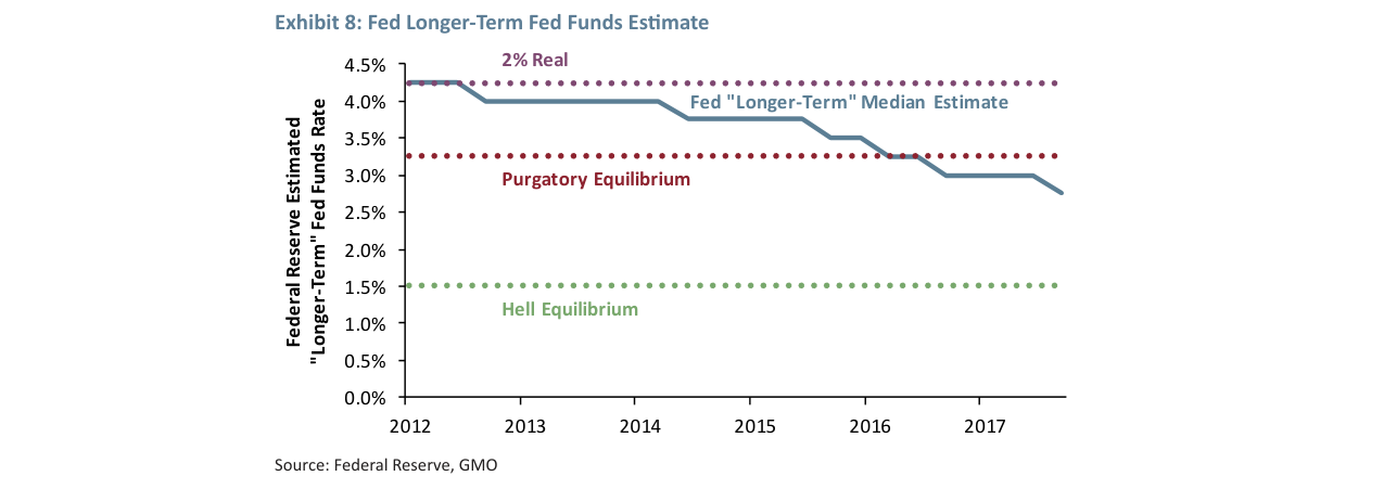
The Fed's median estimate for the longer-term federal funds rate fell steadily from 4.3% in 2012 to ~2.9% in 2017, sitting between a "purgatory equilibrium" (3.3%) and a "hell equilibrium" (1.5%)
The five structural factors Grantham lists (political influence, central bank management, population aging, income inequality, slowing innovation) are not easily reversible in the short term. Using historical data as a reference:
- Monopoly Power: US corporate profit margins rose from 5.8% in 1998 to 11.2% in 2020 (BEA data). If they revert only 2/3 of the way, they would still be 9.3% in 2037, above the historical average.
- Population Aging: The share of the US population aged 65+ rose from 12.3% in 1998 to 17.5% in 2023, projected to reach 21% by 2037 (UN data), slowing labor force growth and suppressing GDP growth.
- Central Bank Policy: The Fed funds rate fell from 5.5% in 1998 to 5.25% in 2023 (with a period of zero rates in between). Under a slow reversion, it might still be below 4% in 2037.
These factors combined make it difficult for market valuations (e.g., S&P 500 P/E) to quickly fall back to the pre-1998 range of 15-18x; instead, they might stabilize around 20-22x, leading to persistently low long-term returns.
3. The "Catch 22" of Asset Allocation: Career Risk vs. Client Patience
Grantham cites Chapter 12 of Keynes's General Theory, pointing out that career risk is the central contradiction in asset allocation:
- Historical Lesson: In 1999, virtually all large investment institutions chose to "go with the flow" and hold overvalued stocks, with no one daring to exit early. The only exception was a value fund that switched to growth stocks at the last minute, yet still failed to avoid a 50% loss in 2000-02.
- Data Evidence: From 1998-2000, the S&P 500 P/E ratio surged from 21x to 35x. Exiting early would have exposed institutions to client redemptions and reputational damage. This "herd error" repeats every 10-15 years (e.g., the 2007 subprime bubble).
- Solution: Independent institutions (like GMO) can reduce business risk through "advance communication + client education," but cannot eliminate it entirely. Grantham emphasizes: "If you are unwilling to take career risk, you should not offer asset allocation services."
4. Improved Stock Pricing Efficiency and the Demise of the "Dogs of the Dow" Strategy
Grantham points out that after the 1990s, the influx of quantitative models and highly educated analysts significantly eroded the excess returns of "low P/E / low P/B" strategies:
- Historical Data: From 1980-1990, the cheapest 20% of stocks ("Dogs of the Dow") outperformed the most expensive 20% by about 5-6 percentage points annually (Fama-French factor model).
- Current Status: By the 2010s, this premium had shrunk to 1-2 percentage points, with increased volatility. Reasons include:
- Quantitative funds (e.g., Renaissance Technologies) rapidly arbitraged away the anomaly through high-frequency trading and factor models.
- Increased client tolerance for "single stock failure" reduced the risk of buying cheap stocks.
- Conclusion: Simple value factors have become ineffective, requiring more precise measures of "true economic value" (e.g., discounted cash flow, intangible asset adjustments). Grantham quips: "Who needs to build a nuclear fusion reactor? You can make more money modeling on Wall Street."
5. The Only Reasonably Priced Asset Today: Emerging Market Stocks
In the inflation scenario, stocks fall 53%, bonds fall 25%, and the 60/40 portfolio falls 42%; in the depression scenario, stocks fall 40-48%, bonds rise 14%, and the 60/40 portfolio falls 18-23%
Grantham's conclusion is that in a "globally overvalued" environment, only Emerging Market (EM) stocks are attractive:
- Valuation Comparison: As of Q3 2017, the MSCI Emerging Markets Index had a P/E of ~12x, below its historical average of 15x; the S&P 500 had a P/E of 22x, above its historical average of 16x.
- 20-Year Return Expectation: EM stocks are expected to deliver a real return of 3.5%-5%, significantly higher than the US (2.5%). EAFE (Europe, Australasia, Far East) stocks fall between the two.
- Risk Warning: EM has high volatility (annualized standard deviation ~25% vs. 15% for the US), but Grantham argues that "in a world of general overvaluation, the only reasonably priced asset is worth a significant allocation."
Actionable Advice: Overweight EM stocks, hold a moderate position in EAFE, and completely avoid US stocks. However, be wary of career risk—if EM falls 20% in the short term, clients may question the strategy while the US market continues to rise (as actually happened from 2017-2021).
Persistent Inefficiency at the Asset Class Level: Historical Evidence and Current Opportunity
Lessons from the 2000 and 2007 Market Crashes
The severe market crashes of 2000 and 2007 clearly reveal a key fact: efficiency has not improved one iota at the asset class level. The market peak in 2000 offered one of the most significant combinations of asset class mispricing in history. Value stocks and small-cap stocks were never cheaper relative to growth stocks and large-cap stocks. Small caps appeared to need a 70-percentage-point rally just to catch up with large caps—and they did exactly that. Even more striking, US REITs yielded 9.1% at the market peak, while the S&P 500 yielded a historically low 1.5%—all rationalized by a mere 1% annual difference in dividend growth! When the S&P 500 fell 50%, the REIT index rose nearly 30% (small-cap value stocks also rose 1-2%, performing well). Newly issued long-term real bonds (TIPS) yielded 4.3%, while conventional long-term bonds yielded 5% (a real yield of 3.5%). All of this was astonishing. Then, in 2007-08, the world saw the most widespread overpricing of assets ever, exceeding one standard deviation. Thus, over the past 20 years, major opportunities at the asset class level have persisted and have even been more favorable compared to the "good old days."
Reasons for Asset Class Inefficiency
Unlike the micro level, where increased acceptability and reduced career risk have narrowed value opportunities, there is nowhere to hide at the asset class level. Moving to cash too early can quickly unravel your business or career; exiting too late makes you appear useless. In short, investing at the asset class level remains dangerous for careers and profits, hence inefficient, occasionally offering excellent opportunities with the old warnings attached.
Current Inefficiency: Emerging Markets (EM) and EAFE vs. US Stocks
The Phillips Curve from 2000-2008 had a negative slope, with unemployment and wage growth negatively correlated; from 2008-2017, the curve flattened, with the relationship weakening by ~80%
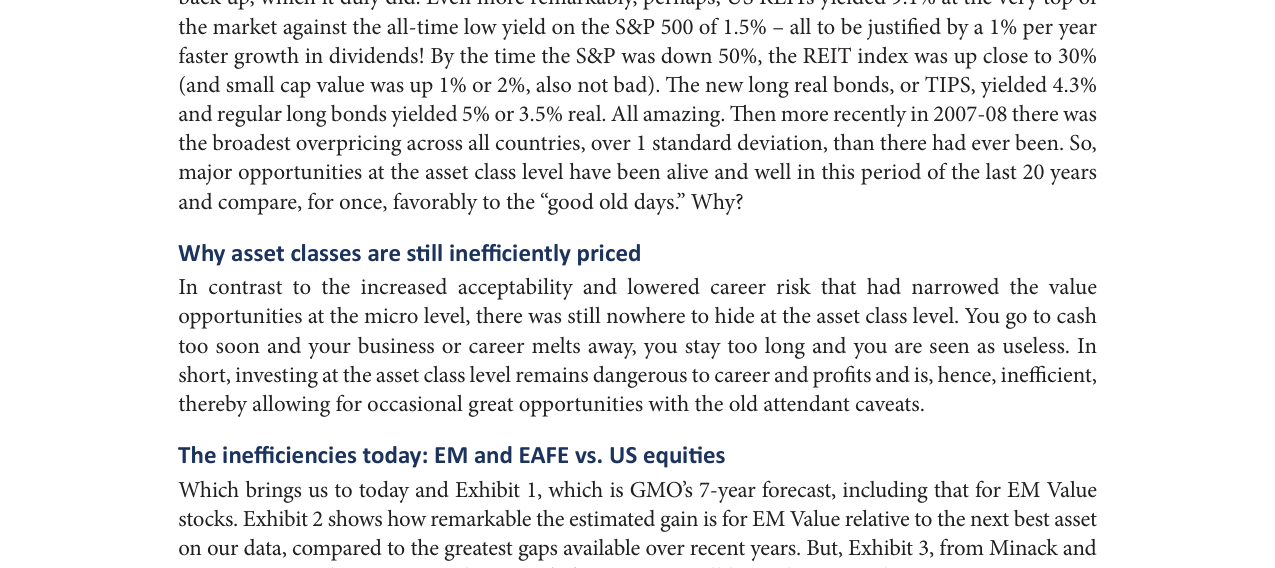
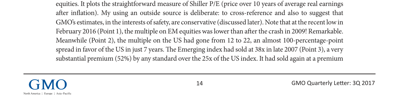
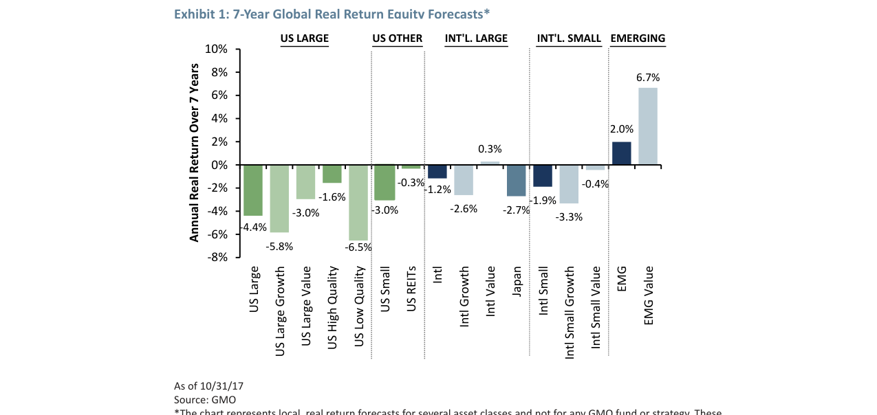
This leads to today's theme and Chart 1, which shows GMO's 7-year forecasts, including those for Emerging Market value stocks. Chart 2 illustrates how significant the estimated return advantage of EM value stocks is over the next-best asset in our dataset, compared to the largest gaps available in recent years. However, Chart 3 (from Minack and Associates in Sydney) suggests that GMO's forecasts may still underestimate the opportunity in EM stocks. It plots a simple Shiller P/E (price divided by 10-year inflation-adjusted average real earnings). I deliberately use an external source for cross-validation and to imply that GMO's estimates are conservatively safe (discussed later). Note that at the recent low in February 2016 (point 1), EM stock P/Es were even lower than after the 2009 crash! This is remarkable. Meanwhile (point 2), US stock P/Es rose from 12x to 22x, creating a spread of nearly 100 percentage points in favor of the US over EM in just 7 years. The EM index traded at 38x P/E at the end of 2007 (point 3), a 52% premium over the US index's 25x (by any measure). It was again at a premium after the 2011 crash. And early last year, the US enjoyed a 120% premium in reverse. When you look at the absolute and relative volatility of these three indices in Chart 3, doesn't it suggest that even with imperfect predictive ability, there are opportunities to make money and avoid pain? This undoubtedly indicates old-fashioned extreme market inefficiency at the asset class level.
| Metric | End of 2007 (Point 3) | Feb 2016 (Point 1) | Aug 2017 (Point 2) |
|---|---|---|---|
| US Stock Shiller P/E | 25x | 22x | 22x |
| EM Stock Shiller P/E | 38x | Below 2009 level | Below 20-year average |
| US vs. EM Premium | EM premium 52% | US premium 120% | US premium ~100% |
Additional Findings from an Absolute Valuation Perspective
From the absolute valuation perspective of Chart 3, two more points are worth noting: 1) The P/E of Developed Markets ex-US (DM ex-US) is far below its 20-year average and 40% lower than the US; 2) The EM P/E is 65% lower than its 2007 peak. The fact that it reached such a high level in 2007 was certainly a problem, but its existence well illustrates the chaotic nature of asset class pricing.
The Courage Problem in Asset Allocation: When EM is the Only Cheap Asset
Assuming you are convinced by the above, let me set a trap. Last spring (or year-end), how many of your institutions had a 10% allocation to EM stocks? My informal survey at four regional conferences showed only 10-20%. So, how many had over 20%? Very few, perhaps 5% or less. Given the opportunity then and the scarcity of opportunities elsewhere, how much should we at GMO and you have allocated to EM stocks? How much should we allocate today? Today, in our benchmark-free allocation strategy, we have 25% in EM stocks plus 3% in EM debt (very similar, about two-thirds), so roughly 27%.
Let me tell a story. In mid-December last year, I told my colleagues in the asset allocation department that I was going to put up to 50% of my sister's and children's pension funds into EM. (I didn't mention it in the quarterly letter because it was preempted by the suddenly hotter topic of "The Road to Trumpville." I regret that, as the shift to EM proved timely, but everything has a cost. However, I did describe this approach as a "kamikaze portfolio" at our annual client meeting the previous November.) Obviously, "up to 50%" is much higher than 27%. (My sister and children are currently allocated about 55%. Why not 100% then? That's a good and difficult question. I suspect a lack of courage.) But the problem is this: many reasonable and experienced people, both inside GMO and among clients, are increasingly worried about an imminent major market decline, even a crash. Now imagine that this year is the start of an 18-month decline of 40% for the S&P 500 and 50% for EM (due to its higher beta), as many expect in such a scenario. What would happen to a manager with a 40% EM allocation? Nothing good. A 40% bet would not even be considered prudent (especially in hindsight), where prudence is defined as the normal behavior of the vast majority of investment professionals. In contrast, my investment-ignorant sister would wait happily in her ignorance—a perfect demonstration of the enormous difference that being completely free of career risk makes.
Sequel Analysis: The Deep Logic and Data Validation of Stalin's Pension Experiment
1. Quantitative Comparison of Survival Probabilities: From "Certain Death" to "70% Survival"
GMO forecasts a real return of -4.4% to -6.5% for US large-cap stocks over the next 7 years, -6.5% for US small-cap low-quality stocks, and +6.7% for EM value stocks, an advantage of 11-13 percentage points
Grantham reveals the fatal flaw of traditional investment strategies through the Stalin experiment. Based on GMO's 7-year forecast (Exhibit 1), the cumulative real return of a standard 65/35 portfolio is only 8.2% (annualized <1%). Even with a conservative 2% upward adjustment (annualized 3%), it remains far below the 4.5% survival threshold. He estimates the survival probability is less than 15%, likening it to "Russian roulette with all chambers loaded" (original footnote 2).
In contrast, a 100% allocation to EM stocks (with two-thirds tilted towards value) yields a blended annualized real return of 5.7%, approaching 6% after the conservative adjustment. Based on Minack's 14.5x Shiller P/E, the earnings yield for EM is 6.9% (100/14.5), still around 6% after deducting 1% for normal frictional costs. Grantham estimates the survival probability for this strategy is at least 70%. This comparison reveals the survival advantage of extreme concentration in the long run.
| Strategy | Annualized Real Return (GMO Forecast) | Adjusted Annualized Return (+2% Conservative) | Survival Probability |
|---|---|---|---|
| Standard 65/35 Portfolio | <1% | ~3% | <15% |
| 100% EM (Value-Tilted) | 5.7% | ~6% | ≥70% |
2. The Failure of the Cash-Sitting Strategy: Even Perfect Timing Fails to Meet the Target
Grantham simulates a "jump out to cash and wait" strategy, assuming the investor has extraordinary skill: missing the last 18 months of a rally (e.g., late 1997), perfectly capturing a 2-year decline cycle (e.g., 1 year in 2008, 3 years in 2000), and re-entering after missing only 6 months of the subsequent rebound. Even so, with the final 6 years of a 10-year test period invested in a normal diversified manner (assuming returns equal to the pre-1998 average), the 10-year average real return barely exceeds 3%. While this is better than the standard portfolio's <1%, it still falls short of the 4.5% Stalin threshold.
Key data: From late 1997 to 2000, the market rally lasted 2.5 years (Grantham's team missed it); the 2008 decline lasted 1 year, the 2000 decline lasted 3 years. Even with perfect execution, the return ceiling for the cash strategy is only 3%, far below the 5.5%+ of the EM concentrated strategy.
3. Relative Value Performance of EM in Declining Markets: Historical Data Refutes High Beta Fears
Grantham points out that EM's performance in bear markets is not necessarily worse; relative valuation is the key variable. He uses the example of small-cap stocks in 2000: when small caps were in the cheapest third relative to large caps (as in 1973 and 2000), their decline was less than the market (Beta < 1). In the 2000 crash, small caps fell only 40% as much as large caps, small-cap value stocks even rose 2-3%, while the S&P 500 plunged 50%.
EM's historical performance validates this:
- 2008: EM was relatively expensive (high Shiller P/E), plunging over 60% (within 4 months), far exceeding the US decline.
- 2000: EM was absolutely expensive but relatively cheap compared to the US, declining slightly less than the US.
- Current (2017): EM Shiller P/E is 14.5x, far below the US (~30x), with relative value at a historical low. Grantham believes that in a major decline, relative value and beta interact, and EM may not fall more than the US.
The predicted return advantage of the best asset over the next-best asset rose from ~0.5% in 2012 to ~5.5% in 2016, a historical high since 1994
4. The Long-Term Cycle of EM Relative Performance: An 11% Gain is Trivial
Since the February 2016 low (Shiller P/E 11x), the MSCI Emerging Index has outperformed the US market by 11% in total USD return, primarily driven by currency, with relative P/E changing by less than 5%. Grantham emphasizes that this gain is trivial in the context of historical cycles:
- 1968-1980: EM outperformed the US by over 300%.
- 1987-1994: Outperformed again by over 300%.
- 1999-2011: Return was 3.6 times that of the US.
- Long-Term Annualized Excess Return: Only 0.5%, entirely from lower valuations and higher dividend yields.
The current EM Shiller P/E of ~14.5x implies a real return of 5.9% (after deducting frictional costs); GMO's adjusted figure is ~16x, with an earnings yield of 6.25% and a net return of 5.25%. Grantham specifically notes that excluding banks and resource stocks reduces EM's relative attractiveness, but he believes the resource cycle has turned (oil prices may rise for 3 years), which actually benefits EM.
5. Key Contradiction: Two-Year Career Risk vs. Ten-Year Survival Risk
Grantham concludes that in reality, pension fund managers are constrained by "two-year career risk" (short-term performance evaluation), forcing them to maintain a superficially "prudent" diversification that leads to future 10-year returns of only 1-3%. In contrast, the extreme setting of the Stalin experiment (life-threatening) forces investors to abandon short-term compliance and adopt a long-term survival strategy. This contradiction reveals a systemic flaw in institutional investing: a fundamental conflict between short-term incentive structures and long-term return objectives.
New Arguments and Data: The Long-Term Cycle of EAFE vs. US and a Supplementary Perspective on Emerging Markets
1. Cyclical Fluctuations of EAFE ex-Japan: Historical Data and Probability Advantage
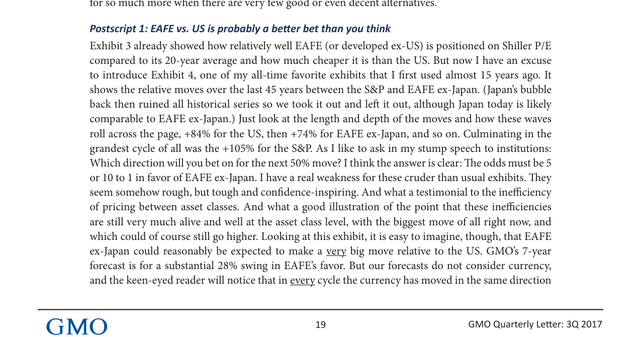
Grantham introduces Exhibit 4, which shows the relative wealth changes between the S&P and EAFE ex-Japan from 1976-2016, revealing significant cyclical fluctuations. Key data points are as follows:
US CAPE fell from 45x in 2000 to ~25x in 2017, still about 65% higher than EM (~15x) and a ~93% premium over the historical average
| Cycle Phase | Relative Return (S&P vs. EAFE ex-Japan) | Currency Contribution | Duration (approx.) |
|---|---|---|---|
| 1976-1980 | S&P +84% | Currency +28% | 4 years |
| 1980-1988 | EAFE ex-Japan +74% | Currency +95% | 8 years |
| 1988-1994 | S&P +96% | Currency +90% | 6 years |
| 1994-2000 | EAFE ex-Japan +75% | Currency +42% | 6 years |
| 2000-2008 | S&P +105% | Currency +58% | 8 years |
| 2008-2016 | EAFE ex-Japan +9% | Currency +34% | 8 years |
Core View:
- In each cycle, the currency direction aligns with the overall relative trend (e.g., USD strengthens when S&P rises, non-USD currencies strengthen when EAFE rises), and the momentum effect dominates the value effect. For example, during the S&P rally from 2000-2008, the USD appreciated 58%, even though a strong dollar theoretically harms US exporter profits, but foreign capital inflows pushed the dollar higher.
- Currently (as of 2017), EAFE ex-Japan is at a historical low relative to the S&P (only +9%), far below the highs of previous cycles (+74% to +105%). Grantham believes that in the next 50% relative swing, EAFE ex-Japan has a 5-10 times higher probability of winning.
2. Quantitative Forecast: GMO's 7-Year Outlook with Currency Effect Overlay
- Stock Level: GMO forecasts EAFE will have a 28% relative return over the S&P (based on valuation reversion).
- Currency Level: GMO believes EAFE currencies are "moderately cheap" against the USD, expecting an additional 8% contribution.
- Combined Effect: 1.28 × 1.08 = 1.38, or a 38% total return. However, given that cycles typically "overshoot fair value" from cheap to expensive, the actual return could double to 76%, consistent with the historical gains of the previous two EAFE ex-Japan cycles (+74% and +75%).
Comparative Data:
| Scenario | Forecast Return | Basis |
|---|---|---|
| Stock valuation reversion only | +28% | GMO 7-year model |
| Stock + moderate currency appreciation | +38% | 1.28 × 1.08 |
| Cycle extreme (overshoot fair value) | +76% | Historical cycle average (+74% to +75%) |
From 1976-2016, the relative wealth accumulation of EAFE ex-Japan vs. the S&P showed multiple cycles; in 2016, the US relative performance was at a high of ~1.9x, near historical peaks
3. Allocation Trade-off Between EM and EAFE
In Postscript 1, Grantham suggests that for a "Stalin-style" extreme survival scenario (e.g., a pension fund), the original 100% EM allocation could be adjusted to 80% EM / 20% EAFE. Reasons:
- Risk Diversification: EAFE's cyclical fluctuations are not perfectly synchronized with EM, and its current valuation is also at a historical low (Shiller P/E 20-30% cheaper than the US).
- Historical Return Symmetry: The cyclical gains of EAFE ex-Japan (+74% to +105%) complement the potential returns of EM (based on 10-20% cheaper valuations).
- Career Risk Consideration: Both zero career risk (e.g., managing personal funds) and extreme career risk (e.g., life-threatening) lead to a similar allocation—heavily overweight non-US assets. In contrast, conventional two-year career management (pursuing "looking normal") leads to inefficient allocation.
4. The Unique Value of Early-Stage Venture Capital (VC)
In Postscript 2, Grantham adds arguments for early-stage VC:
- Declining US Corporate Dynamism: Since 1970, the share of the workforce employed by new companies (1-2 years old) has fallen by 50%. Although giants like Amazon receive excessive attention, the overall economy is more tilted towards monopoly, conservatism, and profit protection.
- Early-Stage VC as a "Last Bastion": In a low-risk-appetite environment, early-stage VC is one of the few asset classes that still embodies "entrepreneurial spirit." While its overall valuation is higher than historical levels, it still appears cheap relative to other assets (like US large-cap stocks, bonds).
- Allocation Suggestion: If allowed in the "Stalin fantasy," Grantham would retain 2/3 early-stage VC + 1/3 EM, rather than pure EM. This reflects his preference for high-risk, high-return assets, but with the prerequisite of "having good access" (i.e., professional screening ability).
5. Supplement to the Existing Analysis
- Connection to Previous Conclusions: The previous analysis emphasized that EM is in its cheapest 10-20% historical range. This section, through EAFE's cyclical data, further demonstrates that non-US assets (including EM and EAFE) are collectively undervalued, and historical patterns support mean reversion.
- Risk Warning: Grantham acknowledges that the current EAFE ex-Japan gain (+9%) could continue to widen (i.e., the US could remain relatively stronger), but considers this probability very low. He cites the "crude but comforting" chart, emphasizing that pricing inefficiencies between asset classes persist and the current one may be the biggest opportunity yet.
Summary
This section, through 45 years of cyclical data for EAFE ex-Japan, a quantitative model for currency effects, and supplementary arguments for early-stage VC, strengthens the core view that "non-US assets (especially EM and EAFE) are significantly undervalued." Grantham's allocation advice expands from pure EM to an EM/EAFE combination and introduces early-stage VC as a higher-risk-return option, reflecting a balance between "courage" and "rationality" in extreme scenarios.