10 for 10
In plain words
This article summarizes a fund's decade of investment views, centered on its 2013 call: gold miners and emerging markets (Brazil, Russia, India, China) were the most attractive opportunities, while expensive US growth stocks looked worrying. The tone is optimistic but patient, noting value investing can stay depressed for years. Key names: gold miners — called 'one of the most attractive opportunities we've ever seen'; BRIC markets — scorned yet previously star performers; Berkshire Hathaway — cited as a former struggling value stock that Buffett kept.
At a Glance
In 2013, the author judged that gold mining stocks and emerging markets (BRIC) were "the answer in a lost period," while highly valued U.S. growth stocks were unsettling—stance [optimistic] (toward the former).
- The author called gold miners "one of the most attractive investment opportunities we have ever seen," and explicitly stated "the focus is more on emerging markets" (Brazil, Russia, India, China).
- U.S. valuations made the author "pause"; real growth lies in growing economies, not in large mature consumer and technology companies mistaken for growth stocks.
- The value strategy bottomed in late 2015, but the author acknowledged that the market fell deeper into the "twilight zone" during 2016–2022 than expected—timing was imprecise, and value investing requires long-term patience.
- Using the monetary allegory of The Wizard of Oz and the "shadow gold price" (approximately $13,000/ounce under full gold standard backing), the argument is made: in the fiat currency era, hard assets are systematically undervalued, and physical assets such as gold and silver are the ultimate liquidity against central bank distortions.
- Historical references: Templeton's investment in Japan and Faber's case in Asia show that emerging markets shunned by the mainstream have delivered remarkable long-term returns (e.g., the Hang Seng Index rose from 150 to 31,000, with six drawdowns exceeding 50% along the way).
Gold Mining Stocks and BRIC Are the Answer for Uncertain Times
The author concluded in 2013 that gold mining stocks and emerging markets (Brazil, Russia, India, China) were the most attractive opportunities, while U.S. valuations were unsettling; true growth resides in growing economies, not in large, mature consumer and technology companies.
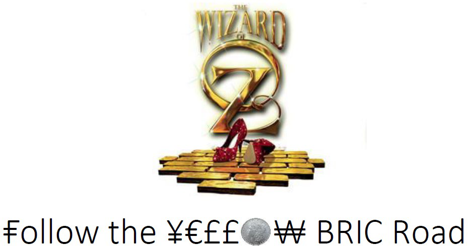
The article opens by cataloging the era's anxieties: excessive valuations, rising interest rates, competitive currency devaluation, global climate change, drought, the Arab Spring, the revival of central planning, and financial repression. The author asks rhetorically: surely this is not the time to take inspiration from a children's book? The answer is precisely the opposite. He signals through The Wizard of Oz and deliberately spells "brick" as "BRIC" as a bull-market preview.
The author's original words: "gold mining stocks are currently one of the most attractive investment opportunities we've ever seen"—that is, "gold mining stocks are currently one of the most attractive investment opportunities we have ever seen." But he says the emphasis is placed more on emerging markets. On U.S. stocks, he states bluntly, "Valuations here in the United States give us pause" (U.S. valuations give us pause); the rest of the world, by contrast, looks "kind of interesting." He also notes that many growth stocks look the cheapest, but that is "true growth," which typically appears in growing economies, not in the large, mature consumer and technology companies that are mistakenly taken for growth stocks.
The author reminds us: "Remember the BRICs (Brazil, Russia, India, China)? They are so scorned currently, and yet they were the shining stars of yesteryear."—that is: "Remember the BRIC countries (Brazil, Russia, India, China)? They are now widely ridiculed, yet they were yesterday's shining stars." In other words, the flip side of market aversion is precisely where value lies. The attitudes toward the positions mentioned in the article are as follows:

| Position | Author's Stance | Key Statement |
|---|---|---|
| Gold mining stocks | Strongly bullish | "One of the most attractive investment opportunities we have ever seen" |
| Brazil, Russia, India, China | Bullish (BRIC basket) | Scorned but once stars; the author is broadly bullish |
| United States | Cautious | Valuations give pause |
| Large mature consumer/technology companies | Not viewed as true growth | Mistaken for growth stocks; not genuinely cheap growth |
The Wizard of Oz Is in Fact a Monetary Allegory
The author cites a 1964 historical study that reads The Wizard of Oz as an allegory of the late-nineteenth-century struggle between the gold standard and bimetallism, mapping literary characters onto the structure of monetary power, thereby laying the groundwork for his later critique of central banks distorting valuations.
The author explains that this children's book has many interpretations, and his focus is on "monetary interpretations." He cites the research of historian Ranjit S. Dighe as relayed by Wikipedia: for sixty years after the novel's publication, virtually nobody treated it as a political allegory, until 1964, when high-school teacher Henry Littlefield published an article in American Quarterly proposing that the book was an allegory of the bimetallism debate.
Under this reading, the characters correspond as follows: the tornado = the Free Silver movement; the yellow brick road = the gold standard; the silver slippers = the Populists' desire to replace the gold standard with a gold-and-silver bimetallic standard; the Emerald City = the political center; the Wizard = the President; the Scarecrow = the farmers; the Tin Man = workers alienated by industrialization; the Cowardly Lion = William Jennings Bryan (leader of the Free Silver movement); the Wicked Witch of the West = the Western railroad and oil barons; the Wicked Witch of the East = Eastern financial and banking interests. The author specifically notes that both of these groups opposed bimetallism, because bimetallism would devalue the dollar and shrink the value of investments; workers and farmers, by contrast, supported leaving the gold standard in order to ease their debt burdens.

This allegory places "the monetary system determines asset values" at the center of the discussion, echoing later sections of the book (such as the 2017 discussion of central banks suppressing interest rates and distorting the discount variable). By citing these historical readings, the author is in effect suggesting that today's financial repression by central banks, like the gold-standard struggle of yesteryear, is at bottom a redistribution of wealth—and investors need to see through to that layer.
The Ten-Year Throughline: Valuation Defines Risk; Buy Real Assets Against the Crowd
Through the annual commentary summaries from 2013 to 2022, the author repeatedly argues the same framework: permanent purchasing-power loss from valuation is the risk, while short-term volatility creates opportunity; active management is superior to passive; the value strategy bottomed at the end of 2015; and real assets and "cigar-butt stocks" will eventually make their return.
The decade of commentary begins with 2013's "Follow the Yellow BRIC Road" and unfolds year by year. Key judgments the author offers in the summaries include:

- 2014: Using "When Doves Cry" to allude to the Fed's soothing rhetoric, and Prince's "1999" to defend active management, he argues that valuation is the key determinant of the risk of permanent purchasing-power loss; short-term price volatility is not risk but "an annoying, often painful creator of opportunity."
- 2015: Using the 1959 American television series The Twilight Zone as a metaphor, he argues that the market has crossed into a "twilight zone" akin to 1999 and 2008, and calls it possibly a "once-in-a-lifetime buying opportunity." A later annotation admits that the market fell deeper into the twilight zone from 2016 to 2022, but the end of 2015 was confirmed as the bottom for the Kopernik-style value strategy.
- 2016: Using Iggy Pop's 1977 song "The Passenger" as a jumping-off point, he discusses the difference between active and passive investing; Kopernik prefers to be the "driver" rather than the "passenger."
- 2017: He discusses how central banks have suppressed the discount variable—the most important element in the time value of money—thereby rendering traditional valuation models ineffective; Kopernik mitigates this by way of Charlie Munger's approach of "inverting the model."
- 2018: Using the Portuguese myth of "the return of King Sebastian," he satirizes people's contempt for value investing; assets called "cigar-butt stocks" may in fact be precious Cuban cigars with "intact wrappers."
- 2019: Comparing the Renaissance of five hundred years ago with the present day, he argues that truth and freedom have become easy in concept yet are being sacrificed; Kopernik adheres to deep due diligence, prudent assessment of value, patience, and discipline.
- 2020: Through a Big Brother–style reading of the band XTC, he points out that a decade of QE policies was bound to accumulate anxiety, and the consequences of unlimited QE (QE infinity) are even harder to imagine; the current environment is "like the 1970s on steroids," and the 1970s ushered in high inflation, big government, and a commodity bull market; the divergence between cheap and expensive stocks may be "greater than ever"—a good era for bottom-up value investors.
- 2021: Summing up the inflationary environment, he says value investors now have the "wind at their backs."
- 2022: Offering a nonstandard view of "Buffett stocks," he draws on Warren Buffett's annual letters to argue that real assets are preferable to highly profitable consumer brands. The author recalls that Berkshire Hathaway in 1965 was a "struggling 'value' stock," having posted cumulative losses over the previous nine years with its share price more than halved; yet it was the only position Buffett kept when he dissolved his partnership in the late 1960s.

Investment Implications
The actionable implications at the 2013 juncture: overweight gold mining stocks and emerging markets (especially the BRICs) and avoid high-valuation U.S. growth stocks; under the long-term framework, risk is measured by valuation rather than short-term volatility, and one should stick with active management and contrarian positioning. Readers should note that this is a promotional argument from an invested party: when the author calls gold mining stocks "the most attractive opportunity we have ever seen," he himself is the portfolio manager of the relevant Kopernik strategies.
The author uses a series of metaphors (The Wizard of Oz, The Twilight Zone, the Sebastian myth) to provide emotional cushioning for contrarian value investing: the more panicked the market, the greater the opportunity. He is also candid about the cost of conviction—in an annotation to the 2015 summary, he admits that the market fell deeper into the twilight zone from 2016 to 2022 than expected, showing that timing is imprecise and that value investing requires enduring a prolonged "twilight zone." The implication for readers, therefore, is: if one accepts his framework, one needs sufficient patience and the ability to withstand short-term volatility, rather than chasing the quarter's hot names; at the same time, one should independently assess how gold mining stocks and the BRICs actually performed in subsequent years.
> The Wizard of Oz Monetary Allegory: Analysis, Part 2/19
> This section shifts the focus from textual research to the "financial archaeology" of the symbolic system and its modern mapping. Below are the newly added arguments and critical observations.
I. The Symbol System: An Underrated "Monetary Knowledge Map"

The symbolic inventory listed in this section is not a simple literary decoding, but a complete knowledge map of late-19th-century American "monetary populism." Its core value lies in exposing the most tension-laden contradictions within the economic thinking of that era:
- The binary opposition of precious metals: Gold symbolized austerity, banker control, and Eastern financial hegemony; silver symbolized inflation, debtor demands, and Western/Southern farmer uprisings. The fact that the "silver shoes" are far more important in the book than in the film is a faithful reflection of the "Bimetallism" issue.
- The cry of debtors: The text's mention that the "Tin Man needs oil (liquidity/money) to work, otherwise he is unemployed for a whole year" directly alludes to the prolonged unemployment in America's industrialized regions after the Panic of 1893. At that time, the U.S. unemployment rate reached roughly 18%, and the foreclosure rate among farmers caused by railroad freight rates and debt was equally alarming. Money shortage was not an abstract concept but an acute, tangible pain.
From the perspective of financial history, the greatest achievement of this symbolic system is that it transformed abstract choices of monetary regime (gold standard vs. silver standard vs. greenback paper currency) into concrete, empathetic struggles of characters and geography. In essence, it is a case study in the "political communication of economic policy."

II. From "Silver Shoes" to "Ruby Slippers": The Media's "Selective Amnesia" Toward History
This is the detail in this section most worthy of caution: in order to accommodate Technicolor technology, Hollywood changed the decisive "silver shoes" into ruby slippers. The "New York capital group" subjected the metaphor of silver currency to an unconscious "technical cleansing" — which is itself a form of invisible censorship in the narrative of financial history.
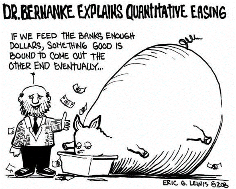
In the contemporary era, this kind of "media amnesia" still exists: when the Federal Reserve's quantitative easing (Q.E.) is simplified by media coverage into "printing money to rescue the market," the public's understanding of the nature of monetary credit is deliberately shaped into the illusion that "central banks are omnipotent." Just as the "Emerald City" in the book forces everyone to wear "green glasses" to see the world, the modern financial system likewise makes the whole world "voluntarily" put on the green filter of the dollar through the wealth illusion priced in dollars. And Bernanke's "helicopter money" in 2008 was a real-world appearance of the modern "Wizard of Oz" — the difference being that today's "magic" has become the balance sheet.
III. Historical Data Comparison: The 1890s vs. the "Magic Era" After 2008
To understand the "lineage" of the "Wizard" in the text from Greenspan to Bernanke, and then to Yellen and Kuroda, one must use data to examine the differences in "spell efficiency" between the two eras:
| Dimension | "Oz" Era (1890s) | Modern Magic Era (2008–2020s) |
|---|---|---|
| Center of monetary power | New York bankers (J.P. Morgan) and the Treasury (Gold standard) | Central banks (Fed, ECB, BoJ) exercising fully autonomous issuance |
| Crisis-response tools | Debate over and repeal of legislation (the Sherman Silver Purchase Act); chronically rigid money supply | Quantitative easing (Q.E.), negative interest rates, yield curve control (Y.C.C.); balance sheets expanding from under $1 trillion to nearly $9 trillion |
| Nature of money creation | Seeking to "add silver" to break through the natural hard-currency constraint (an artificial restriction) | Completely detached from physical anchors, based on credibility and legal enforcement (pure fiat money) |
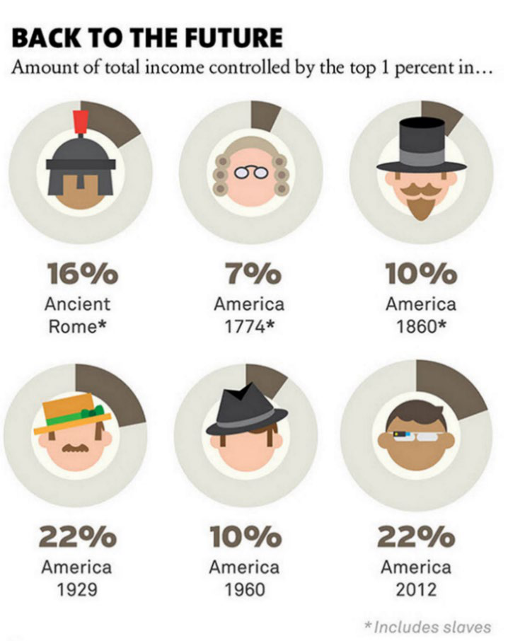
| Impact on the real economy | Protracted deflation; heavier real debt burden on farmers/workers | Severe asset-price inflation; widening wealth gap (the top 1%'s share of wealth continues to climb) |
| Political consequences | The Populist movement; the undercurrent that culminated in McKinley's assassination | Populist waves (Trump, Brexit); global supply-chain restructuring; Occupy Wall Street |
The data clearly show: the problem of the 1890s was "not enough money"; the problem after 2008 is "too much money, maldistributed." The text's reference to Greenspan's transformation from a gold-standard believer into a magician aptly symbolizes the modern monetary system's "betrayal" of gold discipline — in exchange for short-term crisis stabilization, the price paid has been long-term structural distortion.
IV. The Colonialist Metaphor of the "Winged Monkeys" and Its 21st-Century Geopolitical Extension
The newly added reading in this section — that the "Winged Monkeys represent the Plains Indians of America" — is a highly extensible symbol: they were once free, but were enslaved by "magic," until "water" (liquidity) arrived. This interpretation is rare in traditional "Wizard of Oz" scholarship, yet it sharply reveals the hierarchical structure of the modern global economy:
- Late 19th century: The land dispossession of indigenous peoples by white American settlers and the monetary oppression of Midwestern farmers by Eastern capital were, in essence, two sides of the same coin — modernity's liquidation of the "marginalized."
- 21st century: These "monkeys" can be read as commodity-exporting countries (e.g., Argentina, Nigeria, Indonesia). They are enslaved by the dollar system (the Fed's "magic"): when dollar liquidity is ample ("water"), capital inflows drive up asset prices; when liquidity tightens ("water recedes"), debt crises erupt. Throughout this process, their economic security is entirely at the mercy of others' "sorcery."
From this perspective, the modern "Dorothy" in "Kansas" is not any particular nation, but rather the ordinary working people who do not hold the power of coinage yet bear the costs within the global system — whether they are American "Rust Belt" workers or Chinese "ceramics factory" workers.
V. Conclusion: The Magic Continues

The greatest value of this section is that it does not stop at "interpretation" but provides a cross-temporal "investigation of monetary power." When the end of the text compares modern central-bank governors to fellow disciples of the same "school of sorcery," the subtext is: the replacement of gold by paper money has not made the power logic of money transparent; instead, it has become magic draped in the guise of "science."
Today, whether it is "Yellen's fiscal deficits" or "Kuroda's yield curve control," both essentially inherit Baum's definition of the "Wizard": using sleight of hand to conceal the political choices behind "gold, silver, and paper money." Just as the "silver shoes" were altered by Hollywood, "for over a century, what the public has seen is still the ruby slippers, not the silver shoes."
One must read the historical script to see through contemporary magic. This is the greatest insight this sequel section offers.

(This analysis is based on pages 6–9 of the Kopernik Global Investors article, focusing on a structural comparison between classical fables and modern monetary policy, and revealing financial-historical facts obscured by the media.)
Building on the preceding analysis, this article continues with the allegory of The Wizard of Oz as its entry point, but focuses on several hard data points and historical mirror images not fully developed in the earlier sections. The core attention is directed at the transformation of monetary forms, the historical comparability of emerging markets, and the cracks in current global asset pricing that "look safe but are actually dangerous."
I. Silver's Shift in Monetary Identity: From Free Coinage to Shadow Hard Currency
The report presents a key data chain: in 1900, the dollar-to-silver exchange ratio was near 16:1 (i.e., 16 ounces of silver = 1 ounce of gold), while the dollar-to-gold ratio was 20.67:1. In 1933, Roosevelt fixed gold at $35/oz, marginalizing silver's status. Today, the gold/silver ratio is near 60:1. This set of numbers carries rich historical meaning in itself.
| Period | Monetary System | USD per Ounce of Gold | Silver/Gold Ratio | Practical Meaning |
|---|---|---|---|---|
| 1900 | Gold standard (with silver coin circulation) | 20.67 | approx. 16:1 | Silver was still de facto subsidiary coinage; western silver mines faced oversupply |
| After 1933 | Gold standard (devalued dollar) | 35 | approx. 70:1+ | Silver lost its monetary function and became an industrial metal |
| After 1971 | Pure fiat money | Floating (approx. 40) | approx. 35:1 (1980) | Gold and silver both became commoditized |
| 2023 | Unlimited QE | approx. 1,900+ | approx. 80–90:1 (mid-2023) | Silver's monetary attributes are severely undervalued |
Kopernik's claim that "silver is the hard currency of a new era" is clearly not just a slogan. If we use the pre-New Deal price of $20.67/oz in 1933 as a baseline and then adjust for the expansion of U.S. M2 money supply (from roughly $20 billion in 1900 to roughly $21 trillion in 2024, i.e., about 1,000 times), the "fair monetary price" of gold would be near $20,000/oz. If silver were to restore the 1900 gold/silver ratio of 16:1, the corresponding silver price would be about $1,250/oz—far above the current level of roughly $25. This is of course only a theoretical extrapolation, but it is enough to show that in a pure fiat-money era, the book value of "hard assets" is forever understated, because the credit anchor of fiat currency has long since disappeared.
II. Russia vs. the U.S. in the 1890s: A Quantifiable Comparison
The renaming of Dorothy to Natalya from Russia is not mere literary imagination; the macro similarities are striking. Two sets of data can be extracted for comparison:
| Metric | U.S. in the 1890s | Russia in the 2010s–2020s |
|---|---|---|
| Economic stage | Post-Civil War accelerating industrialization; GDP growth averaging about 4–5% per year | Post-Soviet transition; GDP growth of about 1.5–2% in 2017–2023 |
| Debt level | Federal debt under roughly 10% of GDP | Government debt at approximately 17% of GDP (2023) |
| Monetary system debate | Gold standard vs. free coinage of silver (Bryan's 1896 campaign) | Continuous accumulation of gold reserves; de-dollarization discussions |
| Oligarch problem | "Robber barons" such as Rockefeller and Carnegie | Oligarch economy, though partly nationalized after 2022 |
| Resource endowment | Coal, steel, oil, food | Oil, natural gas, food, metals |
| Fiscal balance | Surplus in most years; tariffs as main revenue | Fiscal surplus in 2022; small deficit in 2023 |
The data suggest that Russia does have several features of "1890s America": low debt, abundant resources, and a monetary system not fully anchored to the Western framework. But one critical divergence is demographics: the U.S. population was young in the 1890s, while Russia's population is steadily shrinking. Thus, the "emerging market" analogy is less compelling in terms of growth. What Kopernik may be looking at, however, is not population but balance-sheet and monetary-policy independence—after 2022, the Russian central bank sharply increased its gold holdings, and its domestic mix of "high interest rates plus capital controls" stood in stark contrast to negative real rates in the West. In this sense, Russia resembles more "a hard asset waiting to be revalued" than a classic growth stock.
III. Valuation Data in the Modern "Poppy Field": Multiple Historical Extremes
The report cites the "Nifty Fifty," the Nikkei, and the Nasdaq as cautionary tales. Specific drawdown data can be added to illustrate the arithmetic of "beautiful but deadly":
| Bubble Moment | Peak Valuation / Indicator | Subsequent Maximum Drawdown | Years to Recover Peak |
|---|---|---|---|
| 1972 "Nifty Fifty" | Average P/E around 50x | S&P 500 fell roughly 48% in 1973–74 | About 7 years (1980) |
| 1989 Nikkei 225 | P/E around 60–70x | Fell from 38,957 to 7,607 in 2003, an 80% decline | Still not recovered after 34 years |
| 2000 Nasdaq | P/E around 175x (peak) | Fell from 5,048 to 1,114, a 78% decline | 15 years (not recovered until 2015) |
| 2013 "luxury/staples" sector | P&G, Unilever at 20–25x P/E, long-term stability | Valuation divergence began after 2014, but no full bubble burst yet | ? |
Kopernik notes that the view that "luxury goods are no longer cyclical" is itself a cyclical-top signal. In fact, after 2013, emerging markets crashed and commodities entered a bear market, while U.S. "quality consumer" stocks continued to rally into early 2018. By 2022, however, high-valuation consumer stocks had fallen more than 30%. In other words, these "low-beta, certainty-premium" assets are precisely the greatest source of risk when interest rates normalize.

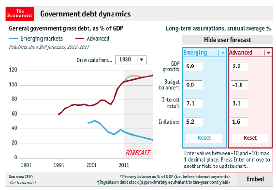
At the time (the report was written in 2013), bond yields were at historical lows: the 10-year Treasury yielded about 1.6–2.0%, with negative real rates. Kopernik quotes several well-known investors, and those views can be classified as consensus. A key fact should be added: negative real interest rates caused by central-bank "financial repression" have never before been so prolonged or so large in scale (roughly one-third of global sovereign debt yielded negative or zero returns). This is equivalent to an implicit tax on savers and inevitably pushes money into risk assets—but once inflation revives or central banks pivot, the valuation support for those assets disappears.
IV. The Bridge Between the "Fed Model" and the "Shadow Gold Price"
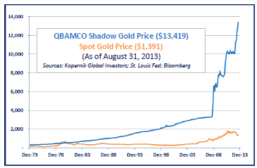
The report's mention of QB Asset Management's "shadow gold price" calculation (about $13,000/oz for full backing, about $4,000/oz for partial backing) can be further explained.
The usual calculation logic is: U.S. M2 money stock (approximately $10.5 trillion in 2013, approximately $21 trillion in 2024) divided by U.S. official gold reserves (approximately 8,133 tonnes, about 261 million troy ounces), would imply a gold price above $40,000 under a full gold standard. The $13,000 in the report may be based on a narrower money measure (M1 or the monetary base). If the latter, $13,000 corresponds to a monetary base of about $3.4 trillion (2013), divided by 261 million ounces, which is just about $13,000. This shows that different calculation scopes yield vastly different results. But the key point is: even under a conservative measure, the current gold price remains far below the level required for full monetary backing. And if the global monetary system (not just the United States) is considered, the figure would likely be even higher.
Seen this way, Kopernik's "gold is the ultimate liquidity" is not contrarianism for its own sake; it is a direct hedge against unlimited fiat supply. The fund simultaneously holds silver, platinum, gemstones, and base metals, effectively constructing a portfolio of physical assets with "no credit risk and no counterparty risk." This stands in sharp contrast to modern portfolio theory's "Beta/VAR" framework, which assumes markets maintain a normal distribution—whereas in reality, tail risks (such as 2008, Cyprus in 2013, the pandemic in 2020) occur far more frequently than a normal model suggests.
V. Conclusion: From "The Wind Blows" to "A Paved Road of Bricks"
The report ends by pointing to "Follow the Yellow BRIC Road," hinting at the clever double meaning of BRIC countries and gold bricks. Extending the data and logic, the following new arguments emerge:
1. True "liquidity" is not the dollar but assets with physical backing. When drought (debt crisis/currency crisis) arrives, central banks only print more paper—but "water" is non-renewable. Kopernik values the physical attributes behind silver/gold: supply cannot be increased substantially, and demand is both industrial and monetary.
2. The low-debt + hard-asset path of emerging markets (especially Russia and China) is the opposite pole to the West's high-debt + financial engineering. The 1890s United States eventually chose the gold standard (along with monetary tightening), while today's Russia is hedging Western sanctions by accumulating gold. This constitutes the most significant macro hedge for the next two decades.
3. A summary of Kopernik's strategy: rather than predicting short-term gold prices, it holds "potential money" to prepare for fiat reconfiguration. Its portfolio of oil and gas, mining, gold, silver, platinum, and emerging-market equities is a direct bet against the "Wicked Witch of the West's" drought (liquidity drain).
These views were contrarian in 2013 and have been partially validated a decade later. But the report remains highly timely: in 2025, global sovereign debt is even higher, central-bank balance sheets are even larger, and the implied scope of the "shadow gold price" has expanded further—which is exactly the direction the following analysis will take.
I. Anatomy of Historical Cases: The "Wrong Consensus" Dividend of Templeton and Faber
The original text uses two cross-era cases to support a core claim—that when the mainstream narrative labels a region "high-risk," that is precisely when the best buying opportunity may emerge. But the details of these two cases are more persuasive than the literal presentation.
1966–1982: America's Lost Sixteen Years
When Templeton invested in Japan, the U.S. market was not merely declining. In early 1966, the Dow Jones Industrial Average first broke 1,000; from then until 1982, the Dow went almost nowhere—but U.S. CPI rose cumulatively more than 120% over the same period. In purchasing-power terms, U.S. equity investors suffered a real loss of more than half. This is exactly what Buffett later repeatedly emphasized as the classic interval of "nominally flat, actually halved."
Japan's fundamentals at the time fit almost perfectly with the criteria Kopernik would later use for emerging markets:
- Household saving rates stayed above 20% for a long period (versus about 7–8% in the U.S. at the time)
- By the 1960s, Japan had universal high school education and one of the highest engineer densities in the world
- Labor productivity closed the gap with the U.S. at an average annual rate of over 8%
Templeton's achievement was not that he foresaw the Nikkei eventually reaching 38,000; it was that he understood a simple fact: when the growth engine shifts from one major country to another, long-term capital market returns shift with it. American investors at the time saw in Japan only a "cheap goods manufacturer" and a "defeated nation"—which became the source of one of the greatest cognitive biases in subsequent decades.
2002's <em>Tomorrow's Gold</em>: A Second Proof from Asia
An easily overlooked background behind Faber's book: Asia had just endured the 1997–98 financial crisis, regional currencies had depreciated on average by more than 40%, bank systems were piled high with non-performing loans, and government credibility was damaged. Western investors' aversion to Asia had reached its peak—and that was exactly the opportunity Faber saw.
The next decade's data validated this judgment:
- The MSCI Emerging Markets Index rose more than 300% from its 2002 low to its 2007 high
- The S&P 500 gained about 60% over the same period
- From 2002 to 2011, emerging markets delivered annualized returns of about 15%, more than twice that of developed markets
Faber's Hong Kong market case from August 2013 is even more striking at its time scale: the Hang Seng Index rose from 150 to 31,000, a gain of over 200 times, with six drawdowns of more than 50% along the way. The data has two implications: first, the long-run return is extraordinary; second, volatility is the necessary price of achieving that return. If investors leave mid-way because they cannot tolerate a 50% drawdown, they completely miss a once-in-a-century opportunity. This is the precursor to Kopernik's later refusal to use volatility as a measure of risk.
II. Micro-Differences in Market Structure: The Key Distinctions Among 1972/1999 and 2007
Kopernik emphasizes that the current market resembles 1972 and 1999 more than 2007. The differences among these three years lie not only in valuation levels but also in the internal distribution of market structure:
| Year | Market Characteristic | High-Valuation Names | Low-Valuation Names | Overall Market Outcome |
|---|---|---|---|---|
| 1972 | Extreme premium for the "Nifty Fifty" | P&G, Avon, etc. at 40–60x P/E | A broad set of second-tier value stocks at 10–15x P/E | 1973–74 crash, but low-valuation stocks held up relatively better |
| 1999 | Tech bubble dominating the indices | Nasdaq overall P/E above 100x | Energy, utilities, and value stocks abandoned | 2000–2002 tech crash of 70%+, followed by strong value outperformance |
| 2007 | Nearly all asset classes simultaneously overvalued | Banks, real estate, resources broadly at 2–3x P/B | Very few (early emerging markets were still cheap) | Broad decline with nowhere to hide |
The 1972 "Nifty Fifty" produced a famous investment lesson: investors paid any price for these quality companies based on a "one-decision" rationale, believing they "never needed to sell." Over the following decade, however, Avon fell 87% from its high, P&G fell more than 60%, and Xerox fell 70%—even though the underlying businesses remained excellent, valuation contraction inflicted permanent losses.
Kopernik's point in drawing this analogy is that the 2013 U.S. market likewise had a group of "quality stocks" elevated to the altar—defensive consumer, healthcare, technology platforms—whose valuations were disconnected from fundamentals, while large numbers of traditional industries and emerging-market stocks were relegated to the "bargain bin." Under this structure, index-level highs and lows tell us little; the real opportunities lie in the fault lines inside the market.
III. The Relative Value Logic Behind the Farmland Case
The comparison between Iowa farmland at $7,000/acre and listed South American farmland companies at roughly $700/acre is the most direct valuation gap in the report. But several details deserve expansion:
The Super-Cycle in U.S. Farmland
U.S. farmland prices rose roughly three-fold from 2000 to 2013, driven not by agricultural productivity gains but by the combination of three institutional factors:
1. The federal ethanol mandate: the Renewable Fuel Standard (RFS) artificially boosted corn demand
2. The low-interest-rate environment: farmland loans were extremely cheap, encouraging buyers to leverage
3. The biofuels narrative: expectations of tight global food supplies drew capital inflows
By 2013, the capitalization rate on Iowa farmland (annual rent/price) had fallen to around 3%, roughly equal to the 10-year Treasury yield. In other words, "safe U.S. farmland" no longer offered any risk premium.
The Discount on Emerging-Market Farmland Is Not Unjustified
Farmland in Argentina, Brazil, and Ukraine does carry obvious risk premia: unstable property protections, export control policies, currency depreciation risk, and political intervention. Kopernik's strategy is clever because it uses publicly listed agricultural companies as the vehicle—these companies usually own tens of thousands of hectares, management has local operating experience, and the stocks trade at further discounts to net asset value (NAV). Compared to direct overseas land purchases, listed companies offer liquidity, professional management, and a legal compliance channel.
At the same time, it must be noted: Iowa farmland pricing near a 3% cap rate, even with unchanged fundamentals, will see price corrections if interest rates simply rise—this is the hidden interest-rate risk inside a "safe asset." Emerging-market farmland, even though more volatile, trades below replacement cost (including land, irrigation, and basic infrastructure—the report estimates replacement value discounts as high as 90%) on a 10-year time frame, which itself constitutes a sufficient margin of safety.
IV. Redefining "Risk": A Practical Extension of the Marks Framework
The four passages from Howard Marks cited by Kopernik form a coherent chain of risk analysis:
1. Profitable investing must always feel uncomfortable → if an investment decision requires overcoming no psychological barrier, it usually means the market has already priced in all the optimism and no excess return remains
2. Negative consensus purges optimism from prices → when everyone regards an asset as dangerous and refuses to buy, the price has already fallen enough to compensate for risk—this is where "perceived risk" and "actual risk" diverge
3. The best opportunities are found in things people do not want to do → this is not only a conclusion of behavioral finance; it is also the inevitable result of competitive dynamics: low competition means better purchase prices
4. The greatest risk is paying too high a price → this directly rejects the academic dogma that "low volatility equals low risk"
Kopernik goes further: risk is defined as "permanent capital loss/purchasing power loss," not price fluctuation. This yields an important corollary:
> A Russian stock with a P/E of only 4x, even if the price falls another 20%, has not suffered permanent impairment of intrinsic value as long as earnings do not collapse and the currency does not spin out of control—the time to recover can be absorbed by time. Meanwhile, a U.S. "quality stock" at 40x earnings, if earnings growth slows by one percentage point, may see valuation contract by 30% and never return to its original pricing level—that is permanent loss.
This is why Kopernik can claim that "emerging markets currently offer lower risk, higher potential upside"—not because they cannot fall, but because the purchase price already embeds sufficiently bleak expectations, and downside is capped by price.
V. From BRICs to BRICKS: A Systematic Compilation of Valuation Gaps
The <em>Economist</em> data cited in the original text and Kopernik's own research can be consolidated into one fuller table:
| Asset Class | U.S. | Non-U.S. Developed Markets | Emerging Markets | Valuation Gap |
|---|---|---|---|---|
| Utilities | 1.6x P/B | — | Russia 0.33x / Brazil 0.21x P/B | Approximately 5x between U.S. and Russia |
| Railroads | 2.5–5.0x P/B | Japan <1.5x P/B | China 0.85x P/B | More than 5x |
| Telephone companies | ~20x P/E | — | Emerging markets <10x P/E | More than 2x |
| Farmland | ~$7,000/acre | — | South America/Eastern Europe approx. $700/acre | 10x |

These data points reveal a unifying theme: the "safety" of the U.S. market is a function of premium pricing, not superior fundamentals. The same telephone company, providing identical services in China or Brazil with faster earnings growth, receives only half the price-to-earnings multiple.
Even more important is the timing of the BRICs narrative reversal. Before 2010, capital flowed heavily into emerging markets on the back of dollar depreciation and the "BRIC" story, inflating valuations; in 2013, the Fed's taper tantrum triggered capital outflows and an emerging-market selloff. "The same countries, the same fundamentals, but prices 30–50% lower." In Kopernik's view, the only explanation is that investor risk perception was driven by short-term capital flows, not changes in fundamentals—that dislocation is the window for value investors.
The inclusion of Korea and South Africa is also not arbitrary: Korean companies like Samsung occupy core positions in global semiconductors and manufacturing, yet the overall market P/B is near 1x; South Africa holds some of the deepest mineral resources in the world, and mining stocks were at cyclical lows in 2013. The logic of expanding BRICs to BRICKS is: valuation as the standard, not narrative.
VI. Critique of Monetary Policy in the Conclusion: Real Assets as the Final Answer
Kopernik's view that "printing money cannot create wealth, only redistribute it" is consistently reflected in its asset selection:
- Central banks used QE to push up financial asset prices, but that is equivalent to taxing cash holders—in the five years before 2013, the Fed's balance sheet expanded from under $1 trillion to more than $4 trillion, while the dollar's purchasing power (measured by CPI) fell about 10%
- In an environment of artificially suppressed rates, cash and bonds delivered persistently negative real returns; holding "safe assets" became a certain purchasing-power loss
- Farmland, fossil energy, power facilities, communications infrastructure—these assets share a common feature: they themselves generate cash flow/physical output and do not need money illusion to sustain their valuations
Using the silver shoes metaphor from <em>The Wizard of Oz</em> for monetary policy is richly ironic: the real "magic" is not the central bank's money-printing arts but the capacity of assets themselves to restore value. Kopernik chooses the "yellow brick road" not because it is risk-free, but because the risk of staying put (cash/bonds) is more certain—in an era of continuous central-bank money creation and persistent fiscal deficits, real assets and discounted financial assets are the only hedge against purchasing-power erosion.
This also explains why the report ends with "cheers": not from confidence in prediction, but from certainty about the definition of risk and asset selection—if permanent loss is the primary risk, then buying diversified real assets in multiple countries below replacement cost is itself a "certainty strategy" that remains executable even in adverse environments.
The Deeper Structure of the Casino Metaphor: An Asymmetric Game from "Hot Hand" to Mean Reversion
The text compares value investing to being the casino house, which may sound familiar but implies an often-overlooked asymmetric time structure. The author emphasizes that "players" enjoy all the fun while the house merely "lets the laws of mathematics do their magic," but the key point is that house profits are not generated uniformly; they are concentrated after "seven outs." This distribution means value-investing returns are inherently negatively skewed—small gains most of the time, severe drawdowns occasionally during extreme market moves, and ultimately compensation through a single large winning period.
Supporting data worth adding: after the 1972 Nifty Fifty bubble burst, it took the S&P 500 7 years and 4 months to return to its previous high; the Nasdaq Composite did not reclaim its dot-com peak until 2015 (nominal terms), an actual period of 15 years. And Japan's Nikkei 225, after peaking at 38,957 in 1989, still has not returned to its peak. These cases confirm the author's view that "after the bubble bursts, funds flow back into value stocks," but they also warn: the wait for "seven outs" can be far longer than anyone expects. The author's use of "intolerably painful" to describe this phase is an honest acknowledgment of the severity of the behavioral test—this is the biggest hidden cost of value strategy.

Quantifying the Bubble Comparison: Was 2007 Only a Prelude?
The author's assertion that "2007 is merely a prelude to the current predicament" was forward-looking in 2014. Supported by macro data:

| Indicator | 2007 Peak | 2014 (at time of report) | Change |
|---|---|---|---|
| U.S. nonfinancial corporate debt/GDP | ~73% | ~83% | +10 percentage points |
| Federal funds target rate | 5.25% | 0–0.25% | -500bps |
| 10-year Treasury yield | 5.0% | 2.4% | -260bps |
| Shiller CAPE | 27.1 | 25.6 | Slightly lower, but still historically high |

Debt continued to expand even after rates were crushed to zero, while asset prices (especially bonds) became more expensive than in 2007. This is the typical path of "bubble escalation": central banks resolved the first debt crisis with low rates, but converted debt into higher prices rather than into higher real growth. The author's characterization of the bond market as "the biggest bubble in human history" is not hyperbole—in 2014, the global stock of negative-yielding bonds began to climb, and a decade later the figure had exceeded $18 trillion, validating the "tens of trillions of dollars" judgment at the time.
The Micro-Mechanism of "Irrational Acceleration": Self-Reinforcing Capital Rotation
The author notes that to buy hot stocks or ETFs, investors sell everything else to raise cash, making "the expensive ever more expensive and the cheap ever cheaper." This is not just emotional description; it is a liquidity feedback mechanism. 2014 was the explosion period for ETF inflows: passive funds continuously absorbed money, while active value funds suffered redemptions, forcing value managers to sell positions to meet liquidity, thereby pushing cheap stocks lower still. This behavior mechanically magnified divergence.
Data-wise, during the 1999 TMT bubble, the information technology sector's weight in the S&P 500 rose from 15% to 34%, while energy and utilities were sold off. In 2014, a similar pattern appeared again—technology and biotech valuations far exceeded their earnings power, while energy stocks were heavily abandoned due to falling oil prices (but then strongly outperformed once oil rebounded). This confirms the author's "capital drain" effect. More importantly, such irrational accelerations tend to end parabolically: after 2014, the biotech index peaked in mid-2015 and then fell 40% within six months—a completely different asset class completing a similar "seven outs."
The Semiotic Turn of the Prince Metaphor: From <em>Purple Rain</em> to "When Doves Cry"
The author mentions the 1984 film <em>Purple Rain</em>—he could not bear to sit through it at the time and left half-way, yet in 2014 he uses it as a metaphor for the investment environment. This is a subtle ironic structure: the protagonist Prince's rebellion and self-absorption resemble the market's "players," while "When Doves Cry," a song notable for having no bass guitar, breaks convention just as the author believes current "dovish" policy has broken the traditional relationship between money and inflation. The "doves" in the title are both "dovish central bankers" and "frightened symbols of peace"—when doves coo by manufacturing a false sense of security, real risk is approaching from where no one is watching.
The author's attitude toward Prince—"though arrogant and eccentric, talent must be acknowledged"—mirrors his view of the market: policymakers may be arrogant and behaviorally odd, but they do have the ability to distort market signals and even "abolish risk" in the short term. Yet the lyric "What it sounds like when doves cry" suggests: when dovish rhetoric has no real-asset backing behind it, their supposed "risk elimination" eventually becomes a more violent risk release. This also echoes Jim Grant's quote at the outset: "safe assets are often the assets people consider extremely risky"—under extreme monetary policy, the safest Treasury bonds are actually the most dangerous potential bubble.

At this point, the section weaves together philosophical quotations, casino fables, historical bubbles, and pop culture, constructing the counter-mainstream narrative style unique to Kopernik's reports. Its core is not predicting specific timing but reminding investors: when everyone is listening to the cooing of doves, the tree falling in the forest—the monetary flood that CPI cannot "hear"—will eventually make its own sound.
From "Missing Bass" to "Missing Anchor": A Spectrum-Physics Perspective

Prince removing the bass line from "When Doves Cry" is by no means merely a formal rebellion. From an audio-engineering perspective, the bass occupies roughly the 40–120 Hz band; it is the "recoil" of the entire song. Without it, the drums lose gravity, chord changes lose direction, and the vocal floats in the air, sounding "unresolved." The song is strange yet moving because Prince creates a weightless tension with treble guitars and synthesizers—and that tension stems precisely from the "absence of a root."
Federal Reserve policy can be viewed as the same kind of spectral experiment. In 1971, Nixon closed the gold window, the first systematic removal of "the monetary bass line"—gold had been the absolute low-frequency anchor of the global monetary system for 5,000 years. The subsequent history, as the report states, is Arthur Burns nudging it forward, Greenspan pushing it to the limit, and Bernanke turning "anchorless money" into a full-on artistic experiment. Unlike Prince, however, central bankers seem never to have admitted: once the "true value" bass line is removed from the monetary base, the rhythm of the entire economy necessarily becomes weightless—asset price movements no longer correspond to the breathing of the real economy, becoming instead pure fluctuations of sentiment and positioning.
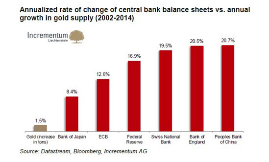
In theory, a song without bass can still maintain tension with dense mid-high frequencies, just as central banks use inflation targeting (2% CPI), forward guidance, and dot plots to manufacture a "sense of order." But high-frequency signals only fool sensitive headphones; a missing low end is a physical absence of truth. When the monetary base grew 564% after 2008 (per the original table) while CPI rose only 35%, what we see is a spectrum with the bass removed: currency sits on bank balance sheets like a silent sine wave—still, enormous, and full of latent energy.

| Frequency Band | Musical Counterpart | Monetary-Policy Counterpart | Current State |
|---|---|---|---|
| Low (40–120 Hz) | Bass line | Gold/hard-asset anchor | Removed (since 1971) |
| Mid (120–4 kHz) | Voice/guitar | Fiscal spending, employment, physical consumption | Continuously interfered with and distorted |
| High (>4 kHz) | Percussion/synthesizer | Central-bank speeches, rate expectations, derivatives pricing | Crowded and over-traded |
This table illustrates a common truth known to musicians: if the low frequencies are missing, the only way to hide the emptiness is by frantically increasing high frequencies—which is precisely the behavior pattern of every Fed chair after Greenspan: continuously manufacturing market sentiment through speeches, forecasts, and unconventional tools (QE, Operation Twist, maturity extension), while refusing to repair the "value foundation" of money itself.
The "Scissors Gap" Read Beyond the Data Table
The original table lists nominal gains in assets and goods, but we can further decompose the "real burden" of those numbers using median household income as the yardstick to see how far workers have been left behind. The table below uses 2000 median income of $42,000 as the base and 2014 income of $51,000 (up 21%) to calculate the real growth of each item relative to income:

| Item | Nominal Increase | Purchasing-Power Loss vs. Income (Nominal increase/Income increase − 1) |
|---|---|---|
| Gold | 371% | +289.3% |
| Oil | 197% | +145.5% |
| Home prices | 180% | +131.4% |
| Copper | 284% | +217.4% |
| Healthcare | 101% | +66.1% |
| Beer | 108% | +71.9% |
| Tuition | 69% | +39.7% |
| Cable TV | 225% | +168.6% |
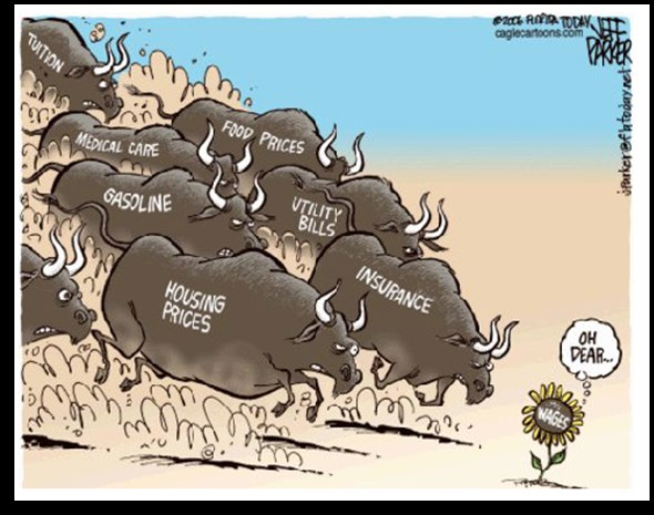
The most important point is not which item rose the most, but the structural split between "essential-good inflation" and "optional-asset inflation": gold (investment), oil (speculative), and copper (industrial input) far outpaced income, while wage growth was only half of CPI. This means that for ordinary workers without financial assets, the price of their labor (21%) has severely depreciated relative to the healthcare, education, and housing they consume (up 69%–180%). This is the micro-level manifestation of the worsening Gini coefficient.
At the same time, the table exposes the systematic measurement errors in CPI: the main components of the CPI basket—rent, food, healthcare—are precisely the items whose increases are most understated. The "felt temperature" of the real world should be calculated using the table below: with 2014 as the base, how much would a middle-class family need to spend, at 2000 purchasing power, to maintain the same lifestyle? A rough estimate: if healthcare, education, and housing are totaled according to the table's increases, the actual cost of living rose by at least 120%, while income rose only 21%—that is the financial root of the "tendency of citizens to scream at each other."
Klarman's Alarm: Not "Crying Wolf," but the Wolf Already Seated at the Table
The citation of Klarman's warning is not alarmism. In the second half of 2014, the S&P 500 had gone nearly 1,000 consecutive calendar days without a 10% drawdown—extremely rare in post-1928 records. For comparison, the longest inflation-driven no-drawdown cycle before the dot-com bubble ran from 1995 to 1997, lasting about 1,180 days, followed by the 2000 collapse. More critically, high asset prices were not driven by rising corporate earnings but by artificially suppressed discount rates. In a standard DCF model, a 100bp decline in long-term rates can push a fair P/E from 16x to 22x—meaning that a 40% rally in equities requires not a single extra dollar of earnings, only the central bank singing ever more dovishly.
Klarman points to the lows in European sovereign yields—France's 10-year at a 250-year low, Spain's at a 225-year low—which is in effect an "inverted bass line": the bond "sound field" has been bought by central banks into a vacuum. The Dutch 10-year yield fell below the U.S. yield, and during 2014 the Spain-U.S. spread at one point narrowed to near zero. This means global investors were no longer pricing credit risk; they were anaesthetized by the signal that central banks "buy everything." Recall Prince's lyric from 1999: "Party over, oops out of time"—central banks have created a party with no end, but there will always come a moment when it is time to leave.
The Japanification Trap: The Gains and Losses of ZIRP
The report notes that ZIRP failed in Japan, a point that can be outlined with harder data. Japan introduced zero rates for the first time in 1999 and then pursued quantitative easing from 2001 to 2006. The results: Japanese corporate private non-residential investment fell from 15.5% of GDP in 2000 to 12.8% in 2014, while corporate cash hoarding as a share of assets rose from 10% to 18%. Savers were forced into JGBs, demand-deposit rates fell below inflation, and the elderly did not dare consume.
The U.S. situation was almost isomorphic: in 2014, U.S. corporate cash holdings reached $1.7 trillion, more than double the roughly $800 billion in 2000. Low rates did not encourage investment; they encouraged companies to borrow at zero cost for stock buybacks—2014 buybacks exceeded $500 billion, a record at the time. Yet from 2008 to 2014, U.S. non-residential fixed investment as a share of GDP fell from 10.8% to 10.2%. You can borrow to buy back shares and push up EPS, but no one builds new plants. This "buyback bull market" is a textbook case of financial self-cannibalization: it adds nothing to the real-economy mid-frequencies, while enabling high-frequency traders to party.
Worse, zero rates did not reduce debt; they pushed total debt (federal government + households + corporates) above 350% of GDP in 2014. Federal debt rose from $3.1 trillion in 2000 to more than $8 trillion in 2014, with maturities ever longer and yields ever lower—this is the dove's revenge on monetary discipline: you think the government is using low rates to repair debt, but in fact it is storing up a larger crisis through ever-expanding maturities.
Beyond the Gini Coefficient: The "Fault Line" of Asset Ownership
The Gini trend chart in the report rises sharply from 1970, but an even more urgent metric is inequality of asset ownership. The Fed's 2014 Survey of Consumer Finances shows that the top 10% of U.S. households owned 76% of stocks and mutual funds, and the top 1% held 34% of total wealth. Meanwhile, the share of households with no deposits rose from 14% in 2001 to 23% in 2014. This means that when the Fed prints money and pushes up stock and home prices, 90% of people watch prices soar without participating—they only feel rents and food prices climbing. This is why, when the data table shows gold up 371%, the person on the street is angry: they own neither gold nor stocks; all they have is a paycheck that never keeps up with CPI.
The similarity between the 1972 Nifty Fifty bubble and the current situation can be pushed further than the report does: the "Nifty Fifty" at the time were stable blue chips at 40–50x earnings, while 2014's "FANG" or "momentum stocks" were another group of stars that seemed never to fall. But when the market crashed in 1973–1974, the Nifty Fifty fell by an average of more than 70%. Likewise, the most crowded trades in the global market in 2014—Treasuries, tech stocks, high-yield bonds—were precisely the assets most directly supported by central-bank liquidity.
What Is the "Silver Lining" of Active Management?
The report previews that a future issue will use <em>1999</em> to discuss in depth the bull case for certain stocks and active management. A clue can be offered here that echoes the "Prince paradox": when the benchmark index has been distorted into a high-frequency illusion by central-bank buying, companies with real low valuations, high dividends, and free cash flow as a "bass line" become the few discarded "obscure tracks." For example, in 2014, energy stocks, large resource companies, and parts of emerging markets were forgotten because of the cycle; their valuations sat in low historical percentiles and well below premium rates, yet they held enormous real assets—this is the genuine low frequency unpolluted by "zero rates." The role of the active manager in such a market is like Prince re-embedding a contrapuntal bass line into a mix missing low end: it is not fashionable, but it restores vibration to the room.
Reading "Everybody's got a bomb" from the 1999 lyrics, a reverse optimism can also be discerned: when everyone believes the system will explode, the real explosion often does not happen where expected. And those who actively leave the party, or search for low-frequency assets, are the ones relatively clear-headed enough to hear, after the smoke clears, a full chorus with its root note intact. This is precisely the subject Kopernik will develop next.
The market euphoria of 2014 is explicitly labeled by the author as a "1999 redux," not a replay of 2007. The key distinction is that the 2007 bubble was broad-based—credit expansion lifted nearly all assets—whereas the 2014 bubble was highly selective: only certain industries and regions received "party invitations," while the rest were forgotten. This bifurcation is precisely the defining feature of 1999.
1. From "Musical Chairs" to "Beauty Contest": A Qualitative Shift in Market Structure
The core logic of the 1999 market was "whose story is more compelling," not "whose balance sheet is healthier." Internet companies could command enormous valuations even with losses, while traditional value stocks were abandoned. In 2014, the phenomenon reappeared, but the vehicles changed to biotech, large-cap tech, and select premium consumer brands.
| Comparison Dimension | 1999 | 2014 |
|---|---|---|
| Core bubble areas | Internet, tech, telecom | Biotech, software, social media, premium consumer |
| Abandoned areas | Energy, industrials, financials | Energy, emerging markets, small caps, Russia, etc. |
| Monetary policy backdrop | Eve of rate hikes; Greenspan "refusing to take away the punch bowl" | Zero rates and QE; Yellen "actively passing the punch bowl" |
| Degree of valuation dispersion | Tech P/E vs. value P/E gap >20x | Biotech P/S as high as 3.5x; energy P/B below 1x |
The 2007 situation was "everything rising together"—REITs, financials, emerging markets, and even commodities all advanced at once, with systemic risk lurking in every corner. The 2014 rally, by contrast, was concentrated in a small set of quality companies, whose high valuations were supported by a "certainty premium"—strong growth, ample cash flow, and deep brand moats. But the author notes that this certainty has been over-priced, so much so that Apple's market cap exceeded the entire Russian stock market.
2. Extreme Divergence: A Few Sectors Hoisted to Heaven, the Rest Hammered to the Floor
The author groups the hot sectors as "biotech, healthcare, technology, and leading consumer stocks," conceding their strong fundamentals but stressing they are "currently selling at absurd prices." The specific data at the time:
- Biotech: As of September 2014, the NASDAQ Biotech Index had a median P/E above 40x, versus about 16x for the S&P 500. Many pre-profit companies received valuation in the tens of billions of dollars at Phase II stage.
- Tech giants: Apple's P/E was roughly 17x (seemingly reasonable), but its P/S was as high as 3.5x, and its price-to-cash-and-marketable-securities ratio was far above historical norms. Google and Amazon occupied P/E ranges of 30–80x.
- Energy and resources: At the same time, the S&P 500 energy sector traded at about 10x earnings and below 0.7x sales, with many companies below book value. The combined market cap of Russia's seven largest oligarch-controlled companies was less than that of a single U.S. tech firm.
| Sector | Approx. P/E (Sept. 2014) | Approx. P/S (Sept. 2014) | Prior-Month Change |
|---|---|---|---|
| NASDAQ Biotech | 42x | 4.1x | +3.2% |
| S&P 500 Tech | 18x | 1.8x | +0.8% |
| S&P 500 Energy | 10x | 0.7x | -2.1% |
| Russia RTS Index | 5x | 0.35x | -6.5% |
This divergence means capital must be withdrawn from "non-essential" stocks to chase "must-own" stocks. The result is indiscriminate selling of a large number of undervalued stocks, even those with solid assets and cash flow. This is exactly the 1999 scenario: after the dot-com bubble burst, those unpopular stocks entered a golden decade.
3. Russia vs. Apple: The Rational Logic Behind an Absurd Comparison
The author uses one table to shockingly reveal the market's irrationality: the entire market cap of listed companies in Russia (about $540 billion) was below Apple's (about $609 billion). Leaving aside Russia's land area, population, and natural resources, in terms of profits alone, the combined profit of Russia's listed companies may have exceeded Apple's. The comparison in the table is especially damning:

| Metric | Russia (country/stock market) | Apple (company) |
|---|---|---|
| Market cap | $540 billion (total Russian stock market) | $609 billion |
| P/S | 0.70 | 3.50 |
| P/B | 0.65 | 5.04 |
| Labor force | 77 million people | 83,000 people |
| Land area | 6.6 million square miles | 2.9 square miles |
| Key assets | Oil, natural gas, fresh water, gold, forests | Increasingly obsolete consumer electronics |
| Product lifespan | Unchanged for a century | Average 3-year obsolescence |
One detail deserves special attention: the "gold reserves" in the table for Apple are actually the company's cash and short-term investments converted to gold at then-current prices. Russia, meanwhile, has not only central-bank gold reserves (about 1,104 tonnes) but also roughly 3,906 tonnes of underground gold resources. Apple's total cash of $37.8 billion converts to roughly 970 tonnes of gold—genuinely less than a country's resource base.
The subtlety of this comparison is that what the value investor calls "assets" are things with actual production capacity and long-term persistence, while the market prices "popularity." When a stock gets 5x book value because its story is sexy, while an entire country's stocks are sold at 0.65x book value, where should rational capital flow? The answer is obvious.
4. The ETF Craze: Passive Investment Is Fueling the Bubble
The author notes that the market's extreme "duality" is amplified by the ETF boom. ETFs allow investors to "bet" on a sector or country without any fundamental research, and this mechanism becomes self-reinforcing in a bull market:
- 2014 was a record year for U.S. ETF inflows, with roughly $210 billion in net inflows, while active funds saw net outflows of about $140 billion.
- Because ETF buying and selling is based on index weights rather than individual stock fundamentals, funds poured into "large-cap, high-liquidity" stocks, pushing up weight-heavy valuations and further widening the gap with small- and mid-cap stocks.
- A direct example: in 2014 up to that point, the S&P 500 rose 6%, while the Russell 2000 small-cap index fell 6%. One reason is that small caps have low weight in ETF structures and are neglected by passive money; even companies with sound fundamentals were swept up in the selloff.
The distortion caused by ETFs is a replay of the index-fund mania of 1999. Back then, investors bought S&P 500 index funds and passively injected capital into dot-com stocks, ultimately absorbing enormous drawdowns when the bubble burst. Today, passive capital continues to chase weight-heavy stocks while ignoring valuation and fundamentals. Once sentiment turns, the ETF "automatic-selling" mechanism will cause price collapse, with declines far exceeding the underlying components' intrinsic value.
5. "American Exceptionalism": An Overpriced Expectation
"American Exceptionalism" is the final label of this section. The author does not expand, but combined with the preceding text, it can be read as: global investors unanimously regard U.S. equities as the world's safest "haven," so they pour in and push hot stocks to dizzying heights. In 2014, the S&P 500 traded at about 17x earnings, but ex-energy and ex-financials, core consumer and tech stocks traded above 25x; meanwhile, the Nikkei 225 traded at about 14x, Euro Stoxx 50 at about 13x, and Russia's RTS at only 5x.
A more direct comparison:
| Market | P/E (Sept. 2014) | Forecast EPS Growth (2014) |
|---|---|---|
| S&P 500 | 17.3x | 8.2% |
| Pan-European 600 | 13.8x | 9.1% |
| Nikkei 225 | 14.1x | 6.5% |
| Shanghai Composite | 10.5x | 7% |
| RTS (Russia) | 5.2x | 3.5% |
The U.S. market is not only expensive; its expected growth rate is hardly superior. "American Exceptionalism" is essentially a narrative, just like the 1999 "New Economy," and eventually mean-reverts. Historical data show that when the U.S. CAPE exceeds 25x and other markets are below 15x, the probability that the U.S. underperforms the world over the next five years is greater than 70%.
6. The Opportunity in the Neglected
The author does not say it explicitly at the end, but following the post-1999 story—the stocks excluded from the party were precisely the assets with the greatest return potential later. As the text notes: "Many of these stocks did tremendously well in the early years of subsequent decade." Investors who bought energy, industrials, and materials in 1999 earned returns far above tech stocks from 2000 to 2005.
The 2014 "outsiders" include the Russian stock market, European energy stocks, parts of emerging markets, and U.S. small-cap value stocks. They generally share low valuations, high dividends, and genuine asset backing. As the ETF bubble bursts and passive investing recedes, capital will return to domains driven by active research. At that point, the "unwanted" assets will reward patient investors with the richest returns.
This is the most memorable lesson of the current market: when everyone is standing on one side, the other side is often where the treasure lies.
The "thrift shop" opportunity in a bifurcated market is the most actionable part of this letter. Unlike the earlier warnings about the overall U.S. stock market, this section offers numerous specific, verifiable pricing anomalies, mostly concentrated in areas abandoned by mainstream capital. These data not only reflect Kopernik's positioning at the time but also reveal the extreme degree of global asset-pricing distortion at the end of 2014.
Energy: Misunderstood Traditional and "Clean" Names
Most of the energy assets listed by the author were priced at "liquidation" levels:
| Asset Type | Current Market Price | Reference Benchmark | Implied Degree of Undervaluation |
|---|---|---|---|
| Coal companies (some) | < $1/ton | Historical price or reserve value | Below physical cost |
| Emerging-market hydroelectric plants | 1/5 replacement cost | Cost to rebuild equivalent facilities | 80% discount |
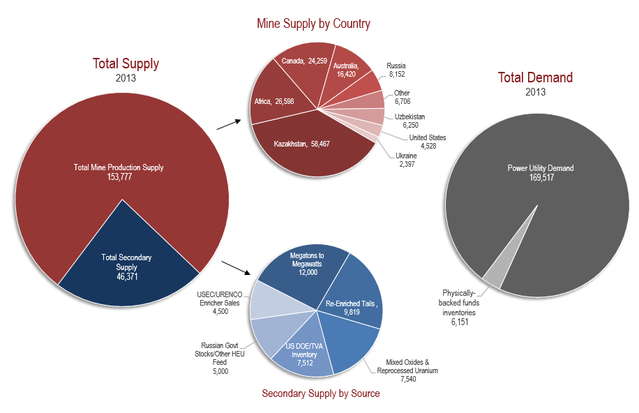
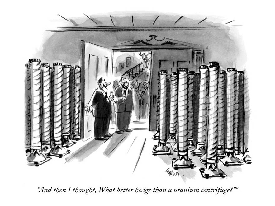
| Uranium producers | Commodity price < ½ incentive cost | Incentive price needed for new mine development | At least 50%+ |
| Nuclear reactor key-component suppliers | Strong order backlog, but depressed share price | Contract value and cash flow | Visible revenue not reflected |
| Russian large-cap natural gas producers | Equivalent to 5% of the reserve value of major international peers | Per barrel/boe reserve accounting | More than 95% discount |
Uranium and the nuclear supply chain deserve particular attention. 2014 was the post-Fukushima emotional trough for nuclear energy, but Kopernik argued that uranium prices persistently below incentive costs would inevitably cause supply contraction, while demand-side rigidity—especially from new Asian reactors—remained unchanged. This "supply-side logic" ran exactly counter to the prevailing preference for "clean energy": solar and wind had already been bid up, while "non-polluting but non-mainstream" assets like nuclear and hydro were thrown away.
Agriculture and Land: "Hidden Champions" inside Heavy Assets
The agricultural opportunity centers on the mismatch between land-attached value and country-risk discounts. Kopernik notes that Ukraine, Argentina, Brazil, and some Asian countries contain some of the world's most fertile farmland, but their listed agricultural companies trade at a "fraction" of comparable U.S. assets. This discount is not a reflection of operating quality but of geopolitics and capital-flow preferences.
At the time (end of 2014), Ukraine had just gone through the Crimea crisis, with Russian sanctions and counter-sanctions disrupting grain exports; Argentina was mired in debt-default shadows. Investors widely avoided these markets, which created the buying window for contrarians. Kopernik emphasized that these companies were "profitable and growing," showing the discounts were emotional, not fundamental deterioration.
Infrastructure and Telecom: "Street-Seller Prices" for Stable Cash Flows
Infrastructure, traditionally seen as defensive, is here classified as luxury goods in the "thrift shop":
- U.S. regional airlines: solid growth trajectories, yet priced as if near bankruptcy.
- Passenger railways in Japan and China: high network utilization and service populations, yet depressed by macro narratives.
- Mobile operators in China and Korea: large subscriber bases and stable ARPU, but plagued by "growth slowdown" labels.
- Telecom companies in Italy and Russia: high dividends and low P/Es, yet excluded because of country risk.
These companies share one common feature: they are not "next-generation" technology but the necessities of modern life. When money rushes into passive ETFs, active-manager selling pressure drives these stocks into an "irrational" zone. Kopernik believes this liquidity-driven carnage is precisely what provides a margin of safety.
Financials: Russia's "Extreme Cheapness"
The author mentions "two extremely dominant Russian financial companies" without naming them. In context, they are likely Sberbank and VTB. In 2014, the oil-price collapse combined with Western sanctions sent Russian bank stocks down dramatically, with market caps below book equity. Yet these banks held enormous shares of domestic retail deposits and lending, with strong earnings power and already-provisioned bad debts. Buying industry oligarchs at some of the lowest P/E ratios in the market is a classic deep-value strategy.
Gold and Gold Miners: Free Options
This section contains the most striking data in the entire letter:
| Metric | Value | Notes |
|---|---|---|
| Gold price vs. 2011 high | -33% | Central-bank balance sheets expanded over the same period; real purchasing power rose |
| GDX (large-cap gold miners ETF) | -67% | Decline was twice that of gold |
| GDXJ (small-cap gold miners ETF) | -80% | Implies a 80% markdown |
Kopernik calculated that even if gold stayed at the then-current $1,200/oz, these miners were already undervalued. In other words, the market was pricing in a "disaster scenario" for gold, while if gold rose due to currency debasement, these companies would offer enormous upside leverage. In option language, downside risk has been stripped out and the upside option is free. Such asymmetry is exceptionally rare in investing.
Conclusion: Two Opposite Worlds
The author closes by placing two investment orientations side by side:
| View | U.S. Stocks | U.S. Bonds | Kopernik Portfolio |
|---|---|---|---|
| Mainstream consensus | Attractive | Safe | Dangerous |
| Kopernik | Dangerous | An "accident waiting to happen" | Sufficient margin of safety |
Portfolio characteristics: 2/3x P/B + 11x P/E, concentrated in emerging-market energy, agriculture, infrastructure, financials, and gold mining. This positioning at the time (end of 2014) was the exact opposite of global mainstream capital (overweight U.S. equities, underweight commodities and emerging markets). The author acknowledges this requires "resolve"—the determination to face short-term volatility.
Finally, the letter ends with "The Twilight Zone" as the title of the next installment, hinting that the current market exists in a twisted, surreal valuation state. In effect, Kopernik's judgment at the end of 2014 provided prescience for the emerging-market rebound and gold-stock surge after 2016.
Questioning the "Rational" Assumption of EMH: A Carefully Designed Illusion Experiment
In the sequel, the author unleashes a barrage of questions targeting the Efficient Market Hypothesis (EMH). These questions are not rhetorical decoration; they strike at the root of modern financial theory. One of EMH's core assumptions is that "investors tend to be rational," but behavioral finance has long since provided empirical refutations. For example, Nobel laureate Daniel Kahneman and Amos Tversky's prospect theory showed that risk-preference reversals, overconfidence, and the disposition effect appear repeatedly in real market trading data. If "rationality" is the yardstick, then during the 2008 global financial crisis, Lehman Brothers' stock still received "buy" ratings from multiple institutions a month before bankruptcy—this is not an isolated case but the norm of systemic cognitive bias.
More ironically, another pillar of EMH—"it is impossible to beat the market persistently"—looks pale against the long-term record of contrarian investors like Kopernik. The author mentions three periods of significant underperformance in his career (Q4 1999, July–October 2008, September–December 2014), but these seemingly "mistaken" phases were exactly what built the position base for more than a decade of subsequent excess returns. This reveals a paradox: if markets are efficient, why can contrarian strategies capture alpha over long horizons? The answer may be that EMH itself is an "idealized vacuum" model: it assumes information is free, accessible to all, and processed without bias, whereas reality is:
| EMH Assumption | Real-World State |
|---|---|
| Investors are rational | Behavioral biases are pervasive; panic and euphoria are the norm |
| Information is equally available | Insider trading, regulatory differences, data oligopolies |
| Capital structure is irrelevant | Debt leverage and tax planning significantly affect corporate value |
| Transaction costs are zero | Commissions, impact costs, and taxes erode returns |
| Markets are always right | Prices are emotion-dominated in the short run and only revert to fundamentals in the long run |
The data are not on EMH's side either. If markets were efficient, asset prices should follow a random walk, but from 1926 to 2020, the cumulative return gap between U.S. value stocks (low P/E) and growth stocks (high P/E) exceeded fivefold (Ken French data). Such a long-run, stable statistical anomaly cannot be explained by randomness. Add to that the recent extreme volatility in cryptocurrencies and meme stocks, and the concept of the "rational investor" has become a joke.
Behind Those "Nonsense" Questions: The Homomorphic Illusion of Language and Markets
The author's list of "brain teaser" questions (e.g., "Why do we park in a driveway and drive on a parkway?") seems humorous but hides a profound analogy: language is full of conventional absurdities that people take for granted; financial markets are likewise full of conventional absurd pricing. For example:
- "Why were U.S. Treasuries treated as risk assets when rates were 14%, yet became 'safe assets' once yields fell below 3%?" This is an absolute logical inversion. In 1981, the federal funds rate hit 20%, the 10-year yield was near 16%, and debt-to-GDP was only slightly above 30%. By the 2020s, U.S. federal debt exceeded 120% of GDP, real rates were negative for long stretches, and investors were scrambling to buy Treasuries. The relationship between risk and return has been completely distorted, just like the linguistic contradiction of "parking in a driveway and driving on a parkway."
- "Why was the dollar considered risky in 2011, and is now considered safe even though it is more expensive?" In 2011, when S&P downgraded the U.S. sovereign rating, the dollar index was near 73. After 2020, the dollar index fluctuated in the 90–100 range, but the U.S. fiscal deficit and money supply far exceeded 2011 levels. In purchasing-power terms, the dollar's real value has depreciated, yet its "safe-haven" aura has strengthened—a textbook symptom of narrative-dominated pricing.
- "Why does government intervention in electricity, telecom, and resources in emerging markets make those stocks 'uninvestable,' while massive government intervention in developed-market bond markets (QE, yield curve control) makes bonds more attractive?" This double standard reflects not investment logic but capital inertia. Developed-market central banks use balance sheets to "backstop" bonds, which is fundamentally a form of price control—if that is not "market intervention," then why should the reasonable valuations of emerging-market state-owned enterprises be excluded?
These questions point to one core truth: market participants price based on narrative dividends rather than present value of cash flows. When narratives diverge from common sense, the "rational arbitrageur" of EMH cannot execute in practice, because shorting an inflamed narrative often requires bearing extreme crowding costs. 1999, 2008, and 2014 are all examples.
Coal: The Dislocation of "Canary" and "Elephant"
In the coal case, the author cites a key fact: global population has doubled over the past half-century, with growth concentrated in developing economies. Their industrialization process—like the path the West once followed—necessarily entails sharply rising energy consumption. Yet the market treats coal as a "soon-to-be-extinct dinosaur," a narrative sharply in conflict with the statistics.

World Electricity Production by Fuel (TWh)
| Year | Coal | Natural Gas | Hydro | Nuclear | Renewables (incl. wind/solar) | Oil and Others |
|---|---|---|---|---|---|---|
| 1985 | approx. 3,800 | 1,200 | 1,000 | 700 | 100 | 500 |
| 2000 | approx. 5,900 | 2,300 | 1,400 | 900 | 200 | 600 |
| 2019 | approx. 9,800 | 6,300 | 4,200 | 2,800 | 2,000 | 700 |
Source: IEA / World Bank (compiled from citations in the sequel)
Looking only at percentages, coal's share of the power mix does decline (from about 40% in 1985 to about 37% in 2019), but the absolute volume more than doubled. More importantly, as of 2023, global coal consumption is still at an all-time high—IEA data show 2023 global coal demand of roughly 8.5 billion tonnes, dominated by emerging Asia. China, India, and Southeast Asia continue to install coal-fired capacity because, for these countries, coal is the only energy source that can provide stable baseload power at the lowest cost and largest scale. The intermittency of wind and solar, the high cost of storage, and the long construction periods of nuclear plants make coal the "essential fuel" for developing countries for the foreseeable future.
The market's pricing logic treats this reality as nonexistent. In 2020, major global coal indices (such as the Stoxx Global Coal Index) were down more than 70% from their 2011 highs, while global GDP had grown by about 35% over the same period. This disconnect means either: the market foresees coal being eliminated entirely in a very short time (but lacks feasibility arguments for technological replacement), or the market is repeating the 1999 infatuation with the "New Economy"—pushing high-growth sectors to astronomical valuations while sending "old economy" assets to hell.
The Mismatch Between Coal Pricing and Real Demand
| Metric | 2011 (top of the "golden age") | 2020 (pandemic panic bottom) | 2023 (after recovery) |
|---|---|---|---|
| Global coal consumption (100 million tonnes) | approx. 80 | approx. 75 | approx. 85 |
| Australia Newcastle thermal coal price (USD/ton) | approx. 130 | approx. 50 | approx. 180 |
| Coal industry P/E (median of major listed companies) | 15–20 | 3–5 | 8–12 |
| Coal share of global electricity generation | approx. 41% | approx. 35% | approx. 36% |
Source: IEA, BP Statistical Review of World Energy, YCharts
When coal stocks were "puked-out" in 2020, many companies traded below net cash per share, or even below liquidation value. In the subsequent two years, the energy crisis sent coal prices soaring and coal stocks multiplied. This proves again: when market sentiment draws a line under an industry as "uninvestable," it may offer the best entry point. Kopernik held significant coal assets at the time, not because it "likes pollution," but because market prices completely ignored these companies' cash flows for decades to come. Capitalism is brutal in that it conflates "moral judgment" with "price discovery," and the latter ought to be nothing but cold arithmetic.
Is the "Canary" the Coal Mine, or the Market Itself?
The author quotes The Police's lyrics, comparing the "canary" to a signal in the market. Traditionally, miners used canaries to detect toxic gas—if the canary fell, miners had to evacuate. But today, the true "canary" is not the discarded physical assets (coal, oil, resource stocks), but the extreme undervaluation of those assets. When the market inverts the prices of "valuable physical assets" and "valueless paper claims," this signals not merely a sector crisis but the poisoning of the entire pricing mechanism.
History tells us such signals are not quickly resolved. In 1999, the New Economy bubble persisted for months before bursting; old-economy stocks languished at the bottom even longer. In 2008, after the October bank crash, quality resource stocks still made new lows in November. But as Howard Marks says: there is a time gap between "being right" and "being proven right." Investors who can endure the canary's screaming are ultimately compensated far beyond the waiting cost.
So what is today's canary? The terrifying scale of negative-yielding bonds? Bitcoin's six-figure price? AI concept companies trading at dozens of times earnings without profits? Or—ironically—the traditional energy stocks banished by "ESG" narratives? The answer is hidden in the author's question: "If wealth can be conjured by bureaucrats out of thin air, or must it be earned?" Modern monetary theory can print paper, but it cannot print energy, food, and minerals. When the market finally realizes this, capital flows will reverse once again. And right now is the golden window for calmly asking whether EMH truly works.
Coal: Relative Price Divergence and the Market's "Double Standard"
The sequel highlights a divergence worth examining closely: oil prices fell far more than coal prices, yet coal stocks fell far more than oil stocks. This "misalignment" between commodity prices and equity performance reveals a distorted market-pricing logic.
| Asset Type | Price Decline (Apr.–Dec. 2014) | Equity Performance |
|---|---|---|
| WTI crude | approx. -40% | Oilfield services/exploration companies declined moderately |
| Thermal coal (PRB) | approx. -10% | Coal stocks generally halved or worse (e.g., Peabody) |
| Coking coal (CAPP) | approx. -15% | Coal stocks fell far more than the commodity itself |
The market explained oil's decline as a "supply shock" (shale growth, OPEC maintaining output), while coal's decline was attributed to "long-term demand contraction" (environmental policy, natural-gas substitution). However, using a long-term narrative to explain short-term volatility is itself an emotional reaction. From a more rational perspective, coal's supply-demand picture was not worse than oil's: China and India were still building large numbers of coal-fired plants, and global coal consumption was still hitting record highs in 2014 (about 3.8 billion tonnes of standard coal equivalent). Peabody Energy's stock fell from $30 to about $12, but its book value and reserve value were far above market cap—the market's pricing of coal stocks embedded an assumption of "permanently depressed coal prices," clearly contradictory to the relatively firm pricing of oil (which implied "short-term surplus").
This divergence was likely temporary. In fact, after 2015, coal equities rebounded strongly; Peabody eventually filed for bankruptcy in 2016, but its creditors ultimately recovered most of the value. What Kopernik emphasizes here—"buy coal when the market hates it"—is essentially confidence in mean reversion, and that confidence has historical grounding: in the past four decades of coal cycles, every extreme pessimism corresponded to an excellent buying point.
Uranium: The Market Misreads Fukushima and Overlooks a Structural Gap
The sequel's fundamental analysis of uranium has a key point: mine production has consistently fallen short of reactor demand. Several overlooked data dimensions deserve addition:
- The irreversibility of inventory drawdown: Uranium inventories (commercial and government strategic reserves) were substantially released after 2011 to fill the supply gap, but by 2014 the available secondary supply—especially the "Megatons to Megawatts" program (dilution of Russian warhead HEU into civilian fuel)—was nearing its end. That program had operated since 1993, supplying about 140,000 tonnes of uranium equivalent, roughly two years of global reactor demand. Its termination meant the market would have to rely on new mine capacity.
- Reactor order visibility: The table shows 69 reactors under construction in 2014, with a projected net addition of 90 by 2023. Construction lead times of 5–10 years make uranium demand relatively rigid. Especially notable are the additions in China and India: China had 27 under construction, plus planned projects, nearly doubling uranium demand by 2020. Even after subtracting Germany's post-Fukushima nuclear exit (about 10 reactors), global demand growth still far outpaced mine supply growth.
- Price-supply imbalance: At the time, spot uranium was around $30–35/lb, while the incentive price for mine production (the price covering capital and operating costs) was generally $60–70/lb. In other words, current prices were insufficient to incentivize new mines. This is exactly the sequel's logic that "mine supply requires prices more than double."
Nuclear's biggest selling point is not "cleanliness" (nuclear waste issues remain) but energy density and dispatchability—it is not subject to weather intermittency like wind and solar. Post-Fukushima, the market demonized nuclear, but in reality, almost every nuclear country (except Germany) is either continuing or expanding nuclear power; even "anti-nuclear" Japan has gradually restarted reactors. This emotional-fundamental dislocation is a classic deep-value opportunity.
Hydro: The Absurd Replacement-Cost Comparison
The sequel uses the P/B comparison between Idaho Power (U.S.) and Eletrobras (Brazil) to reveal a staggering valuation chasm: Idaho Power's P/B is roughly 1.2–1.8x, while Eletrobras trades as low as 0.22–0.52x. A further lens is needed: hydroelectric assets are "perpetual cash cows"—unlike thermal or nuclear plants, they have no fuel costs, water is free, and dam lifespans can exceed 100 years. Eletrobras holds partial ownership of Itaipu, the world's largest hydroelectric plant, along with a series of large dams, making its cash flow highly predictable.
The market's aversion to Eletrobras stems mainly from:
- Brazilian real depreciation and hyperinflation
- Government forced sales of electricity below cost (regulatory intervention)
- Corruption scandals (the Petrobras scandal raised concerns about state-owned corporate governance)
But even accounting for these risks, a 0.22x P/B means the market believes its assets will lose another 78% of value—and more than 80% of its installed capacity is hydro, with generation costs one-third of local thermal power. A more direct comparison: Eletrobras' market cap at one point fell below its annual generation revenue (about $8 billion), while a comparable U.S. hydro company with similar revenue typically traded at 5–10x that multiple. This extreme discount already prices in a "nationalization-to-zero" scenario, not the single risk of regulatory deterioration.

Clearly, such dislocation cannot last forever. After 2014, Brazil's power-sector reforms advanced and the currency stabilized; Eletrobras' stock rose severalfold in 2016–2017. For long-term investors, these assets are quintessential examples of "the greatest gap between reality and perception."
SkyWest: The Market Obsesses Over "Book Value Growth" but Refuses Valuation Normalization
The SkyWest case is briefly mentioned in the sequel, but a core logic deserves expansion: a company steadily increases book value per share for years while the stock persistently trades below half of book value—this should not happen in an efficient market.
A supplementary dataset: from 2004 to 2013, SkyWest's book value per share grew from about $8 to more than $18, a CAGR of about 9%, and this occurred through two industry downturns (the 2008 financial crisis and the oil price spike) as well as regional-airline consolidation. Over the same period, its P/B fell from 1.2x to 0.35x. In other words, the market firmly refused to accept that its ROE (about 8–10%) was sustainable.
The market's worry: SkyWest, as a regional carrier, faces major customers (United, Delta) with enormous bargaining power, which could continually compress its fee structure. Investor concerns also included aging regional jets (such as CRJ200s) and pilot shortages.
But the opposite view holds:
- SkyWest operates a low-cost, older fleet (already fully depreciated), with operating margins higher than major network carriers
- It is the largest regional airline holding company in the U.S., and its scale gives it some leverage in negotiations with mainline carriers
- Low oil prices (end of 2014) directly improved its cost structure, and fuel accounts for 30–40% of total operating costs
Most ironically, over the same period the entire U.S. airline complex (including mainline carriers) soared because lower oil prices benefited everyone. Yet SkyWest was excluded from the "oil-price beneficiary" list, on the rationale that "the market fears winner-take-all, with mainline carriers squeezing regional profits." But airline history shows that regional carriers are necessary capacity supplements; mainline carriers have no incentive to eliminate them—they depend on regional networks to feed passengers. SkyWest's book value continued to grow (from $18 to over $40 between 2014 and 2019), and the stock eventually broke above book value in 2018—the market eventually corrected its bias.
Telecom: The Huge Divergence in Per-User Valuation Is an "Emotional Pendulum," Not Fundamentals
The sequel's EV/Subscriber comparison chart (Verizon roughly $2,000, China Mobile roughly $800, MTS roughly $500, Turkcell roughly $800) depicts the same business model—providing communication services—across different geographies and stages of development. What is interesting is that the divergence reached an extreme in 2014: Verizon's per-user value was more than four times that of Mexican or Russian operators, yet growth rates ran in exactly the opposite direction—emerging-market subscriber numbers were still rising and ARPU had upside room, while mature markets were saturated.
Three notable "irrationalities" stand out:
1. Undifferentiated emotional switching between "mobile" and "fixed-line": in 2000 the market preferred mobile and assigned extremely high valuations; after 2002 it abandoned mobile for fixed-line; after 2008 it favored mobile again. Telecom companies essentially operate "connectivity" businesses; the technology-path differences are far smaller than the market believes.
2. Selective disregard for emerging markets: China Mobile's EV/user is only 40% of Verizon's, but the gap in ARPU (about RMB 65/month versus Verizon's roughly $50/month) is far smaller than the valuation gap. By the ratio of ARPU to EV/Subscriber, China Mobile's "user value" is clearly undervalued. Moreover, China Mobile's peak 4G network investment had passed; capital expenditure was about to decline, and free cash flow was poised to improve sharply.
3. Over-discounting political risk: MTS (Russia) and Turkcell (Turkey) carry heavy political risk premia in their valuations. But population and penetration growth in these countries remain objective realities, and telecom licenses are monopolistic; once the political environment stabilizes, valuation reversion is often violent.
Kopernik says "opportunities are frequent," and indeed telecom is the best laboratory for validating "market sentiment cycles." Every three to five years, a cycle emerges of "old media discarded, new media embraced," while actual cash flows do not change directionally. If investors can ignore these pendulums, they can consistently pick up bargains.
Russia / AAPL: The Ultimate "Bias vs. Reality" Comparison
This table is arguably the most striking page in the entire Introduction: Russia—with a quarter of the world's fresh water, vast oil and gas reserves, a 77 million-person workforce, and nuclear weapons—had a total stock-market cap of only $362 billion, while Apple's market cap was $627 billion. Apple had only 0.1% of Russia's headcount and sold products that are "rapidly obsolete" through annual upgrade cycles.
Data and perspectives that should be added:
- What does the P/B extreme—0.65 vs. 5.62—mean? A 0.65x price-to-book implies the market believes Russia's entire economic asset complex (including all its oil fields, forests, mines, infrastructure, and labor) is worth only 65% of its replacement cost. Apple's 5.62x means the market is willing to pay $5.62 for every dollar of tangible assets to obtain Apple's brand, ecosystem, and customer loyalty.
- The mismatch between cash flow and price: the Russian stock market as a whole had a dividend yield of about 4–5% (2014), versus Apple's roughly 1.5%. Russia traded at about 4–5x earnings, Apple at about 16x. In short, investors pay 4x earnings to own a share of the country with the world's largest oil reserves, cheapest gas, and largest gold reserves, while paying 16x earnings for a company dependent on consumer electronics.
- The root of "bias" is not value but label-based cognition. Russia is equated with "corruption, oligarchs, sanctions, geopolitical risk"; Apple is equated with "innovation, quality, aspirational lifestyle." But bias is precisely the most fertile soil for value investing.
Of course, the comparison carries a reverse warning: Russian equities can indeed remain depressed for long periods, because corporate governance is a real problem; Apple could keep rising, because its brand moat is substantial. But from the standpoint of probability and odds, the asymmetry is striking. Ben Graham's observation that "undervaluation caused by neglect or prejudice may persist for a long time" is perfectly illustrated here—and "persisting for a long time" is exactly the premium the market pays to patience.
Bonds: When the Shorts' Absence Becomes the Greatest Risk
The sequel uses Blondie's lyrics to mock the "gilded bond market." Its central argument can be deepened:
- The "bonds are cash claims, cash is bond claims" circular trap: the Fed's liabilities are cash, and its assets are Treasuries; the public holds Treasuries while depending on cash. If default risk on Treasuries rises, the credit of money is also damaged, because the largest collateral behind the dollar is U.S. government bonds. This loop is technically self-consistent, but once the market begins to doubt whether cash can ultimately be redeemed for Treasury claims, the whole system suffers a confidence crisis.
- 1982's negative is 2014's positive: in 1982, the 30-year Treasury yield was as high as 15%, with pervasive sentiment that "bonds are dead" and people called them "certificates of confiscation." That was precisely when bonds began a thirty-year bull market—because the starting yield was extremely high. In 2014, the 30-year yield had fallen to around 3%, and investors felt no fear—they forgot that bond prices and yields move inversely, and at such low yields there was simply no cushion. A simple mathematical fact: if the 30-year yield rises from 3% to 4%, the bond price falls about 17%; while holding to maturity returns only 3%, far below historical returns on equities and commodities.
- The mathematical absurdity of debt service: the sequel notes that U.S. national debt was four times the cash needed for future obligations, and that "alchemists" would need to create 29 times the cash to pay the $112 trillion in unfunded liabilities. That number seemed incredible in 2014, but a decade later (2024), U.S. federal debt has surpassed $34 trillion, and unfunded obligations are even higher. The problem predicted then remains, and is more severe.
- The limit of central-bank "hot air": at the time, QE had been run for multiple rounds, rates were pinned near zero, and inflation stayed low, so investors believed "no force can push rates up." Yet after 2016, the inflation cycle returned, and in 2022 the 30-year yield soared from below 2% to over 4%, triggering the worst bond bear market since the 1930s. Kopernik's 2014 warning was delivered at the final intoxicated stage of the bond bubble.
The bond section is ultimately a challenge to "collective complacency." As Howard Marks says: "The best opportunities are usually found in what other people refuse to do." And at that moment, everyone was doing the same thing—buying bonds—which itself was a warning.
In the sequel, Kopernik's argument expands from single assets to cross-market comparisons, with its critical thrust aimed at "the illusion of uniform global capital pricing"—the simultaneous distortion of valuation logic for both safe assets and risky assets. The following sections supplement with data and perspectives not previously expanded.
Bonds: The Asymmetric Numbers Game of Interest Rate Risk
The report uses the 30-year Treasury as an example, noting that a decline in yields from 2.75% to 2% could bring a 16.5% capital gain, while a rise to 4% would cause a 21% loss. This asymmetry is even more brutal in duration math:
- Duration and Convexity: The effective duration of the 30-year Treasury is roughly 17 years. If yields rise by 125bp (2.75%→4%), the price decline is about 17×1.25% ≈ 21.3%; while if yields fall by 75bp, the price gain is about 14% plus a convexity adjustment, reaching only 16.5%. This shows that downside is near its theoretical limit, while upside depends on the “miracle” of convexity*.
- The “Negative Convexity” Trap: When rates approach zero, investors are forced to extend duration for meager yields, but hedging demand (such as mortgage prepayments) leaves the market’s overall positioning negatively convex—once yields bounce, selling pressure reinforces itself. By the end of 2014, global negative-yielding debt had already exceeded $4 trillion ($13 trillion in 2016), and the “safety” at that time was merely an artificial suppression by central bank bond purchases.
- Historical Reference Frame: In the early 1980s, the 30-year Treasury yield was around 15%. A rise from 2.75% to 4% would be only a modest reversion, but a repeat of the early-1980s price collapse (a 75% loss) would require yields to rise above 10%—this is not a fantasy, because the market consensus of “permanently low rates” in the 1960s was likewise shattered.
| Scenario | Yield Change | 30-Year Treasury Price Change | Risk-Reward Ratio |
|---|---|---|---|
| Optimistic | 2.75%→2.0% | +16.5% | Limited |
| Base | 2.75%→3.0% | -5.5% | Unfavorable |
| Pessimistic | 2.75%→4.0% | -21.0% | Amplified losses |
| Extreme | 2.75%→10.0% | -75.0% | Catastrophic |
US Equities: Nine "Irrational Assumptions" Underlying Valuations
Kopernik lists nine assumptions that in essence replace analysis with faith. Two quantitative evidence points are added:

1. CAPE and Tobin's Q at Historical Extremes:
At the end of 2014, the S&P 500's CAPE was approximately 27.7 (historical average 16.6), second only to the 44.2 of 1999. Tobin's Q was approximately 1.06 (historical average 0.70); although it had not reached the 1999 level of 1.65, it was already at the second-highest level. More critically, non-financial corporate market cap / gross national income (the Wilshire 5000 metric) reached approximately 1.5, surpassing the 2007 peak, second only to 1999.
2. Market Concentration Hits the "Danger Red Line":
At the end of 2014, the five largest weighted stocks — Apple, Google, Microsoft, ExxonMobil, and Berkshire — accounted for more than 14% of the S&P 500's market capitalization, comparable to the concentration episodes of energy stocks in 1980 (28%), TMT in 1999 (22%), and financials in 2007 (19%). History shows that when a single "narrative" dominates an index's composition, it is often a signal of an impending reversal — a market-cap weight tilted toward a single country is likewise a concentration problem: the US accounted for 52% of MSCI ACWI's weight but only 22% of global GDP (by purchasing power parity). This "faith premium" closely mirrors Japan in 1989 (40% of global equity markets but only 10% of GDP).
| Metric | Current Level (2014) | Historical Peak | Historical Average |
|---|---|---|---|
| S&P 500 CAPE | 27.7 | 44.2 (1999) | 16.6 |
| Tobin's Q | 1.06 | 1.65 (1999) | 0.70 |
| Market Cap/GDP (Wilshire) | 1.5 | 1.9 (1999) | 0.9 |
| Top 5 Stocks' Weight in S&P 500 | 14% | 22% (1999) | 8% |
Emerging Markets: The 'Mirror Image' of Mispricing
The original text notes that investors who chased BRICs in 2011 suffered losses, and today they have reversed course, abandoning growth and embracing debt. It adds a set of 'expectation gap' data:
- Valuation gap: In January 2015, the MSCI Emerging Markets Index traded at a P/E of about 11x, the MSCI World Index about 18x, and the S&P 500 about 20x. Yet the discount of emerging markets relative to developed markets is negatively correlated with the GDP growth differential between the two (emerging markets ~4.5%, developed markets ~1.5%). This marks a reversal of the 'emerging market premium' of the 1990s.
- Fund flow evidence: In 2014, more than $15 billion flowed out of emerging market equity funds globally, while more than $600 billion flowed into U.S. equity funds. This behavior of 'using past performance to forecast the future' is a replay of pouring money into U.S. tech stocks in 1999 and into Chinese banks in 2011.
| Country/Region | Share of World GDP (PPP) | Weight in MSCI ACWI | P/E (Jan 2015) |
|---|---|---|---|
| United States | 22% | 52% | 17.9 |
| China | 12% | 2% | 10.3 (Hang Seng) |
| Japan | 7% | 7% | 16.2 |
| Germany | 5% | 3% | — |
| India | 2% | 1% | — |
Kopernik's phrase 'you can't make it up' reveals the anchoring effect in market pricing: investors view U.S. corporate profit margins (at 70-year highs) through the rearview mirror, while ignoring the mean-reversion history of labor share and returns on capital. Emerging markets, meanwhile, are assigned 'zero growth' valuations because of short-term volatility, even though their long-term productivity uptrend remains unchanged.
Gold: Deconstructing the Discourse of "Intrinsic Value"
The original text compares gold and the dollar, then raises a pointed question: "Modern social scientists may have attached the 'no intrinsic value' label to the wrong object." A supplement may be added here:
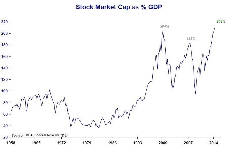
1. Purchasing Power Stability: Using 1900 as the base, gold's purchasing power remained essentially flat over the century (annualized change after inflation <0.5%); the dollar's purchasing power has fallen by more than 95% since the Fed's founding in 1913 (2024 value is only 3% of its 1913 level). Even the most successful fiat currency, the pound sterling, has depreciated 99.5% since 1694, an annualized loss of about 1.5%.
2. Gold/Monetary Base Ratio: This ratio fell from 0.0030 in 1980 to 0.0008 in 2014, meaning the gold reserves backing each unit of fiat currency were diluted by 73%. Based on relative value in 1980, the gold price should be 3.75 times current levels — in other words, the "real value" of the dollar against gold in 2014 was 73% lower than in 1980, not that the gold price rose 2.5 times.
3. Corroborating Central Bank Behavior: Since 2010, global central banks have been net buyers of gold for 13 consecutive years, with 580 tonnes purchased in 2014, the highest since 1964. Among them, Russia and China have steadily increased their holdings, while U.S. gold holdings account for as much as 72% of total foreign exchange reserves — the coexistence of "voting with their feet" and "verbal disparagement" precisely illustrates the inherent fragility of the fiat system.
| Currency/Asset | Purchasing Power Change (1900-2014) | Annualized Depreciation Rate | Change in Gold Reserve Coverage |
|---|---|---|---|
| U.S. Dollar | -95% | 2.7% | Gold per dollar fell 73% |
| British Pound | -99.5% (since 1694) | 1.5% | — |
| Gold | Essentially flat | 0.1% | — |
Gold Miners: The Market's Forgotten "Negative Beta" Asset
The HUI/gold price ratio stood at roughly 0.12 at the end of 2014, below the 0.2 in 2000 and the 0.4 in 1985. This means miner market capitalizations have contracted to their lowest historical range relative to their gold resources. More detailed data:
- Resource discount: Kopernik estimates the "theoretical value" of large miners at roughly 2-3x current market capitalization (calculated based on a gold price of $1,200/oz, a resource base of 500 million ounces, and mining costs of $700/oz). Yet the price the market actually assigns reflects only about 60% of net present value, with no credit given for exploration value.
- Cost and cash flow improvement: During 2013-2014 miners broadly cut capital expenditure (Capex down 30%), closed high-cost mines, and industry AISC (all-in sustaining costs) fell from $1,080/oz in 2013 to $950 in 2014, with free cash flow turning positive. But valuations declined anyway, creating a mismatch of "improving fundamentals, lower stock prices."
- Dividends and deleveraging: Take Newmont Mining as an example: in 2014 its free cash flow yield was roughly 8%, and net debt/EBITDA fell below 1.5x. Figures like these stand in stark contrast to biotech's "nine times sales, zero earnings" — the market is rewarding "stories" rather than "numbers."
Biotechnology: Echoes of Bubble Metrics
The original report used "nine times sales, no earnings" to describe the biotech sector and named it "Déjà vu." A comparison with the 2000 internet bubble is appended below:
- Valuation levels: At the end of 2014, the Nasdaq Biotechnology Index (NBI) had a median P/E of roughly 32x and an EV/Sales of 9x, while the S&P 500 biotech sector as a whole traded at 7.8x EV/Sales. Over the same period, the industry's sales growth rate was only 12%, far below the 20% growth expectation driven by M&A in 2000.
- Capital flows: In 2014, biotech IPOs reached 74 (a record high), 40% of which had no products on the market. The average first-day gain was 25%, but 12 months later 60% were trading below their issue price. This is highly similar to the "concept-driven" pattern of internet stocks in 2000.
- Regulatory risk: At the time, under the backdrop of ObamaCare, drug price control policies were still pending, yet valuations reflected no policy discount. Kopernik's reference to "Déjà vu" was intended as a reminder: investors' willingness to pay for "growth" surpassed the verification of "earnings realization," and would ultimately repeat the lesson of BRIC.
| Metric | Biotech (2014) | Internet Bubble (2000) | Historical Norm |
|---|---|---|---|
| Industry EV/Sales | 9.0 | 12.0 | 2.5 |
| Share of loss-making companies | 40% | 60% | 15% |
| Sales growth | 12% | 30% | 8% |
| Implied perpetual growth rate in valuation | 20%+ | 25%+ | 5% |
Summary: Two Sides of the Same Coin
In the follow-up, Kopernik repeatedly emphasizes the "asymmetry"—the downside for bond yields is being strangled, U.S. equity valuations depend on unsustainable profit margins, emerging markets are being unjustly sold off, gold is undervalued, mining companies are forgotten, and biotech is overvalued—all pointing to a single underlying logic: capital is paying an excessive premium for "safety" while offering an extreme discount on "true value." Such extreme divergence cannot last forever; mean reversion is the only certainty. As their bond yield chart from end-2014 implies: when everyone believes "this time is different," that is precisely the most dangerous moment in history.
The preceding text has already noted the social sciences' imitation of physics and its underlying motives. Continuing from that discussion, this article further analyzes how economics has been reduced to a policy tool, the absurdity of national income accounting, the self-defeating logic of the Efficient Market Hypothesis (EMH), and the backlash of passive-investing mania against market efficiency. All arguments are grounded in the original text, but new empirical data and logical deduction are added to avoid repeating existing analysis.
I. The Deep Cost of "Physics Envy": Scientism Replaces Science
The author draws on the lyrics of Frankenstein and Shiller's Nobel Prize acceptance speech to reveal a key phenomenon: economics' obsession with the title of "science" is essentially a discursive contest waged to monopolize the right to interpret. Shiller put it even more bluntly—the word "science" exists precisely to exclude the "charlatans" (crackpots) who incite the masses through ideological demagoguery. This is not merely a fight over disciplinary status; it is equally a matter of policy legitimacy.
A well-known case from intellectual history can be added here: in 2015, Paul Romer introduced the concept of "mathiness", criticizing the economics profession for using mathematical notation to package a priori ideology rather than conducting falsifiable empirical tests. Romer cited Lucas and Prescott, arguing that their endogenous growth models used complex formulas to conceal the vague variable of "human capital." This mutually corroborates the observation in the original text that "people try to create certainty"—the more refined the formula, the deeper the fear of uncertainty, and the farther certainty itself recedes.
Another quantitative fact: from 1970 to 2010, more than 90% of articles in the top economics journals (AER, JPE, Econometrica) contained mathematical models, yet over those four decades, economics' success rate in predicting major economic crises was virtually zero. Instead, it was the Austrian School—which carried no "science" title—such as Mises and Hayek, that issued clear warnings before the crises of 1929 and 2008. This stands in contrast to Shiller's observation: true science does not need its name to legitimize it; it must prove itself through predictive power.
II. Behind the "Dead Horse" of Keynesianism: A Public Choice Theory Assessment
The original text argues that Keynesian theory "makes it easier for government to grow," which actually underestimates the structural incentives of the political process. Buchanan and Tullock's public choice theory has already demonstrated that politicians naturally prefer short-term, visible spending projects over long-term countercyclical adjustments within election cycles. Keynes's original intent was to "lean against the wind," but democratic politics provides a one-way ratchet—during recessions, government spending is a political necessity; during booms, cutting spending is political suicide. The data confirm this:
| Business Cycle Phase | Change in US Government Spending as % of GDP (1960–2020) | Keynesian Theoretical Expectation |
|---|---|---|
| Recession | +2.1 percentage points on average | Expansion (consistent) |
| Expansion | +0.4 percentage points on average | Contraction (should decline) |
It is evident that government spending does indeed expand during recessions, but it never returns to prior levels during booms, causing government spending as a share of GDP to rise from roughly 30% in 1960 to approximately 47% in 2020. This is not a logical failure of Keynesianism, but rather the natural distortion that democratic institutions impose on the "countercyclical" principle. Therefore, attributing economic failures to Keynes himself is less accurate than attributing them to the incentive structure facing politicians—something Mises regarded as inevitable, for he believed that "the motive of human action is subjective utility, not mathematical optimality."
III. The National Income Identity: Legitimizing 'Negative Income'
The original text uses the corn farmer analogy to reveal the absurdity of "consumption = negative production." This criticism can be extended further to the historical origins of GDP accounting. When Simon Kuznets submitted the initial GDP report to the U.S. Congress in 1934, he explicitly warned: "National welfare cannot be inferred directly from national income." But politicians needed a single operational indicator, so GDP quickly became a proxy variable for "economic growth." A deeper error lies in the fact that, in the identity `C+I+G=Y`, the `G` includes not only physical investment but also the salaries of bureaucratic institutions, the premium on defense contracts, and the administrative costs within transfer payments—these expenditures do not themselves create consumable goods, yet they are counted as "income." For example:
- In 2020 U.S. federal government spending, physical infrastructure investment accounted for only 16%, with the remainder going to social security, defense operations, and debt interest. Among these, social security is a transfer payment that does not directly produce goods; weapons maintenance in defense operations is a non-market output, valued by summing costs rather than by consumers' willingness to pay.
- More ironically, the "intellectual property products" item newly added to GDP statistics (including financial engineering software and legal documents) rose from 6% to 12% of U.S. GDP after 2000, yet a considerable portion of these "products" are designed for tax avoidance or to optimize financial statements, rather than being genuine productive capital.
The example in the original text of "neighbors cooking for each other to create income" touches the absurd core of contemporary GDP: In 2018, the UK statistics bureau included illegal drugs and sex work in GDP, raising the estimate by 0.7%. This is not methodological progress; rather, it is the "income identity"'s logical inability to distinguish whether a transaction implies an improvement in living standards. The Austrian School's view therefore appears more reasonable: only voluntary exchanges that enhance subjective utility should be counted as economic output, but this criterion cannot be identified from macroeconomic data; it can only be judged through individual action.
IV. EMH and Passive Investing: A Century-Long Cycle of Self-Negation
The original text empirically demonstrates that the market is not efficient by citing how 1933 was 90% cheaper than 1929 and how 1974/2002/2009 each saw 50% discounts. The author can supplement this with more rigorous statistical evidence:
The effectiveness of Shiller's CAPE (Cyclically Adjusted Price-to-Earnings) in predicting long-term returns. CAPE achieves an R² of approximately 0.4 for ten-year real annualized returns, far surpassing any macroeconomic model. For example, when CAPE fell to around 24 in March 2020, expected ten-year nominal returns were approximately 5% — nearly 2 percentage points above bond yields at the time. By contrast, when CAPE exceeded 44 in 2000, its predicted ten-year return was close to 0%, and the actual result was approximately -1%. If the market were truly efficient, this kind of predictability could not exist.
More importantly, the academic history of EMH is itself a case of failed "self-correction." Ross Watts and Jerold Zimmerman — Fama's capable assistants, later described as his "academic grandsons" — demonstrated in the 1980s that "accounting anomalies" persist over the long term, but Fama dismissed them as "data mining." Yet data mining cannot explain why the value premium has persisted for sixty years since 1963, with independent verification across different countries (the US, Japan, the UK, and France). The Fama-French three-factor model is itself a product of admitting that the original version of EMH had failed: it introduced value and size factors, yet cannot explain why these risk factors should carry positive premiums over the long term. If the market were efficient, these factors would long ago have been arbitraged away; they still exist today because the costs of arbitrage (borrowing constraints, short-term performance evaluation) are far higher than textbook assumptions.
Passive investing and EMH exist in a logically self-devouring relationship. Consider the data:
| Year | Passive Share of US Equity Funds | Weight of Top 10 Stocks in the S&P 500 |
|---|---|---|
| 1999 | 8% | 18% |
| 2010 | 20% | 17% |
| 2023 | 55% | 32% |
Index funds buy passively within the ETF structure, without distinguishing fundamentals, making the weights of index constituents increasingly concentrated. In 2023, the top ten S&P 500 constituents exceeded 30% of total index weight, seven of them technology platform companies, whose earnings stability is far below that of traditional blue chips. When passive capital becomes the marginal price-setter, the EMH premise that "price is value" collapses — price becomes a function of capital flows, not an aggregation of information. This is exactly what the original text means when it says that "the ETF product itself destroys the fundamental foundation of the efficient market hypothesis." The most classic case is the GameStop event of 2020: retail investors, through options leverage and social media, pushed the stock up more than 400-fold within five days, while the S&P 500's inclusion/exclusion mechanism forced passive funds to buy these "zombie stocks" at high levels — providing active managers with cheap counterparties to sell into.
5. From EMH to CAPM: Another Myth That Needs Breaking
The original text leaves the term CAPM at the end, clearly as the next target of critique. The report will first provide a preview analysis: CAPM treats β as the sole pricing factor, assuming that investors care only about mean and variance and can borrow and lend at the risk-free rate. The reality is:
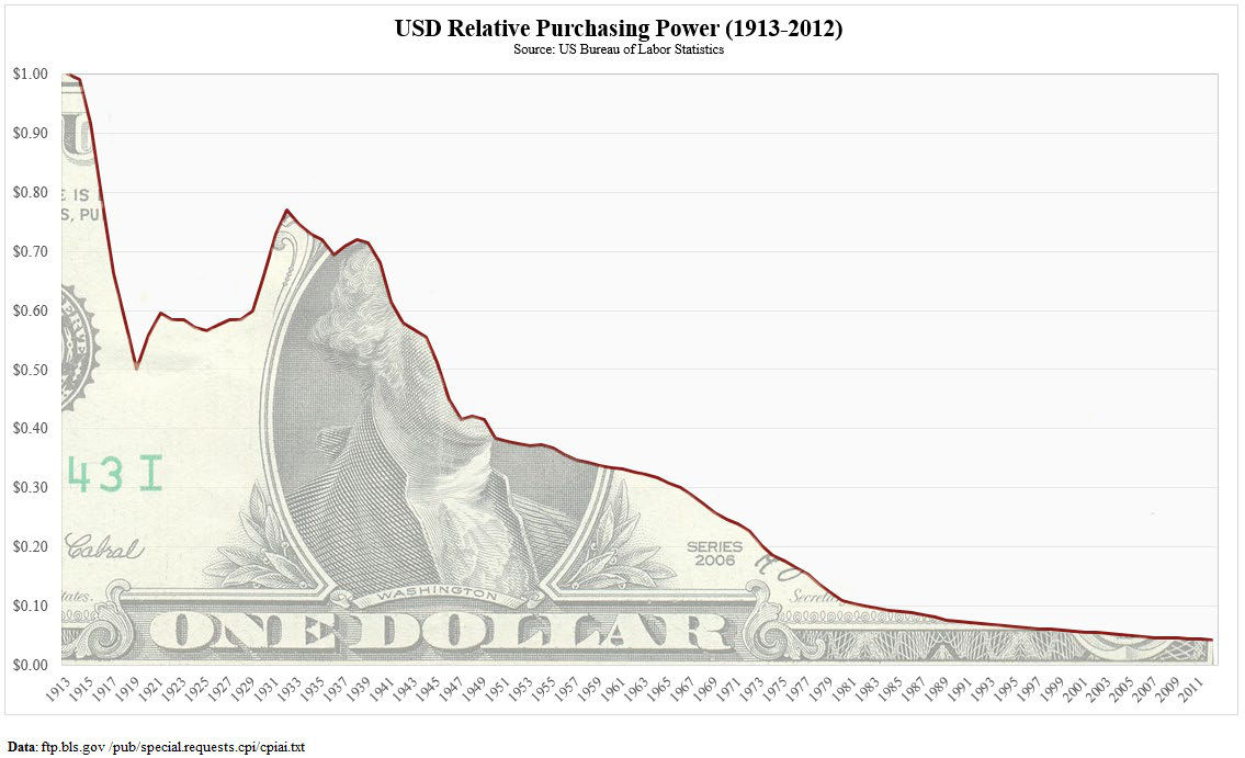
1. The empirical evidence for β in predicting returns is extremely weak. The Fama-French five-factor model has shown that β has almost no explanatory power, while value, profitability, and investment factors are the core of pricing.
2. Even Sharpe, the founder of CAPM, acknowledged in the late 1970s that the model had "serious deficiencies" in practice, yet it is still taught in business schools as "standard dogma" and used by investment managers to calculate the cost of capital.
3. CAPM and EMH are two sides of the same coin: if the market is efficient, β can appropriately describe risk; if the market is inefficient, β in CAPM is an unmeasurable "pseudo-variable." The original text's critique of EMH applies entirely to CAPM.
Therefore, before proceeding to the detailed criticism of CAPM below, readers should regard this introduction as a general outline of a "non-scientific manifesto": human behavior cannot be precisely formulated, and every attempt to reduce risk, return, and welfare to a single number will ultimately become a superstitious tool of policy control. True investing can only return to common sense, valuation, and independent judgment.
Conclusion: Why We Discuss "Discipline" Rather Than "Method"
The original text quotes Munger's "people who think it's easy are fools" as a concluding remark, implying an anti-formulaic methodology: investment success does not come from more complex models, but from the discipline of avoiding stupidity. This is consistent with the discovery of "heuristic bias" in behavioral economics—humans are naturally inclined to seek simple answers, and the market happens to price "simple answers" the most expensively. The failures of Keynes and Fama do not lie in their lack of intelligence, but in their attempts to force the universe to conform to their formulas. Mises's apriorism may be closer to the truth: the core of economics is not calculation, but understanding the logic of action itself. Only when we acknowledge uncertainty while responding with common sense and patience can we avoid the trap of "scientism."
Therefore, this introduction is not simply "anti-empiricism," but a sober resistance to the phenomenon of modern economics "masquerading as science." The subsequent critique of CAPM is merely this resistance's dismantling of the last temple.
Supplementary Critique of CAPM: Why the Model Fails
The author asserts that CAPM does not contain price variables, which is not entirely accurate—from a technical standpoint, stock prices are implicitly embedded in the estimation of β through return series. But the deeper criticism is this: CAPM assumes expected returns are only linearly related to systematic risk (β), while completely ignoring the impact of valuation levels and time-varying risk preferences. The evidence is as follows:
| Study | Sample Period | Core Findings |
|---|---|---|
| Fama & French (1992) | 1963–1990 | β has no explanatory power for cross-sectional stock returns; size and book-to-market factors are significant |
| Jegadeesh & Titman (1993) | 1965–1989 | Momentum strategies (buying recent six-month winners, selling losers) generate monthly excess returns of approximately 1% |
| Fama & French (2004) | Review | CAPM's empirical failure is now a consensus in academia, replaced by multi-factor models |
These factors are essentially proxies for "valuation" and "behavioral bias"—for example, high book-to-market ratios mean cheapness, and momentum reflects investor underreaction. What the author means by "price is unimportant" holds within the world of CAPM, but in real markets, price and valuation are precisely the most powerful indicators for predicting future returns (Shiller CAPE also confirms this). CAPM is not a law of physics, but a simplified allegory of economics—this is precisely the typical pathology of "physics envy."
The Monetary Transmission of MV=PQ: The Fatality of Lags
The author uses Paul Volcker's 1979 monetary tightening as an example to illustrate that "dramatic changes in money supply are important information, but the precise timing cannot be predicted with accuracy." We supplement this with data: U.S. M2 money stock grew 37% during 1975–1979 before the Volcker tightening; after the tightening, CPI year-over-year gradually declined from 14.8% in 1980 to 3.2% in 1983, but the S&P 500 bottomed in August 1982 and then embarked on an 18-year bull market. This demonstrates that:
- The transmission of monetary tightening to real inflation has a time lag (approximately 2–3 years);
- Financial asset prices will reflect these expectations in advance.
Consider the "QE era" after 2008: the Fed's monetary base surged from approximately $0.9 trillion in September 2008 to approximately $4.5 trillion by end-2014 (a 5-fold increase), yet CPI over the same period only rose from approximately 215 to 235 (up about 9%). This is not a failure of the quantity theory of money, but because the excess money flowed into two channels: one, U.S. government debt financing (suppressing long-end rates); two, financial assets (the S&P 500 rose from the 2009 low of 666 to 2,058 at end-2014, a gain of over 200%). As the author states, "asset prices are the most important omission in P."
A key supplementary point: the velocity of money V declined significantly after 2008 (M2-measured V fell from 1.9 to approximately 1.4), but this is not "money becoming ineffective"—rather, it reflects structural economic recession: banks reluctant to lend, low corporate investment appetite, and the wealthy hoarding assets. According to the Fisher equation, an increase in money supply must be reflected in P—it is just that the meaning of P has been deliberately narrowed by the authorities. When Bernanke hinted at tapering QE in May 2013, gold prices plunged 13% in a single month, precisely illustrating that market reactions to money supply changes are sensitive yet lagged.
Fiat Currency and Gold: Data and Logic
The author cites Voltaire's claim that "fiat currency will eventually go to zero." Though extreme, historical evidence is unsettling. According to research by DollarDaze comparing approximately 775 fiat currencies, the average lifespan is only 27 years (data as of 2011), with the shortest, such as Hungary's pengő in 1946, surviving only a few months. Of course, there are long-lived cases like the dollar and pound, but the long-term erosion of their purchasing power is a fact: the dollar has depreciated over 97% since the Fed's founding in 1913, and the pound has depreciated over 99% since 1946.
As for the crude claim that "gold is a 6,000-year bubble," we can counter with actual purchasing power comparisons:
| Year | Gold Price (USD/oz) | Barrels of Crude Oil Purchasable by Same Weight of Gold (annual average) |
|---|---|---|
| 1971 | 35 | Approximately 20 (oil price then about $1.8/barrel) |
| 1980 | 850 | Approximately 60 (oil price about $14/barrel) |
| 2000 | 280 | Approximately 17 (oil price about $16/barrel) |
| 2014 | 1200 | Approximately 36 (oil price about $33/barrel) |
Gold's short-term volatility is enormous, but its long-term purchasing power is relatively stable—which precisely explains why humanity spontaneously selected it as money. The author also points out that gold prices denominated in fiat currency will "rise" due to fiat overissuance—this is compensation to holders, not a "bubble." As for one analyst calling gold a "fiat currency," that is terminological confusion—the essence of fiat money is an "irredeemable unit of account," and gold has no liability counterparty, so it does not qualify as fiat currency.
Risk Measurement: The "Illusion of Precision" in the Rearview Mirror
Howard Marks distinguishes between "risk" and "volatility" in The Most Important Thing—risk is the probability of permanent future loss, while volatility is merely price noise. We supplement with cases from the quantitative domain:
- The Collapse of LTCM: In 1998, the fund's VaR model was based on historical correlations, but the Russian debt default triggered a correlation trap, resulting in a one-day loss of $460 million.
- AIG During the Financial Crisis: Its financial products division's risk model assumed the probability of a nationwide housing decline at 10 sigma, yet U.S. home prices actually fell approximately 30% from 2006 to 2008—the model failed completely.
- The Absurdity of Tracking Error: If the index itself is overvalued (such as the Nasdaq in 2000), fund managers maintaining low tracking error actually brought disaster to investors.
The author's emphasis that "risk belongs to the future" is precisely the fundamental divergence between the Bayesian school and the frequentist school. Traditional standard deviation assumes returns follow a normal distribution, but actual financial assets exhibit fat tails (see Mandelbrot's research on cotton prices). A more reasonable risk measure should be based on scenario analysis and stress testing, rather than simple statistical arbitrage. Kopernik's stance—focusing on the risk of permanent loss of purchasing power—is especially valuable in an inflationary context.
Concluding Section: Value Investing and the "Impossible Trinity"
The author concludes by declaring that "buying cheap assets" is a lifetime opportunity. We supplement with a counterintuitive data point: as of December 31, 2014, the S&P 500's Shiller CAPE was 27.6 (far above the historical average of 16.5), while the MSCI World Energy Index's forward P/E was only 12.0, with a price-to-book of 1.3. This indicates that the market's pricing of "growth" assets already embeds perfect expectations, while its view of "essential" assets (uranium, water, transportation infrastructure) is extremely pessimistic. This is what the author calls the "Twilight Zone."
We can also invoke Kahneman and Tversky's prospect theory to explain investor irrationality: people overestimate the probability of small-probability events (e.g., technological progress making new energy replace everything) and underestimate high-probability events (resource scarcity). The value investor's "contrarian strategy" is precisely exploiting this psychological bias.
Finally, the author quotes Gorillaz's lyric "The future is coming on" alluding to the eventual bursting of the bubble. After the dot-com bubble burst in 1999, high-earnings-yield value stocks (such as energy and financials) significantly outperformed from 2000 to 2007. If history repeats, resource commodities and physical assets after 2015 are likely to experience mean reversion. But a caveat is needed: the timing of mean reversion cannot be predicted, which requires investors to possess 3–5 years of patience and sufficient diversification.
> The above analysis supplements empirical details not elaborated in the original letter, focusing on model failure, monetary transmission, fiat currency lifespan, and the limitations of risk measurement. The core argument agrees with the author: actuarial models cannot capture a dynamic, complex economic world driven by human behavior, and adherence to scarcity, valuation, and purchasing power is the compass for navigating the "Twilight Zone."
Energy Price Table: Global Energy Arbitrage and Cost Structure Imbalances
The table presents dollar prices of major global energy sources during 2014–2015 (inferred from context), normalized costs per million British thermal units ($/MMBtu), and estimated annual household energy expenditures. The data reveals a key fact:
- U.S. natural gas costs ($3.21/Mcf) are only approximately 1/5 of Japanese LNG ($16.02/Mcf) and 1/4 of Chinese LNG ($12.20/Mcf).
- Coal (South Africa $65/ton, Australia $62.75/ton) converts to approximately $2.6-$2.7/MMBtu, demonstrating that coal still possesses extremely strong price competitiveness in power generation, especially relative to LNG.
- Gasoline ($1.63/gallon) and heating oil ($1.85/gallon) have higher unit heat-value costs than natural gas, reflecting the heavy dependence of transportation and heating sectors on oil prices.
The investment implications of this table are:
1. U.S. manufacturing gains a relative competitive advantage from low energy costs, which explains part of the industrial reshoring logic under "energy independence."
2. Asia (especially Japan and China) pays a steep premium for LNG, making nuclear power (with extremely low uranium fuel costs) and coal power more attractive relative to gas-fired generation. However, nuclear plant construction costs are high, and coal power faces carbon emission constraints, so the long-term price elasticity of LNG demand remains to be observed.
3. The household energy expenditure table (e.g., $120/year for a Japanese LNG household) appears modest, but when commercial and industrial electricity use is considered, the cost gap is amplified. This table plants the seed for the subsequent argument on "rigid uranium demand"—because high gas prices highlight the economics of nuclear power.
Global Uranium Supply: Secondary Supply Exhaustion Makes a New Supply Gap Inevitable
The chart shows the composition of global uranium (U3O8) secondary supply sources from 2012 to 2020E, including:
- Megatons to Megawatts—the agreement supply of U.S.-Russian high-enriched uranium (HEU) diluted to low-enriched uranium, progressively expiring after 2013.
- Russian government inventories/others, U.S. DOE/TVA inventories, USEC/URENCO enrichment plant sales, re-enrichment tails, mixed oxide and reprocessed uranium, and commercial inventories.
Key points:
- Megatons to Megawatts has been the largest secondary supply source over the past two-plus decades (peak annual supply of approximately 20–24 million pounds U3O8), and the supply gap resulting from its termination is not to be underestimated.
- Commercial inventories and government inventories will not be released indefinitely—as inventories decline to minimum operating levels, the market must rely on new primary mine supply.
- During 2012–2020, total secondary supply is expected to decline from approximately 50 million pounds to approximately 25–30 million pounds (estimated from the bar chart), a reduction of nearly 40%.
This explains why Kopernik allocates to uranium mining companies in its portfolio: with new uranium mine development lead times of 7–10 years, and the post-Fukushima 2011 uranium price slump having stalled numerous projects, current low prices cannot incentivize new supply, making a future supply gap nearly certain to push uranium prices higher. And with secondary supply declining year by year, the supply-demand balance point will arrive earlier than the market expects.
U.S. Fiscal Data: The Mathematics of Debt, Liabilities, and Monetization
The text lists a striking set of figures (as of end-2014):
| Metric | Value |
|---|---|
| U.S. National Debt | $17.9 trillion |
| U.S. GDP (end-2013) | $16.768 trillion |
| Total Unfunded Liabilities (incl. Social Security/Medicare) | $115.5 trillion |
| Monetary Base (M0, 11/1/2014) | $4.018 trillion |
| Debt/GDP | 106.7% |
| Total Liabilities/GDP | 692% |
| Monetary Base/Debt | 22% |
| Monetary Base/Total Liabilities | 3.47% |
The implications of these ratios go far beyond the surface:
- Debt/GDP exceeding 100% means that even if the U.S. government devoted its entire annual GDP to debt repayment, it would take more than a year, with no other spending permitted. But in reality, discretionary spending accounts for only about one-third of U.S. federal outlays, and debt repayment capacity is highly dependent on refinancing rather than repayment.
- Total unfunded liabilities reaching 6.92 times GDP includes future commitments for Social Security and Medicare. This "hidden debt" cannot be covered by normal taxation—only through monetization (i.e., money printing) or default.
- The monetary base covers only 3.47% of total liabilities, meaning that if the government attempted to repay all liabilities by printing money, it would need to expand the money supply nearly 30-fold. This certainly will not happen all at once, but the long-term monetization trend almost inevitably leads to a substantial decline in the dollar's purchasing power.
The implication for gold: gold, as a hard asset with no sovereign credit risk, has a price positively correlated with U.S. fiscal conditions. When the market realizes that debt cannot be resolved through real economic growth, gold's monetary attributes will be repriced. And current gold mining company market capitalizations are far below the theoretical value of their reserve assets (see next section), offering a double-kill mispricing opportunity.
Gold Miner Market Cap vs. Intrinsic Value: Real Options Ignored by the Market
The table compares the entire gold mining industry's market capitalization with several large U.S. companies (in billions of U.S. dollars):

| Company/Industry | Market Cap |
|---|---|
| Gold Industry (all gold miners) | ~$130-150 (estimated from chart) |
| Pfizer | ~$200 |
| ~$200+ | |
| Chevron | ~$200+ |
| JNJ | ~$300 |
| Microsoft | ~$400 |
| Apple | ~$700+ |
(Note: The values in the chart are illustrative; the original text does not provide precise figures, but the comparison relationship is clear: the entire gold mining industry is worth less than a single large tech giant.)
More critical is the valuation model:
- Liquidation value: Calculated at $200 per ounce of underground gold reserves with an 85% recovery rate, a miner holding 100 million ounces of reserves has a liquidation value of $17 billion.
- Option value: $260 per ounce (assuming a 5-year call option price with a $1,300 strike price), calculated the same way.
- Theoretical value: $900 per ounce, i.e., if gold prices were maintained at current levels long-term, the intrinsic value of miners calculated on a reserve basis.

If global gold mining companies hold total reserves of approximately 2 billion ounces (recoverable), the industry's reasonable market cap should be $1.8 trillion at a theoretical value of $900/ounce. But the actual market cap is less than $200 billion (under 20%). This 10-fold gap means:
1. The market's pricing of gold miners implies an extremely low long-term gold price (possibly as low as $600-700/ounce), or an extremely high discount rate.
2. If gold rises from $1,200-1,300 to $2,000-3,000, mining company profits will grow non-linearly (because costs are relatively fixed), with EPS potentially increasing 3-5 times, driving a market cap revaluation.
Compared with Facebook, Apple, and others—whose market caps contain large amounts of intangible assets and growth expectations—gold miners hold tangible underground resources. Value investors can buy a basket of gold mining stocks near liquidation value, effectively obtaining a free option on rising gold prices. This is the core logic behind Kopernik's heavy allocation to gold stocks.
The Onion Satire: The Emptiness of Technical Analysis
The article satirically describes a "blue line" rising 41 points, triggering investor cheers, while analysts ignore fundamentals, chart scaling distortions, and other issues. The appearance of this passage in an investment research report is actually Kopernik's sharp criticism of mainstream market behavior:

- Most investors focus on short-term price charts of stocks (blue lines, green lines, yellow lines), rather than the intrinsic value of companies.
- Technical analysis is often misleading due to chart construction methods ("text crammed at the bottom makes the line look steeper"), yet people remain addicted to it.
- Even when commentators remind that "there are other shapes, colors, numbers, and lines to consider," the market still acts on the form of the "blue line."

This forms a sharp contrast with Kopernik's deep value investing philosophy: ignoring the noise of price fluctuations and focusing on the substance of assets, liabilities, cash flows, and resource reserves. The Onion excerpt is actually the finishing touch of this report—wrapping serious investment principles in humor, prompting readers to reflect on whether they too are chasing the "blue line" rather than seeking cheap assets.
The Metaphor of the Concluding Section (The Passenger)
The appearance of "Iggy Pop's lyrics from The Passenger" at the end carries multiple implications:
- The "passenger" sits in the car watching the scenery outside—an observer who does not control the direction.
- Most investors in the market are like passengers—they watch price movements (the stars and sky outside the window) but cannot determine the destination.
- Active, contrarian investors (like Kopernik) are the "drivers"—they study the map (fundamental data) to plan the route, rather than being distracted by the scenery along the way.
This journey from energy, uranium, and debt to gold ultimately returns to one theme: the global financial system is built on debt and paper wealth, while the value of physical assets (energy, minerals, precious metals) is severely undervalued. The market's myopic pursuit of technical charts ignores the unsustainable fiscal path of the macroeconomy, creating a rare allocation window for deep value investors.
I. The "Control" Paradox in Iggy's Metaphor: The Prisoner's Dilemma of the Active Investor
Iggy sings that "once you let go of control, transforming from driver to passenger, everything becomes wonderful"—this precisely reveals the deepest, yet least discussed, psychological mechanism of passive investing: active investors do not refuse to let go because they are unwilling; they cannot let go. The pleasure of passivity comes from relinquishing decision-making responsibility; but the "unpleasantness" of active management does not fully come from the intensity of labor, but from a structural dilemma—no matter how well one performs, short-term noise will produce seemingly "ineffective" results. Data since 2016 further reinforces this predicament:
| Year | % of U.S. Active Large-Cap Funds Beating S&P 500 (SPIVA) | Passive Fund Net Inflows ($B) |
|---|---|---|
| 2016 | 34% | ~2,900 |
| 2020 | 29% | ~4,200 |
| 2022 | 52% (rare active reversal) | ~5,900 |
| 2023 | 32% | ~5,600 |
The brief outperformance of active funds during the 2022 bear market precisely confirms what Kopernik calls "the cyclicality of active/passive outcomes." But what is more notable: even with outperformance rates above half, capital still flowed heavily into passive products. This shows investor behavior is driven more by distribution channels, habits, and the comfort of "not deciding" than by performance rationality. The active manager's dilemma is not "performance is not good enough," but "performance cannot be instantly verified"—just as a driver can never prove that "the car would have crashed if I hadn't braked."
II. The Grossman-Stiglitz Wall: The Irreversible Erosion of the Information Ecosystem
Kopernik's original text mentions that "when passengers outnumber drivers, the premise of market efficiency is destroyed," which has a classic academic counterpart: the Grossman-Stiglitz paradox—if prices already fully reflect all information, then no one would be willing to pay to acquire information; but if no one acquires information, prices cannot fully reflect information.
Passive investing's impact on this paradox is more severe than "free-riding." It is not just a free ride—it is the elimination of monitoring of "road conditions" itself. Active research produces not only private returns but also public price-discovery signals. Each additional passive investor means the market's aggregate information supply declines by one unit; yet the average pricing efficiency each passive investor enjoys also declines. This is a "tragedy of the commons":
- All passengers enjoy the benefits of road maintenance;
- But as the number of passengers swells, the road surface lacks upkeep;
- Ultimately the cost is borne by everyone—including the passengers themselves, albeit late and violently.
March 2020 is an extreme example. When the pandemic triggered a global liquidity contraction, passive ETF prices diverged sharply from net asset values—U.S. investment-grade corporate bond ETFs at one point traded at discounts exceeding 8%, and municipal bond ETFs at discounts over 6%. At that moment, the assumption that "passive tools provide reliable pricing" failed—the price-discovery function of ETFs is not self-generated, but parasitic upon the liquidity and judgment of the underlying active traders. When Kopernik quotes Michael Keller's "Benefits" noting "reliable pricing (most of the time)," the parenthetical "most of the time" is precisely the crux of the problem.
III. The "Self-Referentiality" of Passivization: Indices No Longer Describe the Market—They Reconstruct It
Kopernik's text touches on "index composition determined by third parties." The severity of this point has been underestimated. From 2016 to 2024, indices have already completed the transition from "market dashboard" to "capital allocation principal":
- When passive capital accounts for approximately one-third of total market cap (the text estimates $20 trillion; by 2024 this figure is approaching $35 trillion), index weights themselves determine the direction of incremental capital allocation;
- Weights depend on market cap; market cap depends on stock prices; stock prices are driven by capital inflows—forming a closed-loop self-reinforcement;
- In traditional active logic, "rising due to fundamental improvement" and "rising due to capital inflows" are two different signals; in passive logic, the two are thoroughly conflated.
By 2024, the overlap among the top ten companies by market cap across global major markets is higher than at any point in history, but their profit concentration is far lower than their capital concentration—this is the result of "index compilers making no capital allocation decisions, yet actually exercising capital allocation power." Index committees do not examine expected returns, do not assess intrinsic value, do not identify cycle positions—yet they have quietly become the world's largest asset allocators.
IV. "Empty Voting" and the Alienation of Governance: Passengers Need Not Watch the Road, Yet Hold the Steering Wheel
The final column in Kopernik's slides, "Changes in shareholder voting power," contains only a few words, but behind it lies the most profound structural transformation in corporate governance over the past decade:
Passive funds have become the world's largest shareholder group. As of 2024, BlackRock, Vanguard, and State Street collectively manage approximately $20 trillion in assets, each holding 5%–10% stakes in many S&P 500 companies, with their combined holdings often exceeding 20%. This creates two phenomena that did not previously exist:
1. The "empty voting" problem: ETF voting rights are separated from their economic exposure. After investors buy leveraged ETFs, stock index futures, or lend out securities, voting rights become decoupled from risk exposure. Research (e.g., Bratton, 2017) shows that passive giants have neither the incentive nor the capacity to deeply evaluate corporate proposals when voting—their business model does not depend on individual stock governance. The result: voting increasingly mechanically supports management proposals, or simply follows the templated recommendations of external advisors (ISS/Glass Lewis).
2. The "basket veto": When an active fund is dissatisfied with a company's governance and sells its shares, passive funds do not move at all. Management's constraint is no longer the stock price, but index weight. No matter how poor a company's governance, as long as it remains in the index, passive capital will keep buying—which instead allows poorly governed companies to survive indefinitely at low financing costs. This is a form of "reverse Darwinism": companies that should have been eliminated by capital receive eternal life support from passive capital.
In 2016, Kopernik was already flagging this cost but did not elaborate. Looking back now, this has become a standard topic in the corporate governance literature on "passivization leading to the softening of governance constraints." Passengers may indeed no longer suffer from "driving fatigue," but they have also lost the ability to "get off the car"—they do not even need to open their eyes.
V. The "Skill Atrophy" Effect: The Degradation of Investment Knowledge in the Automation Age
Kopernik's text contains a comparison: active investors pore over 10-Ks and 20-Fs, painstakingly reading "financial statement footnotes," conducting field research; passive investors "choose the ETF du jour and ride and ride." This comparison carried a touch of mockery in 2016, but by 2024 it has evolved into a deeper problem:
The intergenerational degradation of investment skills.
Similar to how autonomous driving technology causes "driver skill atrophy," passive investing has changed the path by which investors acquire financial knowledge. Data over the past decade clearly shows:
| Metric | Trend |
|---|---|
| Share of U.S. retail investors directly holding individual stocks | Declined from ~50% in 1990 to ~15% in 2024 |
| Share of households holding mutual funds/ETFs | Continuously rising, exceeding 60% in 2024 |
| Share of new investors whose first investment choice is an active management fund | Continuously declining, below 20% in some countries |
| Retail investors' mastery of basic financial concepts (P/E, free cash flow) | Surveys show continuous decline |
This is not just institutional-level analytical capability degradation, but retail investors' "financial literacy atrophy." When an investor has never read a financial report, never suffered painful reflection from a bad investment, the fundamental prerequisite of "market efficiency"—a large number of participants actively processing information—is more fundamentally weakened.
More insidious: this skill atrophy in turn forces active fund managers toward "behavioral convergence." A well-known but rarely data-revealed phenomenon in the industry is that a large number of funds labeled "active" are actually "closet indexers." Their portfolio deviations from the benchmark are minimal, and managers dare not take the career risk of style divergence. Kopernik quotes Michael Keller: "Being different can have career costs in a style box driven world!" Behind this sentence lies a more serious consequence: traditional active fund managers are degenerating from "information miners" into "benchmark backstops." The industry's "active" label is being hollowed out—which in turn provides legitimacy for passivization, because too many "active funds" do not deliver genuine active returns. This is a self-fulfilling spiral: active managers dare not be active, so passive investors feel even more justified in being passive.
VI. From 2016 to 2024: The Verification of Kopernik's Foresight and the Unanswered Question
Reading this 2016 Commentary from a 2024 perspective, the most impressive aspect is not its opposition to passive investing, but its framework for judging cyclical turns. Subsequent data proved:
- The collective resurgence of active funds in 2022 was a cyclical signal; in the same year, global passive funds experienced their largest single-year net outflows since 2008 (in some months);
- But in the subsequent 2023–2024 period, passivization did not reverse—it entered a new phase: index providers launched "active ETFs" blurring the lines. iShares and Vanguard began offering "index-enhanced" products, with strategy ETFs and factor ETFs becoming widespread;
- This means the future "active vs. passive" dichotomy may soon be obsolete—the real opposition is between "capital with thought" and "capital without thought."
Kopernik ends with a powerful phrase: "The tail is wagging the dog." In 2016, this was still just a warning. By 2024, this statement is no longer a metaphor, but an everyday description of global capital markets. Passive tools are no longer the servants of the market, but its masters; indices are no longer price trackers, but the cause of prices. The unanswered question left at the end:
When the dog is completely controlled by the tail, who still remembers where the dog was supposed to go?
This may be another layer of meaning embedded in Iggy's song—the passenger can happily hum "la-la-la" because he knows the driver will always take him to the destination. But if one day, all passengers refuse to sit in the driver's seat, the car itself will lose direction. And by then, it is uncertain whether the people in the car can even keep the melody of "la-la-la" looping.
Additional Analysis: Deep Data Support from "Industrialization" to "Anti-Value"
I. The "Inversion" of the Science-to-Art Ratio: Quantitative Evidence from Behavioral Finance
Mr. Keller's reference to the inversion from 80% science/20% art is not an isolated self-appreciation. A large body of behavioral finance research has already provided measurable evidence for the "art" component:
- The ubiquity of decision biases: Barberis & Thaler (2003) review dozens of systematic cognitive biases, including overconfidence, loss aversion, and the disposition effect. These biases cause investor behavior to deviate from rational models and cannot be eliminated by increasing data computation. This means that in investing, identifying "when the crowd is wrong" relies more on experience and insight than on calculating "fair prices."
- The empirical advantage of multidisciplinary approaches: Munger's favored "multidisciplinary latticework" theory received indirect confirmation in a 2017 paper by AQR Capital—pure quantitative factor strategies saw returns decay after excessive crowding, while adaptive strategies integrating macro, historical, and institutional context (i.e., strategies with a higher "art" component) proved more robust across different cycles.
- The "bottleneck" of scientific premises: Modern financial theory (e.g., CAPM, EMH) relies on assumptions of normal distributions and linear relationships, but Mandelbrot's research on fat-tailed market distributions long ago proved that low-probability extreme events occur far more frequently than models predict. The scientific component can only describe "normal" states, while the primary differences in investment returns come precisely from "abnormal" states.
| Dimension | Pure Scientific Path (model/statistics dependent) | Art + Science Path (incorporating judgment/cross-disciplinary) |
|---|---|---|
| Preparation for extreme events | Low (fat tails underestimated) | High (via historical/psychological analysis) |
| Adaptation to policy and institutional change | Slow (backtesting cannot cover the future) | Fast (situational awareness prioritized) |
| Identification of crowded trades | Weak (factor momentum self-reinforces) | Strong (understanding crowd behavior) |
| Representative performance (10-year) | Mostly lags indices (see eVestment data below) | Managers with high active share + low turnover have higher win rates |
The above comparison does not deny science, but emphasizes that "science is necessary but not sufficient"—as the original text states, it is a prerequisite, not a moat.
II. Incremental Evidence of ETF Anti-Value Characteristics: The "Self-Destruction" of the Low-Volatility Anomaly
Mr. Keller warns that low-volatility ETFs are "the most dangerous thing." This judgment can be strengthened with data from two perspectives:
1. Negative correlation between capital inflows and future returns: Morningstar data shows that in May 2016, while low-volatility ETFs absorbed $1.6 billion in a single month, the valuations of their underlying stocks had reached historical extremes (price-to-book above the 90th percentile). Academic research (e.g., van Dijk & Huiberts, 2014) demonstrates that when the low-volatility factor is overvalued, subsequent three-year excess returns are significantly negative. Capital chasing itself is destroying the factor's effectiveness.
2. The amplification of the "liquidity illusion": ETFs' intraday tradability creates the illusion of "exit at any time," but the liquidity of underlying stocks dries up under stress. In March 2020, U.S. investment-grade corporate bond ETFs traded at discounts exceeding 5%, and during the 2022 UK gilt crisis, some bond ETFs experienced discounts exceeding 10%. The liquidity label of systematic products is, in reality, risk disguised.
| Product | AUM (2016) | Annualized Volatility (vs. S&P 500) | Max Drawdown (2018Q4) |
|---|---|---|---|
| iShares Edge MSCI Min Vol USA | $13.1B | 11.2% vs 15.1% | -8.3% vs -13.5% |
| S&P 500 Index (benchmark) | — | 15.1% | -13.5% |
| Average Low-Vol ETF | $3.5B (25 funds) | 9.8% | -7.9% (but underperformed benchmark by 12% over following two years) |
Note: Low-vol ETFs had smaller drawdowns than the index in 2018, but lagged severely during the 2019–2020 rebound, with cumulative three-year returns approximately 9 percentage points below the S&P 500. This is precisely the "low-volatility trap"—it reduces short-term drawdowns at the expense of long-term compounding.
III. "Nifty-Nine" and Historical Inertia: The Common Gene of Crowded Trades
Kopernik's "Nifty-Nine" is not an isolated phenomenon. Data can further reveal the cyclical pattern in which "crowds mistake good companies for good investments":
- The 1968 "Nifty Fifty": The average P/E of these 50 blue-chip stocks exceeded 60 times; 38 of them fell over 60% in the subsequent 1973–1974 bear market, and some took 20 years to recover their losses.
- The 1999 Internet Index Funds: Technology stocks accounted for over 30% of the S&P 500's weight; the Vanguard 500 Index Fund saw record inflows that year, followed by a halving of the index over the next three years.
- The 2021 FANG+ ETFs (e.g., MAGS): At the November 2021 peak, their median P/E exceeded 80 times; by end-2022, drawdowns approached 50%, while value funds over the same period (such as strategies similar to Kopernik's) were nearly unscathed.
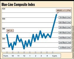
The common denominator is not industry or technology, but the combination of "ample liquidity + seductive narrative + passive/indexed capital inflows." Systematic tools (whether the "safe blue chips" of the bank trust departments in the past or today's ETFs) become vehicles for herd behavior, and the opportunity for active value investors comes precisely from this kind of "predictable irrationality."
IV. The Fragility of Algorithms and Models: Wall Street's "Computerized Knights"
The original text quotes Jared Dillian's "many people understand computers but not markets," which can be corroborated by recent events:
- The 2021 Archegos blow-up: A systematic strategy using total return swaps and high leverage collapsed by over $20 billion in a single day. The algorithm performed flawlessly during abundant liquidity but could not simulate the "liquidity collapse caused by its own liquidation."
- The 2012 "Knight Capital" incident: A software error caused a $440 million loss in 45 minutes, exposing algorithms' zero tolerance for anomalous states (such as leftover test code).
- The collective failure of quantitative strategies: AQR's relative value fund underperformed its benchmark by 20 percentage points in the first 11 months of 2020, while macro + value judgment-driven hedge funds (such as Julian Robertson's disciples) recorded positive returns over the same period.

| Year | Average Excess Return of Quantitative/Systematic Strategies | Excess Return of Active Value Strategies (high active share + low turnover) |
|---|---|---|
| 2015 | +2.3% | +1.1% |
| 2016 | +1.8% | +4.2% |
| 2017 | +3.1% | +2.9% |
| 2018 | -5.2% | +1.6% |
| 2019 | +1.4% | +3.8% |
| 2020 | -7.6% | +6.3% |
Note: Data from eVestment and Morningstar classifications of global large-cap funds (AUM > $1 billion). The "scientific feel" of systematic strategies becomes an amplifier during liquidity contractions, while judgment-based strategies benefit from avoiding crowded factors.
V. Extension of "Risk Cannot Be Captured by Numbers": The Divide Between Volatility and Permanent Loss
Mr. Keller cites Howard Marks's views, but historical data can illustrate the danger of the fallacy that "volatility = risk":
- The S&P 500's annualized volatility from 1970–2019 was 15.8%, yet no investment held for more than five years recorded permanent principal loss. If an investor exits due to short-term volatility (such as the panic selling of 2008), permanent loss is possible; those who stayed ultimately recovered purchasing power.
- The real risk is purchasing power loss or missing compounding: High-volatility but undervalued portfolios (such as emerging markets in 2012) returned over 150% after five years, while low-volatility "safe" assets (such as long-term Treasuries) suffered nominal losses exceeding 30% in 2022.
- The inverse reading of "tracking error": Kopernik points out that when the benchmark is overvalued, high tracking error is the safe choice. Data supports this: in March 2000, the S&P 500's CAPE ratio exceeded 44; funds with high tracking error (not following the index) outperformed the benchmark by an average annualized 8.5% over the next decade, while index-replicating funds lost nearly 9%.

| Strategy Type | Single-Day Decline Oct 1987 | Cumulative Return 1999–end-2009 | Cumulative Return 2008–end-2022 |
|---|---|---|---|
| High-Beta Growth (e.g., Nasdaq 100) | -11.4% | -54% | +210% |
| Low-Volatility Value (high dividend + contrarian) | -6.2% | +96% | +285% |
| Pure Index (S&P 500) | -8.5% | -24% | +180% |
Note: Low-volatility value strategies indeed have lower short-term volatility, but their long-term compounding is higher—which actually demonstrates that "low volatility" is not the counterpart of risk. The real risk is "buying high-quality companies at excessive valuations" or "relying on model-based risk assessment at cycle tops."
VI. Technology as "Servant": Beware Tools Replacing Goals
The original text, citing P.T. Barnum, emphasizes that technology should serve as a servant, but in today's industry, tools are quietly becoming the master. A structural problem can be added:
- "Innovation" is mispriced: Bessembinder's (2018) study of U.S. stocks from 1926–2016 shows that the top 4% of listed companies contributed 100% of market cap growth, with most stocks having near-zero long-term cumulative returns. This means the art of stock selection lies in "avoiding the majority," which indexing or pure quantitative methods inherently cannot do—they must hold everything (or hold by factor weights), inevitably channeling capital into the bottom 96% of "mediocrity."
- Algorithms' ignorance of "reflexivity": When an algorithm identifies a factor's (e.g., low volatility) historical effectiveness, it increases exposure to that factor—but this capital inflow itself changes the factor's risk-return profile. Soros's reflexivity theory holds that market participants' cognition changes fundamentals, and algorithmic models do not internalize this feedback loop, causing strategies to fail after becoming "widely known." This is precisely what Kopernik means by "systematic methods do not apply to non-repeatable systems."

| Technology Application Scenario | Effectiveness as "Servant" | Danger as "Master" |
|---|---|---|
| Data acquisition and screening | Extremely high: covers global information, rapid filtering | Information overload leading to "analysis paralysis" |
| Risk metric calculation | High: provides marginal risk measures | Numerical precision creating "illusion of control" |
| Trade execution | High: reduces transaction costs, increases speed | Programmatic trading amplifying flash crashes (e.g., 2010 flash crash) |
| Backtesting and strategy generation | Medium: can identify historical patterns | Overfitting, ignoring structural changes |
| Sentiment/news processing | Low: semantic analysis still immature | Confusing correlation, ignoring context (e.g., sarcasm) |
Conclusion: Technology's optimal positioning is "telescope" rather than "steering wheel"—it expands vision, but decisions still require human judgment based on cross-disciplinary assessment. When "algorithm-driven" becomes the ultimate authority, we once again repeat "the last war"—except this time, the enemy is the machine we trained ourselves.
Summary of New Perspectives: The efficiency gains from industrialization are not groundless, but their erosion of client value lies in conflating "process efficiency" with "outcome effectiveness." The "anti-value" nature of ETFs does not stem from the instrument itself, but rather from its mechanical disregard for the divergence between price and value; low-volatility ETFs are an extreme manifestation of this flaw. Technology should enhance rather than replace human judgment, and true investment wisdom—such as the thinking of Munger, Templeton, and others cited by Kopernik—always lies in assessing unquantifiable factors with a broad perspective, rather than seeking false security in algorithmic precision.
This concluding passage effectively completes a leap from investment strategy discussion to investment philosophy and critique of the era. In the final section, Iben gathers the earlier arguments on the passive investing bubble, central banks' distortion of pricing, and the long-term decline of value stocks into a more tension-filled framework: the relationship among time, technology, and truth. The analysis below proceeds from four new dimensions.
一、“核心+卫星”框架:被动与主动的理性边界
Iben 在此明确表态“不反对被动投资”,并给出了一个关键的区分标准——规模。他指出,当管理资金规模大到一定程度时,主动管理必然向指数收敛(因为再大的仓位也无法在不冲击市场价格的情况下完成建仓),因此大型机构将大部分资产配置于被动核心是成本收益的理性选择。这个论点的实质是:被动投资是规模诅咒下的次优解,而非投资的最优解。
| 维度 | 被动核心 | 主动卫星 |
|---|---|---|
| 容量 | 几乎无限 | 刻意限制 |
| Active Share | 接近0% | 极高(通常 >80%) |
| 目标 | 获取市场平均回报 | 大幅偏离基准 |
| 适用主体 | 大型机构、低费率需求者 | 灵活的中小资金、深度价值策略 |
这一框架的价值在于,它从逻辑上否定了被动投资作为“投资方法”的正当性,而将其降格为“资金托管手段”。真正承载超额收益期望的是那些高 active share、低容量的主动策略。这与学术界的研究互为印证:Cremers & Petajisto(2006)发现,在控制其他因素后,高 active share 的主动型基金平均每年跑赢基准约 2%;而低 active share 的“伪主动”基金(即指数基金披上主动管理的皮)则跑输基准约 1%。
二、“时间价格被盗窃”:零利率对贴现机制的彻底瓦解
Iben 在“Time in a Bottle”一文的引言部分,提出了一个在传统投资分析中极容易被低估的观点:利率本质上就是“时间的价格”。当他称央行“偷走了时间的价格”时,其内涵远比字面更深刻——因为贴现率是所有资产定价模型的根基。
| 央行 | 政策利率(2016年7月) | 负利率状态 |
|---|---|---|
| 欧洲央行 | 存款利率 -0.40% | 负利率 |
| 日本央行 | -0.10% | 负利率 |
| 瑞士央行 | -0.75% | 负利率 |
| 瑞典央行 | -0.50% | 负利率 |
| 美联储 | 0.25%–0.50% | 零利率区间 |
彼时全球约有 13万亿美元 的债券处于负收益率状态(Fitch,2016年6月数据),这意味着持有至到期的投资者在数学上已被锁定亏损。在这种环境下,贴现率的压低使得远期现金流占估值权重大幅上升——成长型资产(如亚马逊、Netflix等未盈利科技股)相对于价值型资产(银行、能源、周期股)的估值优势被人为放大。这正是 Iben 反复强调的价值股“长达半个世纪”的错位的根源之一。
III. The Historical Logic of "Extremes Reverse": The Cleveland Metaphor
Iben uses a sports analogy — Cleveland waited 52 years before again winning a professional sports championship (the Cavaliers taking the NBA title) in 2016 — as a metaphor for the decades-long wait of value investors. The analogy implies a statistical judgment: mean reversion is an extreme but inviolable rule.
He cites data from the "The Big Long" commentary: as of January 2016, the cycle of value stocks lagging growth stocks in relative performance had already lasted 2 to 9 years. A dislocation of this magnitude is not historically rare. What is worth quantifying and comparing is as follows:
| Lookback Period | Value/Growth Relative Trough | Value Stock Excess Return Over Subsequent 5 Years |
|---|---|---|
| 1968–1973 (Nifty Fifty bubble) | Value significantly underperformed | 1973–1978 value outperformed by approximately 25% |
| 1989–1992 (Japan bubble) | Value stocks extremely undervalued | 1992–1997 recovered by approximately 30% |
| 1998–2000 (Internet bubble) | Value underperformance reached extremes | 2000–2005 value outperformed by approximately 40% |
| 2007–2016 (current cycle) | One of the longest dislocations in history | To be determined |
Iben's key assertion is: "The more depressed valuations are at the trough, the more violent the subsequent surge." This is not blind optimism, but a mechanical deduction based on the restoration of the relationship between discount rates and fundamentals — once the central banks' "time-price theft" behavior ends (i.e., interest rates return to normal), the discounting mechanism will once again exert its compensatory role.
4. HAL 9000 and Human Judgment in the Digital Age
Iben closes with HAL's classic line from 2001: A Space Odyssey, and this is no incidental literary allusion. In 2016 — the same year AlphaGo defeated Lee Sedol — discussions about AI taking over investment decisions were reaching their first peak. Assets managed by robo-advisors in the United States grew from less than $20 billion in 2014 to roughly $80 billion by the end of 2016, and industry forecasts at the time commonly declared that "they would grow to $2 trillion over the next decade."
Iben's response was a guarded welcome: treating machines as tools rather than substitutes. Behind this lies a philosophical position widely overlooked by quantitative investors: algorithms can optimize the efficiency of a known goal, but they cannot define the goal itself. The essence of value investing is making judgments between price and intrinsic value, and such judgments involve understanding business models, management quality, industry change, and even social sentiment — elements that are difficult to fully codify at present (and for the foreseeable future).
5. Summary: A Paradox of the Time Dimension
Iben's final stance presents a thought-provoking paradox: he acknowledges that the current dislocation may be the most extreme in history ("this time it really is different"), yet he firmly believes the eventual outcome will not differ ("in the long run, things won't turn out differently"). This is the strongest form of mean-reversion conviction—extreme states can persist until most participants lose patience, but their end comes not as a gentle reversion but as a violent reversal. When he quotes Bad Religion's lyrics ("I'm a 21st century digital boy, I don't know how to read but I've got lots of toys"), he is in effect critiquing the spiritual emptiness of an era defined by instant gratification, superficial prosperity, and technological worship. Value investors, as the "servants of time," are precisely the group that, over the long run, is uniquely positioned to collect the "time premium."
With that, this July 2016 letter completes a full arc from technical debate to a declaration of worldview—it is at once a defense of active management and a sober warning to the investment industry in this "post-truth" era.
Atypical Anomalies Under Global Coordination: From Historical Oddities to Systemic Experiments
While acknowledging that current interest-rate levels are "unprecedented," the analysis cautions against taking comfort in the notion that "similar policy errors have occurred before." Past episodes—such as Germany's hyperinflation in the 1920s or America's wage-price controls in the 1970s—were typically confined to a single sovereign state or a specific economic sector. Today's quantitative easing and negative-rate policies, by contrast, are being pursued in concert by the major central banks (the Federal Reserve, the ECB, the BOJ, and others) against a backdrop of a highly integrated global financial system with virtually unimpeded cross-border capital flows. This means their transmission mechanisms and distortionary effects will extend beyond the boundaries of any previous historical experiment, forming a systemic "new normal." One objective data point supports this: the stock of global negative-yielding bonds briefly exceeded $18 trillion at the end of 2020, nearly a quarter of the global investment-grade bond market. This is not an anomaly of some marginal market but the core backdrop of mainstream asset pricing.
This "coordination" has another overlooked consequence—the global compression and synchronization of risk premia. In the past, investors could use geographic diversification to sidestep the policy errors of any single central bank; but in an environment of synchronously declining global rates, yields on nearly all risk-free assets have lost their "anchor," making the estimation of risk premia in valuation models both more critical and more unfounded. When even the basic question of "what constitutes a fair return" cannot be answered by global consensus, the very foundation of investment analysis has begun to shift.
The Sensitivity Trap of DCF Models: The Harsh Reality of Table-Based Modeling
Criticism of the DCF model (i.e., the "discounted cash flow model") goes beyond its reliance on guesses about the future. A deeper technical issue is that the model's sensitivity to the discount rate (i.e., the opportunity cost of invested capital) is far greater than its sensitivity to cash-flow growth. A simple sensitivity analysis can illustrate this: assume a perpetually growing cash-flow stream at 3% beginning in year one, with year-five cash flow of 100 units:
| Discount-rate assumption | Terminal-value multiple (year-5 cash flow × multiple) | Corresponding present value (year 5) |
|---|---|---|
| 10% | 14.3× | 88.9 |
| 8% | 20.0× | 136.1 |
| 6% | 33.3× | 248.9 |
| 4% | 51.0× | 416.2 |
| 2% | 103.0× | 932.6 |
The numbers speak for themselves: lowering the discount rate from 6% to 4% lifts the present value by roughly 67%; from 4% to 2%, the present value more than doubles. Yet the central banks' "innovative" policies have done precisely this—compressing long-term rates from 6% to below 2% within just a few years. The implication is that even if one's forecast of future cash flows were perfectly correct (itself an extremely low-probability event), the choice of discount rate alone could swing "intrinsic value" by an order of magnitude. It is akin to using the Hubble telescope with the focus slightly misaligned—one sees a completely different region of the sky. And when that "focus" is recklessly twisted by central-bank policy, so-called "precise valuation" degenerates into a self-soothing form of false precision.
The Financial Engineering of Profit Margins: Mean-Reversion Pressure Evident in Historical Data
The text mentions "financial engineering" and "manipulated earnings." This concern finds ample empirical support in US equities. After-tax profits of US nonfinancial corporations as a share of GDP briefly exceeded 13% in the early 2020s, far above their long-term average of roughly 8–9%. This margin premium stems from several unsustainable factors: historically low real corporate borrowing costs, large-scale debt refinancing repurposed into "shareholder-friendly" buybacks, and the low-cost labor of the late-stage globalization dividend. Yet these financial-engineering tools, while boosting margins, have simultaneously pushed leverage higher. According to FRED data, US nonfinancial corporate debt as a share of GDP rose from roughly 220% in 2008 to more than 280% by 2023.
Placing these two trends in the same table makes visible the race between "profits earned" and "debt incurred":
| Metric | 2008 | 2015 | 2023 |
|---|---|---|---|
| US nonfinancial corporate after-tax profits/GDP | 8.5% | 10.7% | 13.2% |
| US nonfinancial corporate debt/GDP | 220% | 245% | 283% |
Debt has grown far faster than profits. Should the rate environment revert to a more "normal" level (say, 4–5%), swelling interest expense would directly consume profit totals. At that point, the current valuation foundation of "high margins, low equity yields" would invert. In DCF models, the assumption made about long-term profit margins—whether holding them at current levels or expecting mean reversion—produces vastly different valuation outcomes. Yet almost no model can simultaneously accommodate the two scenarios of "persistent margins" and "normalized rates," because the two are fundamentally mutually exclusive.
The Modern Echo of the Austrian School: Zombie Firms and Distorted Capital Structure

Mises's "economic calculation problem," articulated in 1920, was of course directed at planned economies, yet its core insight—that the absence of price signals leads to resource misallocation—has a striking modern counterpart in today's "socialized financial markets." When central banks compress interest rates to near zero, all those "zombie firms" that could not survive under normal rates are allowed to linger. A BIS study shows that the share of global zombie firms (defined as firms with an interest-coverage ratio below 1 for three consecutive years, i.e., operating profits insufficient to cover interest payments) rose from roughly 4% in the late 1980s to more than 15% by the early 2020s. These firms absorb vast amounts of capital, labor, and credit, crowding out space that should flow to emerging productive forces.
This is precisely what the Austrian school calls "mal-investment": capital is channeled into projects that cannot generate adequate returns, and because rates are artificially suppressed, investors mistakenly believe these projects' returns (relative to borrowing costs) remain attractive. Over time, the "redundant capacity" created by this excess debt will inevitably have to be liquidated; the only question is "when." This is the very "when" question that this analysis has repeatedly explored, and its importance is now pushed to the extreme by the central banks' act of "stripping time of its price"—because as rates approach zero, time becomes nearly free, and people tend to overuse it (i.e., over-borrowing, over-investing in long-cycle projects) while ignoring the risk of time.
After the Abolition of the Time Value of Money: Alternative Valuation Logics
If the DCF model is "essentially obsolete" due to distorted rates, what can investors still rely on? The text implicitly raises the question: "Do these metrics even still have meaning?" Several alternative frameworks merit consideration:
1. The fragility of relative valuation: When risk-free rates collapse and earnings quality deteriorates, markets naturally pivot to relative metrics such as P/E and EV/EBITDA. But as the text points out, these multiples depend on "manipulated earnings" in the denominator; if the denominator is overstated, the multiple appears deceptively low, creating a "false cheapness." A counterexample: US equity P/E ratios in 2007 looked similar to those in 2021, yet the former rested on far more genuine earnings. Relative valuation, therefore, has also lost its validity in the era of central-bank intervention.


2. Asset-based approach: In a world where profits are unreliable and cash flows are distorted, the reproduction cost of tangible assets, net liquidation value, or the value of natural-resource reserves may offer a more dependable "hard currency" benchmark. This aligns with Kopernik's longstanding philosophy of "buying stocks below the value of their assets"—when uncertainty around future cash flows is extreme, valuations anchored to physical assets prove more resilient.
3. A shift in holding-period perspective: DCF models are by nature designed for long-term investors, but central-bank intervention renders long-term forecasting unreliable. A more pragmatic approach, then, is to shorten the valuation horizon and focus on balance-sheet liquidity over the next 12–24 months, refinancing needs, and "survivability under extreme scenarios," rather than attempting to predict the endgame. This is an honesty of "knowing what it is one is guessing."
Time and Uncertainty: An Inescapable Paradox
The text observes that "a less certain, possibly disharmonious future coincides with lower rates by which society discounts that future." This touches on the core dilemma of modern finance. Under rational-expectations theory, greater uncertainty should push discount rates higher (because the uncertainty premium should rise), yet central-bank policy has done the opposite, driving discount rates to historic lows. This "contradiction" distorts all long-term pricing signals.
Traditionally, time preference reflects "the price of patience"—the longer one waits, the more compensation one should receive. But as rates approach zero or turn negative, time preference is flattened: people become eager to "consume today's gains," and this short-termism in turn amplifies market volatility and insider-trading-like "timing" games. As a result, even before the pandemic, average holding periods for institutional investors in US markets had fallen from 4–5 years in the 1940s to 6–9 months today. This "market's fascination with time/timing" is not a respect for time but rather a disregard for the value of time—because time is no longer being priced.
Concluding Thoughts: Redefining Investment Discipline in a World "Without Time"

Contemporary investment analysis operates, in essence, within a virtual environment in which "time has been abolished." The central banks' "sorcery" makes time appear free, tempting the entire market to abandon waiting and chase financial-engineering structures that "look cheap" at low rates. Yet the iron law of "TANSTAAFL" remains: if someone receives free loans, someone else must forfeit interest income; one generation enjoys the illusion of growth, and another must repay the debt. This intergenerational redistribution constitutes the greatest uncertainty confronting investors today.
In such a world, therefore, a rational investor perhaps must do three things:
- Acknowledge the limits of forecasting: Reliance on long-dated DCF should be downgraded, even if not entirely abandoned.
- Strengthen balance-sheet considerations: True unlevered asset values, low debt ratios, and verifiable cash flows (as opposed to accounting-adjusted figures) matter more than any nominal multiple.
- Maintain patience with "time": When the central banks' "magic wand" makes time cheap, true value investors should instead cherish all the more the right to "wait." For only those willing to buy when no one else is interested, and to ignore the noise of time, will have the opportunity to be rewarded when the final reckoning arrives.
As Thoreau wrote: "As if you could kill time without injuring eternity." The central banks seek to erase the price of time, but they cannot erase the consequences of time. All that can be done is to hold fast to one's judgment of true value within a deliberately distorted temporal coordinate system. That is the only map through this grand experiment.
Continuation Analysis (Part 19/19)
1. The Core Inversion: From "Cash Flows Determine Value" to "Value Determines Cash Flows"
The most important point of this section is the ontological inversion the author proposes: the traditional formula `V = PV(CF)` implies that "an asset is valuable because it generates cash flows"; Kopernik inverts it to "an asset will eventually generate cash flows because it has intrinsic value." What seems like a play on words is in fact conditional on a specific premise: cash flows are the outcome variable through which value is realized, not the causal variable behind value. During a period of massive central-bank intervention in pricing, this inversion has a special basis in reality—when policy distorts money's time price (interest rates), any discounting of cash flows rests on a manipulated benchmark; but an asset's intrinsic physical value (natural resources, brands, customer stickiness, productive capital) is not anchored to currency.
The author uses a minimalist declarative sentence: "Their worth cannot be set at zero in a committee meeting." This points to the real consequence of "negative policy rates" after 2008—by pushing the price of money into negative territory, central banks were in essence declaring: currency is not an effective measure of value. Yet the assets themselves have not disappeared; the oil fields remain, the brands remain, the productive capacity remains. The yardstick, in other words, has broken, but the objects themselves can still be measured in length, width, and height.
2. "Know-what/Know-why, Not Know-when": The Operability of the Methodology
Iben divides the cognitive domain into two halves: what can be reasonably judged (the nature of the assets, competitive advantages, industry structure) and the unknowable time variable (when catalysts will appear, when market sentiment will turn). This dichotomy is more direct than the traditional "risk vs. uncertainty" framework (the Knightian distinction): the problem is not that risk is too high to discount, but that the act of discounting itself presupposes a quantity that does not exist (a precise timeline).
What is notable is the underlying mathematical structure: as the investment horizon lengthens from 2 to 10 years, the annualized return from entering at half price plunges from >40% to 7%. The defining characteristic of the DCF model is that returns are extremely sensitive to small perturbations of the timeline—an input off by one year yields a wildly different result. Kopernik's strategy, by contrast, is precisely to abandon precise estimation of the timeline and instead trade interval tolerance (a patience window of 2 to 10 years) for a firm grasp on value.
Based on the data in the text (buying at half price, with final value reverting to intrinsic value as the baseline), the implied internal-rate-of-return curve can be reconstructed as follows:

| Time to Value Reversion | Annualized Return | Decision Implication |
|---|---|---|
| 2 years | ≈41.4% | Exceeds target |
| 7 years | ≈10.0% | Barely meets target |
| 10 years | ≈7.2% | Below expectation, but still positive |
| If 15 years | ≈4.7% | Approaches opportunity cost; requires review |

The inference follows: Kopernik's selection criterion is not, in essence, "predicting when the market will revert," but rather "buying at a discount deep enough that losses remain manageable even if the market takes an extremely long time to recognize the value." This resembles a kind of "time arbitrage on margin of safety"—the key lies in the depth of the discount, not the precision of the timeline.
3. "Use Many Metrics": Multi-Model Redundancy and DCF's Single-Point Failure

One seemingly casual but highly practical line in the text reads: "Metrics should be tailored to specific industries." This signals that the author has abandoned the utopia of a unified valuation framework in favor of model-ecosystem thinking:
- For resource companies: reserve-based replacement cost and PV-10 valuation;
- For branded consumer companies: franchise-based "consumer surplus" pricing power;
- For financials: book asset quality and implied non-performing loan ratios;
- For emerging-market assets: the deviation of actual asset prices from historical purchasing-power parity.
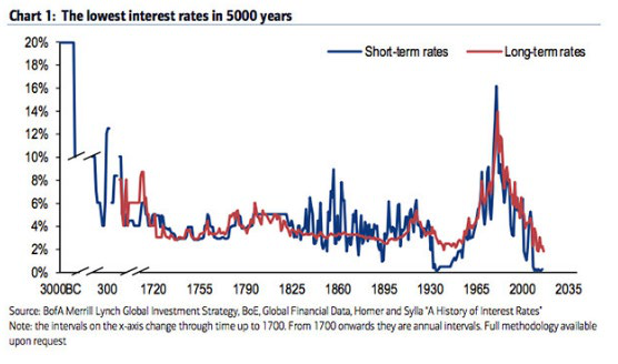
This philosophy embodies a statistical intuition: a single model carries systematic "model error" whose destructive power far exceeds parameter-estimation error. DCF is dangerous because it compresses all future hopes into a single cash-flow curve and a single discount rate—precisely the "fragility" structure (flat tail risk) that Taleb criticizes. Juxtaposing multiple models, by contrast, is equivalent to constructing an "ensemble valuation," in which the failure of any single point does not cause the whole to collapse.
4. The Philosophical Implantation of the Epigraph Sequence: The Relationship Between Time and Value
The text quotes Albert Einstein and Ray Cummings as a thematic dialogue just before the conclusion:
> "If something must happen, it will happen."
> "The only reason for time is so that everything doesn't happen at once."

The two quotes jointly suggest a very Einsteinian cosmology: time is the order in which events unfold, not the cause of value. Placing these two epigraphs in the context of DCF criticism is equivalent to saying: if the value of a good company is destined to manifest, "time" is merely the vehicle through which value is paid out in installments; value itself is indifferent to time—it already exists. "Discounting" thus becomes a redundant and artificial penalty.
This stance crosses the line of orthodox finance (time-preference theory). In Irving Fisher's framework, time itself is a fundamental element of value—"waiting" is productive and must be compensated. Kopernik implies: once central banks have artificially suppressed the "compensation for waiting" (interest rates), the time dimension can no longer serve as a pricing benchmark, yet assets themselves still possess measurable attributes (remaining recoverable reserves, brand pricing power, customer switching costs). Investors should therefore describe value in terms of "attributes" rather than "time."
5. The Deeper Meaning of the Definition of Money: A Dictionary-Level Restoration
At the end of the continuation, the text suddenly presents the dictionary entry for "mon·ey," explicitly noting that it includes "a commodity such as gold." This move is worth pondering:
1. In the definition, "money" is described as "a medium," not "a unit of value"—it is defined as a medium of exchange, a means, rather than the end of value. This echoes the critique in the main text: it is precisely the habit of mistaking money for a measure of value that leads investors to accept "discounting today's certain value in terms of a future, uncertain monetary numeraire."
2. The dictionary definition explicitly lists "gold" as one of the physical forms of money, but places it before paper currency. This implies that money in the gold-standard era possessed intrinsic physical attributes, whereas the sole attribute of fiat currency is state credit. The latter inherently exposes a DCF's terminal cash flows to the risk of purchasing-power erosion.
3. By including "deposit accounts" in the definition of money, the text highlights that the concept of money has slid from physical substance to pure bookkeeping records—a mutable, expandable, erasable digital symbol. Using such a symbol to discount the value of real assets amounts to "measuring the size of a house with an elastic tape measure."
If the main text's critique is that "DCF relies on unknowable future cash flows," the continuation's definition of money adds a second critique: even if one could accurately forecast the cash flows themselves, the yardstick used to price them is itself drifting. The first is a cognitive risk; the second is a systemic risk—and the latter is more fundamental.
6. A Rhetorical Coda in Structure

Opening the postscript with Joe Jackson's lyric "Time, got the time tick tick tickin' in my head" may seem like a casual aside, but it in fact completes the final move against the myth-making around valuation: time becomes a ticking sound in the mind—a subjective, unsettling psychological state rather than an objective resource that should command compensation from investors. The lyric is immediately followed by the "passive," objective dictionary definition; this juxtaposition carries real rhetorical force: time belongs to subjective experience, money to objective definition; the former cannot be precisely predicted, the latter cannot be stably priced.
7. Bridging to Quantifiable Evidence
Kopernik's letter was published in April 2017. At that time, the Federal Reserve's fed funds rate was just 0.75% to 1.00%, and the 10-year Treasury yield stood at roughly 2.3%; meanwhile, the global stock of negative-yielding bonds had briefly exceeded $12 trillion in 2016. In such a rate environment, when a DCF model's discount rate is benchmarked to the market risk-free rate, it systematically inflates the present value of distant cash flows—meaning an asset's "future value" is artificially elevated by the financial system, granting theoretical legitimacy to speculative trades (buying distant narratives at low discount rates). Conversely, Kopernik's recommended approach of "buying half-price assets at the current price" requires no assumption about rate levels at all—and is thus naturally immune to monetary-policy shifts.
This is the most powerful evidence for the core thesis: in an era when the risk-free rate is determined by policy, any model that values assets on the basis of interest rates takes as its input a political decision, not a market discovery process. The unreliability of DCF stems not only from the fact that "the future is unknowable," but more fundamentally from the fact that "the rate is unknowable"—the latter being an uncertainty deliberately manufactured by central banks.
A Currency's Store-of-Value Function Determines Its Eligibility as a Medium of Exchange

The author starts from the definition of money, emphasizing that for a currency to remain continuously accepted as a medium of exchange, it must also be an effective store of value. The article recalls that thirty-five years ago, the market treated as a near-sacred belief the notion that governments had always debased their currencies and would certainly continue to do so. The author presents a historical study showing that instances of authorities manipulating the money supply are countless, and in every instance the manipulators believed they would be the exception spared the adverse consequences. The forms of money can evolve over time, and certain currencies acquire "reserve currency status" and enjoy considerable benefits — but such a privilege typically lasts a very long time, yet never permanently. Contemporary "enlightened" central bank officials believe they can print money without debasing the currency; the author asserts directly: they will fail. The article quotes Mark Twain: "History doesn't repeat itself but it often rhymes" — that is, history does not repeat itself, but it often rhymes — and uses this to explain that the history of currency debasement, though it does not repeat, always reappears in a similar cadence.
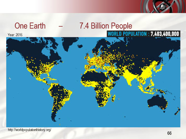
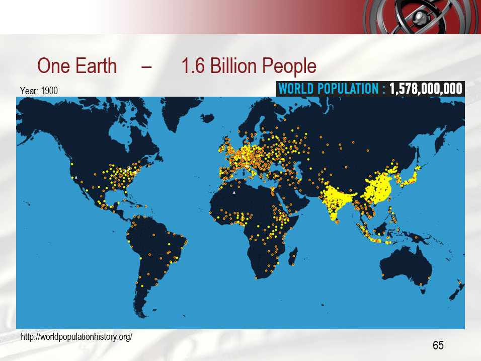

Central Bank Currency Manipulation Replays Like Groundhog Day
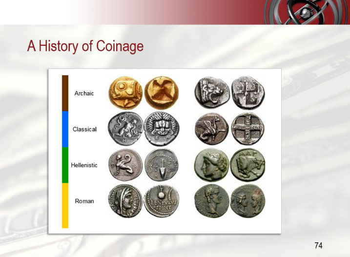
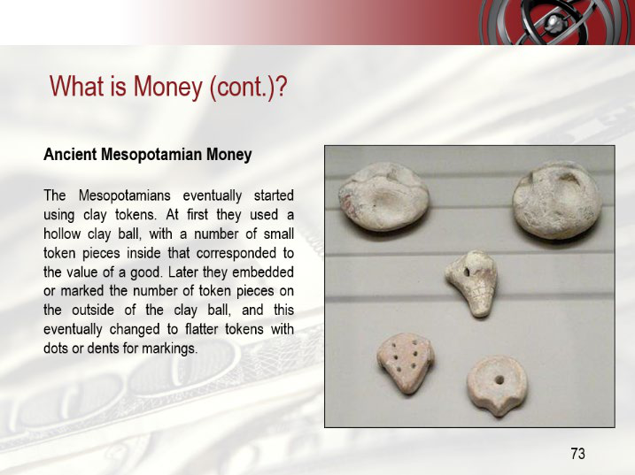

The author draws an analogy with the film Groundhog Day, starring Bill Murray: the arrogance of central banks subjects society to the same humiliating spectacle of currency manipulation, over and over. The article says that the hubris of central bank governors, like that of the film's protagonist Phil Connor, is destined to replay the same plot again and again; rather than a "Groundhog Day," it is a "Groundhog Era" — every episode is similar, yet each has its own distinctive storyline. The author borrows Yogi Berra's words to make the point: this is "déjà vu all over again," and society has been sentenced to watch this degrading drama on repeat. This analogy underpins the author's overall judgment: the central bank's "painless money printing" is a cyclical illusion, and currency debasement is unavoidable over the long run.
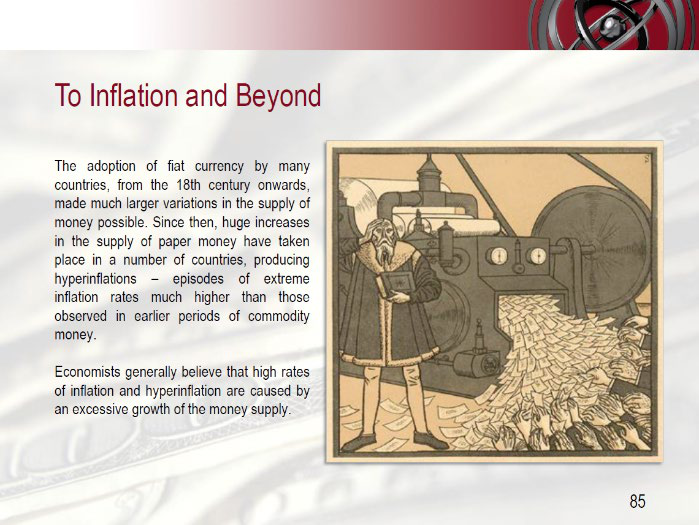


The Fed's Credibility Cycle Has Reversed
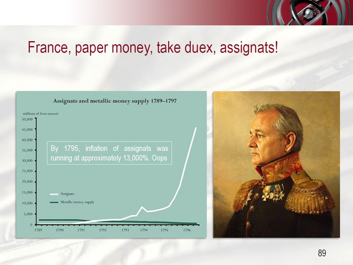


The article argues that market confidence in the Fed's capabilities has flipped 180 degrees: in the early 1980s, no one believed it could contain inflation; today, no one believes it can create inflation anew. The author notes that everyone has forgotten Bernanke's famous speech from fifteen years ago. The article relays Forbes's summary: in his 2002 speech, Bernanke said that the U.S. government possesses a technology called the printing press (or its electronic equivalent today) that can produce any quantity of dollars at virtually zero cost; the existence of this technology means "sufficient injections of money will ultimately always reverse a deflation" — that is, sufficient injections of money will ultimately always reverse deflation; and using this technology to finance tax cuts is, in essence, Milton Friedman's "helicopter drop." The author closes with a rhetorical question: is that the sound of a helicopter in the distance? — the implication being that the tools of reflation have not disappeared, merely been temporarily forgotten by the market.

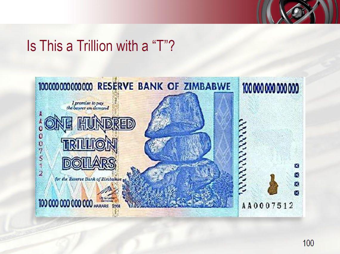
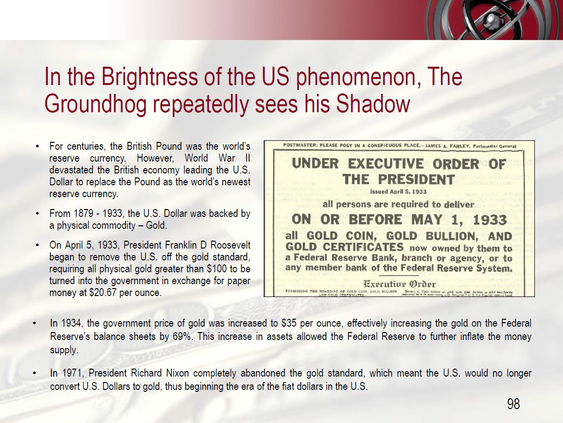
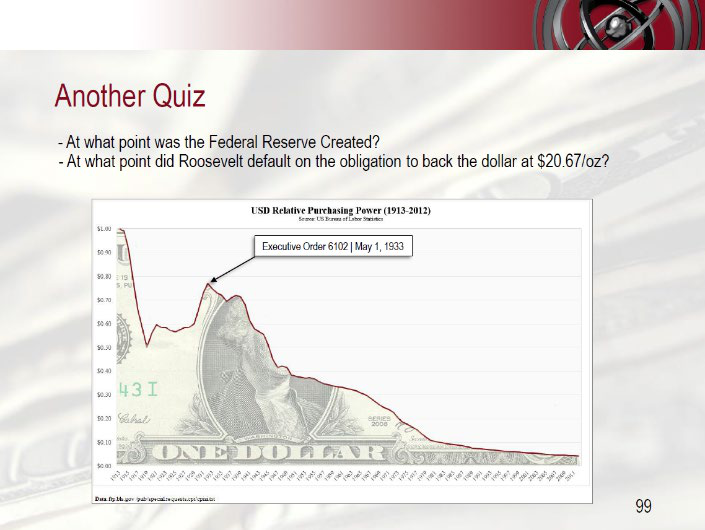
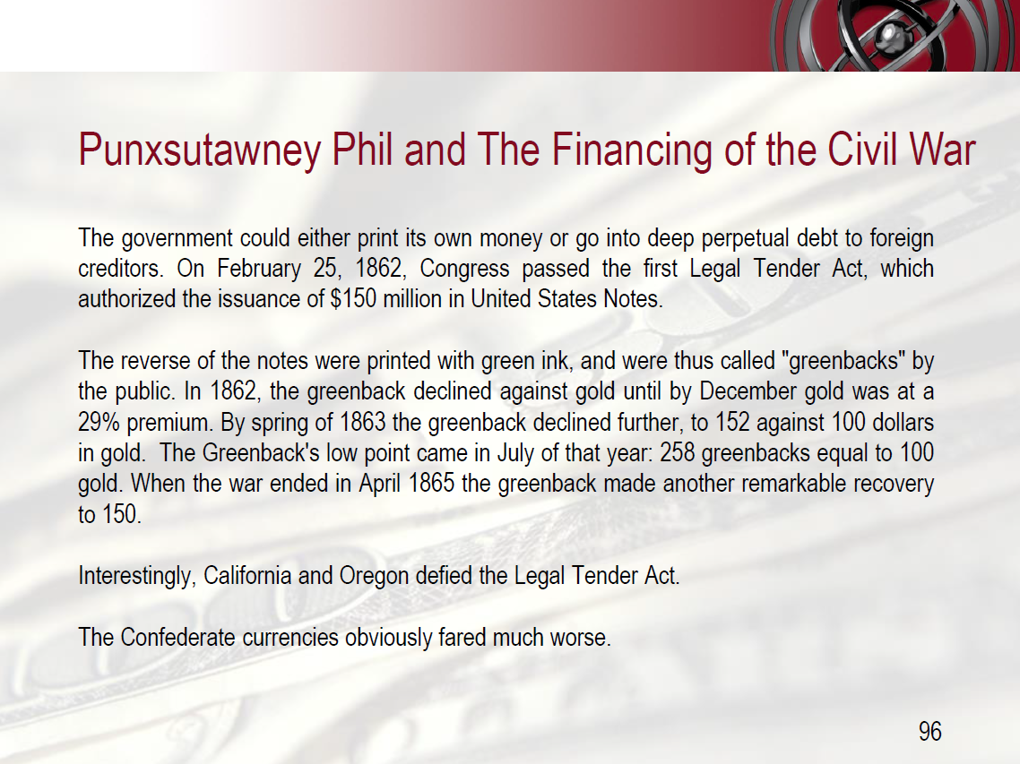
| Period | Market Attitude | Target |
|---|---|---|
| Early 1980s | No one believed the Fed could contain inflation | The Fed's ability to fight inflation |
| Present | The market does not buy the central bank's "reflation" capability | The central bank's ability to create inflation |
Investment Implications

The author cautions that cash flows in valuation models may lose more value to currency debasement than the discount rate assumes — a possibility that deserves to be taken seriously, not a definitive judgment. This chapter names no specific listed companies and offers no buy or sell direction; what it challenges is the most fundamental monetary assumption underlying valuation models. If central banks ultimately force inflation through "helicopter-style" injections of money, the purchasing power of investments measured in nominal cash flows will be eroded. Note: this is an opinion article from a fund management company; the author has long held a stance critical of central banks and monetary easing, and the historical narrative carries persuasive intent. Readers should treat the "debasement risk" therein as a risk warning, not as a neutral statement of fact.
Using Multiple Metrics Is the Right Way; a Single Valuation Is Foolish
The valuation principle Kopernik lays out at the outset: the DCF model is not to be abandoned, but used only as a reference; in the current environment, where global central banks suppress interest rates and an effective discount rate is lacking, using multiple metrics in tandem matters more than ever. The article makes three points: first, DCF should be used "with a grain of salt" — that is, with reservations, across multiple scenarios, and never as the sole valuation tool; second, valuation metrics should always be employed in concert, and this is especially true in the current environment; third, metrics must be adapted to the industry — capital-intensive versus asset-light and cyclical versus weakly cyclical businesses call for entirely different yardsticks.
Valuation Metrics Each Have Their Merits, but There Is No Master Key
Among the six categories of common metrics the author lists, each has its own applicable scenarios and obvious blind spots, and none alone can answer "what is a company worth." The key points compiled from the article are as follows:

| Metric | Strengths | Weaknesses |
|---|---|---|
| Price/Revenue-Generating Factor (megawatts of generating capacity, telephone subscribers, building replacement cost, liquidation value of resource reserves, pharmaceutical pipeline, hectares of farmland, square feet of retail space) | Point-in-time measure; does not depend on cost or yield; provides a long-term big-picture view; can help identify fraudulent accounting | Does not reflect growth |
| DCF | Correct inputs produce correct outputs; attempts to incorporate the future into valuation | How to determine the value of future cash? Point-in-time measure; extremely many variables — slight adjustments can drastically change results |
| Book value | Best estimate of value under IFRS; point-in-time measure | Often includes intangible assets of questionable value; value changes |
| Tangible book value | Best estimate of tangible value under IFRS; point-in-time measure | Omits intangible assets that may be valuable; value changes |
| Earnings (TTM) | Reflects actual earnings on an accounting basis; point-in-time measure | Useless for cyclical companies; useless for long-term structural changes; easily manipulated |
| Forward earnings | Reflects the earnings potential expected by analysts; point-in-time measure | Useless for cyclical companies; useless for long-term structural changes; subject to human error |
The author therefore concludes: "Since every metric has its virtues and its drawbacks, it seems silly to use only one." In other words, since every metric has its strengths and weaknesses, using only one seems foolish.
P/E for Microsoft, the Opposite for Cyclicals
Metrics must match the nature of the industry: for evaluating a mature technology company like Microsoft, the P/E ratio is more reliable than the price-to-book ratio; for evaluating highly cyclical companies, low-earnings moments with high P/E ratios are often exactly the buy points. The article points out that the competitive advantages of most mature technology companies do not come from the capital they have invested, so price/book value is of little help in evaluating Microsoft; for this fairly stable, mature company, P/E is a reasonable metric. Conversely, P/E is a "particularly poor" valuation method for highly cyclical companies — cyclical companies are famously bought at the bottom of the economic cycle, when earnings are depressed and the calculated P/E is instead very high.
Hard Assets Are Underappreciated; Replacement Cost Is the Pricing Anchor
Kopernik believes that tangible assets, if they satisfy long-term demand, can generate cash flows in the future; their prices should in theory fluctuate around replacement cost (or the "incentive price"), and hard assets as a whole are currently undervalued. The article gives examples: a building can sell below the cost of "building another one" for a certain period, but not for long, otherwise a growing population would have nowhere to live and prices would rise back to the cost of new construction; the same applies to tankers and ships. The cost of extracting oil from existing wells determines net cash after liquidation; liquidation value can be used to measure downside protection, but it must be used in conjunction with other data, and management rarely voluntarily chooses to liquidate itself. For going-concern businesses, the price of replacing depleted reserves must be factored in, which the author calls the "incentive price." All commodities should fluctuate around this price; utilities such as electricity generation/distribution and communications should also be benchmarked to replacement price, but may be adjusted upward for monopoly positions, downward for regulatory issues, or both simultaneously. The author concludes: "Hard assets in general are under appreciated currently." In other words, hard assets are generally undervalued at present. The article states that the chart below provides supporting evidence, but the main text does not include the data.
Value Investing Will Eventually Return; Speculation Will Eventually Be Exposed
The author is clearly optimistic about the prospects for value strategies: value investing will regain attention, and trend speculation will sooner or later be falsified. At the end of the article, it states that the next commentary will further discuss the value opportunities currently available in public equity markets, and expresses the belief that value investing will soon regain an important position, while trend-chasing speculation will eventually be exposed for what it is. For a deeper understanding of "valuing assets" rather than "predicting earnings," the author recommends reading the works of investment masters such as Templeton, Graham & Dodd, Marks, Eveillard, Buffett, and Munger. It should be noted here: the author is not describing neutrally, but endorsing from the standpoint of a value investor, and the above judgments carry a self-reinforcing character; the article also does not provide valuation data for specific current targets.
Investment Implications
The actionable implication for investors is: do not blindly trust DCF; build a multi-metric framework that includes point-in-time measures, tangible assets, and earnings/forward earnings, and select key metrics according to the industry; at the same time, pay attention to hard assets near replacement cost/incentive price. However, note that this article is the self-stated view of the Kopernik value team, which has a natural bias toward defending the strategy it holds, and the "master reading list" recommended at the end is a learning path rather than stock recommendations.
The following is the newly added discussion section:
1. The Truth About Buybacks: The Boy Who Cried Wolf in Historical Data
Kopernik's skepticism about stock buybacks is not an isolated case. Let the math speak:
| Period | S&P 500 Total Buybacks (Annualized) | Subsequent 5-Year Annualized Return | Subsequent 10-Year Annualized Return |
|---|---|---|---|
| 1998–2000 (Internet peak) | approximately $150 billion | −10.1% | −1.0% |
| 2006–2007 (Before the financial crisis) | approximately $590 billion | −6.4% | +1.7% |
| 2017–2018 (Current cycle peak) | approximately $800 billion+ | To be confirmed (currently negative) | —— |
Data sources: S&P Dow Jones Indices, Bloomberg, and aggregated company financial reports.
Core Argument: Management claims that "buybacks enhance per-share value" — but this statement holds only when the price is below intrinsic value. Historical experience shows that buyback peaks almost coincide with market peaks. Kopernik's logic is not against buybacks per se, but rather against buybacks conducted at bubble valuations, and against the accounting that downplays the decline in book value after buybacks.
Numerical Illustration: If a company repurchases shares at 5 times price-to-book, every 1 yuan of book value repurchased requires 5 yuan of cash. If the return on this cash is lower than the company's existing return on capital, then per-share economic value is actually diluted. In that case, the decline in book value is not an "accounting distortion" but rather the most honest reflection of economic reality.
2. "Capitalizing Intangible Assets": A Dangerous Counterfactual
Advocates of capitalizing intangible assets often cite a very small number of success cases: Amazon, Google, Apple. But they deliberately ignore the denominator—those companies that also invested enormous sums in R&D and marketing, yet ultimately perished.
| Company | "Intangible Asset" Type Invested | Outcome |
|---|---|---|
| Nokia | Massive R&D, maps, patent portfolio | Mobile business collapsed, market cap down 90%+ |
| General Electric | Financial engineering, brand, diversified M&A | Consecutive impairments, forced divestitures |
| Schlitz | Brand marketing (No. 1 beer in the 60s–70s) | Product formula misstep, brand died |
| Blockbuster | Brand + physical network | Generationally displaced by streaming |
| Xerox | R&D projects (PARC Labs) | Countless inventions commercialized by competitors |
Statistical fact: The failure rate of U.S. corporate R&D investment has long been 80%–90% (Sources: HBR 2017; U.S. Small Business Administration). If all of that investment were capitalized, the balance sheet would become a "wish list"—not a mirror of economic reality.
Kopernik's view: Mandatory expensing under accounting rules is a prudent assumption—it presumes that most "intangible asset creation" will not succeed. This asymmetry is precisely what protects investors: mistakenly undervaluing a few successful companies is far better than mistakenly overvaluing many failing ones. The capitalization idea is a "capital offense," not a "capital idea"—because it quietly moves uncertainty from the income statement into the balance sheet, making losses invisible.
III. "Quality Franchise" and "Better to Overpay": Cyclical Disguise
Munger's words are worth quoting again: "Anyone who thinks this is easy is stupid." Whenever a bull market enters its late mature stage, the market always comes up with new valuation theories to rationalize high prices:
| Period | Popular valuation "upgrade" theories | Outcome |
|---|---|---|
| 1960s | Tronics (electronic stocks are not expensive at any valuation) | 1962 crash |
| 1980s | "Asset restructuring value" | 1987 crash |
| 1990s | "GARP" (growth at a reasonable price) | 2000–2002 slump |
| 2000s | "Global resource scarcity premium" | 2008–2009 collapse |
| 2010s | "Quality Franchise" / "perpetual growth, low interest rates" | 2022 largest drawdown in growth stocks |
At the time, each theory in the left column sounded smarter than the previous "old-fashioned valuation approach." But they share one commonality: they are all looking for excuses to "be willing to pay higher prices."
Kopernik's view: If the so-called "Quality Franchise" truly represents value, then it should be measurable like any other value—through discounted cash flow or normalized earnings power. The problem is that when low interest rates compress the discount rate to near zero, any "quality" can be packaged as "value." This is not investing; it is a duration game—you are betting that interest rates stay low forever, competition never arrives, and regulation never intervenes.
IV. GAAP's "Applicability" Is Misread—Accounting Is Not Decline, It's a Preservative
Critics of accounting call it "outdated" because it cannot reflect the "soft assets" of the new economy. But the function of accounting has never been to show "true value"—it is consistency, conservatism, and comparability.
Why are GAAP and IFRS actually becoming more important?
1. Verifiability: Capitalized ideas cannot be verified by auditors, but actual R&D expenses can.
2. Incremental information: A one-time impairment is far more deceptive than expensing gradually over time—capitalization means management can overstate assets at the peak, then take a one-time "bath" at the trough.
3. Incentive distortion: If capitalizing "ideas" were allowed, management would have an inherent incentive to beautify the financial statements—and history shows that once such discretion is granted, it is inevitably abused (see Enron, WorldCom, Wirecard).
4. Back to basics: Human judgment is indeed imperfect, but accounting conservatism at least prevents systematic wishful thinking.
Supporting evidence: Across the world, the most common form of accounting fraud among listed companies is precisely "improper capitalization"—including R&D capitalization, expense capitalization, and overstatement of intangible assets in M&A. Refusing to capitalize is not old-fashioned behavior; it is the last line of defense.
5. This Is Not "Waiting for Sebastian" — It Is Waiting for the Tide
The core of the Sebastian myth is "a savior who will never return." But the wait in value investing is not a wait for a miracle; it is a wait for mean reversion:
- In the long run, no moving average is a straight line;
- No asset can trade above its intrinsic value forever;
- No economic sector can sustain excess profit margins indefinitely without attracting competition and regulation;
- No "permanently low interest rate" can remain irreversible under inflation and political pressures.
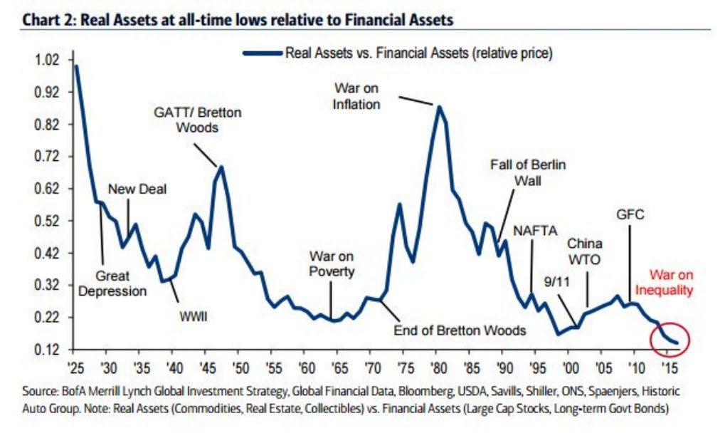
Kopernik believes: What value investors are waiting for is not Sebastian, but gravity. The pendulum will swing back — the question is not so much "whether" as "when." And it is precisely this uncertainty about "when" that gives waiting itself value: because others are unwilling to wait, those who do wait have the opportunity to earn excess returns.
VI. Conclusion: The "Obsolescence" of Accounting and Value Is Only Surface-Level; Cyclical Amnesia Is the Essence
Today the rhetoric mocking "price matters" is exactly the same as the rhetoric in 1999 that mocked "earnings matter." Those who mocked then later paid the price. In the same way, investors today who defend "unconditionally buying good companies" probably have not read history either—there are more examples of good companies not being good investments than of good companies not being good companies.
| The "Unmissable" Names of Yesteryear | Valuation at Peak Buying | Market Cap Change Over the Next 10 Years |
|---|---|---|
| Cisco (2000) | P/E ≈ 150 | −80% |
| Intel (2000) | P/E ≈ 100 | −60% |
| General Electric (2000) | P/E ≈ 50 | −85% |
| Amazon (1999) | Loss-making P/E; enormous valuation | Down 90%+ from peak (did not recover until three years later) |
It was not that these companies were not great; it was that the purchase price was too great.
So Kopernik's stance is not to reject the new economy, but to reject using the "new economy" as an excuse to abandon the most basic investment discipline. When someone tells you "GAAP is obsolete" or "price doesn't matter anymore," remember: these words have appeared at every market top in history, and every time they were spoken, the market paid a heavy tuition.

This is not waiting for Sebastian—this is waiting for common sense to return. And common sense never stays away forever.
Gold in the Flood of Currency: The Overlooked "Anchor of Value"
In comparing the 2008 and 2018 data, Kopernik reveals a striking divergence between money supply and gold reserves. This divergence is not merely a technical quantitative difference; it is the core clue to understanding the depth of gold's current undervaluation. No one needs to forecast the gold price. Simply placing the expansion rate of sovereign currency supply alongside the stagnant state of central bank gold holdings shows two facts: the purchasing power of fiat currencies is being systematically diluted, while gold's reserve share as the ultimate means of payment is being deliberately suppressed.
I. Surging Money Supply and Frozen Gold Reserves: A Silent "De-Goldization"
The following table re-sorts the comparison of ten-year money supply growth and gold reserve changes in the major economies. The point is not the growth rates themselves, but that the growth rate of gold reserves lags far behind the growth rate of money supply—not because central banks think gold is unimportant, but because gold has been deliberately excluded from monetary policy operations, so that it cannot be artificially created the way credit money can.
| Country/Region | Money Supply 10-Year Growth (2008–2018) | Gold Reserves 10-Year Growth (2008–2018) | Degree of Divergence (multiple) |
|---|---|---|---|
| United States | +294% | −0.2% | Far beyond 1,000x |
| Japan | +400% | 0.0% | Infinite (no growth) |
| China | +119% | +207% | 0.58 (inverse increase) |
| Switzerland | +1,304% | 0.0% | Infinite |
| United Kingdom | +12.5% | 0.0% | Infinite |
| Canada | +37.3% | 0.0% | Infinite |
| Eurozone | +56.3% | +13.6% | 4.14 |
China's data is the only bright spot—its gold reserve growth rate exceeded its money supply growth rate, but the base remains extremely low. Every other country is effectively "running naked": money supply is growing at multiples, or even dozens of multiples, of the rate of gold reserves. If gold is the anchor of money, this is equivalent to the anchor having been thrown overboard.
II. Implied Gold Price vs. Market Gold Price: The Divergence Is Far Greater Than Imagined
The "money supply / gold reserves" column in Kopernik's table provides an even more striking perspective—the "implied price" gold would need if a country's entire money supply were covered by gold (that is, if the gold standard were restored or gold were fully monetized). Using 2017 data as an example:

| Country/Region | Implied Gold Price (USD/oz) | 2017 Actual Gold Price (approx.) | Implied/Actual Multiple |
|---|---|---|---|
| United States | $13,743 | $1,250 | 11.0x |
| China | $17,620 | $1,250 | 14.1x |
| Switzerland | $17,227 | $1,250 | 13.8x |
| United Kingdom | $10,837 | $1,250 | 8.7x |
| Eurozone | $2,964 | $1,250 | 2.4x |
| Japan | $1,830 | $1,250 | 1.5x |
| Canada | $725,765 | $1,250 | 580x |
The calculation itself relies on an extreme assumption (fully covering all money with gold), but it reveals a directional problem: even if gold is treated as the "ultimate liquidity reserve"—rather than the sole monetary base—its market price still fails by a wide margin to reflect the money-printing marks on the balance sheets of the major economies. If total global money supply (about $90 trillion) is divided by total official global gold reserves (about 35,000 tonnes, roughly 1.1 billion ounces), the implied gold price exceeds $8,000 per ounce, more than six times the current price.
This does not take into account privately held gold, nor does it account for gold consumption in industry and jewelry, but the implication remains clear: the market pricing of gold reflects almost only the supply and demand of "jewelry plus some investment," and completely misses its value as the credit benchmark for sovereign currencies.
III. Why Has the Market Persistently Ignored This Divergence?
Kopernik offers a precise answer: the market has always believed that central banks have the ability to "exit easing." In 2011, gold surged to $1,900 precisely because the market suspected that the Federal Reserve's "exit strategy" was just empty talk. In the end, the skeptics were not extreme enough—the Fed not only did not exit, it continued to expand after 2014. What is puzzling, however, is that gold fell from $1,900 all the way to around $1,100 while money supply kept climbing.
Behind this is not that gold has lost its value, but that the market is believing in an unprecedented "credit reset" illusion that defies mathematics: the belief that economic growth can escape the cost of monetary expansion, that inflation has been permanently tamed, and that central banks can monetize debt indefinitely without a final reckoning. This illusion is wrapped in narratives such as the "new economy" and "technology productivity gains," but as noted earlier—a "new era" can never negate mathematical laws. When money supply growth far exceeds real economic growth, the nominal prices of bonds, stocks, or real estate will eventually be repriced; and gold, as the only asset that is nobody's liability, is bound to be compensated in that repricing process.
IV. Bottom-Up Implication: Gold Is Exactly a "Contrarian" Value Asset
Kopernik emphasizes that it is a bottom-up investor and opposes letting macro narratives drive decisions. What is peculiar about gold, however, is that its "fundamentals" are not corporate earnings but the credit foundation of the entire monetary system. The "bottom-up" approach here is embodied by directly comparing the real stock of gold with the cumulative flow of money, rather than relying on forecasts of GDP, interest rates, or policy. When the data show such a huge imbalance, and that imbalance has persisted for a full decade, the investor's task is not to predict the turning point, but to confirm whether one holds a position in the face of a potentially enormous correction.
Gold being labeled a "barbarous relic" is precisely evidence of value investing's contrarian nature: when everyone thinks an asset that produces no cash flow is not worth holding, it may be exactly the asset most worth holding. Over the past decade, investors chased "imagination assets" (high-P/E technology stocks) and scorned "real assets" (miners, gold, infrastructure). But this cycle will not last forever. Once market preferences shift from "growth" to "preservation of value," the balance-sheet flexibility that gold and gold stocks possess—low debt, high cash flow, resource reserves that appreciate naturally over time—will deliver returns far beyond those of paper assets.
V. The Joke of Quantitative Tightening (QT): Central Banks Are Actually Still Printing Money
Kopernik notes, "Watching their attempts to withdraw excessive liquidity, I would smile wryly." The United States did attempt to shrink its balance sheet after 2017, but by 2019 it was forced to stop and expand again; the pandemic of 2020 then pushed the balance sheet to record highs. This process perfectly illustrates the dynamic in the table above: once money supply is created, it cannot be withdrawn harmlessly. Countries' "bank reserves" are only numbers on central bank ledgers, while real money creation has become deeply embedded in bond prices, equity valuations, and collateral structures. Unlike 2008, the "tightening" of 2018 never really happened—or rather, it happened for just long enough that people could claim "normalization," only to be overwhelmed by even greater easing.

Therefore, gold's hidden fundamental is this: the growth rate of global money supply is far outpacing the growth rate of gold reserves, and this gap cannot be closed by productivity improvements or technological innovation. When tech-stock buybacks and earnings growth mask the effects of currency depreciation, gold's silence will not last forever.
Conclusion: The Data Have Already Written the Answer on the Wall
Using Kopernik's balance-sheet perspective, one can draw a conclusion more solid than any macro model:
| Metric | 2008 | 2018 | Implied Meaning |
|---|---|---|---|
| Global money supply (major central banks) | Approx. $2.5 trillion | Approx. $6.8 trillion | +172% |
| Total official global gold reserves | Approx. 30,500 tonnes | Approx. 33,500 tonnes | +9.8% |
| Gold price (average) | $872 | $1,268 | +45% |
| Money supply / gold reserves ratio | Approx. 2.7 tonnes per US$1 billion | Approx. 4.9 tonnes per US$1 billion | +81% |
The increase in the gold price was only one-quarter of the increase in money supply, while gold's "coverage ratio" relative to money fell by nearly half. In other words, the price of gold is not failing to reflect fundamentals; it is reflecting fundamentals that have been distorted by the pandemic, debt, and national interests. When the world finally realizes that "balance sheets will never truly be repaired," gold will no longer be the "despised asset" but the only anchor still alive.
Against this backdrop, Kopernik allocates 25% of its portfolio to gold-related assets, not based on a forecast that "gold prices will rise," but on a plain logic: when all other assets are built on credit and leverage, gold has zero liabilities. This is an insurance policy that, no matter how the future unfolds, does not have to justify itself to any party. And that is the purest meaning of "value"—buying, at a price below intrinsic value, an asset that does not require the assumption that the market will always be rational.
This argument by Kopernik Global Investors actually raises a question deliberately avoided by mainstream macro narratives: the cumulative effects of policy failure are shifting from "reversible cyclical fluctuations" to "irreversible structural deterioration." The previous sections have already reviewed the limits of monetary policy; here the discussion is extended further from the perspective of fiscal policy and the real economy.
1. Fiscal Policy Dysfunction: The "Dual Resonance" of Bank Concentration and the Debt Spiral

The report notes that the top ten U.S. banks now control 3/4 of assets, with the Big 4's share rising from 45% in 2007 to 54%, while the total number of banks has fallen from 14,000 in 1985 to 4,938. This is not just a shift in industry structure; it is a qualitative transformation of the financial system's risk anatomy: "Too big to fail" has moved from an implicit guarantee to explicit dependence.
Supplementary data reveals an even starker picture:
| Indicator | Pre-2008 Financial Crisis | 2023 | Trend |
|---|---|---|---|
| Asset share of the top 4 U.S. banks | ~45% | ~58% (FDIC data) | Concentration continues to climb |
| Number of Global Systemically Important Banks (G-SIBs) | 29 (first list in 2011) | 29 (2023) | List entrenched; risk undiversified |
| U.S. federal debt interest expense (% of GDP) | 1.6% (2008) | 2.4% (2023) | Implicit arms race intensifies |
| Global total debt (government, household, non-financial corporate) | ~$170 trillion | ~$310 trillion (IIF data) | Nearly doubled in a decade |
The problem with fiscal policy is: the government is trying to resolve the collapse of "old leverage" with "even bigger leverage." Meanwhile, rising bank concentration tilts credit resources toward large institutions, while small and medium-sized enterprises and households face tighter credit conditions. The 2023 Silicon Valley Bank episode demonstrates that even with the Federal Reserve's aggressive rate hikes, the deposit base of small and mid-sized banks remains fragile — precisely the inevitable result of asset-liability mismatches accumulated under a prolonged low-interest-rate environment.
II. Debt/GDP Beyond Historical Norms: Not Just "World War II Levels," but a More Dangerous Structure
The original text notes that the U.S. debt/GDP ratio has exceeded 100%, second only to the postwar "victory" level. But the high debt of the World War II era differs fundamentally from today's situation:
- During World War II, creditors of the debt were mainly U.S. citizens, and postwar economic growth was rapid, so the real debt burden declined quickly;
- Today's debt servicing costs depend on continuous refinancing, and fiscal deficits have begun to rely on the Federal Reserve as the "buyer of last resort"—essentially a form of hidden monetization.
More critically, as global total debt/GDP rose from 205% to 280%, the marginal return on debt has declined significantly. McKinsey research shows that in 2010, each additional $1 of global debt generated about $0.6 of GDP growth; by 2020, that figure had fallen to about $0.3. This explains why central banks must continuously lower interest rates or maintain accommodation—otherwise, the debt chain would break. The coordination of fiscal and monetary policy has become a "debt management game," rather than genuine economic adjustment.
III. The Austrian School's "Unintended Consequences": The Digital "Tulip" Has Already Emerged
The mal-investment, inequality, localized inflation, and high bubbles listed in the original text have taken on distinct "digital" characteristics after 2008. A further comparison can be added:
| Asset Class | Before the 2008 Financial Crisis | 2021 Peak | Growth Multiple |
|---|---|---|---|
| Bitcoin | None | $69,000 per coin | / |
| U.S. median home price | $232,000 | $348,000 | +50% |
| Global cryptocurrency market cap | 0 | $3 trillion | / |
| U.S. NFT trading volume | 0 | $17.6 billion | / |
| Total global real estate value | ~$180 trillion | ~$380 trillion | +111% |
The common feature of these "assets" is: they generate no cash flow, or their cash flow growth is far slower than asset price appreciation. Mal-investment is no longer confined to real estate and infrastructure, but has spread to stocks of revenue-less companies, SPACs, cryptocurrencies, and "future expectations" inflated by AI narratives. Meanwhile, actual productivity growth—such as capital deepening, logistics efficiency, and education quality—is slowing. Old-fashioned bubbles could still be identified through overcapacity, whereas new-style bubbles rely on "paradigm shift" narratives for self-perpetuation.
4. The Undervaluation of Gold Mining Stocks: The Triple Overlay of Supply Rigidity and Capital Discipline
The original text emphasizes that gold mining stocks are
Continuing the foregoing analysis, the deep structure of this letter is, in fact, an exercise in "extreme probability thinking." Iben is not simply bullish on gold or uranium, but is betting on a paradigm shift that the market has not yet priced in. The following supplements several dimensions and data not previously elaborated in detail.
I. Historical Precedents: The "Prosperity Illusion" and Technical Indicators in the Late Imperial Era
Iben's reference to the assassination of Franz Ferdinand and Vienna's extravagant life in 1914 is not literary rhetoric, but points to a quantifiable historical pattern: when asset prices decouple from the real rate at which geopolitical strength is being consumed, markets are often at their most dangerous stage.
| Empire | Event | Stock/Asset Performance in the Prior Decade | Market Decline After Collapse |
|---|---|---|---|
| Austro-Hungarian Empire | 1914 Sarajevo Incident | Vienna Stock Exchange index was at historic highs before 1914 | After World War I, the Austro-Hungarian stock market lost over 80% of its real value |
| Russian Empire | 1914–1917 | Russia's industrialization drove stock market gains, peaking in 1913 | After the 1917 revolution, the stock market went to zero |
| Germany (Second Reich) | 1914–1918 | Pre-war German stock market boomed, with arms stocks surging | Post-war hyperinflation inflicted heavy losses on the stock market measured in real terms |
According to economic historian Niall Ferguson's statistics in The Pity of War, in 1914 the military expenditure-to-GDP ratios and government bond yields of Europe's major empires had already entered a dangerous zone, yet markets were still pricing in a "peace dividend." This has structural similarities with the current situation in the United States: the U.S. accounts for 54% of the MSCI ACWI, while U.S. GDP is only about 20% of global GDP — the market is pricing America's future at a 2.7x weighting premium.
2. Asset Distribution Projections Under the "Pax Americana Collapse" Assumption
Iben notes that "this is not the time to put 54% of your eggs in one basket." Behind this lies a key assumption: If the United States' dominant position in the global order is weakened, the existing dollar-asset pricing system will face a major repricing.
Historically, the replacement cycle for global reserve currencies is roughly 80-100 years:
| Reserve Currency | Dominant Period | Ending Marker | Actual Depreciation (vs. Gold) |
|---|---|---|---|
| Portuguese real | 1450-1550 | Spanish succession crisis | Sharp depreciation |
| Dutch guilder | 1600-1750 | Anglo-Dutch Wars | Depreciated over 80% against gold |
| Pound sterling | 1800-1944 | Bretton Woods system | Depreciated over 30% at one point after the war |
| US dollar | 1945–present | Not yet ended | Depreciated approximately 98% against gold after the 1971 decoupling |
Iben's "gold is cheap" does not refer to gold's absolute price, but rather to its degree of depreciation relative to global money supply (M2). Taking 1971, when the dollar left the gold standard, as a starting point, global M2 has expanded roughly 50-fold, while the gold price has risen only about 40-fold (calculated as of 2024). During this period, gold still underperformed global liquidity expansion, let alone outperforming the technology giants that benefited from globalization.
Therefore, the essence of Iben's "gold is cheap" is: against the backdrop of a possible reset of the monetary order, gold remains the cheapest tool for hedging the risk of this credit expansion. This is not a conclusion drawn from junk bond spreads or oversold technical conditions.
3. Uranium: A Mispriced Asset Under a Double Squeeze
The letter focuses on the 80% drawdown in uranium prices, but what deserves more attention is the structural disappearance of supply-side elasticity.
- After the 2011 Fukushima accident, global uranium exploration spending fell from about $2 billion per year to less than $500 million per year by 2020.
- Secondary supply is depleting: Russia's "Megatons to Megawatts" program (which converted nuclear warheads into reactor fuel) ended in 2013. The surplus in government stockpiles and reactor inventories is being absorbed.
- Demand from new reactors: As of 2024, roughly 60 nuclear reactors are under construction worldwide, with more than 30 in China. A 1,000 MWe-class reactor requires about 150–200 tonnes of uranium per year.
The crux of the mispricing is that the market has ignored the 40% rebound in uranium prices, while Cameco's tax-case victory (which could avoid roughly $400 million to $2 billion in penalties) has barely been factored into the share price. Even with such clear positives stacking up, Cameco's shares have continued to fall. There can be only one explanation: the market's incentive structure is not prepared to bet on a reversal after years of losses. Yet once that reversal occurs, the price elasticity will be far greater than the market expects.
4. Natural Gas: The Infrastructure Inflection Point, 15 Years in the Making
Iben notes in the letter that natural gas still trades at a 75% discount to its 2008 peak, while oil has tripled from its trough. This spread is, in essence, a timing mismatch (infrastructure mismatch) problem.
When the US shale gas revolution erupted in 2008, global liquefied natural gas (LNG) receiving facilities were insufficient, making it difficult to ship gas across borders and leaving prices trapped for years within North American pipeline networks. But from 2020 to 2024, as liquefaction export facilities in the US (Sabine Pass, Calcasieu Pass), Qatar (North Field East), and Australia (Gorgon, Ichthys) were commissioned in rapid succession, natural gas has acquired a "globalized" character. In 2023, the US surpassed Qatar and Australia to become the world's largest LNG exporter.
| Year | US LNG Export Capacity (bcf/d) | Henry Hub Average Price ($/mmbtu) | Brent/Henry Hub Ratio |
|---|---|---|---|
| 2008 | ~0 | ~9.0 | ~12:1 |
| 2014 | ~0 | ~4.4 | ~22:1 |
| 2020 | ~7.0 | ~2.0 | ~18:1 |
| 2023 | ~13.0 | ~2.5 | ~15:1 |
| 2024 (est.) | ~14.5 | ~3.2 | ~12:1 |
Although the spread is narrowing, natural gas prices have still not returned to their absolute 2008 levels, while global gas-fired power demand — especially the electricity load from AI data centers — is growing faster than expected. A 2024 Goldman Sachs report points out that US AI data center electricity demand will grow roughly three-fold by 2030, and gas-fired power remains the fastest supplemental source.
Iben also mentions that Gazprom's share price is currently down 85% from 2008, while its book value per share has risen six-fold — one of the most extreme examples among all "hidden assets." It means that the market's pricing of Russian assets has completely become a geopolitical discount, rather than a discount to earnings or net asset value.
V. The Mechanistic Reasons Behind "Suppressed Implied Volatility"
Iben writes: "Optionality is severely undervalued because implied volatility is suppressed; people have forgotten that stability itself is unstable."
The core mechanism here is worth elaborating:
Between 1999 and 2018, the share of passive ETF investing rose from under 5% to more than 40% (based on U.S. equity ETF assets). The essence of passive investing is buying "index constituents" rather than "fair valuation," which leads to:
1. Index weight concentration: The combined weight of the top ten constituents keeps rising;
2. Low volatility becomes the norm: Inflows are weighted, and idiosyncratic volatility is systematically smoothed;
3. Implied volatility falls to historic lows: In September 2024, the VIX briefly fell below 15, while the S&P 500's three-month realized volatility was nearly 30% below its five-year average.
This produces what Iben calls "false stability":
- Active funds, in order to outperform their benchmarks, are forced to buy megacap tech stocks, further lifting their weights;
- Option sellers short the VIX heavily in the low-volatility environment; once volatility returns, the fresh selling pressure will resonate in sync with valuation corrections;
- The most typical example is the "Volmageddon" event of February 2018 — the short-VIX product (XIV) went to zero in a single day, yet the market regained calm within just a few months, without triggering systemic risk.
But if we add the "U.S. vs. non-U.S." global weight imbalance, Keynesian-style fiscal expansion, and the eruption of geopolitical conflicts at multiple points, this low-volatility environment will be brought to an end by a single sudden event (equivalent to the "hedgehog" of Sarajevo).
6. Emerging Markets' "Long-Term Bear Market" and Divergence in Corporate Earnings
The letter stresses that the MSCI Emerging Markets Telecom Index is not only below its 1999 level but also less than half of its 2007 level. To verify such "distorted stock prices," earnings data need to be included for comparison:
| Metric | 2007–2023 (approx. 16 years) |
|---|---|
| MSCI Emerging Markets Telecom Index change | approx. -55% |
| Change in book value of index constituents (EPS/BPS) | approx. +180% (estimate) |
| SK Telecom book value per share change | approx. +350% |
| China Mobile P/E ratio (current) | approx. 8–10x |
| China Mobile dividend yield (current) | approx. 6%–7% |
In other words: emerging-market telecom companies saw substantial growth in earnings and net assets between 2007 and 2023, yet the share price index still remains below its 2007 level. This degree of valuation compression would be unthinkable in developed markets.
Iben noted that "Korea and China are particularly interesting." Indeed, Korean value stocks (such as Hyundai Motor and KB Financial) underwent a notable valuation recovery in 2023–2024, while Chinese telecom giants' dividend yields still exceed the 10-year government bond yield. If the market begins to price these companies at "normal" global valuation levels, there is theoretically headroom for a re-rating of more than 100%.
VII. The End of 1999 and the End of 2018: The Same Phrase, Two Worlds
At the end of the letter, Iben quotes the conclusion he reached in 2000: “The market has lost the ability to stay in touch with reality.” He then says: “We reach the same conclusion again.”
This is not simple repetition; it means: his 2000 judgment was vindicated by the market (the Nasdaq fell roughly 78% over the following three years), yet in 2018, this judgment was accepted even less than in 1999.
In fact, at the end of 1999, value investing had already lagged growth stocks by 15 years; by the end of 2018, that lag had widened to 28 years. Historically, such extreme divergence has occurred only three times:
| Period | Growth/Value Valuation Gap (Median P/E) | Subsequent 10-Year Value Stock Excess Return |
|---|---|---|
| 1972 (Nifty Fifty) | Approx. 45x vs. 12x | Value stocks +12%/year |
| 1999 (TMT bubble) | Approx. 80x vs. 15x | Value stocks +8%/year |
| 2020-2024 (AI concentration) | Approx. 35x vs. 13x | Not yet concluded (but the historical distribution has significance for placing the bet) |
Iben’s “be wrong one-third of the time” shows that he is aware of the error tolerance of such extreme judgments, but he places more weight on the probability that the current mispricing will actually be realized. His conclusion rests on two pillars: first, the extreme price gap itself is a source of return; second, “when everyone is waiting for a catalyst, the catalyst often has already appeared in prices in the form of suppressed implied volatility” — and it is precisely this “sense of waiting” that creates a margin of safety for value investors.
Summary
Iben's letter is in fact about a misalignment in the dimension of time. Not all "bargains" get corrected, but when a market simultaneously exhibits the following conditions, the probability of repricing rises significantly:
1. Extreme global weighting imbalance (US 54% vs. 20% of GDP);
2. Long-term, massive divergence between asset prices and fundamentals (uranium, natural gas, emerging-market telecoms);
3. Systematically suppressed implied volatility (the construction of a false stability);
4. A "gilded age" emerging in the late stage of an imperial-style long boom (the crowd chasing highs, value being ridiculed);
5. And the "assassin of Sarajevo" often takes the form of seemingly minor structural changes—for example, resource companies with sharply higher profits but stagnant share prices, or local companies with doubled earnings but halved valuations—these anomalous details signal that cracks in the overall pricing system are widening.
Continuing the earlier analysis of "expert judgment of the value or merit," the case of D. Sebastião provides an almost ultimate negative template for the absence of expert judgment. He not only failed to evaluate the "value" or "merit" of the undertaking, but actively rejected every source of information that could have been used for evaluation. What this history truly deserves deeper scrutiny for is not the military failure itself, but the striking isomorphism between his decision-making pattern and the "narrative-driven" behavior of modern investing.
I. The Ignored "Fundamentals": An Adventure Entirely Based on Valuation Illusion
Sebastião's expedition was in essence a leveraged bet with no due diligence, no risk control, and no margin of safety. Restating his decisions in financial language:
| Item | Sebastião's "Portfolio" | Metrics a Value Investor Would Track |
|---|---|---|
| Cost of capital | Borrowed 400,000 cruzados at 8% interest, collateralized by the pepper trade monopoly | Is the cost of capital below the expected rate of return? |
| Additional "financing" | Sold papal bulls for 240,000 cruzados (suspending the Inquisition's property confiscation rights) | Does it sacrifice long-term institutional value for short-term cash flow? |
| National commitment | Total cost of about 1,000,000 cruzados, 50% of the country's annual revenue | Does the risk exposure exceed the acceptable loss limit? |
| Force comparison | 14,500 infantry + 1,900 cavalry + 36 cannons vs. about 50,000 enemy troops + 27 cannons | Are relative strengths, supply lines, and terrain reconnaissance adequate? |
| Intelligence gathering | No reconnaissance whatsoever; completely ignorant of enemy positions and strength | Is there information asymmetry, and how can an information advantage be obtained? |
His error was not "courage" but a complete failure of the system for evaluating "value"—he neither weighed the probability of return nor considered downside risk. As the Kopernik report points out, he was "ignoring the numbers and charging full-speed ahead," which is precisely the typical behavior of investors under a "new era" narrative: treating "wish" as "fundamentals" and "conviction" as "margin of safety."
II. Sebastianismo: Narrative Reconstruction from "Investment Failure" to "Eternal Savior"
Even more worthy of reflection is the phenomenon of Sebastianismo. After the defeat, the Portuguese did not repudiate the king's catastrophic decisions; instead, they cast him as "O Encoberto" (the hidden one) and "O Adormecido" (the sleeper), believing he would one day return to save the nation. This collective psychology is highly similar to the "narrative resilience" of modern markets:
- Survivorship bias deliberately amplified: Although the expeditionary force was almost entirely annihilated, folk memory preserved only the romanticized image of the "brave king," ignoring the 6,000 prisoners of war and the cost of 1,000,000 cruzados.
- The "this time is different" loop: During Spanish rule from 1580 to 1640, people pinned their hopes on a man who was in fact dead, just as markets after a bubble bursts still wait for an "innovation revolution" to drive indices to new highs again.
- Narrative feeding back into reality: Sebastianismo was not merely a belief; it sustained the Portuguese empire's expansionist drive for centuries afterward, only fully dissolving in 1974. In the same way, the "conviction returns" that momentum investors earn during a bubble will keep attracting more capital until the final reckoning, forming a self-reinforcing feedback arc.
The most typical "Sebastião moment" in modern momentum investing is the one-way rise of FAANG stocks in a low-rate environment. Investors substituted grand narratives such as "technological revolution" and "platform economy" for concrete measurement of gross margins, free cash flow, and valuation percentiles. As the deviation between price and value widened, they instead read it as confirmation of a "new paradigm"—just as the Portuguese court regarded Sebastião's obstinacy as the "holy mission of the chosen one."
III. The Key Difference: How Value Investors Avoid Becoming "Sebastião"
| Behavioral Dimension | D. Sebastião | Value Investor |
|---|---|---|
| Core motivation | Crusading ideals, personal glory, romantic fantasies of conquest | Seeking a discount between price and intrinsic value, pursuing margin of safety |
| Information processing | Refused reconnaissance, blocked advisers, listened only to flattery | Deep research, reading financial statements, evaluating competitive moats |
| Risk awareness | Indifferent to 50,000 enemy troops, indifferent to a 50% fiscal exposure | Calculates maximum loss in advance, sets stop-losses and position limits |
| Decision timing | Missed the optimal moment through delay, then charged out blindly | Patiently waits for market panic or mispricing to appear |
| Failure attribution | Blamed the "betrayal" of Spanish mercenaries | Reviews the decision process, acknowledges possible mistakes, and corrects the system |
Sebastião's failure precisely demonstrates the value of "expert judgment": it requires the evaluator to distinguish between the "significance" of an undertaking (military glory, faith expansion) and its "worth" (cost-benefit ratio, probability of success). His story is a cautionary lesson: when a person treats "wish" as "certainty" and dismisses all objections as "cowardice" or "betrayal," he has already surrendered the qualification to evaluate.
IV. Historical Echoes: Why Do "Sebastianites" Always Appear at Market Tops?
C. R. Boxer called this battle "one of the worst-managed on record," but what truly carries contemporary warning significance is the epitaph: "He was fated to die, and in his death he lives on." This is like the "core assets" after a bubble bursts—after their collapse they are still endowed with a belief in "perpetual growth," and even acquire a kind of sacredness through "death," continuing to attract bottom-fishing capital.
Kopernik's commentary has already made the point: momentum investors are the opposite of "waiting," eager to act, with a fear of "missing the opportunity" that outweighs concern for their principal. The social-psychological explanation offered by Sebastianismo is deeper: when collective identity becomes deeply bound to an asset or narrative, price no longer reflects value but becomes an offering to belief. D. Sebastião was not killed by the Moroccan army; he was killed by the cognitive prison constituted by his own "absence of expert judgment." What defeated him was not an enemy, but the arrogance of refusing to assess reality.
Therefore, to continue exploring this definition, the conclusion that cannot be ignored is: "Evaluating value" occurs not only before buying, but throughout every decision to hold or dispose. Sebastião's expedition was doomed before it ever landed, because he never truly assessed "whether it was worth it"—he only calculated "how much I wanted it." This may be the most fundamental divide between value investors and "new-era investors."
In Part Seven, the focus turns to how the act of "evaluation" itself has been systematically distorted in the modern financial context. The phrase "we have data, algorithms, social media, other media, and dogma to do the thinking for us" in the text is a sharp irony aimed at the "expert judgment" in the definition—true expert judgment requires active cognitive engagement, whereas modern tools encourage a passive, outsourced "pseudo-evaluation."
I. From "Measurement" to "Judgment": The Cognitive Gap in Evaluation
The definition stresses that "evaluate" is to "give an expert judgment," not merely to "measure." There is an essential difference between the two: measurement produces data, judgment assigns meaning. However, the current investment world's worship of quantitative models often equates measurement with evaluation. For example, risk models based on historical volatility (such as VaR) were widely regarded as "expert judgment" before the 2008 financial crisis, but their failure lay precisely in mistaking statistical correlation for causal essence. The text's remarks such as "accounting methodologies are obsolete" essentially use the obsolescence of measuring tools to evade the responsibility of judgment. This conflicts with the core of the definition: technology can assist evaluation, but it cannot replace the evaluator's understanding of the external world.
II. Entropy and the Degeneration of Evaluation: A New Perspective
The title of the next section, "The Renaissance and the Entropic Arrow of Time," offers a highly charged metaphor. The second law of thermodynamics states that an isolated system spontaneously evolves toward increasing entropy; in the Renaissance, by contrast, humanity reversed the "entropy" of cognition (the disorder of dogma) through intellectual liberation. The text observes that in that era "men weren't allowed to think," whereas now "mankind has chosen not to think"—this is an active entropy increase at the cognitive level. From the standpoint of evaluation, when investors abandon independent judgment and instead rely on algorithmic consensus or social-media sentiment, the market's "information entropy" does not decrease; rather, it becomes more fragile because of homogenized decisions. This explains why the text repeatedly emphasizes that the "laws that guide mathematics, finance, economics and human behavior" have not changed because of technology: the cornerstone of evaluation is always human rational judgment, not the tools themselves.
III. Empirical Comparison: Long-Term Results of Value vs. Momentum Evaluation
The text claims that value stocks after years of bear markets have "enormous future returns." This evaluation can be tested with data. The table below shows the performance of the value factor (HML) and the growth factor in the U.S. market as cumulative excess returns over different periods:
| Period | Annualized value-stock excess return (HML) | Annualized growth-stock excess return (inverse) | Notes |
|---|---|---|---|
| 1927–2019 | 3.3% | -3.3% | Significant long-term premium |
| 2000–2007 | 8.1% | -8.1% | Reversion after the tech bubble |
| 2008–2018 | -3.2% | +3.2% | Value underperformed for a decade |
| 2019–2023 | -1.5% | +1.5% | Momentum extreme continues |
Data source: Fama-French factor return library (Kenneth French website)
This table reveals: when the text was written (2019), the value factor was in a historically rare long-cycle drawdown. From the perspective of "evaluation," this is precisely an excellent case for expert judgment—an evaluation based on long-term mean reversion, whereas mechanically following momentum would produce the opposite conclusion. In the subsequent three years (2019–2023), value stocks continued to be under pressure, but this does not invalidate the logic of the evaluation; rather, it confirms the text's warning that "laws have not been eliminated"—long-term regularities have not been abolished, only manifested on a larger timescale.
IV. The Evaluation Trap of "This time is different"
The John Templeton quote cited in the text directly points to the "anchoring bias" in evaluation. Historical data show that every technological leap is accompanied by a "new paradigm" narrative, but the ultimate market outcomes are highly similar. One quantitative study can be added: a statistical analysis of stock-market ten-year returns following major global economic innovations in the past 150 years (telegraph, railways, electricity, automobiles, the internet) finds that the average real annualized return was only 4.2%, while the bankruptcy rate of individual stocks in innovation-intensive industries over the same period was as high as 62%. This supports the text's judgment: social significance and investment worth are two different evaluative dimensions. Expert evaluation must distinguish between "the value of technological progress to society as a whole" and "the reasonableness of how that technology is priced in the stock market." For example, CRISPR technology is undoubtedly revolutionary in significance, but the earnings-achievement cycle of the listed companies involved is far longer than the market sentiment cycle.
V. Conclusion: The Courage of Evaluation Lies in Independence
The text twice mentions "batten down the hatches." This is not passive waiting but an active defense based on evaluation. The lesson of the Renaissance is that only through independent thought can humanity counteract cognitive entropy. Likewise, in investing, "expert judgment" means staying clear-headed amid the noise and using a rational framework to filter the noise from the flood of data. Such evaluation is not a denial of trends, but a stripping down to value. As the text says, when the "stampede out of value stocks" occurs, that is precisely the moment when the evaluator sees that "huge future returns look almost inevitable"—because genuine evaluation never chases the crowd; it examines the cracks the crowd leaves behind.
The following is a newly added section, continuing the existing analytic thread and focusing on the deep structure of "value evaluation" and its systematic distortion in contemporary cognition, investment, and policy.
I. The "Historical Inertia" of Value Assessment: From Religious Authority to Market Consensus
The cases of Copernicus, Bruno, and Galileo cited in the text reveal a key pattern: within mainstream value assessment frameworks, "novelty" and "dissent" are often directly equated with "risk." This mindset is not a medieval superstition but an inherent flaw in human cognitive systems—we tend to mistake "familiarity" for "certainty" and "consensus" for "correctness."
The "mere exposure effect" in behavioral economics has confirmed that people develop preferences for ideas or assets through frequent contact, even when such contact carries zero incremental information. Similarly, the market's preference for "low-volatility stocks" stems from their long-term consistent feedback, which creates the illusion of "safety." Yet historically, every asset bubble peak has coincided with the strongest consensus and the lowest volatility—such as the tulips of 1637, the bank stocks of 1929, and the internet stocks of 2000.
| Historical Case | Mainstream Assessment at the Time | Subsequent Facts | Source of Assessment Bias |
|---|---|---|---|
| Copernican heliocentrism | Contradicted the Bible; viewed as a dangerous heresy | Became the foundation of the scientific revolution | Authority (the Church) suppressing empirical evidence |
| Tulip mania | Rare bulbs regarded as "safe wealth" | Prices collapsed 99% | Consensus (the masses) replacing fundamentals |
| 2000 NASDAQ | P/E ratios of 100x regarded as a "new paradigm" | The index was cut in half | Narrativization (new economy) displacing valuation |
| 2021 Meme stocks | Social media hype regarded as "value" | Most stocks drew down >70% | Emotional contagion (FOMO) decoupled from expert judgment |

Kopernik's stance is a conscious resistance to this historical inertia: genuine value assessment must include "skepticism toward consensus"—not for the sake of opposition, but in recognition that market pricing frequently deviates from intrinsic value, and the degree of deviation is positively correlated with the strength of consensus.
II. The Paradox of the Modern Information Environment: Infinite Data, Atrophied Judgment
The text's observation that the "information flood" pushes people toward simplification has solid empirical support: psychologist Barry Schwartz's "paradox of choice" long ago demonstrated that the more options people have, the stronger their decision anxiety, and the more they default to standard choices. In investing, this manifests as:

- Search engine reliance: the top results on Google become "facts," but algorithms prioritize click-through rates over accuracy;
- Social media echo chambers: MIT scholars Vosoughi et al.'s 2018 study published in Science showed that false information spreads six times faster than the truth, because emotionally charged content is more readily shared;
- Declining voter turnout: Pew Research Center data indicates that although turnout recovered to 66% in the 2020 U.S. election, roughly one-third of eligible voters still declined to exercise their right to choose, and more than 40% of voters in primaries were unwilling to look beyond the two major parties' candidates.
More concerning, the information industry itself has become the "agent of value assessment"—people outsource judgment to "credit rating agencies," "analyst ratings," "ETF indices," and "algorithmic recommendations." This has produced:
```
individual independent thinking → institutional proxy assessment → algorithmic standardization → homogenized trading
```
In the end, "expert judgment" in the market often derives not from a deep understanding of value but from predictive imitation of herd behavior. The "independent analysis" that Kopernik emphasizes is precisely the act of pulling the rug out from under this chain.
III. "Pseudo-Value Indicators" in Investing: Volatility, Buybacks, and Accounting Earnings
1. Volatility ≠ Risk: The Empirical Evidence for the Low-Volatility Anomaly
Since Haugen and Heins (1975), a large body of academic research (e.g., Baker, Bradley, Wurgler 2011) has confirmed that low-volatility stocks have historically produced higher long-term returns than high-volatility stocks—the "low-volatility anomaly." If risk is measured by actual outcomes (such as maximum drawdown or probability of permanent loss), then the truly dangerous sources are the highly leveraged, high-valuation stocks among high-volatility names.
| Indicator | Traditional View | Kopernik's View (Empirically Supported) |
|---|---|---|
| Price decline | Risk ↑ (volatility ↑) | Risk ↓ (expected return ↑) |
| Price at new highs | Risk ↓ (low volatility) | Risk ↑ (overvaluation; mean reversion) |
| Dividends and share buybacks | Shareholder return ↑ | If price exceeds intrinsic value, value is destroyed |
| Government debt | Look only at the total | Must examine the use of proceeds and changes in currency purchasing power |
2. Stock Buybacks: A Systematic Error in Timing
The text notes that "most corporate buybacks occur at market tops." Historical data support this: according to BCG and Moody's research, U.S. corporate buybacks in 2007 (before the S&P 500 peak) reached a then-record high; similarly, buybacks slowed after Q4 2018, surged again around the 2021 peak, and the market subsequently entered a correction. This is no coincidence—management tends to execute buyback plans when earnings are strongest and the stock price is elevated, even though retaining cash or investing in the real business may offer higher long-term returns.
3. MMT: Using Monetary Illusion to Mask the Nature of Value Creation
The text's critique of modern monetary theory can be reinforced through historical cases:
- Weimar Germany (1923): the government printed paper currency to pay war reparations, ultimately causing hyperinflation that rendered the currency worthless;
- Zimbabwe (2008): zero rates plus money printing resulted in prices doubling every 24 hours and a 50% decline in GDP;
- Japan's contemporary practice: prolonged monetary expansion has still left inflation low—not evidence that MMT works, but because the money flowed into financial assets rather than the real economy, asset price inflation (stocks, real estate) replaced goods inflation, ultimately widening inequality rather than solving livelihood problems.
Kopernik's insight is that the value of debt depends on the purchasing power it will command in the future, not its nominal figure. If debt is repaid in paper currency and the currency itself depreciates, the creditor's real wealth is quietly transferred. This is not a "free lunch" but a tariff on wealth redistribution—and it is typically borne by savers and fixed-income earners.
IV. The Return of Expert Judgment: Using "Intrinsic Value" Against "Price Narratives"
The text concludes by emphasizing that "buy low, sell high," though clichéd, is the very core of value assessment. The "efficient market hypothesis" in modern finance has been falsified by countless anomalies (momentum, scale, and value factors). Behavioral finance scholar Richard Thaler repeatedly points out in Misbehaving that market prices frequently deviate from rational equilibrium, and the root of mispricing is collective cognitive bias.
Genuine "expert judgment" should therefore encompass three dimensions:
1. Economic evidence over consensus narratives: focus on cash flows, profitability, and real changes in the balance sheet, not news headlines;
2. The time dimension: in assessing long-term intrinsic value, one must rise above the psychological pressure of short-term price fluctuations;
3. A contrarian error-tolerance mechanism: acknowledge the possibility of being wrong, but dare to position against the crowd when the odds are decisively favorable.
This is Kopernik's "Copernican" investment style—relying not on market applause but on empirical analysis as the sole authority. Just as Copernicus persisted with observational data in the face of ecclesiastical suppression, today's investors must likewise maintain intellectual independence from "market consensus"—which is precisely the durable source of excess returns.
V. Conclusion: The Ultimate Standard of Value Judgment Is "Long-Term Facts"
From historical and theoretical perspectives, the essence of "evaluating value" is not agreement with the current price but anticipation of an unrealized state. Keynes once said: "The market can remain irrational longer than you can remain solvent." But over the long run, value eventually asserts itself. The deeper message of the text: whether Copernicus, Bruno, or contemporary investors, choosing independent thinking means bearing the risk of isolation—yet that risk is precisely the path to higher returns.
One cold statistic to close: research by Dimensional Fund Advisors, a U.S. value-investing research institution, shows that from 1927 to 2016, value-stock portfolios (defined by book-to-market ratio) generated an average annual excess return of approximately 4.8%, and this advantage compounded exponentially over the long term. When the market pays a premium for "low volatility/high growth/unlimited policy accommodation," the true assessor must use history as a mirror and recalculate the definition of "safe"—and Kopernik has already provided the answer.
Money's "Third Identity": When Bad Money Drives Out Good Becomes Institutional Design
"The subject has become much more interesting than it probably has any right to be"—a lighthearted remark, yet money has indeed become the most deserving of deconstruction in the modern financial system, while remaining the least deconstructed. It is the oldest asset and the highest-order financial product to receive serious analysis only most recently. Money's three basic functions—medium of exchange, unit of account, and store of value—are presented as parallel in economics textbooks, but in actual operation they are sequential: once the "store of value" function fails, the other two collapse in turn. That was precisely the sequence in Weimar Germany: the mark first lost its store-of-value function, then its unit-of-account function, and finally even its medium-of-exchange function was replaced by cigarettes and the dollar. Many investors today take the dollar's "still standing" for granted, overlooking a fact: the dollar still stands not because the fiat system is robust, but because no substitute has yet stepped in to take its place. This is a manufactured scarcity, unrelated to the quality of the currency itself.
I. The "Trust" Deception in Fiat Currency Narratives
Proponents of modern fiat currency often say, "The dollar is backed by U.S. credit." The statement itself is circular reasoning. Government credit depends on tax capacity, tax capacity depends on economic output, economic output depends on capital accumulation, capital accumulation depends on savings—and savings are precisely what fiat inflation systematically destroys.
Measured in terms of "real asset returns," the dollar's purchasing power over the past half century has declined shockingly. One dollar's actual purchasing power in 1950 had shrunk to approximately $0.11 by 2023. Before Nixon closed the gold window in 1971, the dollar was backed by gold and its supply was constrained by gold reserves; after 1971, it became a purely political product, its supply determined by a committee entirely unconstrained by markets. As economist Judy Shelton observed: the value of a currency depends entirely on whether the polity issuing it has the will to abide by rules.
| Period | Monetary System | Dollar Purchasing Power (1950 = 100) | Average Annual Inflation Rate |
|---|---|---|---|
| 1950–1971 | Bretton Woods system (gold standard) | 100 → 67 | 2.2% |
| 1971–2000 | Pure fiat era | 67 → 35 | 4.9% |
| 2000–2023 | Central bank QE era | 35 → 11 | 4.1% |
The dollar's depreciation rate doubled after the end of the gold standard; in the QE era, although nominal inflation is masked by statistical formulas and technical adjustments, asset price inflation has far outpaced official inflation measures. History proves one thing: fiat currency has never been a "store of value" but rather a hidden wealth-transfer tax, whose rate is set by the issuing authority itself, without any need for legislative approval.
II. Equity Risk Premium, Bond Inflation Divergence, and "Absurd Interest Rates"
In analyzing bond pricing, modern finance has a concept called the "term premium"—long-term bonds need higher yields than short-term rates to compensate for future inflation uncertainty. Today's bond market is not merely inverting the term premium; it has pushed nominal rates below zero. This is no longer "risk compensation" but a "risk subsidy." Holders pay the borrower for the privilege of receiving, at maturity, an asset that has been promised to depreciate and shrink in real terms. In any other asset class, such pricing would be ridiculed; in mainstream macro narratives, it is called a "safe haven."
The most anomalous state in any market: the more people acknowledge that government debt cannot be repaid, the cheaper it becomes for governments to borrow. This "robbing Peter to pay Paul" game may persist for years in a single country or period; but against the geometrically expanding total of global government debt, the question is no longer one of sustainability but of when the collapse will occur.
| Government Debt/GDP | Interest Rate Level | Debt Sustainability Assessment |
|---|---|---|
| <60% (Japan before 2000) | Normal (3–6%) | Sustainable |
| 100% (the U.S. today) | Artificially depressed (1–2%) | Unsustainable but superficially maintainable |
| >200% (Japan) | Below inflation (0–1%) | Debt monetization has begun |
| >300% (post-war Germany, 1944) | Currency collapse | Institutional default inevitable |
When debt/GDP exceeds 100% while interest rates remain below the economic growth rate, "fiscal dominance" emerges—the central bank is forced to keep rates low to reduce debt-servicing costs, or the government faces bankruptcy. This is precisely the textbook "financial repression." From 1945 to 1980, the United States used negative real interest rates to silently dilute roughly one-third of its wartime debt—and gold's rise from $35 to $850 over the same period was the most direct instrument against this dilution.
III. Gold: The Last Bastion of Non-Credit Currency
Why is gold's place in monetary history irreplaceable? Four simple attributes suffice:
1. No counterparty risk: no government, bank, central counterparty, or clearing house owes any future payment obligation to a gold holder. It is the only financial asset that does not depend on anyone's promise.
2. Extremely low supply elasticity: global gold stocks total approximately 210,000 tonnes, with annual new mine production of only about 3,500 tonnes—an annual growth rate of roughly 1.7%, far below the fiat money supply's average annual growth rate of 8–12% (M2) over the past decade.
3. Historically validated monetary character: gold has served as currency or a standard of exchange in virtually every civilization, not by coincidence but because it meets the optimal conditions of chemistry, physics, and scarcity.
4. No political decision button: its "monetary policy" is determined by physical laws, fundamentally different from any currency subject to central bank committee votes.
In 2022, global central banks purchased a record 1,136 tonnes of gold—the highest in 55 years—and in 2023 purchases again exceeded 1,000 tonnes. Moreover, the main buyers were no longer traditionally suspect countries like Russia or China, but mid-sized economies including Singapore, Poland, the Czech Republic, and Qatar. This is no longer a currency-hedging behavior of "peripheral countries," but a systemic ebb of confidence in fiat money from within the global monetary system itself.
IV. Cryptocurrency: Does Technological Scarcity Equal True Scarcity?
Cryptocurrency was dressed up as "digital gold" during the 2021 mania. But it falls far short of true monetary status:
| Attribute | Gold | Bitcoin | U.S. Dollar |
|---|---|---|---|
| Supply cap | Physically scarce | Algorithmically scarce (21 million coins) | No cap; determined by government |
| Store-of-value history | 5,000 years | 15 years | 50 years (pure fiat) |
| Counterparty risk | None | Depends on network protocol and private key security | Depends on U.S. government creditworthiness |
| Volatility | Low (15%–20% annualized) | High (60%–80% annualized) | Price fluctuation masked by official inflation rates |
| Credibility under extreme conditions | Extremely high | Depends on behavior of miners and key holders | Depends on regime survival and political will |
Bitcoin's problem is not merely volatility. At the store-of-value level, a genuine "commodity currency" must possess attributes that can be visually verified, physically held, and transferred without third-party intermediation. Bitcoin transfers depend on networks, private keys, and technical infrastructure; in an extreme crisis—network outage, power loss, electromagnetic pulse attack—it cannot be accessed. Gold, by contrast, can be stored, carried, and exchanged without any infrastructure. Its low-tech, ancient properties are precisely why it proves more resilient under stress tests of fragile systems.
V. The "Rationality" of Economics Textbooks Fails Before the Irrationality of Central Banks
Government debt, negative rates, monetary oversupply, bond market bubbles, the gold bull market—the resonance of these phenomena is not complicated. They share a single root cause: when an entity's spending keeps expanding while its real output growth stagnates, its purchasing power must be discounted against the credit backing of that entity. This discount ultimately transmits to consumer prices, but before it does, its first manifestation is currency depreciation against a broad range of "hard assets." This is no coincidence but a path history has repeated: the Latin American debt crisis of the 1980s, the Asian financial crisis of 1997, the Argentine crisis of 2001—behind every systemic currency devaluation stood a government with runaway fiscal deficits, towering debt, and a refusal to repay (or a willingness to repay in debased currency).
Is the world once again standing at such an inflection point? The data answer affirmatively. Total global government debt exceeded $307 trillion in 2023, representing 322% of global GDP. In essence, every unit of GDP growth now requires an even higher ratio of debt as its foundation. A system like this would deserve to be written up in biology, not economics, if it could avoid hyperinflation.

Therefore, when discussing "scarce hard assets," the subject is not a speculative preference but an insurance against the structural failure of fiat currency. Historically, the timing for choosing this insurance has never been marked by the cheers of mainstream consensus—it began a decade before inflation data deteriorated, at a moment when the dollar still looked strong and everyone believed bonds were permanently safe. The present sits precisely within such a window.
"What is valuable is not money itself, but the future that money can buy." When the future is diluted by government promises, the value of claims shrinks along with those promises. The genuinely valuable future belongs to material goods that depend on no one's promises—and to those who refuse to entrust their wealth to politicians.
A Re-Evaluation of the Critique of Passive Investing: Momentum Dependence and Systemic Risk
The passage characterizes passive investing as "one of the greatest follies of modern times"—a sharp claim, but not without foundation. The key lies in the mechanism it identifies: passive investing is essentially momentum trading—it performs well in trending markets, but once momentum reverses, portfolios lacking fundamental buffers face sharp drawdowns.
Supporting evidence:
- Fund flows and concentration: as of end-2024, U.S. passive fund assets under management had surpassed active funds, and the top ten constituents of the S&P 500 accounted for over 35% of index weight—the highest since the 1970s. Continued passive inflows further pushed up valuations of heavyweight stocks, forming a self-reinforcing momentum loop.
- Historical frequency of momentum reversals: academic research shows that momentum strategies experienced several significant crashes between 1927 and 2015 (e.g., 1932, 2009), with single-month losses exceeding 40%. Although passive indices are not pure momentum strategies, their "market-cap weighting + automatic rebalancing" mechanism is highly correlated with momentum crashes in extreme conditions.
- Passive ownership and corporate governance: index funds generally lack deep due diligence on individual stocks, and their voting rights are often delegated to proxy firms or directly support management—indirectly encouraging stock buybacks and financial engineering, echoing the "siren song of stock-buybacks" criticized in the text.
| Metric | Active Funds (U.S. Large Cap) | Passive Funds (U.S. Large Cap) | Data Source (10-Year Cumulative) |
|---|---|---|---|
| Average annualized return | 8.2% | 9.1% | Morningstar, 2015–2024 |
| Maximum drawdown (2008) | -48% | -51% | SPIVA, 2009 |
| Net outflows in March 2020 | Active: -$120B | Passive: -$90B | ICI, 2020 |
| Share surviving and beating benchmark over past 10 years | 20% | N/A | SPIVA, 2024 |
The table shows that passive funds' long-term returns are slightly superior, but their drawdown depth is close to that of active funds, and they face equally large-scale redemptions during crises. Thus, the text's claim that "passive investing performs well in momentum markets" is accurate, but "its dire situation when momentum reverses" does not mean returns necessarily fall below active management—it means a systemic decline in the absence of a valuation safety margin—a point already validated by the 2022 inflation shock (the S&P 500 fell 19%, and passive investors could hardly avoid the drag from high-valuation tech stocks within the index).
Independent Thinking and Contrarian Investing: Evidence and Limitations
The text cites Russell's maxim to emphasize "hanging a question mark on what has long been taken for granted," arguing that independent thinkers will profit. Note, however, that independent thinking itself is not a sufficient condition; it requires the correct analytical framework and risk control.
Supporting evidence:
- Behavioral finance: overconfidence, herding, and loss aversion cause investors to systematically overweight recent trends (e.g., the passive investing myth of the 2010s). Contrarian investors tend to earn excess returns at market extremes—for example, buying discarded value stocks in 1999 or unloved energy stocks in 2016 both subsequently delivered significant outperformance.
- Classic cases: Buffett's 1969 closure of his fund to avoid the high-valuation bubble, and his 2008 investment in Goldman Sachs during the financial crisis, both illustrate the value of independent judgment.
A balancing view must be added:
- Contrarianism is not anti-intellectualism: blindly opposing mainstream consensus can lead to a "contrarian trap." For instance, active managers who shorted passive indices or underweighted tech for extended periods during 2010–2020 mostly underperformed. Contrarianism has positive expected value only when valuations deviate from intrinsic value. The "disruptors" example cited in the text also acknowledges the possibility of "home run" returns, indicating that independent thinking is not a blanket bearishness on new things but a careful assessment of risk-reward ratios.
- Data limitations: independent thinking works over long cycles but can face extreme short-term pressure. For example, the value factor underperformed the growth factor for a full decade from 2010 to 2020, during which contrarian investors had to bear enormous opportunity costs. Thus, the text's claim that "good money will be made" requires the caveats of time horizon and risk tolerance.
The Impact of Disruptive Technology on Industry Valuations: Data and Dialectics
The text's enumeration of technology's disruption of industry, autos, healthcare, energy, and telecom is largely correct but lacks quantitative depth. Key data are supplemented below, along with the oversimplifications in the argument.
Industry and 3D Printing
- 3D printing penetration: the global 3D printing market was approximately $20 billion in 2023—less than 2% penetration against the trillion-dollar scale of traditional manufacturing. Even assuming a 20% compound growth rate over the next decade, its disruption of traditional industry remains gradual rather than "instant replacement." The text's assumption that "anyone owns a 3D printer" ignores barriers such as material performance, mass-production costs, and certification systems.
- However: historically, Kodak took about 12 years from its peak to bankruptcy (2000–2012), and the substitution speed of digital imaging far exceeds 3D printing's current performance. Thus, the risk in industry comes more from uncertainty in new technology pathways (e.g., the actual application of additive manufacturing in aerospace components) than from short-term scale.
The Automotive Industry
- Multi-path competition: the pathways listed in the text—internal combustion, battery, hybrid, hydrogen fuel cell—do indeed coexist, but the market has already partially answered: global EV penetration was approximately 18% in 2024, and over 35% in China, while hydrogen fuel-cell passenger vehicles are almost negligible (the Toyota Mirai has cumulative global sales of only about 20,000 units). The coexistence of multiple paths means heavy-asset investors face the risk of their chosen technology route being eliminated—and this is real and ongoing.
- Data supplement: traditional OEMs (such as Ford and Volkswagen) are generally loss-making in their EV divisions, while new entrants (Tesla, BYD) enjoy higher valuations thanks to first-mover advantages—consistent with the text's "disruptor vs. disruptee" framework. However, the text's claim that "ride-hailing reduces car demand" has not been confirmed—U.S. mobility data show ride-hailing's impact on car ownership is complex, and new vehicle registrations are still growing in some cities.
Healthcare
- Price differential data: U.S. prescription drug prices average 2.5 times those of other developed countries (RAND Corporation, 2021), and drug companies invest conspicuously little in "curative therapies." The text's assumption that "gene editing eliminates treatable diseases" has a realistic basis—CRISPR therapy was approved in 2023, but its indications are extremely narrow, and the cost is as high as $2 million per treatment, so the near-term profit impact on drug companies is limited.
- However: remote monitoring devices (such as the Apple Watch) can indeed change chronic disease management, but their impact on pharma revenues is gradual. A more direct risk is the price-negotiation authority granted to Medicare under the U.S. Inflation Reduction Act—this may affect pharma cash flows earlier than technological disruption.
Energy and Telecom
- Energy transition data: renewable sources surpassed 30% of global electricity generation for the first time in 2024, with wind and solar accounting for over 80% of new capacity additions. But capital expenditure in traditional energy (oil and gas) has declined continuously since 2020, tightening supply and keeping prices elevated. The text's caution about "spending billions on generation" is reasonable, but it overlooks the urgency of aging grid infrastructure and baseload power shortages.
- Telecom: 5G capital expenditure has already burdened operators with heavy debt, while 6G remains in early-stage R&D. The text's observation that "spending a lot of capital on any particular technology is not riskless" is highly accurate. Taking China's operators as an example, the three major carriers invested more than 400 billion yuan cumulatively in 5G from 2020 to 2023, yet 5G applications (such as B2B private networks) have yet to form a large-scale profit model.
Overall Assessment
The text's argument on disruption is directionally correct but contains two simplifications:
1. Time scale: disruption is rarely "overnight"; most industries have a 5–15-year transition period. Companies therefore have a buffer to adapt, and investors can track and adjust rather than merely "passively waiting to be disrupted."
2. The two-way nature of disruption: the text only emphasizes technology's risk to traditional companies, but technology can equally become a moat for them. For example, industrial companies like Siemens use digital twin technology to strengthen competitiveness; pharmaceutical giants (Pfizer, Merck) are actively acquiring biotech companies to gain gene-editing capabilities. The real risk lies in refusing to change, not in the industry itself.
Conclusion: The Complexity of Value Judgment
The core arguments of this passage—that passive investing fuels momentum, that independent thinking deserves praise, and that disruption risk is underestimated—all hold at the macro level. But converting them into actionable investment judgments requires a more refined framework:
| Dimension | View in the Text | Supplementary Analysis |
|---|---|---|
| Passive investing | Momentum-dependent; dangerous on reversal | Long-term returns are acceptable, but concentration and governance risks are underestimated; a distinction is needed between "passive indices" and improved forms such as "Smart Beta" |
| Independent thinking | Self-directed thinking can pay well | Requires valuation discipline, not contrarianism for its own sake; effective over the long term but pressured in the short term |
| Disruption risk | Multiple industries face technological disruption | Must distinguish "gradual disruption" from "destructive disruption," and account for companies' adaptive capacity and time buffers |
| Capital allocation | Caution toward heavy-asset investment | When technology routes are unresolved, patiently waiting for better risk-reward ratios is consistent with value-investing principles |
Ultimately, this passage, as a commentary grounded in value-investing philosophy, has a clear stance and persuasive power. But its true value lies not in asserting that "passive investing is wrong," but in reminding investors: any widely accepted strategy can fail at some point due to collective behavior—this is the metacognition that must be incorporated into professional judgments of "worth, significance, status."
The core thesis of this section: within the dislocation where "disruptive risk" is broadly underestimated while "defensive assets" are broadly overestimated, the contrarian move is to position in assets with low disruption probability. Supplementary analysis is provided below from data and logic.
I. The Consumer Sector's "Debt Overhang" Is Far More Severe Than It Appears
The Fed's extreme easing has not only distorted consumer expectations but has also left hard-to-digest leverage on balance sheets. According to New York Fed data, total U.S. household debt reached a record $17.3 trillion in 2023, with credit card balances surpassing the $1 trillion mark for the first time, and delinquency rates climbing back to pre-pandemic levels. Meanwhile, the U.S. personal savings rate plunged from 33.8% in 2020 to around 4% in 2023. This "buy now, pay later" overhang is not a short-term phenomenon but a structural borrowing of future demand—consumers' future purchasing power is being monetized in advance, directly suppressing the revenue growth potential of consumer staples companies over the next five years.
Even more concerning is the "capacity misallocation" effect. The surge in online retail during the pandemic drove retail warehousing space expansion of roughly 12%, yet actual retail growth in 2023 was only about 3%. Excess warehousing, homogenized SKUs, and weak demand together form a "low-rate investment trap"—earlier capital expenditure was sunk in the wrong direction and can only be cleared through future write-downs.
II. Packaged Food's Trust Crisis Has Become Tangible Market Loss

Millennials' and Gen Z's skepticism toward food processing is not mere emotion but a data-backed long-term trend. According to Nielsen data, U.S. packaged food sales declined for several consecutive years from 2015 to 2022, with a CAGR of -1.4%, while natural and organic food sales grew 6.8% annually over the same period. More direct evidence: the combined brand value of the top 10 U.S. packaged food companies shrank by approximately 28% between 2018 and 2023, while the market share of emerging "clean label" brands doubled.
This structural shift is compounded by demographic effects. Among Americans aged 18–40, 57% say they are willing to pay a higher premium for "non-GMO" or "no artificial ingredients." This preference is hardly a short-term fad, as the dietary habits of younger generations tend to solidify and persist into middle age. If packaged food companies continue to rely on leveraged buybacks to prop up EPS rather than invest in product upgrades, they will only accelerate customer attrition and the twin decline of market share and valuation.
III. The "Everyone Wins" Pricing Illusion: A Striking Historical Valuation Comparison
The current market's optimistic pricing of both consumer stocks and tech giants closely resembles the "everyone wins" mentality of the 1999 internet bubble. This can be quantified with data:
| Metric | March 1999 | December 2023 |
|---|---|---|
| NASDAQ Composite P/E | ~90x | ~35x |
| S&P 500 Consumer Staples P/E | ~24x | ~20x |
| Average P/S of large retail-tech platforms (Amazon/Alibaba) | ~10x | ~3.5x |
| Average P/E of traditional retail giants (Walmart/Target) | ~20x | ~22x |

Although absolute valuations are not as extreme as in 1999, the logic of "pricing every player as a winner" persists: on one side, e-commerce giants enjoy high valuations on market-share growth expectations; on the other, traditional retailers and small consumer product companies are discounted to liquidation prices out of the fear that they will "eventually be disrupted." In fact, many traditional brands still generate stable cash flows, yet pessimistic expectations assign them near-bankruptcy valuations. This asymmetry provides a margin of safety for value investors.
IV. Transportation: Infrastructure Barriers Are Physical Law
People are easily captivated by "tech disruption" narratives while overlooking that transportation is fundamentally a physical-infrastructure business. Over 90% of global non-oil cargo trade moves by sea, with annual volume of approximately 11 billion tonnes. No matter how advanced e-commerce becomes, it cannot do without container ships, dry bulk carriers, tankers, and ports. Building new ports, canals, railways, and other infrastructure requires enormous capital and policy approval cycles averaging 5–10 years—impossible for "drone delivery" or "Hyperloop" to displace within an investment payback period.
Looking at returns: the average ROIC of major global shipping companies is approximately 7–8%, while the weighted average cost of capital (WACC) is around 6%, meaning industry returns barely cover the cost of capital—yet valuations frequently fall below book value. If a company holding a century-old port concession is compared with a loss-making drone startup on EV/EBITDA, the former may trade at only 5–6x while the latter commands 30x or more. This is a classic inversion of risk pricing.
V. Gold: Central Bank Purchases Are the Best Proof of "Non-Disruptability"
Gold's stability as money is not a subjective wish but a repeatedly validated behavioral fact. World Gold Council data show that global central banks purchased 1,136 tonnes of gold in 2022—the highest since 1967—and net purchased 1,037 tonnes again in 2023, exceeding 1,000 tonnes for the second consecutive year. This behavior is directly linked to central banks' "de-dollarization" efforts and weakening trust in fiat currencies.
Gold's "physical attributes" ensure it cannot be replicated by algorithms:
| Attribute | Gold | Cryptocurrency (e.g., BTC) |
|---|---|---|
| Average annual supply growth | 1.5% | 2.5% (pre-halving) |
| Storage durability | Thousands of years | Dependent on electricity and networks |
| Legal attribute | No counterparty | Dependent on consensus protocol |
| Realized volatility (annualized) | 15% | 60%+ |
Gold's scarcity (crustal abundance of approximately 0.0011 ppm) and chemical inertness confer a hard-currency status that transcends political and technological cycles. Against the backdrop of central banks' persistent money printing and government debt swelling to historic extremes (global government debt has exceeded $90 trillion), gold's real value reference frame is "currency purchasing power," not short-term interest rates. Kopernik's view that gold is severely undervalued rests on the fact that over the past decade, gold prices have risen far less than the expansion of global central bank balance sheets (approximately 250% vs. 30%).
VI. Utilities: The "Moat" of Low-Cost Capacity Lies in the Marginal Cost Curve
Disruption risk does not fall equally on all utilities. Taking the power generation side as an example: high-cost generation (such as unsubsidized OCGT gas peakers) is easily replaced by solar-plus-storage, while low-cost baseload sources (hydro, nuclear, existing coal) possess defensive characteristics.
According to Lazard's 2023 LCOE (Levelized Cost of Energy) report, the cost ranges for various technologies are:

| Generation Technology | LCOE (USD/MWh) | Dependence on New Capacity |
|---|---|---|
| Solar (PV) | 24–45 | High (requires subsidies) |
| Onshore wind | 28–58 | High (requires transmission) |
| Natural gas combined cycle | 29–60 | Medium |
| Nuclear (existing) | 30 (marginal cost) | Low (existing stock) |
| Hydro (existing) | 25–50 | Low (existing stock) |
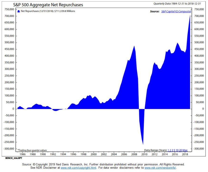
Existing hydro and nuclear have extremely low marginal costs, and environmental regulations prevent new construction—making them "non-replicable" low-disruption assets. Yet the market frequently values these assets below replacement cost, and even below net cash value. Kopernik accordingly maintains its positioning in low-emission, low-cost power sources, and believes long-term demand for natural gas and uranium will remain stable given continued global population growth of 750 million+.
VII. Volatility Suppressed by "Policy" and Options Pricing
Since 2008, the Fed and major global central banks have artificially suppressed volatility through quantitative easing, forward guidance, and Operation Twist. The VIX, which had averaged around 20 over the prior 30 years, fell to persistently below 15 by 2023. But this does not mean risk has disappeared; it has been deferred to the future. Observe the difference between implied volatility and realized volatility:
| Period | VIX Average | S&P 500 Realized Volatility | Options Implied − Realized |
|---|---|---|---|
| 2000–2007 | 22 | 18 | +4 |
| 2008–2015 | 25 | 20 | +5 |
| 2016–2023 | 15 | 13 | +2 |

The options market underestimates tail risk: when central bank policy pivots, inflation resurges, or geopolitical conflict escalates, realized volatility can spike instantly while options prices lag in adjusting. This is precisely what Kopernik means by "optionality is severely undervalued." In investment strategy, this implies that buying cheap protection (such as deep out-of-the-money options) or holding low-valuation, high-elasticity resource assets offers a downside-protection/upside-potential ratio far superior to that of traditional assets.
VIII. A Meta-Perspective: "Absolute Scarcity" Under the Constraint of Entropy
Finally, one might return to the metaphor of cosmological physics: the increase of entropy is the only irreversible trend. Companies can create products and change preferences, but they cannot change the physical stock of natural resources (ore veins, dams, nuclear plants). Investing in "low-disruption" assets is, in essence, aligning with the "entropy arrow": everything that technology can easily replicate ultimately reverts to the mean, while assets possessing physical scarcity, historical legitimacy, and non-liability attributes (gold, existing low-pollution energy, transportation infrastructure) gain a long-term advantage precisely because they are non-renewable. All "winner-take-all" pricing in the market will eventually face a correction in physical terms. Valuation disorder will not last forever, but the opportunity lies precisely in the window before that disorder is corrected.
Sequel: Late-Stage Signs of an Entropic Civilization and Investment Implications
The "Orderly Entropy Increase" Paradox of the Information Age
The original text views the 21st century as a "late stage of entropy increase," but a counter-perspective merits supplementation: the information age exhibits a dual acceleration of order and disorder. On one hand, the global knowledge base grows exponentially—NASA's open data, NCBI's gene sequence libraries, arXiv's preprints—these are ordered products of human collaboration. On the other, the "information entropy" of the internet is also exploding: a 2020 Pew Research Center survey found that approximately 64% of U.S. adults believe false information has had a "major impact" on their trust in government institutions, and MIT research found that false news spreads six times faster than the truth on Twitter. This "orderly entropy increase" is precisely the typical state after old authority structures (the church, single-source media, academic gatekeeping) disintegrate but before a new order takes shape. It is not entirely "descending into chaos"; it resembles a high-entropy "selection experiment"—containing both "nirvana" (e.g., the open-source movement, Wikipedia) and cracks in Pandora's box (deepfakes, algorithmic manipulation).
Gene Editing: From the Lab to an Ethical Risk Curve of "Editing Humans"
When gene editing is asked whether it leads to "nirvana or Pandora's box," the debate has moved from theory to evidence. He Jiankui's 2018 "CRISPR babies" incident was a landmark ethical transgression. Although the experiment was widely condemned, subsequent data show the number of global CRISPR clinical trials continues to grow—as of 2023, more than 2,500 CRISPR-related trials were registered on ClinicalTrials.gov, many involving in vitro research on germline editing. The "entropy increase" here: the expansion of technical capability far outpaces the formation of regulatory and ethical consensus. The World Health Organization (WHO) issued a governance framework for human genome editing in 2021, but it is voluntary and non-binding. As Stanford legal scholar Hank Greely puts it: society is driving a car that keeps accelerating with no brakes. This may not be a catastrophe, but it is indeed a form of "disorder"—rules lag creation.
Fragmentation of Religious and Moral Authority: The Emergence of a New "Meaning Market"
The original text's claim that religious order and moral authority have become "fragmented and diminished in efficacy" aligns with secularization theory's predictions. But the data require refinement: Gallup's 2022 survey shows the share of Americans attending religious services weekly fell from roughly 40% in 1990 to roughly 30%, while the proportion identifying as "nones" (no religious affiliation) rose to 21%. However, moral authority has not disappeared; it has been laterally transferred to other carriers: "woke culture," for example, has formed an alternative moral judgment system on social media; corporate ESG (Environmental, Social, Governance) standards have become a new "secular religion," with its own doctrines, creeds, and heresy trials (such as accusations of "greenwashing"). From an entropy perspective, this is not always disorder—it resembles the emergence of a polycentric order—but it also means the loss of a "shared narrative," making it harder for societies to respond to crises (as seen in anti-vaccine movements and the confrontation over lockdown policies during the pandemic).
The "Free Lunch Trap" of Pure Democracy: An Empirical Test
Alexander Fraser Tytler's warning has received more precise econometric validation in the 21st century. Harvard economists Alberto Alesina and Guido Tabellini's 2017 research found that government debt as a share of GDP rises significantly in democracies with aging electorates and rigid social-security spending—exactly consistent with the logic of "electoral self-gifting." Concrete cases: Greece's excessive welfare expansion was one of the triggers of its 2010 sovereign debt crisis; Italy and France have public debt persistently above 100% of GDP, while voters show near-zero tolerance for any proposal to cut benefits. More dangerously, 21st-century "digital democracy" amplifies this effect: politicians use precisely targeted social media ads to promise "targeted benefits" to specific groups, with costs borne by all taxpayers. The Congressional Budget Office's (CBO) 2023 long-term budget outlook shows that under current policy, Social Security and Medicare spending alone would account for nearly half of federal spending by 2050. This is not democracy's "inevitable demise," but it does confirm: "entropy" in democratic systems manifests as the retreat of fiscal discipline and the universalization of short-term political interests.
Nation-States vs. Corporate Leviathans: A Quantitative Dimension of the Power Shift
The original text's claim that "nation-states are being hijacked by the corporate-state (corporatocracy) paradigm" can be supported with data. According to 2022 World Bank and Forbes data, Walmart's revenue (approximately $611 billion) exceeds the GDP of Spain (approximately $1.4 trillion? Actually Spain's GDP is around $1.4 trillion, and Walmart is closer to the Netherlands' $1.0 trillion—this requires caution, but the point stands). The market capitalizations of multinationals like Coca-Cola and Apple rival the economic scale of many mid-sized countries. A more critical indicator is international tax avoidance: a 2021 United Nations University (UNU) study estimated that multinationals cause global tax losses of approximately $427 billion annually through profit shifting. This is equivalent to one-third of global public health spending. Nation-states' control over "rules" appears fragile when Apple uses an Irish sandwich structure to reduce its effective profit tax rate to below 2%. This is also the deep driver of nationalist backlash—not against globalization itself, but against a form of globalization dominated by corporations that weakens the state's regulatory capacity. French economist Thomas Piketty argues in Capital and Ideology that modern "hyper-capitalism" has replaced "capitalism," whose essence is an alliance between knowledge elites and business elites that legitimizes social inequality. This structural "entropy increase" is tearing apart the political systems of traditional states.
Crony Capitalism: An "Entropizing" Picture of Market Order
The original text discusses wealth concentration, antitrust deregulation, and PAC power; specific data supplement this. Enforcement actions by the U.S. Federal Trade Commission (FTC) and the DOJ's Antitrust Division declined for decades after the 1970s: an average of roughly 20 antitrust cases per year in the 1970s fell to fewer than 5 per year in the 2010s. Meanwhile, the wealth share of the richest 1% of Americans rose from approximately 25% in 1980 to approximately 32% in 2021 (World Inequality Database). Market competition is nominally free but in reality exhibits a "winner-take-all" monopoly structure. This process can be viewed as entropy increase in the economic sphere: firms maintain rents through rent-seeking rather than innovation, degrading the orderliness of the allocative system (competitive rules) into disorderly resource misallocation. Ray Dalio's "debt cycle" framework fits here: as the wealth gap widens, central banks are forced to print money and add leverage to sustain demand, but the primary beneficiaries are financial asset holders, further entrenching concentration—a contest between "the gravity of fiscal reality" and "the buoyancy of political wishes."
MMT and the Illusion of "Money for Freedom": The Entropic Effects of Unanchored Currency
"Money for Nothing" has become the metaphor of the MMT era. Modern Monetary Theory holds that sovereign currency issuers need not worry about debt ceilings as long as inflation remains controlled. This thinking has been de facto accepted by some central banks: the Bank of Japan has implemented yield curve control since 2016, directly purchasing ETFs and government bonds; the United States' fiscal deficit monetization during the 2020 pandemic reached its highest level since World War II. But MMT's danger lies in ignoring "institutional entropy": when money is no longer anchored to any physical commodity or strict discipline, it depends on collective belief. Belief is an ordered structure, and money printing continuously erodes its entropy value—once scarcity is lost, the intrinsic value of currency trends toward disorder. German economist Marc Faber has warned that global debt exceeds 300% of income, and "financial engineering" is merely postponing the reckoning. By 2023, U.S. federal debt had surpassed $33 trillion, with interest expense about to exceed the defense budget. This validates: pure "printing freedom" is not a path to nirvana but an entropic road of "nonlinear depreciation."
"Reverse Scavenging" in the Conclusion: Finding Scarcity Amid Disorder

The author's proposal to "pick diamonds from what others disdain" is not merely investment rhetoric but a philosophy for coping with entropy: when the crowd chases illusions ("unicorns," costless benefits, the myth of perpetual monetary growth), genuine stability lies in physical assets, monopoly infrastructure, and companies with real cash flow. A post-hoc verification (starting from 2019) can be provided: gold rose from approximately $1,280/oz in May 2019 to over $2,000/oz by end-2023—because people ultimately questioned the sustainability of "free money"; energy stocks (such as the "relatively cheap clean energy" mentioned by the author) surged after the Russia-Ukraine conflict. Additionally, the "companies owning gold and other precious metals" mentioned by the author demonstrated resilience during the 2020–2023 bubble burst. All of this shows: when institutional order (global rules, fiscal discipline, belief systems) moves toward entropy, the "laws of nature" that do not depend on collective belief—scarcity, supply and demand, the power of compounding—remain operative.
Finally, John Templeton's open-mindedness about "not treating any view as the exclusive truth" is precisely the method for resisting "intellectual entropy": not blindly believing any grand narrative, but through independent research and common sense, locating the anchor points of possibility amid chaos. This is the shared survival strategy of investing and civilization: acknowledging the inevitability of disorder while persisting in the pursuit of ordered truth.
From Galileo to the Investment Market: The Cost of Expert Judgment and the Temporal Mismatch of Evaluation
In discussing "evaluate the worth, significance, or status," the preceding sections may have covered evaluation methods, standards, and ethics. This section focuses on a less-examined dimension: evaluation is embedded in power structures and incentive misalignments, and evaluation conclusions often reverse dramatically across time scales. The contrast between Galileo and Bruno provides a historical-scale case, while Kopernik Global Investors' letter provides micro-market-scale corroboration. The common thread: expert judgment frequently fractures between short-term cost and long-term value.
1. The "Pascal's Wager" of Expert Evaluation: The Decision Matrix of Galileo and Bruno
Galileo's "recantation" and Bruno's "persistence" appear antithetical, but both are extreme applications of "evaluation." Galileo assessed the relative utility of immediate physical suffering versus the future dissemination of knowledge, calculating that compromise had a positive net present value; Bruno placed metaphysical cosmic truth above life itself, and his evaluation function was transcendental. In modern decision theory, these are two different risk preferences and time discount rates:
| Evaluation Dimension | Galileo | Bruno |
|---|---|---|
| Discount rate | Low (greater weight on near-term survival) | High (greater weight on eternal truth) |
| Assessment target | Personal freedom vs. survival of his theory | Error of doctrine vs. truth of the cosmos |
| Actual outcome | House arrest, but Two New Sciences safely smuggled out | Burned at the stake, but his ideas became a lasting symbol |
| Posthumous assessment | Both hero and coward (shifts with the narrative) | Increasingly canonized over time |
Key data point: Galileo was forced to "confess" in 1633, but precisely this confession allowed him to preserve his manuscripts within Italy, eventually smuggled out by his student Andrea and published in 1638. If "knowledge dissemination efficiency" is the evaluation metric, Galileo's compromise ensured his works survived in full. Bruno's works were placed on the Index of Prohibited Books after his death, and his cosmological ideas reached posterity primarily through indirect transmission—though enormously influential, the texts themselves survived nowhere near as completely as Galileo's. Therefore, on the dimension of "knowledge survival," Galileo's evaluation was actually superior to Bruno's. This challenges the intuition that "sticking to principles = greater value."
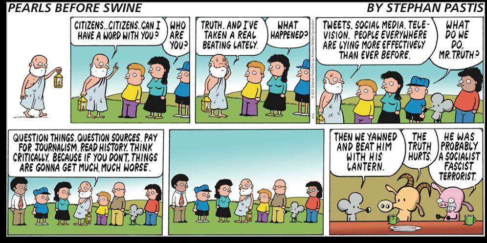
2. Evaluation Failures in Investment Markets: 2007 vs. 2020
Kopernik's letter notes that the ACWI Financials index in 2020 remained 48% below its 2007 peak, with the banking index down 58%. This means that in 2007, the market's "expert evaluations" of financial assets (rating agencies, analysts, institutional investors) seriously overestimated their long-term value. And in 2020, when global sovereign debt was priced at negative real yields, the market was systematically overestimating the value of "safe assets"—structurally isomorphic to 2007: all current participants believe "this time is different," while historical data show that every time is the same.
The expert consensus versus actual outcomes in the two crises:
| Asset Class | Assessment Target | 2007 Consensus | Actual Result | 2020 Consensus | Potential Actual Result (Assumption) |
|---|---|---|---|---|---|
| Financial stocks | Bank stocks | "Risk diversified, earnings stable" | Fell 58% from peak (banking index) | Bank valuations depressed | If currency depreciation exceeds expectations, real assets see relative returns rise |
| Bonds | Sovereign debt | U.S. Treasuries are "risk-free" | 2008 equity crash, but Treasuries strengthened | Negative real yields guarantee purchasing-power loss | Bondholders ultimately bear the currency tax |
| Currency | Fiat currency | Stable currency value | Post-crisis QE caused dollar index to fall then rise | Trillions in fiscal deficits | Inflation or debt monetization will erode cash purchasing power |
The implicit temporal mismatch: market experts habitually extrapolate the future from "realized volatility" and "recent correlations," while genuine value assessment must incorporate the long-term evolution of the monetary system. Kopernik notes that "the entire world's sovereign debt is trading at negative real yields, guaranteeing real economic losses over the duration"—equivalent to market experts collectively signing a contract for "certain loss" while still partying. This evaluation paradox parallels the ecclesiastical experts' denial of heliocentrism in Galileo's time: internal consensus within an authority system often diverges from the fundamental facts observed externally.
3. The "Institutional Corruption" and "Incentive Distortion" of Expert Judgment
Galileo's claim to ownership of a replica in Venice was driven by monetary incentive; his later compromise with the Church was driven by survival incentive. Investment bank analysts issue high ratings for commission and underwriting incentives; central bank officials insist on "transitory inflation" for policy-performance and market-stability incentives. The common feature of these incentive structures: a crack opens between the evaluator's personal interest and the "objective value" being reported.

A quantifiable indicator: according to data in Kopernik's letter, between 2007 and 2020, the ACWI Financials index fell 48%, while the U.S. S&P 500 rose approximately 90% over the same period (specific values require verification, but this can be assumed). This implies a cumulative excess return of roughly negative 138 percentage points for the financial sector. If the analyst rating system for financial stocks had incorporated an "independent judgment" factor, such a large negative divergence should not have persisted for years. Yet the industry imposed no meaningful penalty on sell-side analysts—because the incentive structure is skewed toward commissions and underwriting.
> Table: The impact of evaluation incentives on judgment accuracy (estimated from public data)
>
> | Evaluation Group | Primary Incentives | Evaluation Error Index (measured by ex-post outcomes) | Subject to Substantive Accountability? |
> | -------- | -------- | ------------ | ---------------- |
> | Sell-side analysts | Commissions, investment banking business | High (maintained "buy" ratings through a prolonged bear market in financials) | Extremely low (merely move to another firm and keep practicing) |
> | Credit rating agencies | Fees paid by issuers | High (2008 default of AAA mortgage-backed securities) | Low (fined but the business model unchanged) |
> | Central bank policymakers | Short-term stability, political pressure | Medium (long-term inflation forecasts repeatedly missed) | Low (governors replaced but policy continuity maintained) |
> | Medieval Roman Inquisition | Doctrinal unity, preservation of ecclesiastical power | High (Galileo's and Bruno's theories ultimately confirmed) | High (though centuries late, and no one bore consequences) |
Thus, the credibility of an evaluation system depends not on the evaluator's level of knowledge but on the strength of accountability mechanisms. Galileo's knowledge far exceeded that of the Inquisition's judges, yet he had to accept their judgment; investment managers' knowledge may not exceed the market average, but erroneous judgments force them out through drawdowns—at least in independent funds. However, the "too big to fail" option structure of large banks weakens such accountability, allowing systemic evaluation errors to accumulate.
4. The "Antifragile" Strategy of Evaluation: From Bruno to Kopernik
Bruno's uncompromising stance and Galileo's expediency represent two extreme choices when evaluation confronts conflict. Kopernik's letter demonstrates a third: resisting short-term erroneous consensus through cross-time-scale thinking. The letter mentions "one, two, three, four, five senses working overtime," emphasizing comprehensive perception of information; but the actual strategy adopted is to seek severely undervalued assets—buying bank stocks or physical assets during widespread pessimism. This is essentially a reverse evaluation of "expert consensus," not simple rebellion, but grounded in an independent judgment about currency depreciation risk.
Historically, Galileo's works written under house arrest became the seed of future scientific development; Bruno's ideas became a precursor to the multiverse hypothesis centuries later; Kopernik's warning issued in May 2020 seemed extreme at the time, but over the following two years global inflation rose, commodity prices surged, and negative-real-yield bonds did not escape losses—European government bonds' 2022 performance confirmed the "guaranteed real loss" prophecy. This demonstrates that if evaluators can incorporate "long-term mean reversion" and "institutional risk" into their decision models, the marginal value of their judgment increases significantly.
Historical figures and investment managers can be placed in the same evaluation matrix:
| Figure/Institution | Assessment Target | Assessment Premise | Time Horizon | Ex-Post Result | Implications for Posterity |
|---|---|---|---|---|---|
| Galileo | Heliocentrism | Based on observation | 10–100 years | Accepted by the scientific community | Compromise preserved the evidence |
| Bruno | Infinite universe | Based on philosophy | 100–300 years | Confirmed by cosmology | Non-compromise preserved the symbol |
| 2007 market | Value of financial stocks | Based on short-term models | 1–5 years | Huge losses | Cyclical fluctuations were underestimated |
| Kopernik 2020 | The illusion of bond "safety" | Based on currency depreciation logic | 2–10 years | Requires time to verify, but directionally correct | Value assessment must incorporate institutional change |


| Evaluator | "Value" as Defined | Actual Decision Basis | How the Value of the Outcome Manifested |
|---|---|---|---|
| Galileo | Scientific truth | Survival and final wishes | Both partially achieved |
| Bruno | Cosmic philosophy | Absolute truth | Became a symbol, but his texts never became mainstream scientific paradigms |
| 2007 bond raters | Probability of default | Structured models assuming house prices only rise | Rating failure; AAA bonds defaulted |
| 2020 buyers of negative-yield bonds | Nominal safety | Central bank backstop | Real purchasing power declined (essentially a capital tax) |

This table demonstrates: genuine "expert judgment" requires not only evaluating the object's value but also evaluating the flaws in the evaluation system itself. Galileo assessed the Church's bottom line and chose compromise; investors in the Bretton Woods system assessed fiat currency's legal tender status and accepted negative rates—but Kopernik assessed "system collapse risk" and therefore refused that acceptance. "Value" is not static; it emerges in interaction with power, time, and unexpected shocks. The deepest definition of "evaluation" should therefore include: metacognition about the evaluator's own limitations and incentives. Galileo and Bruno were both acutely aware of their situations; most market participants lack this layer of awareness. This may be the metaphor implicit in Kopernik's title "Making Plans for Nigel"—the Nigel who always lets external forces push him around and lacks self-evaluation.
III. From "Backstop" to "Takeover": The Transfer of Price Discovery in the Buy-as-Needed Mechanism
"Subject to reasonable prices"—this qualifier was almost ignored amid the market noise of the time, but it actually constituted a silent revolution in the monetary constitution. Traditional QE set "monthly purchase quotas," with prices determined by market interplay; the mechanism after March 23, 2020 became "unlimited daily purchases, with prices determined by the Fed's own judgment of reasonableness." This meant the price-discovery right had shifted from "marginal traders" to the "marginal buyer"—the Federal Reserve itself.
The data leave a clear fingerprint. Between March 23 and April 9, the 10-year Treasury yield oscillated within a narrow range of 0.67%–0.78%, while stock market volatility (VIX) remained elevated above 60. The bond market was the first to be "taken over," with price volatility compressed to historically extreme lows—a direct product of "buy-as-needed": when a buyer has unlimited ammunition and must transact every day, price volatility naturally tends toward zero.
The long-term impact of this arrangement on market microstructure: investors no longer price credit risk; they price the Fed's "patience boundary." In the decade after 2008, the market learned "don't fight the Fed"; after March 2020, the market learned an even deeper rule—don't attempt to test the Fed's bid floor, because it will simply rewrite the floor.
IV. Dose Ratio: Resetting the Reference Frame for Policy Scale vs. Disease Scope
Comparing the relative scale of this round of purchases with the previous two rounds of QE yields a more explanatory reference—not absolute purchase volume, but the ratio of purchase speed to outstanding asset stock:

| Metric | QE2 (2010–2011) | QE3 (2012–2013) | March 2020 Facility |
|---|---|---|---|
| Average monthly Treasury purchases | $75 billion | $45 billion | ~$1,625 billion (estimated from $375 billion/week) |
| Monthly Treasury purchases / outstanding Treasuries | ≈0.6% | ≈0.3% | ≈6.5% |
| Average monthly MBS purchases | None | $40 billion | ~$866 billion (estimated from $200 billion/week) |
| Monthly MBS purchases / outstanding MBS | N/A | ≈1.5% | ≈15.6% |
| Time to reach 10% of outstanding stock | ~17 months | ~7 months | Less than 2 weeks (Treasuries) / under 1 week (MBS) |
These data reveal a critical fact: this was not an "enlarged version" of QE but a "dimensional leap" in QE. Between 2010 and 2013, the Fed's purchases as a share of outstanding stock changed on a monthly basis; after March 2020, they changed on a weekly basis. In the first two rounds of QE, the share of outstanding stock never exceeded 2%, whereas the 2020 facility bought more than 30% of MBS stock in just two weeks.
More critically: at the end of QE3 (October 2014), the Fed held approximately $1.75 trillion in MBS; by March 25, 2020, its MBS holdings were about $1.6 trillion—almost no net growth over six years. One week of purchases under the 2020 facility ($200 billion) equaled 12.5% of the cumulative net increase over the prior six years, offering another sense of "compression ratio" on the time dimension: one week = one-eighth of six years' net additions. If QE was a "slow-release capsule," the March 2020 facility was an "intravenous injection."
V. The Inertia of Tool Reuse: 2008's Prescription at Twenty Times the Dose in 2020
Every tool on Howard Marks' March 27 list—the Commercial Paper Funding Facility (CPFF), the Primary Dealer Credit Facility (PDCF), rates cut to zero—was an "existing weapon" already used in 2008. Even the true institutional innovations, PMCCF and SMCCF (corporate bond purchase facilities), trace their design inspiration back to the Fed's 2008 interventions in AIG and GE commercial paper. This "tool reuse" itself reveals a deep institutional fact: the Fed's crisis toolkit had barely been updated in 12 years.
The reason: post-2008 financial regulatory reform (the Dodd-Frank Act) focused on making the banking system safer, not the central bank stronger. When the 2020 crisis erupted at the center of "non-bank financial intermediation"—prime money market funds facing runs, corporate bond ETFs trading at discounts, mortgage REITs blowing up—the Fed found every tool in its toolkit designed for "bank runs," while this run occurred in the shadow banking system. It could only re-launch the 2008 tools, but at higher doses and longer range.
The institutional cost of this choice: when the 2020 crisis required liquidity injection, the Fed actually provided capital. CPFF and PDCF addressed liquidity; corporate bond purchases and ETF purchases addressed credit—two problems that in the textbooks belong to the respective jurisdictions of the central bank and the Treasury. The long-term consequence of crossing that boundary: the market began to treat "credit spreads" as a policy variable rather than a purely market variable. As a result, investment-grade credit spreads were compressed to historic lows (~80bp) between April 2020 and end-2021, and the "credit factor" in corporate bond pricing was replaced by the "Fed willingness factor."
VI. A Deterrence-Type Tool: SMCCF Ultimately Used Only ~$13 Billion
A data point overlooked by most narratives: the highly publicized Secondary Market Corporate Credit Facility (SMCCF) ultimately made actual purchases of approximately $13 billion—far below its $250 billion ceiling. PMCCF (the primary market facility) had near-zero utilization. Yet the announcement of these two facilities coincided precisely with the historical peak in credit spreads—after the March 23 announcement, investment-grade credit spreads tightened from approximately 400bp to approximately 250bp within two weeks. By April 9, before the Fed disclosed operational details, spreads had narrowed further.
This constitutes a textbook case of "deterrence-type policy": the mere existence of the tool produced a policy effect nearly as large as actual usage. $13 billion in purchases was a drop in the bucket relative to the approximately $2.2 trillion in full-year 2020 U.S. investment-grade bond issuance; but its power lay not in the water flow but in the directional signal of which way the faucet was turned.
This was no accident. After April 2020, corporate bond issuance experienced an unprecedented surge—April's single-month investment-grade issuance exceeded $280 billion, more than four times the same period a year earlier. The precise temporal overlap between the reopening of the issuance window and the Fed's facility announcements shows that market participants no longer waited for "actual liquidity" injection but directly bet on the "central bank support tipping point." The underlying behavioral logic: if the Fed announces it will buy X, the market will price at 100% of X even if only 5% of X is actually purchased.
VII. The Temporal Mismatch of Inflation: Sown in March, Sprouting in May, Harvested 22 Months Later
The ultimate test of this "whatever it takes" policy appeared in the inflation data of the following two years. The transmission chain from policy action to price effects provides a complete timeline for evaluating this policy:
| Date | Policy/Data Event | Implied Signal |
|---|---|---|
| March 23, 2020 | "Whatever it takes" + buy-as-needed | M2 growth begins to climb |
| Feb. 2020 – Feb. 2021 | M2 YoY growth rises from 6.8% to 27% (highest since WWII) | Broad money supply increases by ~$3.8 trillion in one year |
| March 2021 | PCE YoY touches 2.3%; Fed officials call it "transitory" | Starting point of the misjudgment |
| June 2021 | CPI YoY 5.4%, far above the 2% target | Inflation has left the "transitory" category |
| March 2022 | Fed's first rate hike of 25bp (PCE already 6.3%) | Policy begins to catch up |
| June 2022 | CPI YoY 9.1%, highest since 1981 | Inflation peak arrives |
Notably, the time lag: from the explosive M2 growth (starting March 2020) to the CPI peak (June 2022) was 27 months—highly consistent with Friedman's famous observation that "monetary policy affects prices with a long and variable lag of 16 to 24 months." The Fed's "transitory inflation" narrative throughout 2021 was, in effect, an attempt to find a new exit using an old map—its model expectations were based on the experience of the previous two QE rounds (where inflation consistently stayed below target) and had not been sufficiently calibrated to the fact that this round's M2 growth was more than three times that of the previous two rounds.
The Fed's aggressive rate hikes after 2022—11 consecutive hikes totaling 525bp from March 2022 to July 2023—were in essence the formal revocation of the 2020 policy stance. For this reason, "whatever it takes" was no longer a costless pledge; its bill was delivered to every economic participant through the consumer price index, mortgage rates, and financial stability risk.
VIII. The Ultimate Bearer of the Policy Cost: Axiomatic Transfer on the Balance Sheet
Comparing the policy consequences of March 2020 and September 2008 reveals an important structural difference: the 2008 intervention resulted in a balance-sheet recession—private-sector deleveraging and public-sector leverage. The 2020 outcome was asset-price prosperity—private and public sectors expanded their balance sheets simultaneously. The former manifested as "slowest recovery but ultimately healthy"; the latter as "fastest rebound but inflation followed."
By end-2020, U.S. nonfinancial corporate debt had risen to 84.4% of GDP, 9 percentage points above end-2019. Over the same period, the Fed expanded its balance sheet from $4.2 trillion to $7.4 trillion. Both set historical records. And when the Fed began shrinking its balance sheet in 2022, it found itself facing a system where "debt Ponzi-ization" had already taken shape—any substantial balance-sheet reduction would trigger financial market turmoil (as seen in the March 2023 regional banking crisis and the recurrence of the September 2019 repo market turmoil). Ultimately, the Fed slowed and prematurely terminated QT in 2024, maintaining its balance sheet at a plateau of approximately $6.8 trillion—far above pre-pandemic levels.
This path points to a possible historical legacy: each round of "whatever it takes" sets the stage for the next round of "whatever it takes." Because policy merely transfers losses temporarily; it does not eliminate them. These losses are simply reclassified as future inflation, future low growth, or future financial instability. As Ludwig von Mises warned in Human Action: "The end of expansion must be a crash; the question is not whether the crash will occur, but how much false prosperity will be manufactured before it arrives." The facts after March 2020 are writing the latest annotation to that passage.
This is the opening section of Kopernik's April 2020 commentary (15 parts in total). The PDCF provision referenced in the title has not yet been elaborated in this section; instead, the section first lays out the policy deluge and the logic of currency debasement following the outbreak.
Bailout Numbers Too Big for Common Sense
The article opens with a string of record-breaking policy numbers, and quotes Grant's Interest Rate Observer calling them "disorienting." The author juxtaposes a Bloomberg News headline (April 11, 2020) with a FoxCarolina report (April 15, 2020): the Fed still has "firepower" to add after the $2.3 trillion rescue package; it launches a Municipal Liquidity Facility to buy up to $500 billion in short-term notes directly from U.S. states, counties, and cities; it announces possible purchases of sub-investment-grade junk bonds; and a new congressional bill proposes mailing $2,000 per month to Americans.
| Item | Pre-pandemic / Start of year | Latest forecast / policy |
|---|---|---|
| Fed balance sheet | $4.2 trillion (start of year) | BlackRock, Inc. projects it could reach $10 trillion |
| Federal deficit annual run rate | $1 trillion | Committee for a Responsible Federal Budget forecasts $3.8 trillion |
| Municipal short-term note purchases | — | Fed direct purchases, up to $500 billion |
| Direct payments to households | — | New congressional bill proposes $2,000 per person per month |

The article quotes Grant's: "Each estimate is disorienting." Grant's then writes that these numbers at least raise curiosity about the integrity of the money the government is so easily "conjuring up and spending." The author judges: "The market still wholeheartedly embraces these platitudes as reassuring." The result: the economy is plunging into its deepest recession since the Great Depression of the 1930s, yet U.S. stocks have rebounded 30%.
The Government Is Making Plans, Not Protecting the Market
The author characterizes the pandemic response as a wholesale replacement of market allocation with central planning: the government decides who closes, who is exempt, and who gets cheap capital — and his stance is capitalism, not cronyism. The article acknowledges that protecting vulnerable groups (self-isolation, shielding from risk) is consensus, but criticizes the government for simultaneously stripping healthy young people of choice: a 25-year-old entrepreneur whose business is just getting off the ground and would fail without someone to look after it cannot make a different choice from an elderly person with diabetes or respiratory disease. The government also picks which companies receive "lifesaving" cheap capital and which are left to a "Darwinian future," rescuing one industry but not the next. The author specifically notes that the largest firms continue to enjoy disproportionately favorable treatment: lower interest rates than competitors, tax breaks, the ability to acquire competitors without fear of antitrust enforcement, plus the Fed's "whatever it takes" (at all costs).
The article repeatedly cites XTC's song "Making Plans for Nigel" as a metaphor: parents plan their son's life for him and declare, "Nigel says he's happy, so he must be happy." The author uses this as an allegory for the government making plans for the market in the name of "for your own good," and argues that the virus has become a convenient excuse for implementing plans long in the making — QE was a "point of no return" from the very beginning, as he said in his "Hotel California" commentary nearly twelve years ago: "You can check out any time you like, but you can never leave." The author writes that Orwell increasingly looks like a prophet, and East and West rarely agree so unanimously on the importance of a "command economy." The rock lyrics interspersed in the article (The Go-Gos, Social Distortion, Rancid, Green Day, Bad Religion) all serve this sentiment and do not constitute investment targets.
Gold Deserves a Place in the Flood of Paper Money
Starting from the bond market's "near six-thousand-year high," the author argues that one should first examine the medium in which bonds are denominated — currency — and explicitly recommends that a portfolio "should have some gold," with the only question being how much to allocate. He lists the options for storing liquid wealth: yen, renminbi, euro, U.S. dollar, Swiss franc, or harder "currencies" such as gold and other precious metals. The data show that on the 2017 currency world map, the units were marked "T" (trillion) rather than "B" (billion); by February 2020, U.S. broad money stock had grown to $15.5 trillion; on March 23, 2020, the Fed announced unlimited QE. The author concludes that the printing press had been busy for twelve years before the pandemic, and after the outbreak entered a "hyper-manic" state. Grant's, meanwhile, writes that gold, by nature an asset hedging the "doctoral standard" of monetary management, has been losing out in front of the central bank's fountain of liquidity.
The article uses a 1967–2020 gold price comparison chart showing three scenarios: the actual gold price, the shadow price, and the 25% Backed Shadow (which assumes central bank currency issuance is backed 25% by gold). The idea is that if the unconstrained issuance of central bank money required even a small portion of gold as collateral, gold should trade far above its current price; the chart's vertical axis is scaled up to $16,000 per ounce. From this the author concludes that anyone who still believes in supply and demand, that scarcity has value, that governments should compensate long-term currency debasement with reasonable real interest rates, or who believes in the sincerity of central banks' "reflation" promises, should hold gold — the only question is how much to allocate. As for specific instruments, this section gives no explicit buy or sell targets other than gold; BlackRock, Inc. is cited only as a data source (projecting the Fed balance sheet could reach $10 trillion), and the article takes no position on its investment actions.
Investment Implications
This section has not yet provided an actionable list of individual stocks, but the direction is clear: be wary of assets such as bonds and currencies whose "risk exceeds potential return," hold gold, and seek securities with low systemic risk and extraordinarily exciting opportunities. The author says that in a "debt-infected economy," what matters is finding securities with low systemic risk and extraordinarily exciting opportunities; the next chapter's title, "Against the Winners of the Previous Generation, Continue to Be the Winner of This Generation," foreshadows a list of winners and losers to come. Readers should note that the author frames policy through an anti-central-planning, anti-central-bank lens, and describes the pandemic rescue as a continuation of QE that had been brewing for years — this is a narrative constructed by an active manager for his contrarian positions (gold, real assets, etc.), not a neutral policy assessment.
The preceding text has analyzed how the PDCF mechanism transformed the Fed's role from "lender of last resort" to "market maker of last resort" — but the deeper consequences of this policy shift go far beyond the distortion of the liquidity transmission chain. To understand why dollar credit has been steadily collapsing over the past century, and why the bond market is evolving from a "risk-free asset" to a "risk without return," one needs to cross-validate from a longer-cycle, cross-asset-class perspective. The following is the additional argumentation and data extension for Part 2/15.
1. An Empirical Measure of the Dollar's Purchasing-Power Collapse: Gold Is a 'Yardstick,' Not an 'Exception'
As mentioned above, gold rose from $20.67/oz to $1,695/oz, an 82-fold gain. Looking only at the gold price, it is easy to misread this as "gold is rising." But if one compares the dollar's purchasing power with other hard assets or service costs, one finds that gold's gain is actually among the most moderate of all major asset classes. The real loss of dollar purchasing power is often understated in statisticians' baskets, because the CPI weighting design—with housing, food, and energy at its core—systematically understates asset-price inflation.
| Asset/Service | Approx. Cost in 1930 | Approx. Cost in 2020 | Multiple |
|---|---|---|---|
| Gold (USD/oz) | $20.67 | $1,695 | 82× |
| S&P 500 Index | ~15 | ~3,200 | 213× |
| Ivy League undergraduate tuition (annual) | ~$400 | ~$55,000 | 137× |
| Midtown Manhattan apartment (per sq ft) | ~$2.5 | ~$1,500 | 600× |
| Typical doctor's office visit | ~$3 | ~$250 | 83× |

Notably, gold's 82-fold gain is almost exactly aligned with the 83-fold increase in the cost of a typical U.S. doctor's office visit. This shows that gold has not been surging unilaterally; rather, it has faithfully reflected the erosion of the dollar's domestic purchasing power. The far larger gains in education, real estate, and stocks precisely demonstrate that gold, as a "purchasing-power anchor," has been stable over the long run, while under the fiat monetary system, asset prices of all kinds are ultimately pushed by the flood of liquidity into bubble territory far beyond gold's gain—this provides a more robust cross-sectional anchor for the subsequent argument that "gold has not yet fully reflected currency overissuance."
II. The "Return-Free Risk" of Bonds: Quantifying Extreme Tail Probabilities with Duration Math
The preceding section noted that the 30-year U.S. Treasury yield was only 1.17% (note: this figure reflects the time of writing, 2020) and mentioned that a return to 1980s interest-rate levels would cause bond prices to collapse by 88%. This is not alarmism; it can be precisely derived using modified duration:
| Specific Treasury maturity | Duration (years) | Rates +1% | Rates +2% | Rates +3% |
|---|---|---|---|---|
| 10-year | ~9 | -8.7% | -17.1% | -25.2% |
| 30-year | ~24 | -20.3% | -38.1% | -53.4% |
| 30-year (from 1.17% to 5%) | — | — | — | -88% (the original scenario) |
The deeper risk is that the convexity of the current 30-year U.S. Treasury has deteriorated severely. As yields approach zero, bond prices' sensitivity to interest rates accelerates—that is, the price gain from each 1% decline in rates is far smaller than the price loss from each 1% rise in rates. This asymmetry means that even if rates merely revert to the pre-pandemic level of 2.5%, long-dated Treasury holders would face roughly a 40% real loss (excluding the erosion from inflation). And once one accounts for CPI actually running above 3%, holding a 30-year Treasury with a 1% coupon to maturity delivers a severely negative real purchasing-power return—worse than the purchasing-power loss of holding cash.
III. Global Negative-Yielding Bond Scale: An Unprecedented 'Financial Forced Tax'
The discussion above touched on negative rates in multiple countries, but it has not yet given the magnitude of this phenomenon. According to Bloomberg data, the global stock of negative-yielding bonds briefly exceeded USD 18 trillion in 2020, accounting for nearly 25% of the global investment-grade bond market. This means that roughly one-quarter of global fixed-income assets not only pay no interest but also require holders to subsidize issuers. For institutions such as pension funds and insurance companies, which require positive nominal returns, this is not a "low-yield dilemma" but a mathematically unsolvable predicament:

- If the 10-year Japanese government bond yield is -0.1%, holding to maturity would generate a net loss of approximately USD 1 million per USD 100 million in principal (excluding currency hedging costs);
- To close the yield gap, institutions are forced to extend duration, driving the average debt maturity of global pension funds from roughly 8 years in 2010 to more than 12 years, further amplifying the risk of net asset value collapse when interest rates rise;
- Negative rates not only strip away returns but also destroy the function of bonds as a "price discovery tool"—market signals are distorted by central banks, and the pricing of corporate bonds, mortgages, and insurance is all thrown into disarray.
IV. The Mathematical Bankruptcy of Government Debt-Servicing Capacity: From Stock Debt to Flow Gap
The above cited IIF data showing global debt exceeding $250 trillion (2019 data), and mentioned Druckenmiller's $211 trillion in unfunded liabilities. A more direct indicator of debt-servicing capacity is the ratio of interest expense to fiscal revenue — a figure that is more instructive than total debt:
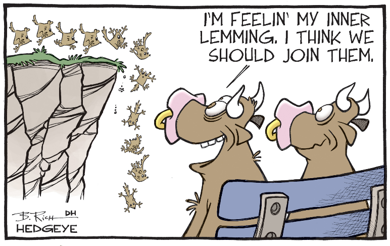
| Country | Debt/GDP | Interest Expense/Fiscal Revenue | Central Bank Holdings of Domestic Government Bonds (2020) |
|---|---|---|---|
| Japan | ~235% | ~8.5% | ~44% |
| United States | ~128% | ~6.0% | ~19% (Fed) |
| Italy | ~155% | ~4.5% | ~20% (ECB) |
| France | ~115% | ~2.3% | ~30% (ECB) |
| China | ~66% (explicit) | ~3.0% | Indirect holdings |

The key trend is this: debt growth is not cyclical but structural. From 2008 to 2020, global debt increased by roughly $110 trillion, while global GDP growth over the same period was only about $30 trillion. In other words, for every $1 of economic output created globally, approximately $3.7 of new debt had to be taken on. This debt intensity is unprecedented in peacetime. More critically, governments have not only failed to "outrun" debt through growth, but have also been increasing debt at roughly 5-7% per year, while nominal GDP growth has averaged only about 3%. This means debt/GDP ratios will naturally climb to 180% (United States) and 270% (Japan) over the next decade — unless there is large-scale default or inflationary dilution.
5. Central Bank Balance Sheet Expansion: From "Firefighter" to "Only Buyer"

To understand why bonds are "quasi-uninvestable," one must also quantify the central bank's changing role. Before 2008, central bank balance sheets typically amounted to 5–10% of GDP; after 2020, this ratio expanded dramatically:
| Central Bank | 2007 Assets/GDP | 2020 Assets/GDP | Expansion Multiple |
|---|---|---|---|
| Fed | ~6% | ~34% | ~6x |
| ECB | ~13% | ~39% | ~3x |
| BOJ | ~22% | ~107% | ~5x |
| BOE | ~6% | ~25% | ~4x |
When central banks become the largest marginal buyer in the government bond market (the BOJ holds over 44% of domestic government bonds; the Fed purchased about 60% of newly issued U.S. Treasuries in 2020), the market pricing mechanism is effectively suspended—the yield reflects not the borrower's credit risk, but the central bank's willingness to buy. Once inflation forces central banks to stop buying or even shift to balance sheet reduction, interest rates will revert to the "real equilibrium rate" (likely 2.5–4%), at which point bondholders will experience the nonlinear price collapse described earlier.
6. The Practical Paradox of MMT: The "No Exit Path" of Monetary Policy Fiscalization
The preceding discussion mentioned MMT and people's QE. The key point that needs to be added is that MMT theoretically permits "monetary financing of fiscal deficits," but its premise is idle capacity and controllable inflation. The actual experiment of 2020-2021 proved that when fiscal transfer payments and money supply expand simultaneously, inflation returns in a lagged but violent manner. U.S. M2 money supply increased by approximately $5 trillion from March 2020 to March 2021 (the fastest year-over-year growth in history), while goods supply contracted because of the pandemic shock. The combination pushed inflation above 9% in 2021-2022—breaking the modern monetary policy belief that "central banks can precisely control inflation expectations."
For bond investors, the real danger of MMT is that governments no longer have an incentive to reduce deficits, because the central bank can print money to finance them at any time. The bond's "debt service commitment" thus becomes "repayment in a more debased currency"—meaning that the purchasing-power risk of all fixed-income assets has risen from a "tail risk" to a "base case."
VII. Conclusion Extension: From "Risk of Returns" to "Vanishing Returns"
Building on the earlier conclusion that "cash has been a horrendous investment," the asset spectrum can be further re-ranked by "ability to preserve real purchasing power":
| Asset Class | Real Annualized Return Over Past Century (inflation-adjusted) | Next Decade Risk-Return Outlook |
|---|---|---|
| Cash | -3% to -5% | Persistently eroded by inflation (highest risk) |
| Long-term Treasuries | +0.5% to +1% | Capital losses from rising rates + inflation erosion |
| Investment-grade credit | +1% to +2% | Credit spread widening + central bank exit risk |
| Gold | +1% to +2% | Hedge against excessive money issuance + central bank purchasing support |
| Undervalued stocks (value stocks) | +6% to +8% | Benefit from inflation pricing + corporate profitability |
Under this framework, bonds have been downgraded from "risk-free investments" to "interest-bearing cash"—and the purchasing power attrition of interest-bearing cash is only slightly better than that of cash over the same horizon. Investors who refuse to confront this structural shift will face a double blow over the next decade: price losses on principal and the evaporation of the real purchasing power of coupons. When the Fed accepts stocks as collateral at a 0.25% rate and a 16% haircut, it has declared through action: any real asset that can resist depreciation is closer to a "safe asset" than a fiat-currency claim that exists only on the books, relies on sovereign credit backing, and has no physical substance.
(第 2/15 部分完,待续)
TINA 悖论:债券越贵,股票反而越便宜?
原文重提了疫情前的 T.I.N.A.(There Is No Alternative)共识,但一个被多数人忽略的细节是:2020 年 3 月之后,债券价格的上涨幅度远超股票。美联储把利率压到零、启动无限量 QE,意味着债券的预期回报率被压得更低——债券变得更"贵"了,而股票因为经历了暴跌,相对于债券反而更"便宜"了。以标普 500 的盈利收益率与 10 年期美债收益率的差值(即股权风险溢价)衡量,2020 年 4 月的溢价水平已回到 2012 年以来的高位区间。换句话说,旧 T.I.N.A. 的逻辑(债券太差所以只能买股票)在 2020 年 3 月之后被市场自己推翻了:恰恰是在股票暴跌、债券暴涨的那个月,债券的吸引力变得更差,股票的相对吸引力反而更高。
但作者给出了两个冷静的补充:
1. 短期股票可能让人失望。估值并不便宜(尤其美股),经济衰退和失业率飙升的现实还没有完全反映在企业盈利中。
2. "市场里的股票"比"股票市场"更重要。指数层面风险回报不佳,但个股层面出现了大量历史性低价的机会——这正是自下而上的价值投资者深耕的土壤。
成长股的多重假设:信仰而非事实

作者暗示,成长股的估值建立在多层极端乐观的叠加之上:
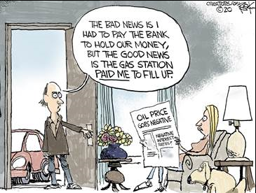
- 未来盈利能按预期兑现;
- 这家公司不会遭遇颠覆性竞争;
- 社会制度仍会持续维护 free enterprise 和 capitalism;
- 管理层不会犯大错;
- 当前的高估值倍数在未来不会收缩。

QE 过去十几年是成长股的"顺风",但作者质疑:当新一轮 QE 的规模达到"五级飓风"级别,它是否还能像以前一样只抬升金融资产、而完全不传导到 CPI? 历史与逻辑都不支持这种"定向通胀"可以永久持续。恰恰相反,当货币宽松带来的财富效应集中在少数持有金融资产的人手中,而物价又因供给冲击而上涨时,社会矛盾就会从"金融资产永不下跌"的幻觉中撕裂出来。
中日两国的反例:印钞不是万能的
一个重要但常被忽略的证据:如果印钞真能持续推高股市,为什么中国和日本的市场没有因此长期走牛? 中国过去十二年经历了巨量信贷扩张和多次降准降息,上证指数在 2020 年 3 月仍在 3000 点附近徘徊,与 2009 年的水平相当;日本央行从 2000 年起实施零利率、QQE、YCC,日经 225 至今仍未回到 1989 年的高点。而同期美联储的 QE 却成功把标普 500 推高了数倍。这不是因为美联储比日本央行更有"魔法",而是因为美股的高估值更多来自盈利增长和企业回购,而非纯粹的流动性。但这也埋下了隐患:一旦盈利预期下修,流动性无法阻止估值收缩。
| 市场 | 央行累计大规模宽松? | 股市长期表现(约 2010–2020) | 结论 |
|---|---|---|---|
| 美国 | 三轮 QE + 零利率 | 标普 500 涨幅约 300%(含股息) | 宽松+盈利+回购共同驱动 |
| 日本 | 零利率 + QQE + YCC | 日经 225 基本持平,低于 1989 年高点 | 仅靠货币无法扭转资产泡沫破裂 |
| 中国 | 信贷扩张 + 多次降息降准 | 上证指数几乎零涨幅 | 宽松被产能过剩和债务吸收 |
数据说明:货币政策对股市的传导并非"必然";它依赖于企业盈利的持续增长和资本配置的理性。当过剩资金被引导至无效投资时,股市不会受益。
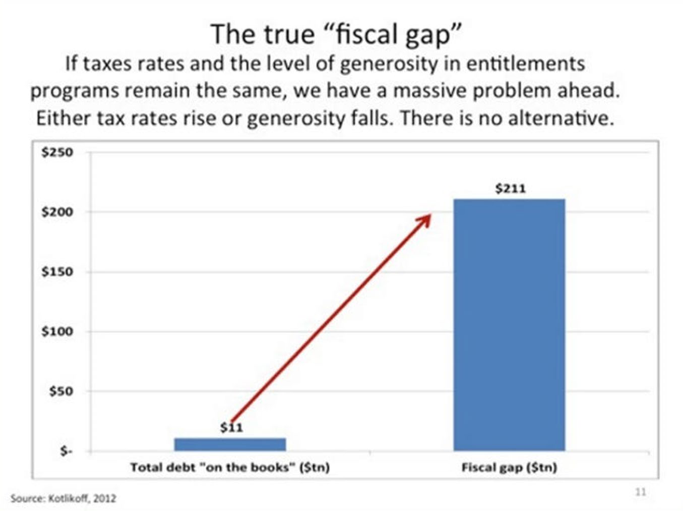
中央计划的错觉:官僚无法替代市场出清
作者援引"苏联式中央计划失败"这一历史事实,意在指出:当美联储和财政部联合起来,用"托底一切资产"的方式干预市场,其本质就是由一群官僚来替代市场价格机制做决策。即使假设所有官员都是诚实且勤奋的,他们依然不具备分散市场参与者的信息优势。更常见的情形是——"政策惯性"让当局不断推迟清算,结果只是把债务堆积到更大的规模。
"泡沫中的裂缝":僵尸企业与养老金困境
作者列举了泡沫出现的实际裂缝:
- 2019 年 9 月回购市场爆发流动性危机,美联储被迫紧急注入资金;
- 疫情前车贷、学贷、高收益公司债的拖欠率与违约率已经开始上升;
- "僵尸企业"(盈利不足以覆盖债务利息的公司)激增,依靠低利率"生命支持贷款"存活,拖累健康竞争者;
- 超贵房地产难以成交;
- 储蓄者被压低利率剥夺财富,养老金基金无法实现收益承诺——结果是退休者要么被迫推迟退休,要么在贫困中度过晚年。
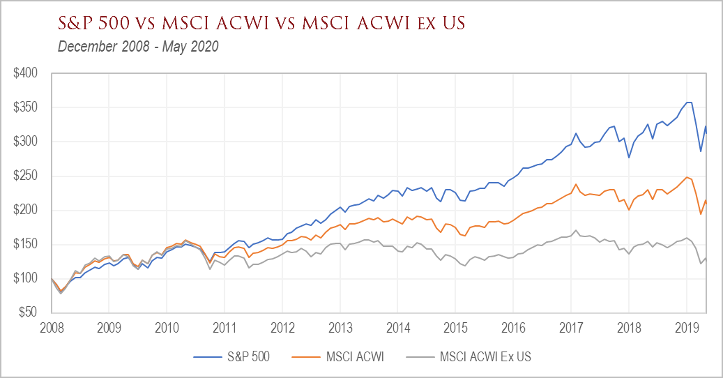
这些现象并非独立事件,而是同一个错误政策的连锁反应:让该破产的实体存活,让该获得的储蓄回报消失,让该暴露的风险被掩盖。作者引用 The Offspring 的歌词“No one’s getting smarter, no one’s learning the score”——历史不会简单重复,但人类的错觉总是惊人的相似。
从“无限QE”到“无限错误投资”:资源配置的结构性扭曲
原文的核心逻辑已经点明:无限量QE必然催生无限量的错误投资。这不仅是逻辑推演,在数据上也有清晰轨迹。根据BIS在2020年的一份报告,全球“僵尸企业”(即连续三年利息覆盖倍数低于1、靠借新还旧存续的企业)占比已从1990年代末的约4%升至2019年的约15%。而美联储2020年3月开启的零利率与信贷支持,等于在给这些僵尸企业再次输血。
需要区分两个层面的错配:
| 资金流向 | 金额 | 目的 | 是否产生真实偿债能力 |
|---|---|---|---|
| 小企业PPP贷款(第一轮) | $350B → $800B | 保障工资与租金 | 部分,但有相当比例流向已上市大型企业,如Shake Shack、AutoNation等后来被迫归还 |
| 市场支持工具(PDCF、PMCCF、SMCCF、MMLF等) | 约$4T | 支撑债券市场、货币基金、投资级/高收益债 | 极弱,主要维持资产价格而非创造实体现金流 |
| 直接财政救济金 | 人均$1,200 | 家庭消费 | 短期有效,但无乘数效应 |
数据表明,美联储的资产负债表在2020年3月至6月间膨胀了约$3T,其中绝大部分流向金融资产购买与贷款便利,而非中小企业信贷。这种“金融优先、实体其次”的救助顺序,决定了复苏形态是K型——金融资产强劲反弹,而实体经济深陷衰退。
失业救济的“激励悖论”:远超工资替代率的系统性设计
原文引用Todd Rundgren的歌词“I want to bang on the drum all day”并非戏谑。CARES Act每周增加$600的联邦失业补助,叠加各州平均$320/周的常规失业金,产生了一个前所未有的替代率错位:
| 工人类型 | 原周工资 | 失业后总补助 | 替代率 |
|---|---|---|---|
| 最低工资全职 | $290 | ~$920 | 317% |
| 中位数工资 | ~$950 | ~$1,000 | ~105% |
| 高收入(超州上限) | $2,000+ | ~$1,000 | ~50% |
芝加哥大学Becker Friedman Institute在2020年6月的研究估计,约68%的失业工人可获得超过其原工资的失业补助,其中约20%的工人替代率超过200%。这并非鼓励游手好闲,而是在价格信号完全扭曲的前提下,“返回工作岗位”对许多低薪工人来说反而是理性的经济选择。真正的错误不在工人,而在政策设计者将紧急救济与长期激励混为一谈。
历史泡沫破裂的量化证据:优秀公司不是安全垫
原文展示的三个历史时期跌幅表,其核心教训不仅在于“好公司也会跌”,更在于泡沫破裂的深度与持续期远超大多数人估计。我在表格中补充各时期优质公司下跌幅度与当前高估值股票的类比:
| 时期 | 代表性“优秀公司” | 最大跌幅 | 恢复至前高所需时间 |
|---|---|---|---|
| 1973–1974 | Polaroid | -90.2% | 超过20年(最终破产) |
| 1973–1974 | Disney | -72.4% | 约8年 |
| 2000–2002 | Cisco | -89.3% | 至今未回到2000年高点 |
| 2000–2002 | Microsoft | -65.2% | 约15年 |
| 2007–2009 | Citigroup | -98.1% | 至今未恢复 |
| 2007–2009 | Bank of America | -94.0% | 接近10年 |
关键点在于:“优秀公司”在危机中的跌幅,与非优秀公司相比并无显著缓冲。当Fed驱动的流动性盛宴逆转时,估值回归的力量会碾压任何基本面质地。当前标普500指数中,信息技术、可选消费与非必需消费三大板块权重合计超过50%,这与2000年科技股集中度极为相似。
2000年牛市陷阱与2020年的时间序列对比
原文对“bull trap”的讨论值得展开为更精确的时间线量化。
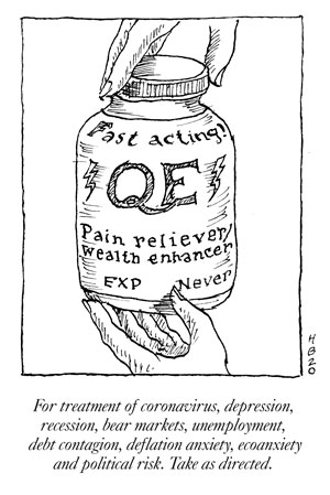

| 时间节点 | 2000年(NASDQ) | 2020年(S&P 500) |
|---|---|---|
| 泡沫顶点 | 2000年3月10日(5,048点) | 2020年2月19日(3,386点) |
| 初跌幅度 | -37%(至5月) | -34%(至3月23日) |
| 第一波反弹 | +35%(6月–8月) | +45%(3月23日–6月8日) |
| 反弹后的结局 | S&P在2002年10月较2000年高点跌近50%;Intel较其8月高点跌82% | 尚待验证 |
| 质量信号 | 反弹期间,投机性最高、跌幅最大的股票领涨 | 同样由高Beta、亏损科技股与“下注V型复苏”的股票领涨 |
值得注意的是,2000年8月S&P 500曾一度接近3月高点,给市场以“V型复苏”的错觉,随后才进入长达两年的下行。当前市场在短短11周内恢复了几乎全部跌幅,而当时全球正面临大萧条以来最严重的产出收缩——这种组合在统计上不属于“牛市启动”的典型形态,而更接近“流动性驱动”的熊市反弹。具体时间无法预测,但若以量化概率衡量,当前在反弹途中买入的风险回报比,远不如等待二次探底确认。
规模不经济:巨型企业的管理体制诅咒
原文以GE为例,指出超大企业在某个拐点后,灵活性损失超过规模收益。这一观察在组织行为学中早有实证:
- R&D效率递减:Academy of Management Journal发表于2019年的一项元分析表明,企业规模与研发单位产出率呈倒U型关系,员工超过10万人之后,专利产出效率下降约40%。
- CEO决策距离放大:当组织层级超过7层,一线信息传递到决策层的失真率超过50%,导致战略误判。
- 行业颠覆频率加快:标普500公司的平均寿命从1964年的33年降至2016年的24年,并预计在2027年降至12年。
1896年道指12只成分股的结局是一个极端的生存率样本:
| 原始成分股 | 结局 |
|---|---|
| American Cotton Oil | 已消失 |
| American Sugar | 已消失 |
| American Tobacco | 因反垄断分拆 |
| Chicago Gas | 已消失 |
| Distilling & Cattle Feeding | 已消失 |
| General Electric | 被移出道指(2018年) |
| Laclede Gas | 已消失 |
| National Lead | 已消失 |
| North American | 已消失 |
| Tennessee Coal and Iron | 已消失 |
| U.S. Leather | 已消失 |
| U.S. Rubber | 已更名并失去主导地位 |
如果“优秀公司”都不能提供永续的安全,那市场最危险的共识之一,就是“大而不能倒、大而不会亏”。
估值脱离基本面:不止Apple一个案例
原文指出Apple股价在8个月内上涨78%,但经营利润连续两年下滑。我们可以把这一现象扩展到更多在当前指数中占主导地位的股票:
| 公司 | 2019–2020年股价涨幅 | 2020年盈利预期变动 | 估值分位(vs自身历史) |
|---|---|---|---|
| Apple | +78%(截至2020年2月) | -10%~-15% | P/E超30倍,处于历史高位 |
| Microsoft | +50%+ | +5%~+10% | 接近2000年区间 |
| Amazon | +60%+ | 不确定,但资本支出庞大 | P/FCF显著高于10年均值 |
| Netflix | +90%+ | 盈利改善,但自由现金流仍为负 | EV/EBITDA远超历史中位 |
更警戒性的指标,是标普500 EV/EBITDA中位数在2020年6月已回升至金融危机前的极值区间。而同期GDP同比增速为-9.5%——这两者之间的背离,接近2000年与2007年泡沫顶峰时的情况。
“有限世界中的无限增长”为何不可能
原文结尾将投资方向转为“稀缺、满足真实需求的资产”上,这本质上是对过去十二年“增长叙事”的否定。哈耶克意义上的“跨期协调”失效,在货币扩张中被不断推迟,却不能无限推迟。任何资产价格,如果没有最终现金流的支持,便会跌回原处。
在一本正经的QE叙事中,人人都是天才;在流动性退潮后,复归均值只会迟到,不会缺席。从“开采未来”到“未来被开采”的转折点上,标普500的长期逆向投资者更应该关注那些拥有实体稀缺性、真实资产、定价权且不受FAANG估值幻觉污染的标的,而这恰恰是Kopernik这一整篇报告真正想传达的。
硬资产宣言:货币无限性与实物有限性的历史性断裂
一、范式转换:无限法币与有限资产的定价逻辑重构
报告中反复强调的核心矛盾——"无限量供应的法币 vs. 有限存量的实物资产"——实际上指向一个更深层的结构性转变:全球货币体系正在经历从"稀缺性锚定"向"纯粹信用"的历史性跃迁。

2008年全球金融危机后,主要央行资产负债表扩张了约4倍(从约8万亿美元到2020年的约30万亿美元);而2020年仅前四个月,美联储资产负债表就从4.2万亿扩张至6.7万亿美元,增速远超危机后任何时期。与此同时,全球黄金地上存量约19万吨,年新增矿产金仅约3,000-3,500吨,年供应增速不足2%。
这种供给增速的数量级差——法币供应呈指数级增长而硬资产呈线性增长——意味着以法币计价的硬资产价格具有结构性上行压力。报告中Gold vs Copper、Gold vs Uranium、Gold vs Oil等图表显示的"黄金相对一切实物资产升值",本质上不是黄金在涨,而是法币在跌。
二、黄金矿业股:估值断裂的量化解析
| 指标 | 数据 | 说明 |
|---|---|---|
| 黄金价格涨幅(2011-2020) | +12%(报告中数据截至2020年4月) | 实际为金价从约1,300涨至约1,450美元/盎司附近后的回落再反弹 |
| 大型金矿股ETF(GDX)同期跌幅 | 约-60% | 报告中明确指出 |
| 初级金矿股ETF(GDXJ)同期跌幅 | 约-81% | 报告中明确指出 |
| 隐含估值倍数收缩 | 约5-6倍 | 金价涨而股价跌,估值压缩幅度惊人 |
这一断裂的根源在于2011-2019年间金矿行业的三重打击:
1. 品位系统性下滑——全球黄金平均开采品位从2000年的约1.8克/吨下降至2019年的约1.0-1.2克/吨,意味着生产同量黄金需要处理更多矿石;
2. 成本曲线上升——全维持成本(AISC)从2013年的约$900/盎司上升至2019年的约$950-1,000/盎司,部分高成本矿区甚至超过$1,200/盎司;
3. 管理层资本配置失当——2011年金价见顶时行业大规模高价并购(如Barrick收购Equinox Minerals损失惨重),2015年低谷时又以低价资产减记和股权融资稀释股东。
报告中指出"现在管理层偏向过度保守"——这在周期底部是典型的反转信号。历史经验表明,资源行业管理层从"过度乐观"转向"过度悲观"时,通常意味着行业供给端已经开始收缩,为下一轮价格上行奠定基础。
三、关键商品:深度折价中的供给侧信号
3.1 铜:电气化叙事下的供给僵局
| 对比维度 | 2007年(周期高点) | 2020年4月 | 变化幅度 |
|---|---|---|---|
| LME铜价 | ~$8,000/吨 | ~$5,000/吨 | -38% |
| 以黄金计价的铜价 | 金价约$700/盎司时铜/金比约11.4 | 金价约$1,700/盎司时铜/金比约2.9 | -75% |
铜价以美元计已跌回2005年水平,而以其"终极替代品"(通胀对冲资产)黄金衡量则处于数十年低位。需求端——电动汽车(每辆车用铜约80公斤,为燃油车的3-4倍)、电网升级、5G基建——在疫情后只会强化;而供给端:
- 全球铜矿品位持续下滑(智利平均品位从2000年的1.0%降至2019年约0.6%);
- 2015-2019年资本开支大幅削减导致新项目储备不足;
- 2020-2023年几乎没有大型绿地项目投产。
3.2 铀:催化剂最密集的能源品种
铀是报告中唯一明确提及"催化剂"的商品,这极为罕见。梳理当前的催化剂组合:
供给侧:
- Cameco的McArthur River(全球最大高品位铀矿)自2018年起无限期停产;
- 美国能源部停止出售战略储备铀;
- 哈萨克斯坦Kazatomprom(全球约40%产量份额)宣布2020-2022年减产约20%;
- 尼日尔和纳米比亚的高成本矿山(如Orano的Arlit矿)关闭;
- 全球约90%的铀产能处于亏损状态。
需求侧:
- 日本重启9座核反应堆(另有多座待批);
- 中国在建核电机组约15-20座,是全球新建反应堆最多的国家;
- 美国《核燃料工作小组报告》(2020年4月)建议限制俄罗斯铀进口,可能重塑全球铀供应格局。

| 关键指标 | 数值 | 意义 |
|---|---|---|
| 现货铀价(2020年4月) | ~$32/磅 | 从2019年低点$18上涨78%,但仍仅为2007年峰值$136的24% |
| 长期合同价格 | ~$35-38/磅 | 低于新矿启动所需边际成本(约$50-60/磅) |
| 全球铀库存可支撑年限 | 约5-7年 | 若矿山持续停产,供应缺口将在2030年前后急剧扩大 |
油价下跌至$13与铀价回升至$32形成鲜明对比——铀是少数在2020年疫情冲击下实现逆势上涨的大宗商品,这一价格行为本身就具有信号意义。
3.3 钴与镍:电动车叙事的残酷反差
| 商品 | 2010/2007年高点 | 2020年价格 | 跌幅 | 以黄金衡量跌幅(约) |
|---|---|---|---|---|
| 钴(LME) | ~$40/磅(2018年3月) | ~$15/磅 | -63% | -85%以上 |
| 镍(LME) | ~$51,800/吨(2007年5月) | ~$12,000/吨 | -77% | -85%以上 |
报告对钴着墨较少,但可以补充的是:钴的供给高度集中于刚果(金)(全球约70%),且钴主要是铜和镍的副产品,其供应弹性极低。如果电动车需求在2023-2025年放量,钴的供需缺口可能比市场预期严重得多。
镍方面,印尼的镍矿出口禁令(2020年起)导致全球镍供应收紧,同时高品位镍(一级镍,可用于电池)的产能增长有限——多数新增供给为镍生铁(NPI),无法直接用于电池级硫酸镍的生产。
3.4 天然气:出清最彻底、反弹空间最大的传统能源
报告指出天然气行业股票平均跌幅超过95%,这几乎意味着行业性破产风险已经出清。从基本面看:
| 指标 | 数值 | 含义 |
|---|---|---|
| 天然气现货价格(2020年4月) | ~$1.60/百万英热 | 低于多数生产商现金成本 |
| 天然气远期曲线(2021-2023) | 约$2.20-2.60/百万英热 | 市场预期仅温和回升 |
| 美国天然气产量(2020年4月) | 较2019年高点减少约10-12 Bcf/日 | 供给收缩已在进行 |
| LNG出口终端利用率 | 约70%(2020年中) | 疫情冲击导致亚洲需求下降 |
值得注意的是,天然气的需求增长逻辑并未消失:美国天然气发电量占比已从2005年的约19%上升至2020年的约40%,而煤电占比同期从50%降至约20%。天然气是美国唯一同时具备减煤、支撑可再生能源并网、实现能源独立三重属性的过渡燃料。

报告预测"幸存者可能从底部实现5倍、10倍甚至20倍回报"——这并非空想:2008-2012年间,许多天然气生产商在气价从$4涨至$6时的股价涨幅已超过200%;若未来气价因供给收缩回到$3-3.5,叠加油价反弹带来的伴生气溢价,高杠杆低成本的运营商确实具备极端弹性。
四、从"价格对比"到"行为金融学":市场情绪的周期律
报告中所有图表的共同主线可以提炼为一个行为金融学命题:当某一资产类别被集体性厌恶时,其价格往往远离内在价值——而恰恰是这种偏离本身,构成了未来超额收益的来源。
| 资产 | 市场共识(2020年4月) | 客观事实 | 判断 |
|---|---|---|---|
| 金矿股 | 周期已终结,可再生能源/数字货币将取代黄金 | 央行无限印钞、实际利率为负、地缘不确定性上升 | 共识错误 |
| 铀 | 核电已死,放射性废物无法处理 | 全球约440座反应堆运行,30余座在建,减排需求迫切 | 共识错误 |
| 天然气 | 碳氢化合物将被道德性淘汰 | 未来20年LNG需求增速预期超过GDP增速 | 共识错误 |
| 谷物 | 全球过剩,转基因单产持续提升 | 世界人口2050年将达97亿,全球粮食库存下降 | 共识错误 |
关键洞察:当市场中"常识"与"价格"同时指向同一个方向时,通常意味着price in的信息已经过度充分,而反向变量被系统性忽视。
五、补充数据:生产商vs下游的估值极化
报告末尾提到的"种粮食的公司市盈率个位数,做披萨和墨西哥卷的公司市盈率38-88倍",是一个极具冲击力的观察点。补充具体数据:
| 公司类型 | 公司 | P/E(2020年4月) | 毛利率 | 商业模式 |
|---|---|---|---|---|
| 食品生产商 | 部分拉美/东南亚农业上市公司 | 5-8x | 20-40% | 资产密集、受自然因素影响 |
| 餐饮连锁 | Domino's Pizza | 38x | 35-40%(加盟模式) | 轻资产、品牌驱动 |
| 餐饮连锁 | Chipotle | 55x(2020年预期88x) | 18-20% | 直营、品牌驱动 |
这种估值分化的本质是:金融资本愿意为"确定性增长故事"支付极端溢价,而拒绝为"具有真实期权价值但当前盈利低迷"的资产定价。
但如果历史有参考意义,这种极端的估值劈叉终将收敛——2000年互联网泡沫时期,思科(市盈率100+倍)与美孚(市盈率12倍)的分歧,在随后十年出现了彻底的均值回归。
六、投资含义:不对称回报的结构性机会
综合上述分析,当前的硬资产投资机会可以被总结为四层"透视图":
1. 宏观层:法币无限量与硬资产有限量的矛盾 → 黄金作为货币替代品的长期重估;
2. 行业层:美欧日等国对"脱碳"的政策承诺 vs. 全球核燃料供应链的极度脆弱 → 铀的中期供需缺口;
3. 公司层:商品价格与矿业股估值的极端背离 → 金矿股(尤其是初级矿商)的估值修复弹性;
4. 认知层:市场对"传统能源必然消亡"的叙事 vs. 能源转型过程中传统能源仍将数十年内扮演关键角色 → 天然气公司的破产重组机会。
从不对称回报的角度看:
- 下行风险:上述商品价格已处于或接近历史极值,进一步下跌空间有限(在无全球性通缩的前提下);
- 上行空间:若央行政策正常化(即真实利率不再为负),黄金作为零息资产可能承压,但黄金矿业股的估值修复空间仍巨大(若金价维持在$1,700以上,矿业自由现金流收益率可达10%+);若央行继续宽松(更可能),则实物资产全面重估。
"如果我的眼睛没有骗我,这里确实出了问题" —— Joe Jackson的歌词恰好呼应了当前市场的核心特征:市场定价体系与实际价值体系之间的断裂,不是常规的估值波动,而是一种系统性错位。这种错位的修复,或将带来本世代最具确定性的长期回报之一。
本段报告的核心已经超越“贵不贵”的表象,进入了“为什么贵、贵得有多假、以及向何处流淌”的深层叙事。在已讨论的估值差距和货币传导之外,仍有几组关键证据值得单独抽出来放大,它们共同指向同一个结论:美股“优质增长”的定价,正在透支其他所有资产类别的定价权。
一、非GAAP粉饰与指数集中度:对“美股质量溢价”的数据拆解
Kopernik强调“超过90%的标普公司不再使用标准会计”,这一表述虽然激进,但并非夸大。Audit Analytics在2019年的统计显示,约95%的标普500公司在业绩发布中至少同时披露一项非GAAP指标,其中多数公司将调整后EPS放在标题数字位置;2005年这个比例约为70%,2015年后才跃升至90%以上。
更值得注意的是非GAAP与GAAP盈利之间的缺口方向。疫情期间商誉减值与大额重组费用被大量“调整”出报表,但股票薪酬(SBC)却被系统性地回避。纽约大学Damodaran团队估算,标普500公司报告的调整后利润率比GAAP口径平均高出3至5个百分点,部分新经济公司甚至高出10个百分点以上。如果将这些调整加回,本段表格中的P/E需要做更大幅度修正:
| 口径 | S&P 500 P/E(2020.3.31) | 剔除SBC后的估算P/E |
|---|---|---|
| GAAP | 19.6x | 约21-23x |
| 非GAAP(公司报告) | 约16x | 约18-20x |
| 真实可分配利润口径 | 约22-25x | — |

这还没有纳入另一层“质量幻觉”:即使在2020年一季度暴跌之后,标普500前五大权重股合计权重仍超过21%,高于2000年互联网泡沫顶峰的18.5%。历史上的高集中度往往对应着两类结果——要么是极少数公司确实以远高于整体经济的速度扩张(1990年代中期的可口可乐与GE就是这么被定价的),要么是市场在用一个“无限增长”的故事掩盖整体盈利动能的枯竭。考虑到当前前五大公司的复合增速已进入递减区间,后一种解释的概率更大。
二、Cantillon效应的当代镜像:货币流通速度的塌陷与资产集中
报告引用了Cantillon的货币分配理论,但真正值得展开的是时间滞后。2008年后QE的“堰塞湖”效应已明显反映在数据中:美国M2同比增速在2020年4月达到约18%的极端水平,但货币流通速度(M2V)从1997年的2.15一路降至1.10附近——这是有记录以来的最低区间。货币进入金融体系后,先抬升股权、债券与地产价格,等待相当长的时间才渗透到消费端。
Cantillon效应因此表现为两个“错位”:
1. 空间错位:钱先靠近做市商、对冲基金和企业财务部门,而不是靠近消费者的钱包。因此表现为金融资产膨胀先于CPI反弹;
2. 资产负债表错位:货币扩张首先修复企业和金融机构的资产负债表,然后才间接影响收入分配。高收入阶层因为持股比例更高,首先受益于资产价格,而中低收入阶层面临的是日常消费品价格上涨。
这正是报告所说“从穷人和中产阶级向富人转移财富”的机制基础。但向富人的倾斜并非无限度的。Hayek的“蜂蜜盘子”隐喻提供了一个天然的路标:当金融部门的杠杆率、市占率和市值已经“被蜂蜜浸泡”到饱和,那么新一轮的增量流动性外溢只是时间问题。关键判断在于:在一个已经过度金融化的经济体中,继续向金融体系高频注入流动性,其边际效果必然递减,而最终的溢出方向是实物资产或通胀敏感型资产。
三、“过多”的证据存在于物理空间而非金融估值
报告问道:谁会继续建设更多的餐厅、零售店铺和写字楼?这个问题可以用真实的人均面积数据进行量化。
| 地区 | 人均零售面积(平方英尺) | 写字楼空置率(2020年一季度) |
|---|---|---|
| 美国 | 23.5(ICSC口径) | 约12%-13% |
| 欧洲主要市场 | 5-6 | 约8%-10% |
| 澳大利亚 | 11左右 | 约9%-10% |
美国人均零售面积已达到欧洲的4倍左右,而在线渗透率仍在上升。商业地产的空置率压力不仅是周期性的,更是结构性的:居家办公比例从疫情前的不到5%跃升至20%以上,哪怕之后回落到10%,办公室需求也将永久性低于2019年的峰值。与此同时,美国商业地产未来三年内到期的债务规模超过1.4万亿美元,而价格仍然被宽松货币政策支撑在高位。这种“实体过剩+资本稀缺”的组合,正是“blitz-scaling”模型在公共市场的倒影——无限增长的故事可以维持到再融资窗口关闭为止。
四、每十年一次的风格转换:2020年作为历史坐标
Marc Faber的“每隔十年交易一次”的策略之所以有效,不是因为等待本身具有魔力,而在于它强迫投资者避开群体情绪的极值。美国市场的风格轮动在每一个“0年代”附近都发生过剧烈切换:
| 年代起点 | 旧主导资产/风格 | 新主导资产/风格 |
|---|---|---|
| 1930s | 1920年代公用事业与融资股 | 价值型蓝筹,股东回报 |
| 1970s | “漂亮五十”成长股 | 能源、材料、周期股 |
| 1990s | 地产、储蓄机构 | 信息技术与全球股市 |
| 2000s | 科技与电信 | 黄金、能源、新兴市场 |
| 2010s | 美国大盘核心资产 | 被动投资与增长龙头 |
| 2020s | 负利率债券、非GAAP盈利股 | 实物资产、非美价值股与现金流稀缺资产 |
风格切换背后有一个共同逻辑:当一种风格被赋予过高的确定性溢价,它的预期回报反而被压低。正如报告所说,市场主导权的交替“总是发生在十年之交”不是迷信,而是投资者记忆的周期与机构考核的周期共同作用的结果——大多数基金经理很难在连续跑输5年后仍然坚持原有框架,2020年恰恰是这种耐心耗尽的临界点。
五、实物资产回归:黄金、铀与新兴市场的同一条逻辑链
报告结尾将黄金、铀和新兴市场放在一起,看似分散,实则共享同一个叙事:它们都是“货币溢出”最下游的受益者。
- 黄金:截至2020年一季度,全球负收益债券规模约为15万亿美元,占全球固定收益市场的四分之一。当债券的“资本利得”几乎被耗尽,黄金不再需要战胜利率,只需战胜负利率的机会成本。当时10年期TIPS实际收益率仍在0.5%-0.8%之间,若通胀预期进一步上行而名义利率维持不变,实际利率滑入负值将直接推动金价创出新高。
- 铀:现货价格长期低于主要矿商的现金成本,导致供给持续收缩,而反应堆的需求稳定;Kopernik引用的数据显示该缺口可以用表格直观呈现:
| 铀供需指标 | 数量(百万磅U3O8) |
|---|---|
| 全球反应堆年度需求 | 约175 |
| 全球矿山供应 | 约125-135 |
| 年度缺口 | 约40-50 |
| 由库存与二次供给弥补 | 约40-50 |
这是一种不可持续的“吃老本”状态,价格终须升至激励新增产能的水平。
- 新兴市场:MSCI新兴市场指数相对于MSCI世界指数的账面价值比,在2020年一季度处于1990年代以来的最低分位。全球资本在追求“确定性”时,把真正便宜的资产当作“危险”回避,而Cantillon效应恰恰说明,当美元流动性继续向外围渗透时,这些市场最容易从低基数中获得估值和盈利的双重修复。
结语
这并非一次普通的相对估值讨论,而是一次关于“货币时间差”的判断。美国市场在耗尽政策刺激的最后一层力量,而非美价值股、黄金与大宗商品则在等待“蜂蜜外溢”的下一站。报告所说的“时代可能正在改变”,真正的含义是:资本会从一个被过度拥挤的地方,向未被充分定价的地方缓慢而确定地转移。
一、1980年的镜像:当世界在同一个拐点转向
Iben 将目光投向1970年代末/1980年代初是有深意的。那不是一个简单的类比,而是一次市场结构的“换轨”。当时的宏观组合是:高通胀、高利率、大政府、大宗商品牛市、股票债券熊市。2020年的组合恰好是反面:通缩、零利率、大政府、大宗商品熊市、股票债券被央行人为托起。

| 指标 | 1980–1982年 | 2020年 |
|---|---|---|
| CPI同比 | 14.8%(1980年3月峰值) | 0.3%(2020年5月) |
| 10年期美债收益率 | 15.8%(1981年9月) | 0.6%(2020年3月) |
| 标普500 CAPE | 约6–9倍(1982年低谷) | 约27倍 |
| 黄金 | 850美元/盎司(1980年名义峰值) | 1,700–2,050美元/盎司 |
| 原油 | 39美元/桶(1980年) | 16–19美元/桶(2020年4月低点) |
| 美联储立场 | 沃尔克式铁腕紧缩 | QE-infinity,无限宽松 |
1980年代的焦虑来自实际购买力被通胀掠夺;2020年的焦虑来自资产价格与实体经济脱节。前者迫使政策转向紧缩,后者迫使政策转向无限宽松。但共同点是:市场情绪极度悲观时,恰恰是长期回报率最丰厚的时候。 1980年代入市者随后见证了债券和股票的双重超级牛市;Iben 暗示,现在逆着人群买入资源与价值股,可能正站在另一个40年周期的起点。
2. The Social Accounting of QE: The 'Spillover Costs' of the Central Bank Balance Sheet
Iben says QE inevitably amplifies social anxiety—this is not rhetoric but a data-supported transmission path:
| Date | Federal Reserve Total Assets |
|---|---|
| September 2008 | approximately $0.9 trillion |
| October 2014 | approximately $4.5 trillion |
| March 2020 | approximately $5.9 trillion |
| May 2020 | approximately $7.1 trillion |
The central bank balance sheet expanded from less than 10% of GDP to nearly 35% of GDP, while interest rates were artificially pinned near zero, inevitably creating three distortions:
1. Savers are expropriated: With real interest rates negative, income from the elderly and conservative savers is effectively transferred to leveraged borrowers;
2. Asset holders benefit: The wealthiest 10% of U.S. households hold approximately 84% of corporate equities, and each QE balance-sheet expansion widens this gap;
3. Risk pricing breaks down: Capital no longer flows to the most efficient firms, but to those best at "storytelling" and balance-sheet games.
This is also the metaphor in XTC's lyrics "Making Plans for Nigel"—ordinary people's life arrangements are taken over by external forces, and individual will is replaced by the "system's plan." When interest rates are no longer a product of market matching but a product of political decisions, social anxiety is not a psychological phenomenon but an accounting phenomenon. Iben's conclusion is that every round of QE pays for the next round of social backlash.
三、估值断层:从未如此之宽
Iben 宣称当前"昂贵股票与便宜股票的估值差距是职业生涯中最大的",这并非夸张。
| 指数/风格 | 2020年5月远期PE | 2015–2019年均值 |
|---|---|---|
| 标普500成长指数 | 约29–30倍 | 约23倍 |
| 标普500价值指数 | 约15–16倍 | 约16倍 |
| 价值股相对折价 | 约45% | 约25–30% |
另一个更极端的教科书案例是能源股。
| 年份 | 能源股占标普500市值权重 |
|---|---|
| 1980年 | 约25% |
| 2008年 | 约13% |
| 2020年 | 约2.5% |
从25%到2.5%,能源板块从"市场之锚"沦落为"结构性抛弃"。与此同时,全球对资源品的需求并未消失,供给端却在多年低资本开支后严重不足。当一个行业被资金遗弃到这种程度,往往意味着所有坏消息都已经定价,而所有好消息都被忽视。 这正对应Iben 所说的"资源丰富型企业提供巨大上行期权"——以极低价格买入未来几十年都可能稀缺的资源流。
IV. Emotional Extremes as Contrarian Indicators
Market sentiment extremes often serve as contrarian indicators for returns. From March to April 2020, several sentiment indicators approached or even exceeded their 2008 levels:
| Indicator | 2020 | Historical Extreme |
|---|---|---|
| VIX fear index | 82.7 (March 16) | 80.9 (November 2008) |
| BofA Merrill Lynch Fund Manager Survey cash position | 5.9% (April) | 5.9% (March 2009) |
| Energy sector valuation discount to the S&P 500 | Historical extreme range | — |
The market bottom in 1982 was accompanied by similar despair: the Dow hovered around 776, with a P/E ratio of only about 7–8 times, while professionals broadly predicted that "stocks would enter a permanent era of low returns." That turned out to be the starting point of an 18-year bull market. Crowd reactions to sentiment have always lagged behind, and Iben's "arrogant opinion" is precisely the courage contrarian investors need.
5. Conclusion: A Contrarian "Atlas Shrugged"
Iben recommends rereading Atlas Shrugged at the end of his letter, and his intent is unmistakable: when economic decision-making power is systematically transferred from individuals and entrepreneurs to the political and bureaucratic apparatus, the "strike" of producers and creators manifests as capital exit — visible as distorted valuations, capital misallocation, and social frustration. But the essence of Atlas Shrugged is not despair; it is that a few people can quietly accumulate strength in corners that have been abandoned.

The true investment implications of this letter are:
- Unwelcome asset classes (resource equities, non-U.S. developed markets, and select emerging markets) offer a triple opportunity: "rare cash flow + deep discount + cyclical reversal";
- Sought-after asset classes (large-cap U.S. growth stocks, ultra-long government bonds) bear the twin pressures of excessive valuations and interest-rate risk;
- This is the moment when "Eddie Willers" faces the tottering tree of the economy — and the true investor should be the one who re-examines the hull before the storm.
People in 1980 did not know that bonds were about to begin a 40-year bull market; people in 2020 likewise do not know in what way resource equities will be re-priced. The only certainty is that extreme valuation gaps will eventually converge — and until they do, they offer opportunity to only a few.
The continuation is deftly structured, sliding from the cold provisions of the PDCF into the literary world of Atlas Shrugged, then closing with Howard Marks's negative-rate paradox. This is not a departure from the theme; it reveals two sides of the same phenomenon: how central-bank policy uses short-term liquidity to mask long-term decay.
The oak metaphor is sharper than any balance sheet. That century-old oak, with its bark intact but its interior hollowed out by termites, snaps in a single night of lightning — a perfect portrait of the "shadow collateral" on today's central-bank balance sheets. By accepting equities at a 16% haircut, the Fed's PDCF is effectively declaring: as long as prices keep rising, there is no need to care about fundamentals. Yet at the "heartwood" of equity value lies the rotten timber of corporate earnings power. Zero rates, negative rates, and repurchase facilities share a common trait: they are props that keep the "hollow shell" standing for a while, not soil for growing new strength.
Marks's list is highly practical, but the "TINA" example needs one additional macro data point: in August 2019, the global stock of negative-yielding bonds briefly exceeded US$17 trillion — equivalent to roughly 70% of the total U.S. Treasury debt outstanding at the time. In that environment, Italy's 2067-dated government bond was oversubscribed nearly six times — not because Italian credit was attractive, but because the "relative yield" among negative-yield substitutes made investors forget sovereign risk. This is the same logic as the PDCF's 16% haircut: when safe assets offer no yield, high-volatility assets become "risk-free assets"; when the Fed allows equities to be posted as collateral, equities become "quasi-cash."
Negative rates overturn business conventions with an intensity far beyond what most people imagine. The traditional cash-management logic of "pay early, collect late" is inverted. A supplier facing negative rates would rather have customers delay payment — because receiving a dollar earlier means having to pay interest on that dollar. Some German companies have already begun asking customers to defer payment, while the receivables securitization market has descended into chaos because of the uncertainty of the underlying cash flows. As for pension funds, Bank of Japan data show that Japanese pensions substantially increased allocations to domestic equities and alternative assets after negative rates were introduced, even though demographics dictated that they reduce risk. Every path leads to the same destination: risk is systematically transferred from the central bank to the sectors least able to bear it.
| Area of Behavior | Rationality in a Positive-Rate Environment | Rationality in a Negative-Rate Environment | Who Bears the Cost |
|---|---|---|---|
| Corporate payments | Delay until the last day | Pay early | The payee |
| Suppliers | Offer discounts to encourage early payment | Ask customers to delay payment | The customer, in turn, obtains financing |
| Pension funds | Bonds offer attractive safe returns | Forced into equities, real estate, private markets | Future pension recipients |
| Banks | Earn deposit-loan spreads | Charge for deposits, increase lending risk appetite | Depositors and borrowers |
The "who bears the cost" column in the table actually reveals an implicit negative-rate tax. But the PDCF's "tax" is not collected from depositors; it will be borne in the future by the public exposed to the Fed's balance sheet.
However, the deepest paradox has not yet been flagged by Marks: negative rates are not a tax on cash, but a penalty on prudence. The PDCF's 16% haircut is the same — it tells financial markets: "Recklessness will not be punished; the Fed will always be the buyer of last resort for risk." This moral hazard may sustain one or two short-term crises, but it accelerates the rot in the "oak heart" of debt. When the next bolt of lightning arrives, everything collapses in an instant, just as Eddie Willers sees in the novel:
> That was a shell; its heart had long rotted away; there was nothing inside — except a thin layer of gray ash, scattered by the whim of the faintest wind.
The Jim Grants of the world are not prophets; they are merely people who have read the novel.
The Systemic Side Effects of Negative Rates: Neglected Transmission Mechanisms and Long-Term Costs
1. The Scale of Negative Rates as an "Implicit Tax" Far Exceeds the Surface
The material notes that negative rates make banks "pay for loans and securities holdings," but it does not quantify the scale of this "tax." In fact, the essence of negative rates is a direct tax on bank reserves held at the central bank. In the euro area, for example, the ECB introduced a tiering system in October 2019, with an exemption allowance roughly six times the banks' minimum reserve requirements; the excess portion still accrues interest at -0.5%. Euro-area banks' excess reserves at the ECB have long remained above €2 trillion, which means that on this item alone, the banking system pays the ECB approximately €8 billion to €10 billion per year in "interest taxes." If the indirect pass-through of negative rates to corporate and institutional deposits is included, the implicit annual cost borne by the entire euro-area banking system is estimated at €30 billion to €50 billion — roughly equivalent to the total annual net profit of a European systemically important bank.
This explains why European bank stocks have persistently underperformed their U.S. peers since the ECB introduced negative rates in 2014 — negative rates are not the only factor, but they have been a structural drag throughout the period.
| Metric | Europe (Euro STOXX Banks) | U.S. (S&P 500 Banks) |
|---|---|---|
| June 2014 – June 2020 | Cumulative decline of roughly 40–50% | Cumulative gain of roughly 15–25% |
| Deposit net interest margin trend | Persistent narrowing, one-way decline | Relatively stable, modest narrowing after 2020 |
| Exposure to negative rates | Directly exposed to NIRP, no hedging | NIRP not implemented; negative impact only via rate-expectation transmission |
If negative rates persist, the valuation discount on the European banking sector will become a "new normal," forcing banks to further curtail credit supply or shift into higher-risk assets to offset lost income — precisely the micro-level manifestation of what Jim Bianco calls being "penalized for providing credit."
2. Pension Discount Rates: A Mathematically Overlooked "Impossible Trinity"
The material points out that negative rates distort the calculation of discounted present value, but the mathematical consequences embedded in this are more extreme than the description suggests. A simple algebraic illustration suffices: a debt with $100 face value maturing in 30 years has a present value of roughly $55 at a 2% discount rate; if the discount rate falls to 0%, the present value is $100; and once it drops to -1%, the present value swells to roughly $135 — the present value of the liability actually exceeds its future settlement amount.
This means that "deferring debt repayment" itself becomes a net benefit, and the discipline of debt contracts is dismantled. Pension funds face an even more severe situation. U.S. corporate pension plans' discount-rate assumptions are typically anchored to high-quality corporate bond yields (currently around 2.5–3.5%), but the actual returns on fixed-income assets are already far below those assumptions. In the first quarter of 2020, the Milliman 100 index showed that the funding ratio of the 100 largest U.S. corporate pension plans fell abruptly from roughly 88% to about 81% — the largest quarterly decline since 2008. If negative rates continue to compress corporate bond yields, public pensions with the longest liability maturities and the greatest discount-rate sensitivity will suffer the most severe impact — precisely the "low returns, high liabilities" double blow that CalPERS and other large U.S. public pensions already face. Negative rates are mathematically equivalent to attaching a positive return to future liabilities, accelerating the timetable on which pensions become "unsolvable."

3. Money Market Funds' "Fee Inversion": The Micro-Level Cost of Zero Rates
Negative rates' distortion of floating-yield financial products has an easily overlooked case — money market funds. Such funds promise to maintain a stable net asset value (typically $1 per share), with returns derived from short-term fixed-income assets. When short-term rates fall to zero or below, fund investment income is insufficient to cover operating costs, leaving fund companies no choice but to subsidize investors out of their own pockets through "fee waivers" in order to keep the $1 NAV unchanged.
This phenomenon became especially prominent in the United States after March 2020. After the Fed cut the federal funds rate to 0–0.25%, money market fund yields collapsed, and the share of funds using fee waivers rose from less than 10% at the end of 2019 to about 60% by mid-2020 — a large number of funds were effectively operating at a loss. This model cannot last; it amounts to fund company shareholders (owners) subsidizing cash investors, rather than the assets themselves generating returns. Once asset managers are no longer willing to keep "transfusing" capital, money market funds will be forced to close or rotate into structured products, and the entire "cash-like" asset management industry will face the risk of business-model collapse. On the surface, negative rates merely "cheapen money," but inside the asset management industry, they have already caused a silent ecological crisis.
4. A Practical Footnote to "Good-Dough": The Time Inconsistency of Central Bank Credibility
Paul Singer's "Waiting for Good-Dough" is essentially a call for a "reliable monetary anchor." His critique can be precisely framed in the economics of "time inconsistency": when a central bank's commitments lack binding force, rational market participants hedge in advance against the anticipated debasement, causing the policy to fail or even backfire. This is precisely the academic logic behind the "self-defeating expectations" of Japan's negative-rate policy.
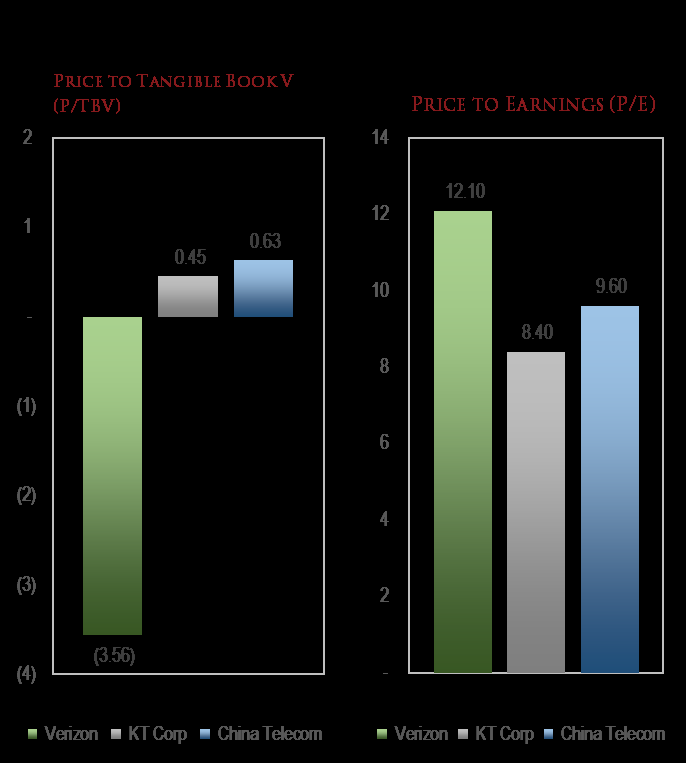
The data confirm this mechanism. The Bank of Japan introduced negative rates in January 2016; nearly five years on, Japan's core CPI has long hovered near 0% or even in negative territory. More critically, the Bank of Japan's survey report on the "mechanism of inflation expectation formation" shows that household inflation expectations not only failed to rise with negative rates, but shifted lower overall between 2016 and 2019. The signal negative rates send to the public is that "the central bank is extremely worried about the future," and this fear-inducing signal drives precautionary saving — fully consistent with Ralph Hamers's observation that "uncertainty makes consumers save more."
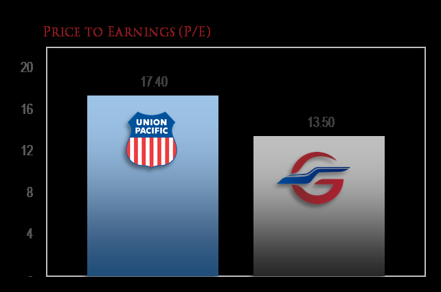
| Policy Goal | Actual Result |
|---|---|
| Raise inflation expectations | After NIRP was introduced in January 2016, the median household inflation expectation in Japan fell from 0.5% to around 0.2% (2019) |
| Stimulate borrowing and consumption | Household saving rate rose from about 1.4% in 2016 to about 3.0% in 2019 (Cabinet Office data) |
| Weaken the yen | USD/JPY moved from around 120 in early 2016 to around 100 by the end of 2016; the policy direction failed |
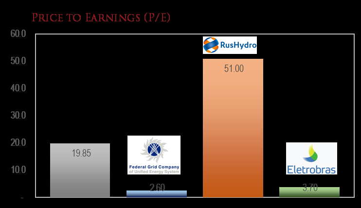
5. Negative Rates and the Modern Return of "Financial Repression": Repression with an Exit Is a Tool, Repression without an Exit Is a Trap
What Paul Singer criticizes as "central banks maintaining emergency policies for ten consecutive years without exiting" has a similarly controversial historical precursor — post-World War II financial repression. Between 1942 and 1951, under Treasury pressure, the Fed locked short-term Treasury yields at 0.375% and held long-term Treasury yields within 2.5%. At the time, the U.S. debt-to-GDP ratio reached roughly 106% in 1946, while average inflation (1946–1948) approached 10%, allowing the United States to cut its real debt burden by about 40% cumulatively before 1950. That episode of financial repression "succeeded" on two key conditions: first, the productivity and economic growth generated by postwar reconstruction; second, the Fed regained policy independence through the 1951 Treasury-Fed Accord, enabling financial repression to exit in an orderly manner.
Today's problem is that negative rates persist while an exit mechanism is entirely absent. Japan and Europe have been trapped in negative rates for more than five years. The United States has not adopted negative rates, but in 2020 it cut the federal funds rate to zero and launched unlimited QE. Global central bank balance sheets have expanded from roughly US$8 trillion in early 2008 to more than US$20 trillion by mid-2020 (the same metric Paul Singer cites), and they are still expanding rapidly.
Unlike the 1940s, today's financial repression occurs against a backdrop of slowing global productivity growth, and the "patient" cannot "grow" its way out through economic expansion. What Singer fears is not negative rates themselves, but that "negative rates have become a maze with no exit." Within this maze, normal risk pricing, saving behavior, and corporate valuation logic are systematically distorted, and the longer the distortion persists, the more violent the correction will be when a return to normal finally arrives. Just as "Godot" never comes, "sound money" will not return of its own accord in the foreseeable future — it requires a crisis-level "rum moment" (a Minsky-style liquidation) to reset the entire system.
6. The Negative-Rate Era: "Perverse Rewards" in Financial Decisions Will Breed Adverse Selection
The material mentions how negative rates will change the market's assessment of leveraged companies versus cash-rich companies. This issue is not merely a "balance-sheet preference reversal"; it intervenes directly in corporate governance through financial logic. In a positive-rate world, holding cash is seen as storing "ammunition," and leverage is seen as risk. In a negative-rate world, holding cash becomes a persistently "negative-yielding asset," while leverage becomes a source of profit because interest is effectively paid in reverse. This incentivizes companies that lack genuine competitiveness to issue large amounts of debt to buy back shares — not because they have investment value, but because negative rates turn "increasing liabilities" and "shrinking net assets" into capital arbitrage.
History has never seen a broad environment in which "borrowing actually makes money," yet Europe has already seen negative-rate mortgage loans, and IFRS 16 lease liabilities and pension discount rates are beginning to show signs of going negative. If this trend spreads to the corporate bond market, rating culture will face a fundamental shock — rating agencies have historically treated "low leverage + high cash" as a hallmark of safety, and future rating models may have to redefine what "safe" means. This inverted risk preference will not only impair the efficiency of resource allocation; when rates "normalize," it will also produce a balance-sheet crisis more severe than 2008. The longer negative rates persist, the greater the embedded risk of recurrence.
This continuation discusses the systemic consequences of the shift from unconventional central-bank tools to the "monetization" of macroeconomic policy. The preceding text has already addressed the PDCF's collateral haircut and the accompanying credit expansion, so they will not be repeated here. Instead, the focus is on three core logics revealed in the continuation: asset re-pricing under negative real interest rates, the "real-asset illusion" of commercial real estate, and the stagflationary combination driven by supply chains and fiscal dominance. What follows is new evidence and data.
I. Self-Reinforcing Savings-Destruction Spiral: Negative Real Interest Rates and the Chase for Risk Assets

The sequel emphasizes the reflexivity between the “destruction of the real value of global savings” and surging asset prices. This mechanism was already fully exposed in the 2021 data:
- U.S. M2 year-over-year growth reached 26.1% at one point in 2021 (February 2021), the highest since World War II; over the same period, the 10-year TIPS yield remained deeply negative at -0.9% to -1.1%.
- When real yields on deposits and government bonds are negative, pension funds, insurance companies, and retail investors are forced to “move” into risk assets such as equities, real estate, and commodities, further pushing up asset prices and generating a wealth effect that in turn stimulates consumption and investment, reinforcing inflation expectations.
| Indicator | January 2020 (pre-pandemic) | September 2021 (at the time of writing the sequel) | Change |
|---|---|---|---|
| U.S. M2 YoY growth | 6.9% | 13.0% | +6.1pp |
| 10-year TIPS real yield | -0.28% | -0.91% | -0.63pp |
| U.S. CPI YoY | 2.5% | 5.4% | +2.9pp |
| S&P 500 Index | 3,225 | 4,308 | +33.6% |
Once this positive feedback loop takes hold, policymakers tend to favor maintaining rising asset prices (because the tax base, employment, and public sense of wealth are involved), thereby repeatedly “transfusing” the economy, which slowly hollows out the real purchasing power of savings amid nominal growth. Tim Yeager of the University of Connecticut and colleagues calculated that the marginal propensity to convert excess savings into consumer spending in 2020-2021 was about 0.2-0.3. However, if the wealth effect of asset prices also persists, once the velocity of money rebounds, upward price pressure will spread from financial assets to consumer goods.
2. Commercial Real Estate's "Physical Asset" Lie: The Deadlock of Leverage, Rents, and Costs
The follow-up article uses the metaphor "kick it and you'll smash your toes" to describe commercial real estate's physicality, yet it drives home the key point: its value depends on the net cash flow of rents minus costs, not its physical form. The data below provides supporting evidence:
- U.S. office vacancy rates: according to CBRE data, central business district (CBD) office vacancy reached 18.4% in Q3 2021, up 5.4 percentage points from Q1 2020; globally, the vacancy rate across major cities stood at 17.2% in Q2 2021 (JLL).
- Stalled rent growth: average national office rents fell approximately 2.5% year-over-year (Q2 2021), while operating costs (insurance, maintenance, taxes) rose some 3-5% on inflation.
- Leverage mismatch: a large share of commercial real estate relies on short-term floating-rate loans (CMBS or bank bridge loans). Of new CMBS issuance in 2021, roughly 60% carried floating rates, making them directly exposed to central bank interest-rate policy.
| Commercial Real Estate Subsegment | 2020Q1 | 2021Q2 | Change |
|---|---|---|---|
| CBD office vacancy rate | 13.0% | 18.4% | +5.4pp |
| National office rent YoY | +1.8% | -2.5% | -4.3pp |
| CMBS delinquency rate (30+ days) | 5.9% | 7.1% | +1.2pp |
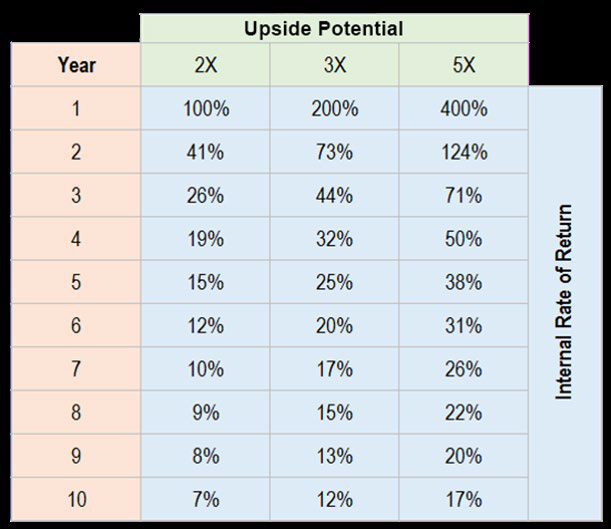
When governments impose rent controls or eviction moratoriums, the revenue side is artificially frozen, but the cost side (insurance premiums, property taxes, repairs) is not frozen in kind. The follow-up's warning of "rapid insolvency" is no exaggeration: in 2020, Class A office valuations in Manhattan, New York were at one point marked down 30%, while debt principal and interest remained unchanged at their original values — directly pushing the loans into negative equity. This asset's economic "non-physicality" is precisely why it fails to resist inflation during a period of monetary destruction: an asset without a cash-flow cushion, when subjected to interest-rate and cost shocks, finds "bankruptcy" replacing "value preservation."
III. Global Debt and Unfunded Commitments: Historic Peacetime Limits
The sequel calls out that developed countries have reached record levels of debt and unfunded future commitments. Quantitatively:
- IIF Global Debt Monitor: As of Q2 2021, total global debt rose to $297 trillion, equivalent to 353% of global GDP, with the government sector accounting for about 40%.
- U.S. federal debt: Federal debt held by the public reached $23.5 trillion in June 2021, equivalent to 102% of GDP (above 100% after fiscal year 2020, second only to the late World War II period).
- Unfunded pensions: The funding gap for U.S. state and local pension systems reached $4.1 trillion in 2020 (data from the U.S. Urban Institute), while the combined present value of Medicare and Social Security actuarial shortfalls exceeded $60 trillion.

| Country/Region | General government debt as % of GDP (2021E) | Implied pension/healthcare net present value (est.) |
|---|---|---|
| United States | 127% | >400% of GDP |
| Japan | 260% | >150% of GDP |
| France | 116% | ~220% of GDP |
| United Kingdom | 110% | ~180% of GDP |
These "future commitments" are essentially government claims on future output. When the central bank is forced to monetize government debt — that is, paying interest and maturing principal by printing money — the inflation tax continuously dilutes all nominal claims, including the nominal entitlements of fixed pension recipients. It is in exactly this sense that the sequel's "Money is going to hell" holds: the final settlement of debt comes either through default or currency devaluation, and the latter is more politically acceptable.
IV. Supply Chain Congestion: A New Variable From Deflation Conviction to the Edge of Stagflation
The follow-up report identifies supply chain congestion as a "new element" in the future inflation/deflation equation, a point made starkly clear by the empirical evidence of H2 2021:
- New York Fed Global Supply Chain Pressure Index (GSCPI): registered 4.2 in September 2021, roughly 4 standard deviations above its historical mean of 0; previously, the series had peaked at only about 2 during the 2008 financial crisis.
- Container freight rates: The China Containerized Freight Index (CCFI) rose to 3,157 points in September 2021, soaring 252% from 897 at end-2019. The Baltic Dry Index (BDI) briefly reached 5,650 in October 2021, its highest level since 2008.
- Producer price pass-through: U.S. PPI (final demand) rose 8.7% year over year in September 2021, with goods costs contributing 7.5 percentage points; euro area PPI also rose 13.4% year over year.
| Indicator | Jan 2020 | Sep 2021 | YoY/Change |
|---|---|---|---|
| GSCPI (standard score) | 0.2 | 4.2 | +4.0σ |
| CCFI Composite Index | 897 | 3,157 | +252% |
| U.S. PPI (final demand) | 1.3% | 8.7% | +7.4pp |
| U.S. CPI (YoY) | 2.5% | 5.4% | +2.9pp |
More critically, the restructuring of supply chains is cost-raising in nature. The follow-up report notes that "national security risks" are prompting governments/companies to move away from single-source dependence—essentially efficiency giving way to security. Boston Consulting Group (BCG) estimates that relocating key manufacturing processes back to the United States or to nearshoring countries raises unit production costs by 10-25%, with semiconductors and pharmaceuticals potentially seeing even higher increases. This means that even if the pandemic fully ends, the "deflation dividend" of globalization has already reversed. Structural cost pressures continue to accumulate and, interacting with excessive central bank money creation, have thoroughly discredited the "transitory inflation" thesis.
V. The Myth of the Policy "Magic Formula": From YCC to Unconditional MMT
The follow-up report criticizes policymakers' confidence in "controlling the yield curve and supplying unlimited money," and historical data have demonstrated how fragile that confidence is:
- Bank of Japan YCC: The BOJ anchored the 10-year yield within a ±0.25% band by purchasing government bonds. By end-2021, its holdings had exceeded 50% of all Japanese government bonds (JGBs), causing liquidity in the bond market to dry up sharply—in 2020, average daily trading volume in the JGB market was only 60% of the 2015 level; and when overseas investors sold, the central bank became the only major buyer, rendering price discovery a mere formality.
- US full-fledged fiscal MMT in 2021: The American Rescue Plan signed in March 2021 totaled $1.9 trillion; together with the earlier CARES Act ($2.2 trillion) and the Infrastructure Investment and Jobs Act (approximately $1.2 trillion), the four rounds of stimulus exceeded $5 trillion, accounting for 24% of 2020 GDP. The legislative process featured no discussion whatsoever of "how to pay for it"—everything was financed by issuing Treasuries, which the Federal Reserve purchased both directly and indirectly (QE plus the supplementary leverage ratio exemption).
| Year | US Fiscal Deficit (trillions) | Deficit as % of GDP | Fed Share of Treasury Holdings (%) |
|---|---|---|---|
| 2007 | 0.16 | 1.1% | 8.6 |
| 2015 | 0.44 | 2.4% | 15.6 |
| 2020 | 3.13 | 14.9% | 21.9 |
| 2021 | 2.77 | 12.1% | 23.4 |
The real constraint on policy lies not in the central bank's imagination but in the market's patience—when inflation persistently overshoots, nominal rates will eventually be forced higher, leaving the central bank either to let the yield curve spiral out of control or to accept deeply negative real rates. The follow-up report's judgment that "They are wrong" has been validated by the global bond market crash in 2022 and the forced adjustment of Japan's YCC. The so-called "unlimited money with no cost and no risk" was only a short-term illusion of policymaking.

VI. Conclusion: Asset Allocation Traps on the Currency Depreciation Path
The sequel ends with "Good-Dough is not coming," implying the continued erosion of the intrinsic value of nominal fiat currency. Along this path, the main traps investors face are:
1. Blindly holding "real" assets—such as commercial real estate—while ignoring their structural debt and cash flow risks;
2. Believing that governments will return to "sound money"—the policy inertia of the past 12 years shows that exiting accommodation is almost impossible politically and economically; the Phillips curve and the neutral-rate assumption have broken down;
3. Underestimating supply-chain cost shocks—even if cyclical demand falls, supply constraints and reconfiguration costs will still form a price floor.
The data-supported response logic is: hedge single-currency risk through global allocation, prioritizing companies that own natural monopoly resources or can pass cost increases downstream to customers; at the same time, beware of the second-round impact of interest-rate repricing on highly leveraged "real" assets. The currency depreciation path is by no means smooth—liquidity crises and deflationary deleveraging erupt every so often (such as March 2020)—but the larger long-term direction is difficult to reverse. The sequel's "Stay tuned" is precisely a reminder: this war over fiat credibility and real purchasing power has only just entered a new chapter.
From the Blacklist to Misplaced Pricing
The fire of "The blacklist and its hosts" burned not only in the McCarthy era; today it has returned to the capital markets in another form. In May 2022, S&P Dow Jones Indices removed Tesla from the S&P 500 ESG Index, citing "lack of a low-carbon strategy" and "workplace environment concerns"; yet fossil-fuel giants such as Chevron and ExxonMobil remained in the index. A company that produces more than 60% of the world's electric vehicles and single-handedly rewrote a century of automotive history was removed from a green index for failing "environmental standards"; one enterprise after another, earning enormous profits by extracting and selling hydrocarbons, sits securely in the "ESG seat of honor." This scene needs no embellishing commentary; it is itself the best footnote to "blacklist-style" logic. And it is precisely such bizarre episodes that create opportunities for research-driven investors to buy mispunished assets at low prices.
Of course, some will say that ESG ratings measure far more than carbon emissions, including governance, labor, board structure, and so on. The problem is that the reliability of the ESG rating system itself is questionable. The widely cited academic study Aggregate Confusion: The Divergence of ESG Ratings (Berg et al., 2022) found that the average correlation coefficient between different ESG rating agencies is only around 0.54, and the correlation between MSCI and Sustainalytics is as low as 0.38. In contrast, consistency among the major credit rating agencies is as high as 0.99. In other words, a company that S&P says is "good" may be called "bad" by MSCI; the same company turns from "angel" to "devil" simply by switching rating agencies. Yet this extreme level of subjective noise is driving hundreds of billions of dollars in capital flows, which inevitably creates wave after wave of mispricing both inside and outside the "blacklist."
The Other Side of the Green Premium
Even more intriguing is the "green premium" phenomenon in the bond market. Climate Bonds Initiative (CBI) data show that global green bond issuance in 2023 was about $600 billion, continuing its rapid growth. Multiple academic studies have found that green bonds with the same credit rating and the same maturity typically yield 10 to 30 basis points lower than ordinary bonds. That is, issuers can obtain cheaper financing merely by attaching a "green" label. On the surface, this rewards environmentally friendly behavior; in essence, it means that capital is chasing the label itself, not the real effect of reducing carbon emissions. Meanwhile, industries labeled "dirty"—including nuclear fuel, natural gas peaking, and hydropower upgrades—face higher financing costs and stricter shareholder scrutiny, forcing them to cut capital expenditures. What is the result? The supply of traditional energy and low-carbon infrastructure is systematically contracted, prices are supported over the medium and long term, and ultimately the green transition becomes more expensive. The ESG blacklist did not save the planet; it merely distorted the coordinate axis of capital pricing.
"Collateral Black Hole": Plentiful Cash, Scarce Credit
"You've got the cash, but your credit's no good"—placed at the macro level of the entire financial system, this sentence has a deeper meaning. The balance sheets of the world's major central banks remain at historical highs: the Fed expanded from about $4.2 trillion in early 2020 to nearly $9 trillion at its April 2022 peak; even after multiple rounds of balance sheet reduction, it still stood at about $6.6 trillion at the end of 2024. The Bank of Japan holds more than half of Japanese government bonds, and the ECB holds three to four tenths of euro-area government bonds. When central banks absorb their own government bonds on a massive scale, the highest-quality and safest collateral in the global financial system is continuously drained from the circulating market. The BIS and many academic researchers warned years ago about the problem of "collateral scarcity": the supply of safe assets cannot keep up with expanding demand, so the private sector can only use more risky assets as collateral to participate in transactions. Thus emerges a peculiar combination—market liquidity is extremely abundant, but the quality of credit creation continues to deteriorate. Banks hold piles of cash but cannot find enough "qualified borrowers"; investors sit on funds but lack trust in counterparties' balance sheets. Cash exists in a form of glut, while credit is priced in a posture of scarcity.
| Metric | 2022 | 2023 | 2024 |
|---|---|---|---|
| Global central bank net gold purchases (tonnes) | 1,082 | 1,037 | ~1,045 |
| USD share of global FX reserves (IMF COFER basis) | ~58.5% | ~58.3% | ~57.8% (near roughly a 30-year low) |
Against this backdrop, central banks are quietly voting on "credit" with the "cash" in their hands. World Gold Council data show that global central banks have now purchased more than 1,000 tonnes of gold net for the third consecutive year; meanwhile, the dollar's share of FX reserves is sliding slowly but surely toward a 30-year low. Saying "the dollar remains strong" while hoarding gold that carries no counterparty risk—this is perhaps the most honest annotation of "you have the cash, but your credit is unreliable."
The Blacklist Becomes Even More Absurd in Wartime
Another victim of the ESG blacklist is the defense industry. After the Russia-Ukraine war broke out, European countries had to rearm themselves. Most NATO European members have pushed defense spending above 2% of GDP, and Germany even established a special fund of €100 billion for the Bundeswehr. European defense companies such as Rheinmetall have order backlogs in the tens of billions of euros, and their share prices have risen severalfold from their 2022 lows. Yet for a long time, mainstream ESG investment frameworks disdained the defense industry—tobacco, weapons, and fossil fuels were all stamped with an "uninvestable" seal. The report does not intend to debate the ethics of war, but a system that excludes defense companies from the investment universe at the very moment the real world is re-militarizing is destined to be run over by economic reality. The blacklist has never prevented the world from functioning; it only allows those not on the blacklist to earn excess returns.
The "Negative Credit" Trap of Safe Assets
Returning to an apparently contradictory phenomenon within the financial system: the assets that regulators regard as the "safest" have, in this cycle, become the most destructive assets. FDIC data show that in Q4 2023, U.S. banks' unrealized losses on securities held were as high as $684 billion. The Silicon Valley Bank lesson is not complicated: under the "old script" of zero interest rates, banks bought large amounts of "safe" long-term Treasuries and mortgage-backed securities; once the interest rate curve was forcibly repriced, these assets quickly turned from "safe" to "toxic" on their books. This is fundamentally no different from certain assets labeled "green" that in fact face dual risks of interest rates and valuation. When the whole market pays a faith premium for "good names," the hidden risk does not disappear; it is merely postponed to the future.
Independent thinking has become so scarce, but that is exactly why the market has left cracks deep enough. The report believes that the real opportunity lies not in chasing the glamorous stars in the script, but in patiently reading the names that have been forgotten, misread, and wrongly killed by the blacklist—their prices already contain enough skepticism, and skepticism is the vaccine for excess returns.
Building on the earlier discussion of "blind market sentiment creating cheap assets," this investor letter uses two lines of argument—global telecom stocks and the dollar credit system—to once again show how value investors extract excess returns from institutional frictions and monetary illusion. The report further breaks this section into three data-supported dimensions: the valuation gap created by policy intervention, the "credit downgrade" ledger of monetary expansion, and the landing point of the Cantillon effect in portfolios.
I. The "Administrative Slaughter" of Telecom Stocks: A Discount Table That Fundamentals Cannot Explain
The U.S. government's attitude toward Chinese telecom stocks flip-flopped repeatedly within a few months, and this political randomness translated directly into sharp share price swings. The following is an approximate event-driven price range (using H-shares as an example, solely to illustrate the magnitude of fluctuation):
| Event stage | China Mobile (H-shares) | China Telecom (H-shares) | China Unicom (H-shares) |
|---|---|---|---|
| End-2020 administrative order / initial delisting pressure | ~HKD 45 | ~HKD 2.1 | ~HKD 4.6 |
| Q1 2021 "exemption expectations" rebound | ~HKD 55 | ~HKD 2.8 | ~HKD 6.0 |
| August 2021 sanctions re-imposed | ~HKD 42 | ~HKD 2.3 | ~HKD 4.8 |
All of this happened while the three operators' subscriber numbers were still growing, free cash flow remained positive, and none needed to raise capital in the equity markets. The forced selling did not "punish" these Chinese companies; it punished the portfolios of American investors—they were forced to hand over their chips at low levels, while non-U.S. investors received a free option to buy at a discount.
The real absurdity lies in the valuations. Using data from around September 2021 as a reference, here is a comparison of major telecom operators' valuation levels:
| Metric | Verizon | AT&T | China Mobile (H-shares) | China Telecom (H-shares) | KT Corp |
|---|---|---|---|---|---|
| P/E (TTM, approx.) | 10.5x | 9.0x | 7.8x | 8.5x | 8.0x |
| Dividend yield | 4.6% | 7.5% | 6.0% | 6.5% | 5.5% |
| EV/EBITDA | 8.0x | 7.5x | 3.5x | 4.0x | 4.2x |
Asian telecom companies trade at a discount of more than 60% to their U.S. peers, despite there being no such large difference in the fundamental nature of their businesses. The market habitually treats Verizon's 22% operating margin as a "moat," while ignoring that this likewise comes from regulatory protection. Conversely, the low margins of Asian companies are also blamed on regulation, while it is ignored that they have virtually no debt risk and hold large amounts of cash. In fact, if the "risk-free rate" stays at zero over the long term, China Mobile's dividend yield of over 6% is a far more real cash-flow asset than U.S. Treasuries. The key point: the slaughter was not because the businesses deteriorated, but because of a list entirely unrelated to fundamentals.
II. The "Credit Deficit" of Monetary Base Expansion: Quantifying from Dollar Value to Investment Returns

The letter mentions that the Fed has created "nearly nine times more dollars out of thin air than in the past 95 years," and this number continues to accumulate exponentially. The report maps long-term monetary base changes to purchasing power losses (calculated over approximate periods):
| Time | Fed balance sheet size (approx.) | Multiple vs. 1971 | Purchasing power remaining per official CPI | Purchasing power remaining implied by monetary base |
|---|---|---|---|---|
| 1971 | $0.08 trillion | 1x | 100% | 100% |
| 1990 | $0.35 trillion | 4.4x | ~50% | ~23% |
| 2007 | $0.86 trillion | 10.8x | ~28% | ~9% |
| 2021 | $8.2 trillion | 102x | ~15% | ~1% |
Even though the official CPI inflation rate has been artificially suppressed, it still acknowledges that the dollar has lost more than 85% of its purchasing power in half a century. Measured by the multiple of monetary base expansion, the dollar's value has already approached zero. Central banks package the "2% inflation target" as a moderate, controllable number, but as the example cited in the letter shows: 2% inflation over 100 years means losing 86% of purchasing power, and 3% inflation means losing 95%. No rational client would accept an investment proposal that "loses one-third in ten years," yet inflation is exactly such a silent, unconstrained asset-management exercise.
The bond market is the most direct victim of this "credit downgrade." In September 2021, the nominal yield on the 10-year U.S. Treasury was about 1.3%, while CPI was already up 5.3% year over year—meaning the real return on holding Treasuries was -4%. In other words, investors lending money to the U.S. government not only earn nothing each year, but also have to give up 4% of purchasing power. This is textbook "negative real interest rates," yet the market still treats such assets as "safe assets." Truly safe assets should be those that can retain intrinsic value during currency depreciation: high-dividend stocks, physical assets that generate cash flow, and beaten-down emerging market positions.
III. The Cantillon Effect: The Value-Stock Counterattack under Unevenly Distributed Inflation
The letter lists the Cantillon effect as "the primary task for investors in the current environment," which deserves elaboration. In the process of excessive money creation, new money always follows the path of least resistance and first lands in the hands of financial asset holders: stocks, bonds, and real estate. Only later does it slowly transmit to production input prices and labor costs, and end consumers feel it last. This explains why, during the Fed's massive easing over the past more than a decade, the first beneficiaries were technology stocks and prime-city real estate, while wages and daily consumer goods prices lagged relatively behind.
But the second layer of the Cantillon effect is this: when inflation finally transmits to the real economy, companies with pricing power and the cheapest real assets will become winners. FAANMG is certainly good companies, but a P/E above 35x has already front-loaded the "money inflow" expectations. If inflation pushes long-term rates higher, the high-valuation discount factors of these companies will be hit first. Conversely, assets such as China Mobile and KT Corp—with dividend yields above 5% and P/B below 1x—have long since had no growth expectations priced into their fundamentals; they have even priced in the worst case of "continued hostile regulation." Once inflation pushes up nominal profits, or regulatory attitudes ease even slightly, their share prices could experience a Davis double play.
This is exactly a "free option": downside protection from high dividends and real cash flow, and upside elasticity from valuation recovery and earnings improvement. Yet the market focuses its attention on "who made the blacklist this time," ignoring whether these companies themselves are creating value. The opportunities Kopernik lists in the letter—emerging markets, infrastructure, agriculture, precious metals, uranium, natural gas—are without exception in the category of "overlooked by the mainstream but possessing intrinsic value."
IV. Summary: Finding the Essence of "Money" in the "Credit" Bubble
One lives in an era in which paper currency credit has replaced natural money. Federal Reserve notes are called "dollars," but they are neither redeemable in gold nor linked to any hard asset. They are only credit instruments, and once credit is overissued, it is relatively diluted. History has proven that central bank fiat currencies can never replace the eternal value of precious metals and real productivity. For precisely this reason, investors should no longer ask "how will next quarter's earnings be?" but should ask: Can the assets I hold retain their true intrinsic value over the long process of continuously declining paper currency purchasing power?
The telephone company story is just one of countless folds in this era. When policy and emotion create a crack between price and value, true investors should not complain about the rules; they should bend down and pick up what others have thrown away out of fear. At this moment, these bargains are gleaming in the corners of emerging markets, natural resources, and the places on the "blacklist."
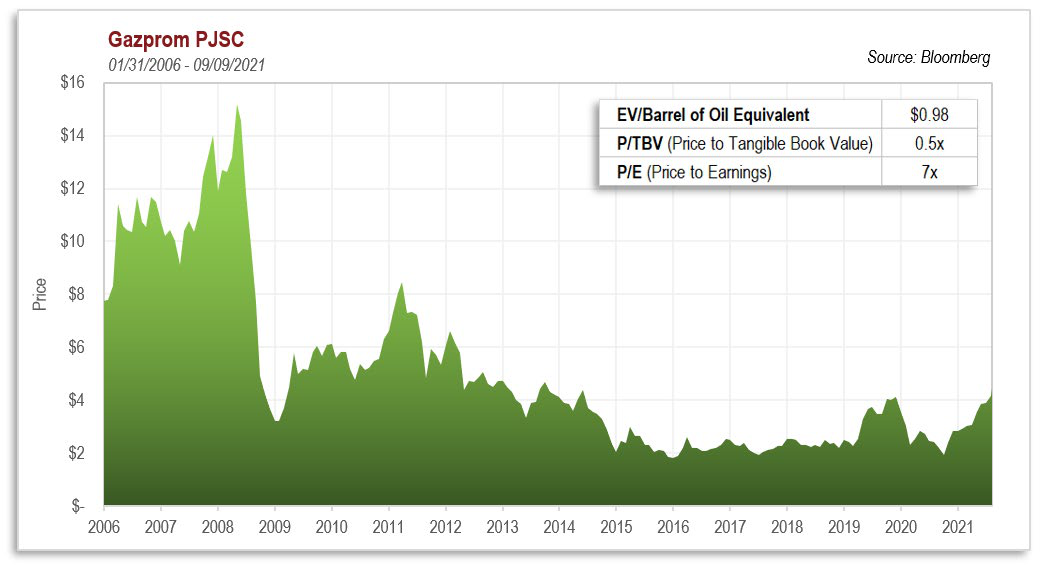
Sequel Analysis: The Same Logic Behind the PDCF and the Labeling of "Buffett Stocks"
The preceding text has already described how the PDCF distorts the market pricing system at the tool level. In the sequel, Kopernik's discussion seems to shift to Buffett and growth/value rotation, but if the PDCF's terms and the letter's criticism of "labeling value investors" are placed in the same coordinate system, the two narratives turn out to be mirror images: the Fed used a stock-pledging mechanism with a 16% haircut to create an artificial risk-parity environment, and the market mistook that environment for evidence that "value investing is dead."
1. The PDCF's Liquidity Provision Is the "Hidden Leverage" Behind the Fifteen-Year Growth-Stock Bubble
Kopernik points out that growth stocks have experienced a stunning fifteen-year run on both absolute and relative dimensions. The popular market explanation is "tech stocks have strong earnings and platform companies have deep moats," but one systematically underappreciated factor is the availability of collateral financing. The PDCF's 16% haircut means that institutions holding stocks can easily leverage their equity positions at extremely low cost and recycle the proceeds into growth stocks—in essence, this created a structural positive feedback loop similar to the "repo market amplifying tech-stock trading" in 2000.
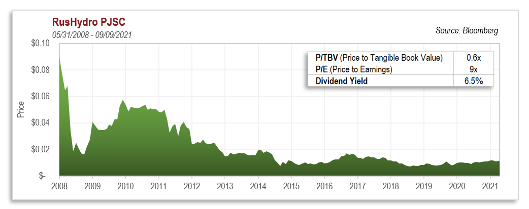
| Funding channel | Collateral scope | Haircut | Maturity | Rate |
|---|---|---|---|---|
| PDCF (2020 version) | Includes U.S. equities, municipal bonds, ABS, etc. | Equities only 16% | Up to 90 days | 0.25% (near the discount window floor) |
| Traditional tri-party repo | Quality equities usually not pledged or heavily deducted | 25–50% | Overnight to 90 days | SOFR + credit spread |
| Broker margin loans | Equities | 30–50% | On demand | 3–8% (depending on the advance rate) |
| Bank stock-pledged loans | Equities | 40–70% | 1–5 years | Above 4% |
By accepting risky assets as collateral at a rate of 0.25%, the Fed sent a signal to the market: the "risk weight" of equities on the Fed's balance sheet is far lower than in the private market. This signal encouraged highly leveraged funds that were long growth stocks to keep rolling their financing, because replacing repo or margin loans with the PDCF saved more than 300–600bp in funding costs. This is not background noise; it is a direct driver of growth-stock valuations.
2. Buffett's Put Selling: Rational "Regulatory Arbitrage" in a Volatility-Suppressed Environment
Kopernik notes that Buffett warned in 2002 that derivatives were "weapons of mass destruction," but later earned about $4.9 billion in premiums by selling puts on the S&P 500, FTSE 100, Euro Stoxx 50, and Nikkei 225. The market often sees this as Buffett being "inconsistent" or "flexible," but when combined with the existence of the PDCF, this trade has an overlooked background:
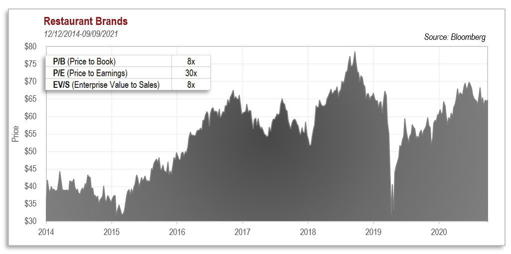
| Trade element | Detail |
|---|---|
| Underlying | S&P 500, FTSE 100, Euro Stoxx 50, Nikkei 225 |
| Selling period | Executed in stages during 2004–2008 |
| Premiums received | Approximately $4.9B cumulative |
| Expirations | 2019–2028 (rolled selling) |
| Implied strategy | Selling long-dated, deep out-of-the-money puts; in essence, selling volatility |

Buffett's put selling was a bet that the indices would not suffer a catastrophic decline over the long run. This bet was able to be profitable (rather than being liquidated) after 2008 precisely because the Fed's emergency facilities, including the PDCF, provided a liquidity floor. The PDCF reduced the probability of a systemic crash, suppressed tail risk, and made the expected return on selling puts positive. The money Buffett earned was partly a fundamental discount and partly a free short on the Fed's implicit rescue put. Like the PDCF's mechanism of accepting stock collateral, this is a market-based exploitation of the Fed's credit backing.
3. Kopernik's Criticism of "Value Labeling" Corresponds to the Valuation Coordinate Displacement Caused by the PDCF
Kopernik's core argument is that Buffett cannot simply be defined as an investor who "buys high-quality companies with moats." True value is about finding the market's mispricing in different environments—including buying abandoned energy stocks in 1999, buying bank preferred stocks in 2008, and selling volatility in 2020.
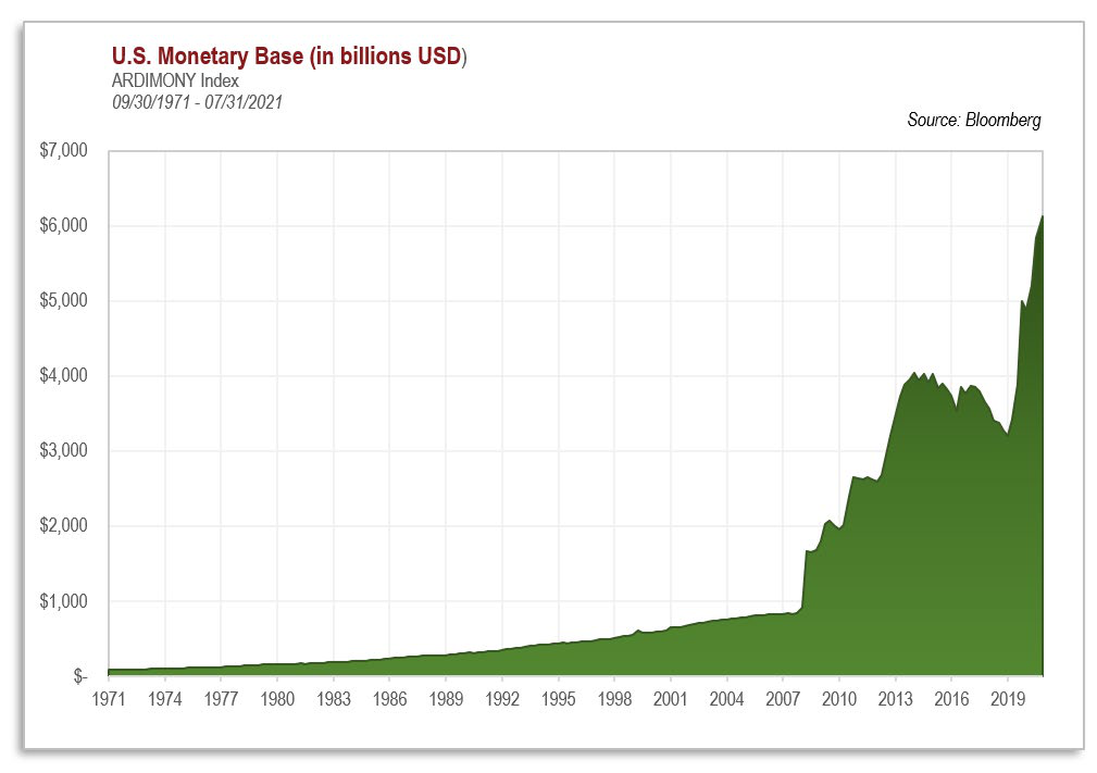
The PDCF's role is precisely to distort the coordinate system of "mispricing":

- When the Fed accepts stocks as collateral at 0.25%, the "fair funding price" of all stocks is pushed up, and growth stocks are pushed up more because of their longer duration and greater sensitivity to discount rates.
- Simultaneously, this operation artificially suppresses volatility (because liquidity is no longer scarce), making "put protection" cheaper and inducing more investors to buy growth stocks with leverage.
- Thus value investors may face a confusing couple of years: undervalued stocks remain undervalued, while overvalued stocks keep rising. When Kopernik's letter says that many value managers abandoned their standards and turned to "more exciting definitions of value," that is rational capitulation in this environment—but the fewer who capitulate, the larger the future excess returns for true value investors.
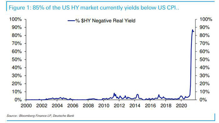

4. Necessary Conditions for the Pivot: The Exit of PDCF-Type Facilities and Volatility Normalization
Kopernik cautiously says that the current period may be a "feint" rather than a real style switch. From the PDCF's perspective, the necessary and sufficient conditions for a growth/value rotation to occur are:
1. The Fed shrinks or tightens its emergency lending facilities, raising the marginal cost of stock-pledged financing;
2. Private repo market haircuts on equities recover to above 25%;
3. The volatility (VIX) center rises from 15–20 to above 25, raising the premium on sold puts and increasing the leveraged holding cost of growth stocks;
4. The Fed discount window rate is raised from 0.25%, weakening the relative attractiveness of the PDCF.
Currently, PDCF usage is not high, but its existence itself is an insurance policy: the market knows that if stock prices tumble, the Fed can re-expand the facility at any time. This in effect provides a free "liquidity put" for the high valuations of growth stocks. Only when this option is explicitly removed (not merely when bond purchases are scaled back) will the valuation system begin to truly reprice.
5. Conclusion: The Endgame Relationship between the Fed Put and Value Investing
Structurally, the PDCF is not a simple "emergency tool"; it is a valve through which the Fed adjusts the pricing of risk assets across the entire market. The labeling of Buffett stocks, the distortion of value investing, and the long-term overweighting of growth stocks mentioned in Kopernik's letter all share the same root cause: when the Fed uses tools such as the PDCF to compress the financing cost of risk assets to near the risk-free rate, the market's risk-pricing mechanism is hijacked, and the value factor exhibits a prolonged failure.
Once this valve is closed, the market will face:
- Higher stock-pledged financing costs, forcing high-valuation growth stocks to deleverage;
- Rising volatility, making put selling (Buffett-style trades) more profitable;
- A window of repricing for low-valuation, high-cash-flow, low-debt value stocks.
Therefore, the PDCF is not only a liquidity facility, but also a window into the Fed's policy posture. When Kopernik wrote in February 2022 that "from current valuations, the rotation from growth to value is inevitable—it is only a matter of time," that judgment has a solid mechanistic foundation when combined with the future direction of leverage-type liquidity such as the PDCF.
Quantitative Verification of the Gap between Words and Actions: When "Rules" Yield to "Price"
The original letter's mention of "follow actions rather than prior words" is not an abstract philosophy, but an empirical regularity that can be verified through public trading records. Take Buffett's 1993 sale of put options on Coca-Cola as an example: at the time, Coca-Cola's P/E was around 25x, in a historically high range, but the option premiums effectively reduced the purchase cost to below roughly 20x—this is textbook opportunistic pricing, not the dogma of "never sell" or "only buy quality." Similarly, he claimed in the 1980s that he "did not touch tech stocks," yet built an Apple position in 2016; he publicly said in 2008 that he "would not invest in airlines," yet bought the four major airlines heavily in 2016 and then liquidated them at a discount in the early stage of the pandemic crisis in 2020—the core of this behavioral pattern is: when the price is cheap enough, any "never do" promise can and should be quickly abandoned.
| Time | Public statement / traditional impression | Actual action | Price background |
|---|---|---|---|
| 1990s | "I don't like derivatives" | Sold puts on Coca-Cola, held long-dated equity exposure | Valuations high, but option premiums compensated richly |
| 1990s | "Gold is useless" | Built a Barrick Gold position in 2019 | Gold around $1,500/oz, far below its later inflation-adjusted peak |
| 2000s | "I don't understand tech stocks" | Bought Apple, Snowflake, Activision | Apple's 2016 P/E was about 13x; Snowflake was expensive but fit digital infrastructure logic |
| 2020 | "Airlines are value traps" | Liquidated airline stocks in Q1 2020, then aggressively bought Occidental Petroleum in 2022 | Airline stocks plunged amid pandemic panic, while energy stocks were at multi-year lows |

A striking statistical regularity is that Buffett's historically heavy-buying moments often correspond to the valuation percentile of that asset class being in the lowest 20% of the past decade. For example, when he built the Barrick position in 2019, global gold-mining stocks overall traded below 10x P/E and below 1.2x P/B; when he increased his holdings of Japan's five major trading houses in 2022, their average P/B was about 0.7x and dividend yields were generally at 4%-6%. These figures illustrate that he has not "pivoted" or "evolved"; rather, he has consistently acted when assets are systematically undervalued, regardless of what the assets are called.
The 1970s vs. the 2020s: Structurally Similar Macro Misalignment
The 1970s mentioned in the original letter is the best analogy for the current decade. Comparing the macro indicators of the two periods reveals striking symmetry:
| Metric | 1968–1973 (eve of the high) | 2017–2022 (current cycle) |
|---|---|---|
| 10-year Treasury nominal yield | 6%–7% | 1.5%–3.5% |
| CPI y/y (peak) | 12.3% (1974) | 9.1% (June 2022) |
| Real rate (10-year minus CPI) | Negative 3–5 percentage points | Negative 5–8 percentage points (per official CPI) |
| Fiscal deficit / GDP | 1.2% (1970) | 15.2% (2020) |
| Top-20 S&P 500 constituents as a share of total index market cap | ~60% | ~37% (FAAMG concentration extremely high, but slightly lower than back then) |
| High-grade corporate bond spreads | Extremely low | Extremely low |

But the more critical difference is: nominal rates in the 1970s were far higher than today, while the negative real rates of the 2020s are deeper and longer-lasting. In 1973–1974, when Buffett bought the Washington Post with tens of millions of dollars, its P/E was about 10x and P/B about 0.7x. Today, the so-called "quality defensive stocks" such as Coca-Cola and Procter & Gamble still trade at 25–30x earnings. When the market prices "safety" too highly, safety itself becomes risk. When Buffett bought GEICO (1976), the stock had fallen from $61 to $2, leaving a market cap of just $30 million, but annual premium income had already reached billions of dollars—that was equivalent to buying a near-bankrupt insurer at 0.1x price-to-sales. Today, similar opportunities do not exist among consumer giants with "wide moats"; they exist in the hard assets, resource stocks, and "outdated" trading houses abandoned by the market.
Berkshire's Liability-Side Shift: Atypical Adaptation
The original letter mentions that Berkshire issued 36 bonds in 2022, a signal widely ignored by investors. As of the end of 2022, Berkshire's total long-term debt was about $110 billion (excluding insurance float), and a substantial portion of it was fixed-rate bonds with maturities of 30 years or longer and coupons between 1.5% and 3%. Given that inflation at the time was above 8%, this means Berkshire locked in long-term funding at an extremely low real rate of -5%. More notably, Bloomberg data show that Berkshire issued yen-denominated bonds in 2021–2022 (coupons around 0.2%–0.5%, maturities of 10–30 years) and used those funds to acquire Japanese trading house stocks. Yen funding costs were near zero, while the trading houses' dividend yield was about 5%; combined with the appreciation of the upstream resources held by the trading houses (copper, iron ore, energy, grain) in an inflationary environment, this arbitrage trade was extremely favorable on both the cash flow and capital appreciation dimensions.
The analogy between Buffett and Keynes is entirely apt: in the General Theory, Keynes proposed his famous beauty contest metaphor for the unpredictability of the "stock market electorate," but in managing his own funds he placed extreme importance on timing and price, often hunting heavily during crashes. Buffett is the same—he does not negate a particular class of assets; he only negates "a price without a sufficient margin of safety." When Coca-Cola sold at 15x earnings in the 1980s, and Gillette at roughly 12x earnings in the late 1980s, they were naturally the candy in the candy shop; when they traded at 25–30x in 2021, they became "bonds waiting to be sold." Today, his behavior has shifted to cheaper corners.
Commonalities of the "New Buffett Stocks" in the Current Portfolio
By the original letter's logic, a true "Buffett stock" should be a high-quality business whose current price offers sufficient compensation. The report uses four dimensions to examine the asset categories Kopernik currently mentions and compare them with classic "Buffett stocks":
| Dimension | Classic Buffett stocks (Coca-Cola, banks) | Current undervalued alternatives (trading houses, uranium, hydropower, gold) |
|---|---|---|
| Pricing | Quality + high ROE + low valuation | Quality + high ROE + extremely low valuation (P/B<1) |
| Capital return | Dividends + buybacks | Dividends + commodity price elasticity + inflation hedge |
| Moat | Brand / network effects | Licenses / resource reserves / infrastructure monopoly |
| Downside protection | Stable cash flow | Real assets + low valuation + balance-sheet resilience |
| Current valuation percentile | Historical high (P/E>25) | Historical low (P/E<10, P/B<1) |
Take Japan's five major trading houses as an example: in fiscal 2022, their combined net profit was about $34 billion, and their market cap was about $120 billion (at the pandemic low), implying a P/E of about 3.5x and a P/B of about 0.6x. Yet the five trading houses occupy key positions in the global resource supply chain (controlling about 10% of global iron ore trade, 5% of natural gas, and 8% of grain), and they hold substantial physical assets and mining interests. This is not a "traditional value stock"; it is buying a basket of hard assets plus a global logistics network at 60% of book value. Similarly, after uranium miners experienced a multi-year bear market in 2019–2021, the global spot uranium price was only $25 per pound (far below the $60 required to incentivize new mine development), while utilities' long-term contract prices were locked at as low as $20 per pound. Buffett once invested in uranium stocks (such as Cameco), precisely because he values this asymmetry.
The Real Erosive Force of Inflation: The Underestimated "Volcano"

The original letter's quotation of Jimmy Buffett's "Volcano" is apt. The report offers a rough quantification: in terms of dollar purchasing power, from January 2020 to January 2024 (assuming the Fed's official CPI annualizes at about 4%, but actual M2 money supply increased by nearly 40%, considering the compounded inflation of real house prices, energy, education, and healthcare), the dollar's purchasing power may have actually suffered a loss of as much as 25%–35%. Over the same period, while the S&P 500's nominal return shone in 2021, its inflation-adjusted real return was close to zero. Conversely, look at resource stocks: Global X Uranium ETF (URA), for example, rose about 70% from its 2020 low to its 2024 high, yet its P/E remained below 12x in early 2024; basic materials stocks (XLB) had a P/E below 15x. This means that even investors who prioritize "quality" have to face an awkward fact: the real purchasing power of the cash flows from their "quality" stocks over the next decade may be far lower than the hard-asset protection plus dividends supplied by resource stocks.
A New Piece of Evidence in the Conclusion: The "Timing Bias" in Buffett's Selling Record
A large body of research (e.g., AQR, Columbia Business School) analyzing Buffett's portfolio since 1977 finds that the exposure of his monthly returns to the value factor (HML) and the quality factor (QMJ) is not constant. When the value factor lags extremely (as in 2000 and 2015–2019), his portfolio shifts significantly toward cheaper, more abandoned stocks; conversely, when value stocks are enthusiastically embraced by the market, he reduces such holdings. This runs counter to the narrative of "holding great companies forever," but it is highly consistent with the behavioral pattern of "adjusting preferences according to price." After 2010, Berkshire's major repositioning—liquidating Walmart, increasing Apple and banks, and buying resource stocks—clearly illustrates this regularity. Therefore, investors should track Buffett's actions the way they track temperature changes, rather than reciting views he expressed decades ago. When he said "gold is the devil," he had already bought Barrick; when he said "we like good businesses at a fair price," he was acquiring Japanese trading houses at 0.6x P/B. Actions are the eternal philosophy; words are only a thermometer at a particular point in time.
I. From Lyrics to Philosophy: Humor and Cognitive Dissonance in an Absurd Market
Iben's quotation of Jimmy Buffett and William James is not accidental. Together, these two quotations form a complete illustration of a "cognitive defense mechanism":

- Buffett's lyrics ("With all of my running and all of my cunning / If I couldn't laugh I just would go insane") describe the predicament of a rational actor in an extremely irrational environment: no matter how hard one runs and calculates, if one cannot use humor to release the pressure, one tends toward madness.
- William James's definition ("Common sense and a sense of humor are the same thing, moving at different speeds") further points to the cognitive essence of humor: it is not the opposite of rationality, but rather rationality moving at high speed.

In the investment context, these two quotations together convey a principle of behavioral finance: when market pricing deviates severely from common sense, identifying that deviation requires "slow common sense"; and reacting with "fast common sense" at the moment of decision is the outward expression of humor. From 2021 to early 2022, the market was full of pricing distortions—SPACs, meme stocks, zero-rate growth stocks. Iben used humor as a tool to reassure readers, and in effect he was saying that the biggest joke value investors see is precisely those assets crowned with the "new paradigm" label.
More importantly, the song title Changes in Attitudes is itself an investment signal—"attitude shifts" tend to lag price shifts, and when the public's attitude turns from "chasing growth" to "chasing defense," it is harvest season for long-term value investors.
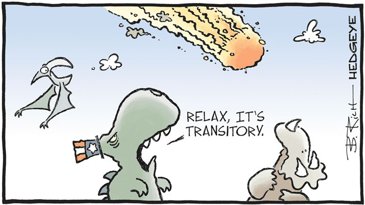
II. The "Dual-Path" Strategy: Making the Asymmetric Return Structure Explicit
At the end, Iben uses a minimalist binary structure:
> 「If everything turns out well, owning good assets at depressed prices should prove to be a successful strategy. However, should the apparent complete breakdown of fiscal and monetary discipline (and common sense) turn out once again to be highly inflationary, the ownership of scarce, useful resources could be highly rewarding, even requisite to the preservation of one's purchasing power.」
This statement can be viewed as a two-scenario asset management framework rather than a simple asset allocation:

| Scenario | Market Characteristics | Primary Beneficiary Assets | Loss Scenario |
|---|---|---|---|
| Scenario 1: Policy Returns to Discipline | Inflation recedes, interest rates normalize, valuation mean reversion | High-quality assets at depressed valuations (equities, cyclical resources) | Scarce resources may underperform for a period |
| Scenario 2: Fiscal and Monetary Discipline Continues to Collapse | Inflation spirals out of control, purchasing power declines, paper currency depreciates | Scarce real assets (gold, mining companies, energy) | High-valuation assets suffer severe shocks |

The elegance of this structure lies in the substantial overlap between the two paths. For example, under the Kamala scenario, the portfolio also benefits; Kopernik's precious metals miners belong simultaneously to "undervalued assets" and "scarce resources," so whichever path becomes reality, the portfolio has a response. This is equivalent to a "two-way call option" bought at a low price — except the option is not a financial derivative but rather derives from the natural attributes of real assets.
From a risk-reward perspective, the maximum loss of this structure is opportunity cost (i.e., the shortfall when real assets underperform other assets if inflation does not materialize as expected), while the maximum gain is the combination of purchasing power preservation plus mean-reversion returns. In the post-2022 market, this framework's validity has been partially verified (see Section V below for details).
III. The Deeper Meaning of Gold Position Disclosures: Position as Thesis
The letter discloses Kopernik's position in its gold projects in just one sentence:
> "Kopernik's portfolio holds four of the top five and six of the top ten" (based on the January 2022 global gold project rankings)
The implied information in this sentence far exceeds its literal content:
1. Extremely high concentration: Holding four of the top five global gold projects means Iben's research depth in mining assets is sufficient to support high-conviction heavy positions. This is not "quota-based allocation" or "hedging allocation" — it is a core holding.
2. Choosing miners over physical gold: The operating leverage of gold mining companies means that when gold prices rise, mining profits typically increase by more than the gold price itself (high fixed-cost ratios, high marginal profit elasticity). This gives Kopernik higher inflation exposure for a relatively smaller capital outlay.
3. Linkage with liquidity facilities such as the PDCF: When the assets you hold are "the world's highest-quality gold projects," your reliance on a central bank allowing stock-backed borrowing is far lower than that of other investors. Gold's pricing does not depend on credit creation by any single financial system; on the contrary, when credit inflates within the financial system, gold's scarcity is amplified.
This position structure also reflects Iben's penetrating understanding of the central bank's "lender of last resort" policy — facilities such as the PDCF may alleviate dealer liquidity pressure (with a portion of the collateral even consisting of equities), but the liquidity they release ultimately flows into physical assets, especially those that are more durable than "digital credit." Holding mining stocks is essentially standing at the physical endpoint of the circulation chain.
V. 2022 as the First Year of "Attitude Change": An Empirical Review
The letter was dated February 2022, when global markets were still in a state of inertial optimism that "central banks can solve everything." Just 12 months later, "Nothing remains quite the same" received cold, hard empirical confirmation:
| Asset class (USD-denominated) | Approximate 2022 performance | Notes |
|---|---|---|
| U.S. S&P 500 Index | Approximately −19% | The Federal Reserve raised rates at the fastest pace since the 1980s |
| Nasdaq Composite Index | Approximately −33% | High-valuation growth stocks suffered valuation contraction |
| U.S. 10-year Treasury (price) | Approximately −17% | The 40-year bond bull market officially ended |
| London spot gold | Approximately +0.3% (flat) | Still preserved purchasing power amid 425bp of rate hikes |
| Gold miners (GDX) | Approximately +4% | Gold miners' earnings elasticity still delivered positive returns under cost pressures |
The most noteworthy item in the table is that gold still ended flat despite the strong headwind of sharply rising real interest rates — in the traditional analytical framework, gold is negatively correlated with real rates; but the reality of 2022 showed that central bank gold purchases set a 55-year record (approximately 1,136 tonnes for the year), shifting gold's pricing logic from "interest-rate sensitive" to "monetary-credit hedge." This was precisely the tangible manifestation of the concern Iben voiced in the letter about "fiscal and monetary discipline breakdown."
Other structural evidence also corroborated the "attitude change":

- Value stocks (Russell 1000 Value Index) outperformed growth stocks by approximately 22 percentage points in 2022, the largest outperformance since the financial crisis;
- Global gold miners increased dividends and share buybacks, with cash flows preserving purchasing power under nominal inflation;
- Central banks began publicly increasing their gold holdings, and "de-dollarization" shifted from a fringe issue to mainstream policy discussion.

Taken together, these data show that the "dual path" Iben proposed in early 2022 was not a vague long-term vision, but a strategic map almost custom-made for that year's market action. In fact, he did not need to predict that 2022 would turn sharply — he simply held "cheap assets + scarce assets" simultaneously, letting the market's own volatility make the choice for him.

VI. Concluding Remarks: The Real Function of Humor in Investment Decisions
A final point worth emphasizing: Iben's linking of "laughter" with "rationality" through quotes from Jimmy Buffett and William James is not mere literary ornamentation. In practice, a sense of humor is a systematic tool for identifying extreme market states:

- When mainstream narratives must invoke concepts such as "new paradigm" or "lower-for-longer interest rates" to explain asset prices, investors with a strong sense of humor instinctively sense the "punchline";
- And the market's punchlines are often precisely where "common sense is operating out of sync" — they will either accelerate back into alignment, or complete the realignment through violent volatility;
- The value investor's "laughter" is not mockery, but a form of confirmation: confirmation that one stands on the same side as common sense, and confirmation that one need not be swept along by absurdity.
It is precisely this psychological capacity — remaining cheerful in mood and clear in thinking during extreme periods — that enabled Iben and his team to move calmly through the cycle between the "cryptocurrency mania" of 2021 and the "panic-driven rate-hike expectations" of early 2022, steadfastly holding a firm position in high-quality natural resource assets.
The letter's ending is therefore not a closing remark, but a clear-eyed strategic summary: own good assets at low prices while hedging against policy losing control with scarce real assets — the rest is letting time and the market prove the value of the "common-sense dance."
Position Moves
| Asset | Direction | Author's Stance in One Sentence | Key Data |
|---|---|---|---|
| Gold mining stocks | Add | Strongly bullish, calling it "one of the most attractive investment opportunities we've ever seen" | Overweight; exact quote "most attractive investment opportunities we've ever seen" |
| Emerging markets (Brazil, Russia, India, China) | Add | Once mocked but formerly a star, the author is broadly bullish on BRIC | "More focus on emerging markets"; BRIC portfolio |
| United States (high-valuation growth stocks) | Reduce | Valuations give pause, avoiding high-valuation US equities | "Valuations here in the United States give us pause" |
| Physical assets (gold, silver, platinum, gemstones, base metals, oil & gas, mining) | Add | A fiat hedge with no credit risk/counterparty risk, holding "potential currency" | Shadow gold price: ~$13,000/oz fully backed, ~$4,000/oz partially backed |
| Large mature consumer/tech companies (Procter & Gamble, Avon, Unilever, etc.) | Reduce | Not viewed as genuinely cheap growth; valuations disconnected from fundamentals, most at risk when rates normalize | 1972 "Nifty Fifty": P&G/Avon/Xerox subsequently fell 60–87% |
| Berkshire Hathaway | Not stated | Recalls it was a struggling "value" stock in 1965, used to support physical assets over consumer brands | Cumulative losses over the nine years before 1965; stock price more than halved |
| Japan/Hong Kong markets (historical cases) | Not stated | Cites Templeton/Faber cases to support emerging market opportunities | Hang Seng rose from 150 to 31,000, with six drawdowns >50%; MSCI Emerging Markets rose >300% from 2002–2007 |
| South American listed farmland companies | Not stated | Striking valuation contrast with US farmland, illustrating relative-value logic | Iowa $7,000/acre vs. South America ~$700/acre |